Customizing a Chart
Analytics Plus provides a wide range of customization options, allowing you to personalize the chart's appearance, which is visually appealing and informative. You can adjust colors, fonts, and layouts to match your branding or preferences.
Analytics Plus' Settings pane comprises the following three tabs:
General: From this tab, you can perform the following customizations:
Note: These options differ depending on the chart type.- Analysis: This tab lets you customize the settings for advanced analytical features such as Forecasting, Trend Line, Cluster Analysis, Anomaly / Outlier, What-if Analysis, and Data Alerts. Please note these options will appear here once you enable them in the charts.
- Zia Insights: From this tab, you can customize and control the factors used to generate Zia insights. Click here to learn more.
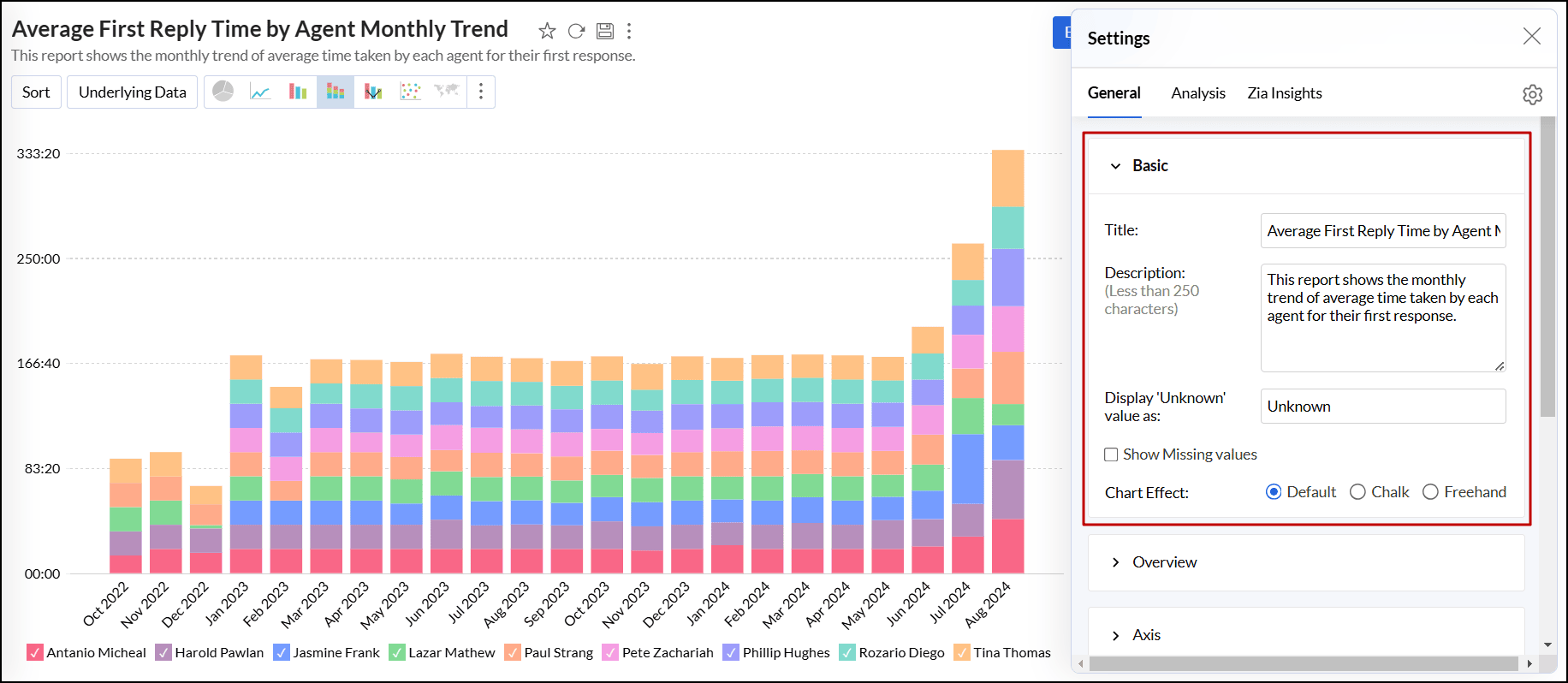
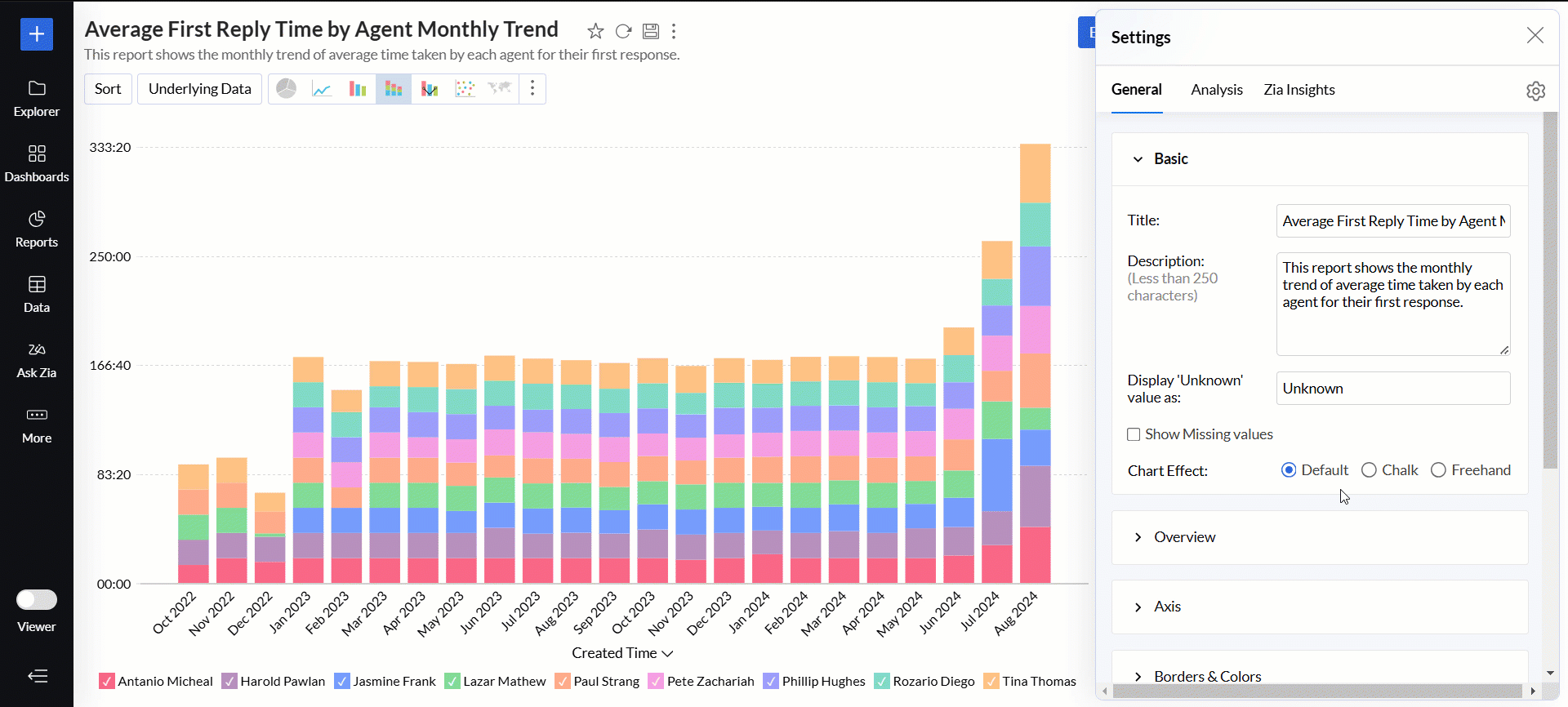
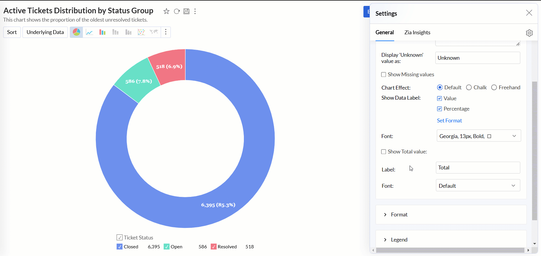
Basic settings
This section lets you customize the elementary details of the report, such as the Title, Description, representing Missing values, and other chart-specific options.
Accessing the Basic settings
- Open the desired chart, and click the Settings icon.
- In the dialog that appears, expand the Basic tab.
Working with Basic settings
The available options below vary depending on the chart type.
- Title and Description: This option lets you modify the title and description of the chart as required.
- Display 'Unknown' value as: This option enables you to define a value that should appear in the chart when there are null, empty, or missing data points.
Show Missing values: This option displays the data points with missing values in the chart. Please note that this option is displayed only when the chart has missing data points.
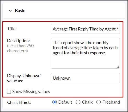
Chart Effect: This option enables you to apply an effect over your chart. The following are the available options:
- Default: This option generates the chart without any effects. This option is selected by default.
- Chalk: This option gives the appearance of a chalk drawing to the chart.
- Freehand: This option resembles hand-drawn charts with uneven lines and irregular shapes.
Show Data Label: This option displays the actual values corresponding to each point in the chart. You can also choose to display charts without the data label.
- Set Format: This option lets you format the column values used to generate the data labels. You can also do this from the Format tab of the Settings dialog.
- Font: This option lets you choose the desired font style for the data label.
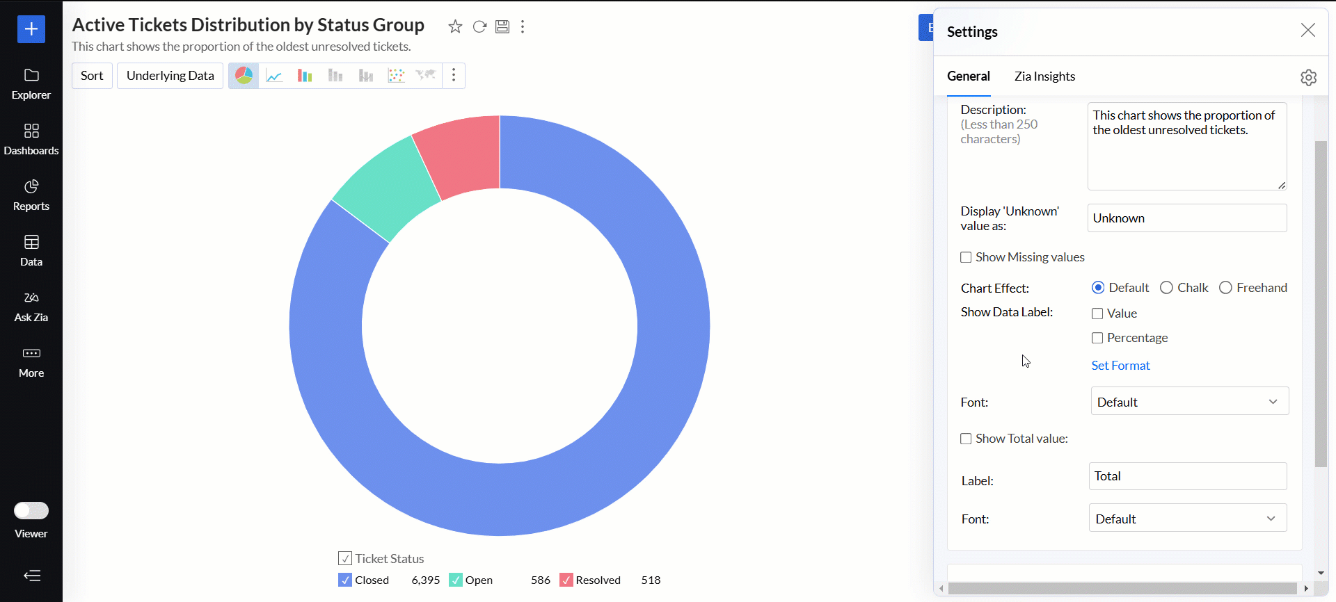
Show Total Value: This option displays the total of all the data in the report.
- Label: This option lets you add a label for the total.
- Font: This option enables you to choose the desired font style for the total.
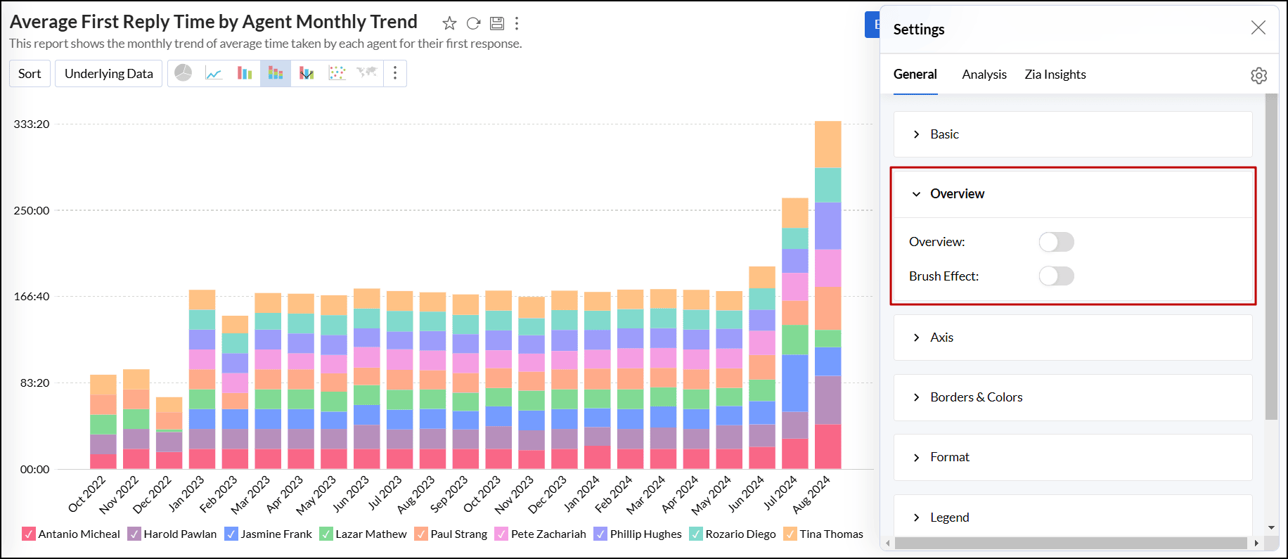
Overview settings
This option allows you to add the overview, scroll bar, and brush effect to charts. Click here to learn more.
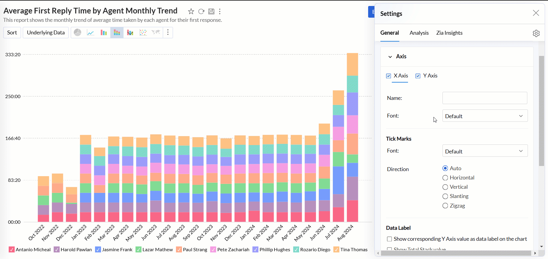
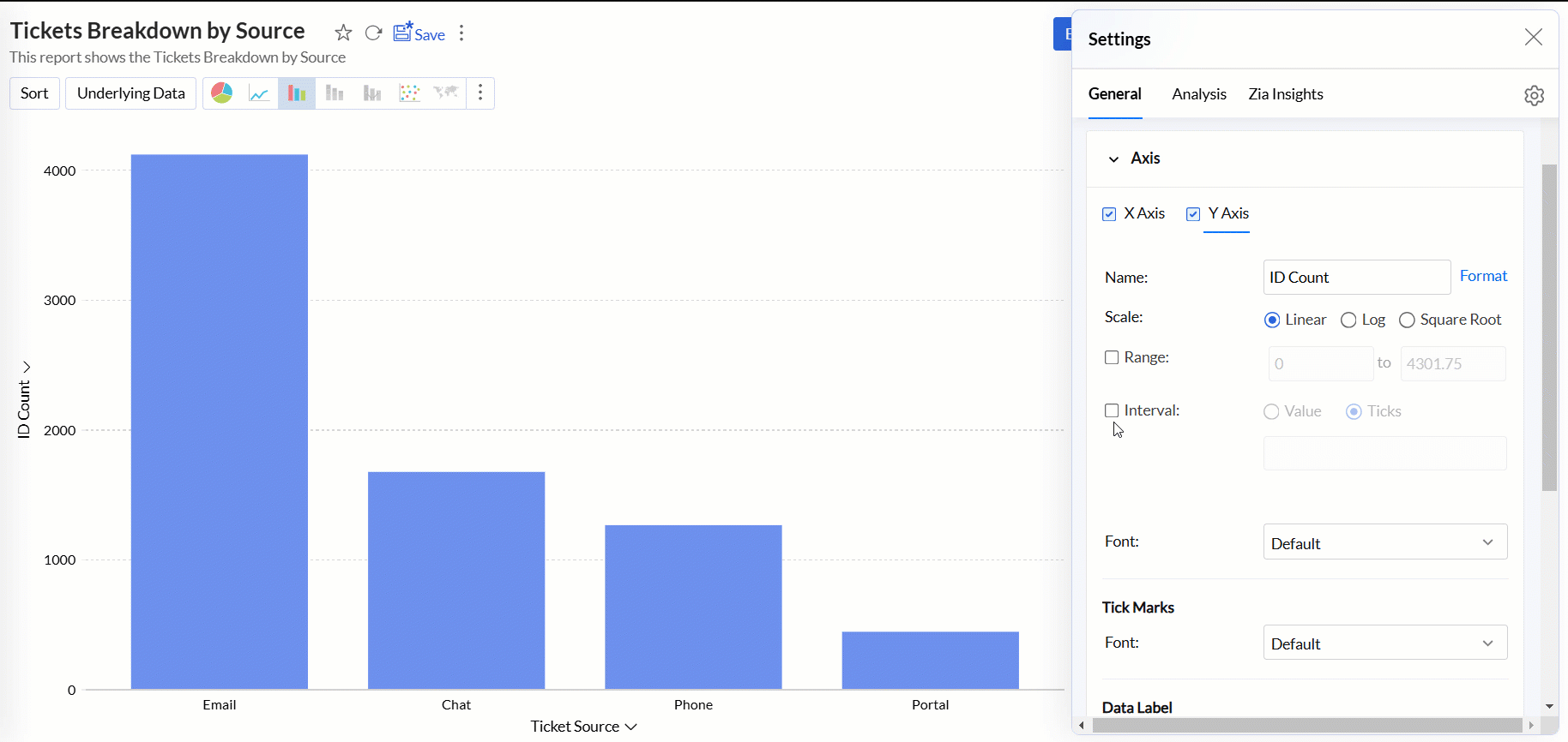
Axis settings
Analytics Plus automatically sets values for chart axes (X-axis and Y-axis) such as labels, axis range, interval between labels, etc. You can also customize these properties as required.
Accessing the Axis settings
- Open the desired chart, and click the Settings icon.
- In the dialog that appears, expand the Axis tab.
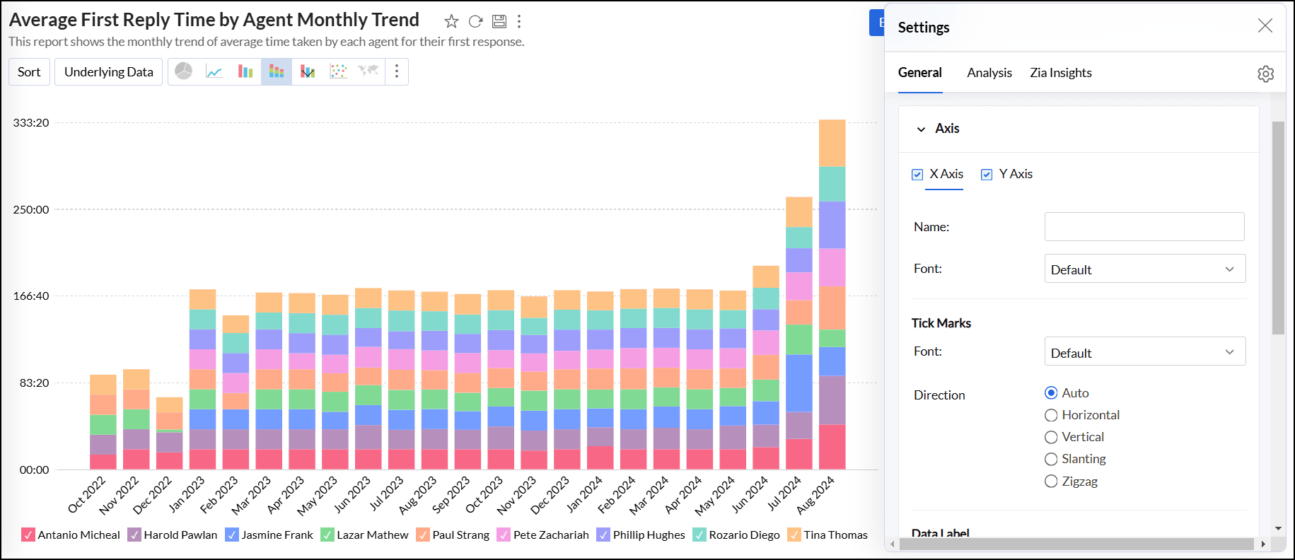
Working with Axis settings
The following options are available for customizing X-axis and Y-axis. To adjust the settings, navigate to the appropriate axis tab.
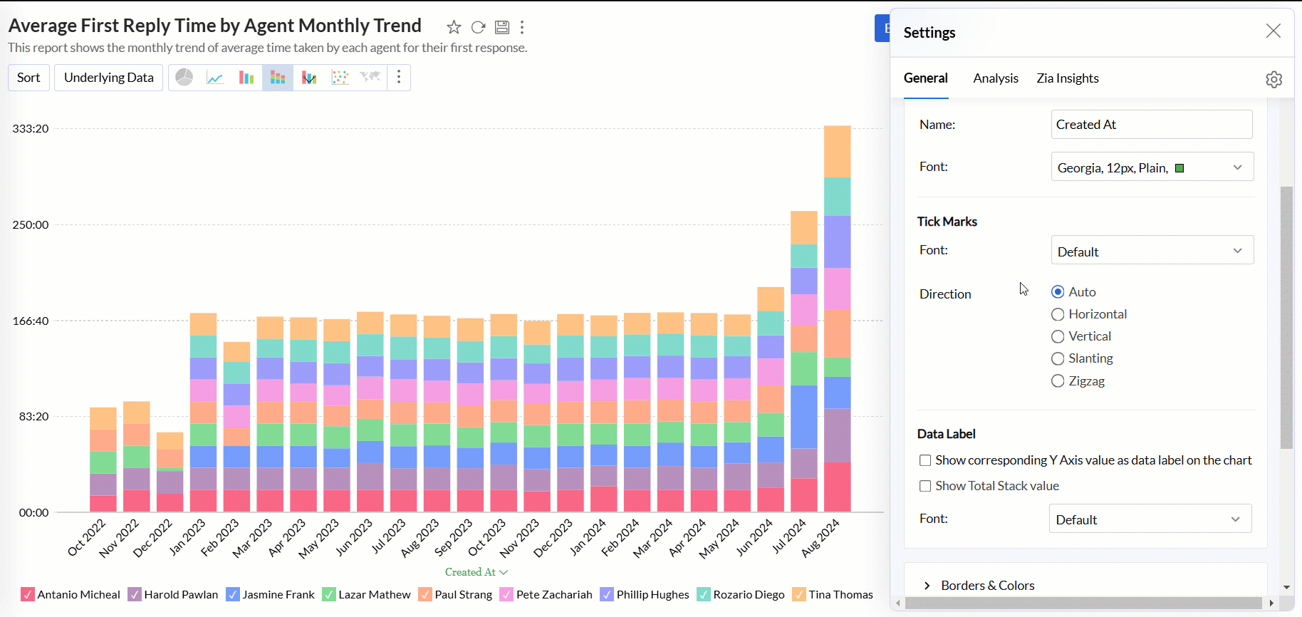
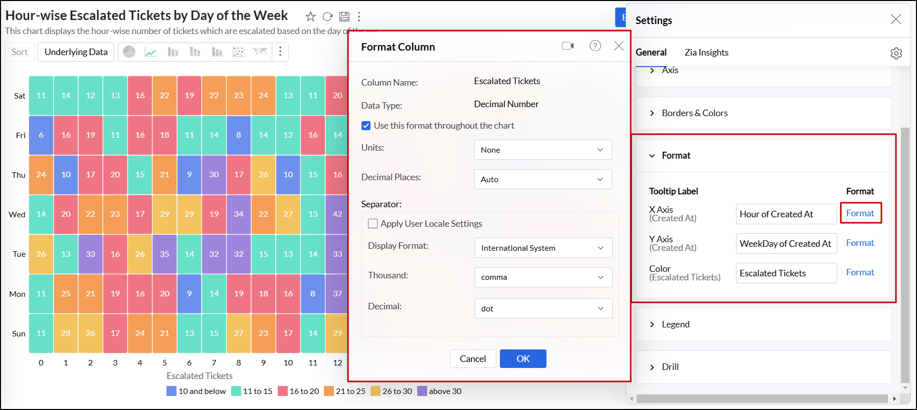
- Name: Specify a name for the axis. By default, the corresponding column name is set as the axis label. For numeric data types, you can also format the column values by clicking the Format link next to the axis label name.
Font: This option lets you choose the desired font style, size, and color for the axis label.
Tick Marks
- Font: This option allows you to set the font style, size, and color of the tick marks in the axis.
- Direction: This option sets the orientation of tick labels.
- Auto: Align the tick labels in the most appropriate direction based on the number of characters in the tick label.
- Horizontal: Align the tick labels in a horizontal direction.
- Vertical: Align the tick labels in the vertical direction (90-degree angle to the axis).
- Slanting: Align the tick labels in the slanting direction (45-degree angle to the axis).
- Zigzag: Aligns tick labels in a zigzag pattern.
Scale: This option lets you specify how to scale the tick labels. Available options are:
- Linear: Adds tick in linear number sequences as 100, 200, and 300 with equally spaced grid lines.
- Log: Adds ticks in log number sequences as 10, 100, and 1000 with equally spaced grid lines.
- SquareRoot: Adds tick in the square root sequence as 5, 25, 625 with unequally spaced grid lines. Spacing between the grid lines decreases as value increases.
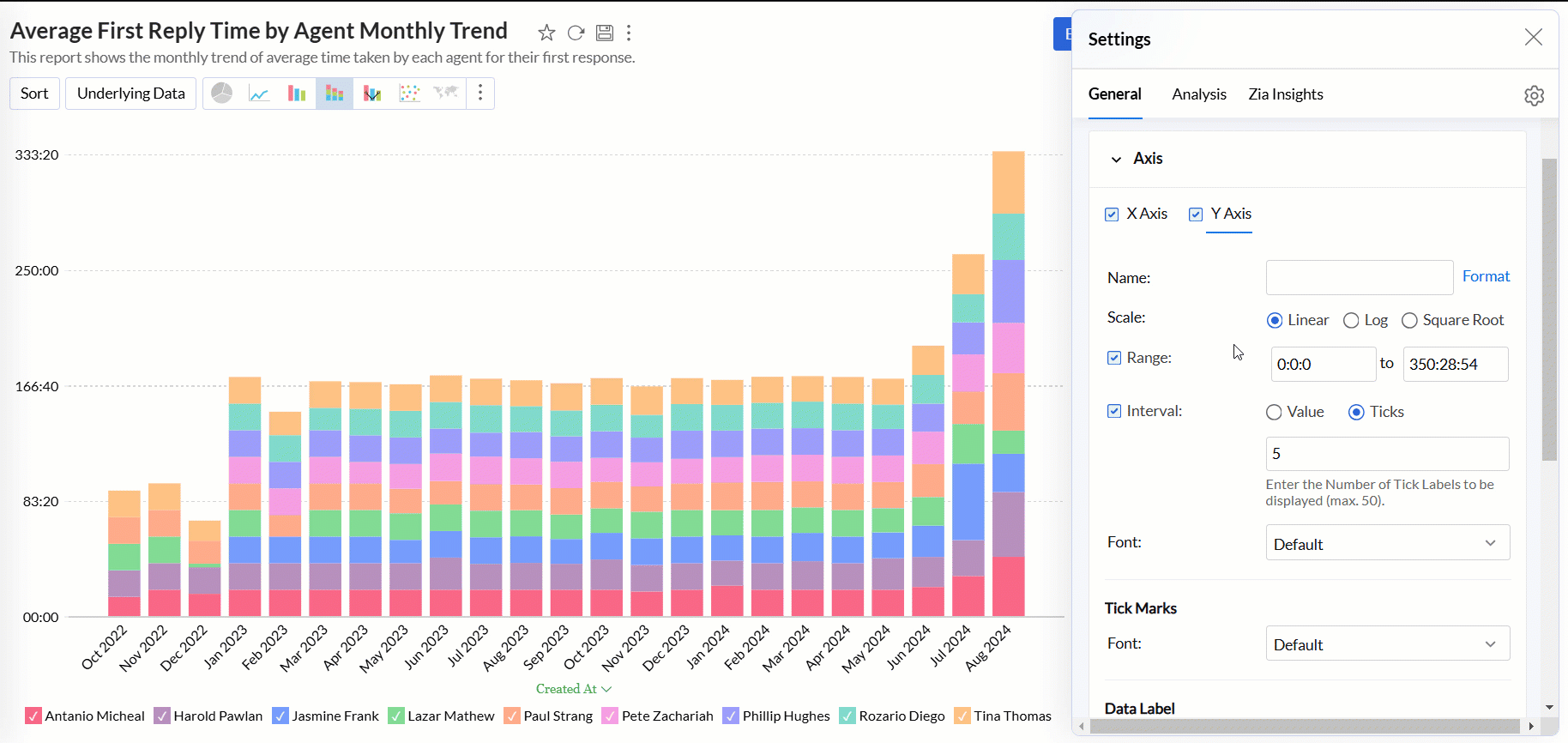
Range: Refers to the minimum and maximum values displayed on the axis. Analytics Plus automatically calculates the range based on the maximum and minimum values in the data series. However, you can also set a custom range by selecting the Range check box and adding the corresponding values.
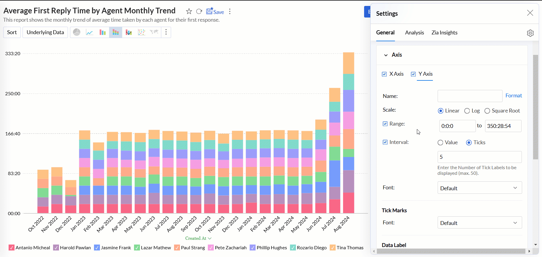
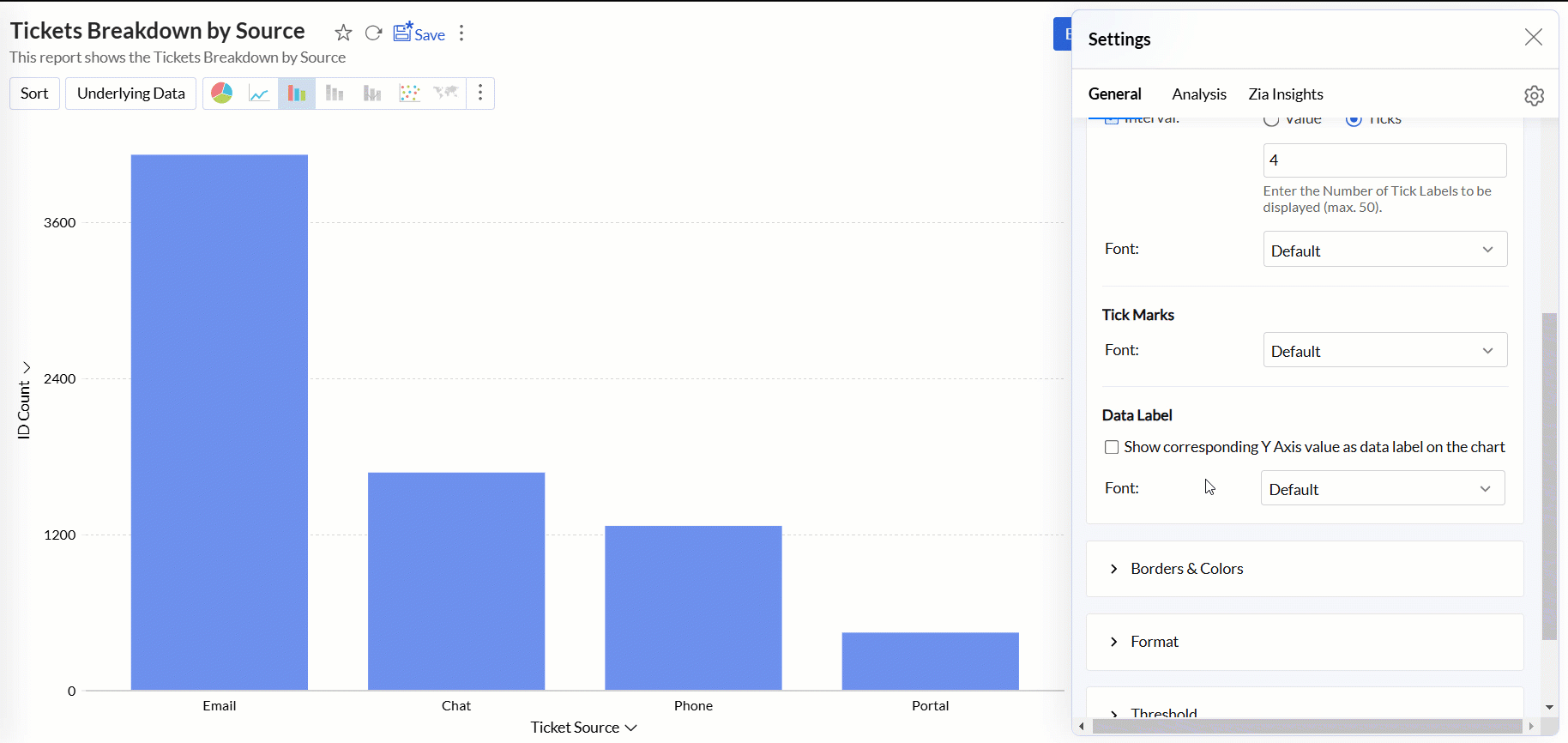
Interval: Refers to the spacing or distance between the tick marks or labels along the axis. Analytics Plus automatically determines this based on axis label length and chart size. You can also set a custom interval by selecting the Interval check box and choosing one of the following options:
- Value: It determines how much the axis value increments between each label. For example, if you set the value to 10 on a numeric axis, the tick labels will appear at 0, 10, 20, 30, etc.
- Ticks: Refers to the number of tick labels you want to display along the axis, regardless of the interval between them.
Data Label: This option displays the axis values as data labels on the chart.
- Font: This option allows you to set the font style, size, and color of the data label in the axis.
Borders & Colors settings
Analytics Plus enables you to customize the default background and border colors applied to the charts.
Accessing the Borders & Colors settings
- Open the desired chart, and click the Settings icon.
- In the dialog that appears, expand the Borders & Colors tab.
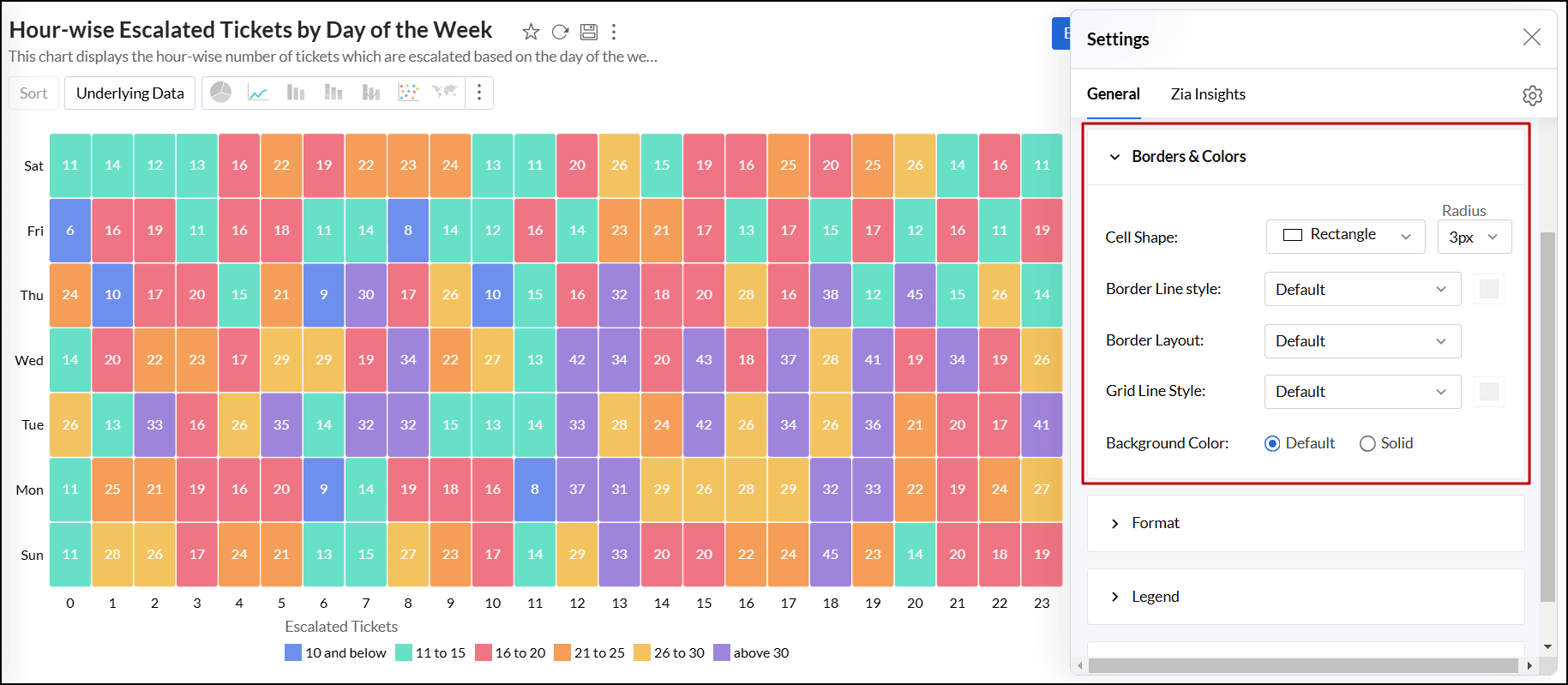
Working with Borders & Colors settings
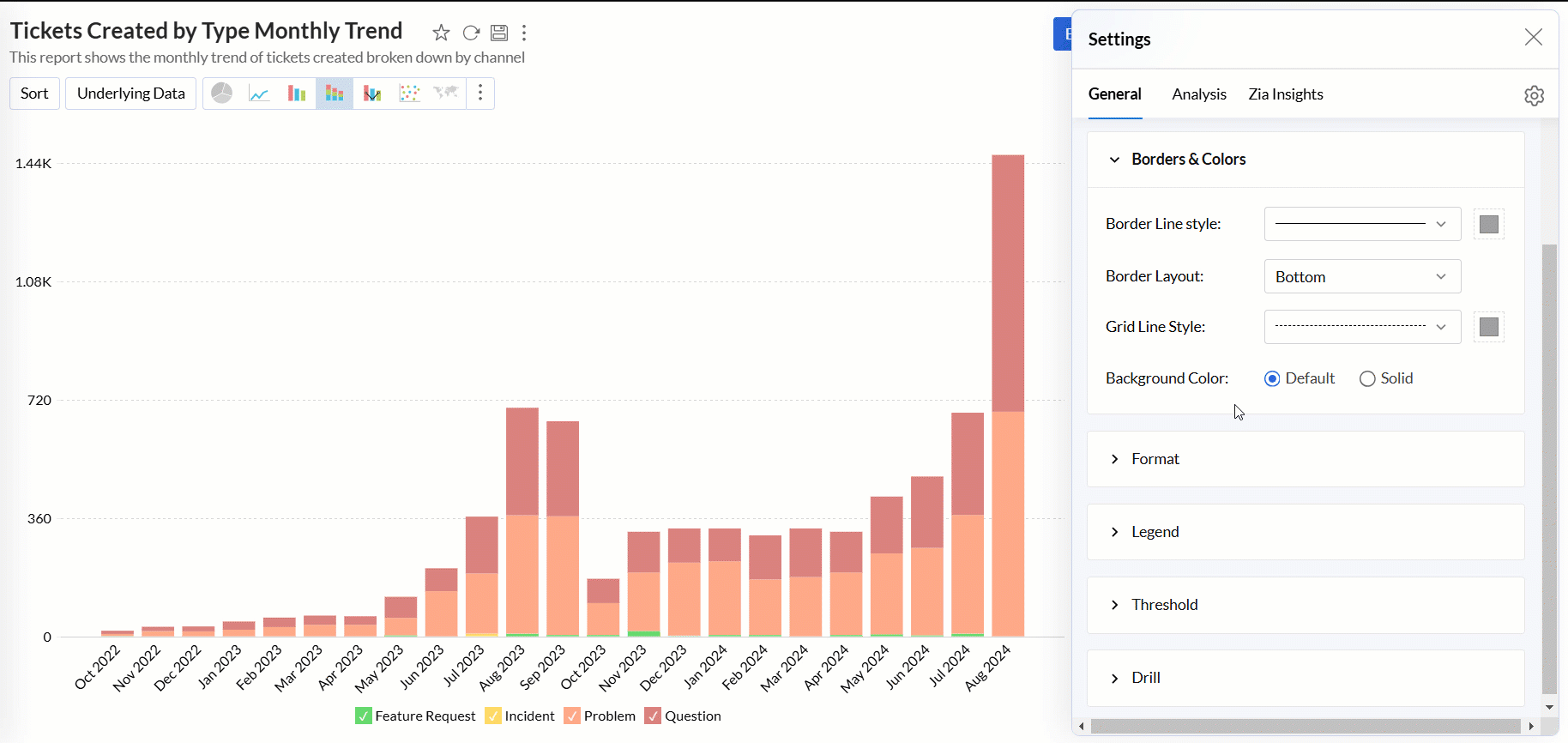
- Border Line Style: Select the style and color for the borderline from the drop-down menu.
- Border Layout: Choose the layout of the border. The default option applies a thin gray border at the bottom of the chart.
- Grid Line Style: Select the style and color for the grid lines from the drop-down menu.
- Marker Fill Color: Select the fill color and style for the markers in the chart.
- Background Color: Apply a background color to the chart. By default, no background color is applied. Select the Solid option to choose a color if needed.
- Cell Shape: For TreeMap charts, choose the shape and size of the cells to customize the display.
Format setting
Analytics Plus lets you modify the format of a column, including options for alignment, decimal places, date formats, currency, symbols, and more. Depending on the data type, you can choose how to display the data in the chart.
Accessing the Format settings
- Open the desired chart, and click the Settings icon.
- In the dialog that appears, expand the Format tab.
- Click the Format link corresponding to the column name.
- In the dialog that appears, make the desired changes, and click OK. Please note that the options displayed in the Format Column dialog vary based on the data type of the selected column. Refer to the following section to learn more.
Working with Format settings
Numeric data type
- Alignment: This option allows you to align the cell values horizontally in the Left, Right, and Center positions.
- Units: This option enables you to format the unit values in any one of the following ways:
- None: No unit formatting applies to the data.
- (Thousands) K: The data is formatted in thousands (k).
- (Lakhs) L: The data is formatted in lakhs (L).
- (Millions) M: The data is formatted in millions (m).
- (Crores) C: The data is formatted in crores (C).
- (Billions) B: The data is formatted in billions (B).
- (Thousands) K - (Lakhs) L - (Crores) C: The data is auto formatted to the unit value as thousands (K), lakhs (L), and crores (B).
- (Thousands) K - (Millions) M - (Billions) B: The data is auto formatted to the unit value as thousands (K), millions (M), and billions (B).
- Auto (User Locale Specific): The data is auto formatted to the unit value as per the user local standards, i.e., either as thousands (K), millions (M) and billions (B) or thousands (K), lakhs (L), and crores (B).
- Separator: This option allows you to select a separate for decimal and thousands.
- Apply User Locale Settings: Select the checkbox to use separators based on the locale settings of a user. For example, in the US locale, a comma is used for thousands separator, and in the German locale, a dot is used. Please note that if this option is selected, the following options are disabled.
- Display Format: Choose the required format to place thousand separators, either International System (123,456,789) or Indian System (12,34,56,789).
- Thousand: Select the type of thousand separators such as none, comma, dot, space, and single quote. This option applies to number and decimal columns.
- Decimal: Choose the type of decimal separator, either a dot or a comma. This option applies only for decimal, currency, and percentage columns.
- Currency Symbol: This option enables you to choose the type of currency symbol from the drop-down list. This option applies to currency type columns.
- Negative Number Display: This option allows you to specify the format to display negative numbers. You can either choose Within Parenthesis [-25 as (25)] or With Negative Sign [-25 as -25].
- Decimal Places: This option sets the number of decimal places to be displayed for decimal, currency, and percentage columns.
Date data type
- Alignment: This option allows you to align the cell values horizontally in the Left, Right, and Center positions.
- Choose Date Format: This option lets you select a format to display the date values from the list of available formats. You can also specify a custom date format if the required format is not available in the default list. Click here to learn more about constructing a custom data format.
Duration data type
- Alignment: This option allows you to align the cell values horizontally in the Left, Right, and Center positions.
- Choose Duration Format: This option lets you choose the duration format from the available formats. You can also specify a custom format. Click here to learn more about constructing a custom duration format.
String or Category data type
- Alignment: This option allows you to align the cell values horizontally in the Left, Right, and Center positions.
URL data type
- Alignment: This option allows you to align the cell values horizontally in the Left, Right, and Center positions.
- Alternate Text: This option enables you to provide a substitute reader-friendly text to be shown instead of the actual URL.
- Sorting: For a URL data type column, Analytics Plus performs sorting based on the actual URLs in the column.
- Copy and Paste: When you copy and paste the alternate text in a column, Analytics Plus pastes the actual URL corresponding to the column.
- Exporting: While exporting a view with an alternate text, Analytics Plus exports the actual URLs in the column.
- Image: This option lets you replace the URLs that point to images with the corresponding images in charts. Refer to the following section to learn more.
Display images in charts
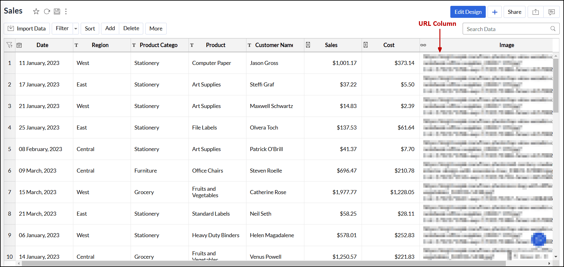
The following is a sample table with an image URL column:
Follow the steps below to convert the image URLs into the corresponding images in charts:
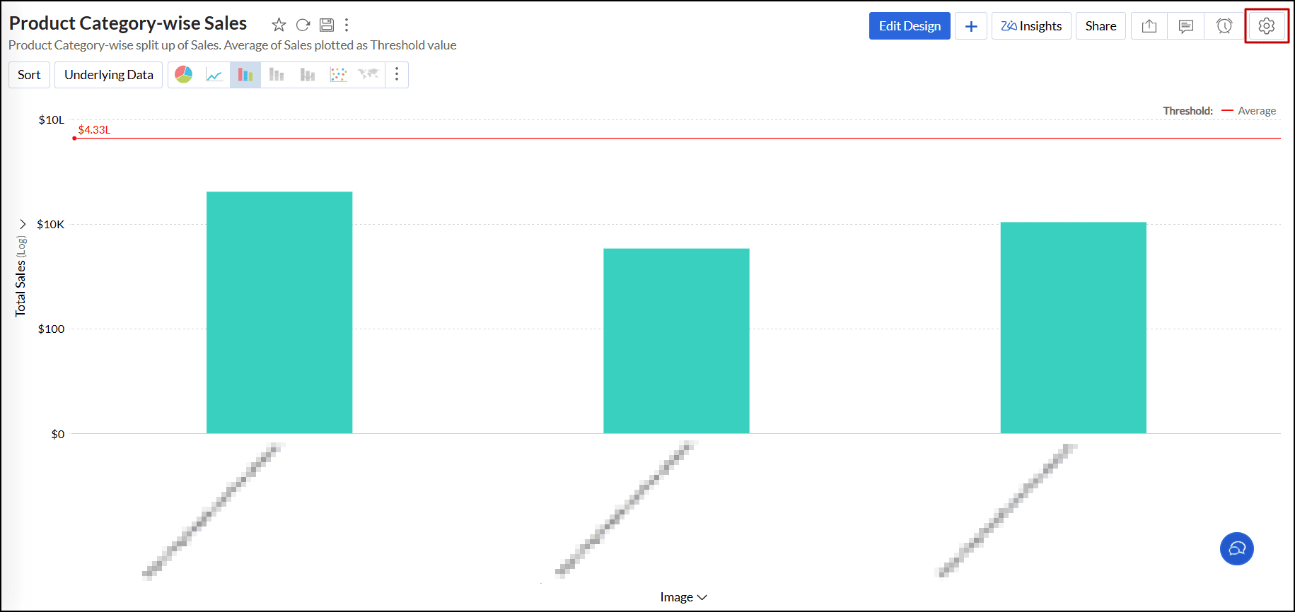
- Open the required chart in the Edit Design mode.
- Add the image URL column to either the X or Y-axis shelves, or the Color shelf, and click the Click Here to Generate Graph button.
Click the Settings icon in the top-right corner either in Edit Design mode or View mode.
- In the dialog that appears, navigate to the Format section and click the Format link next to the URL column.
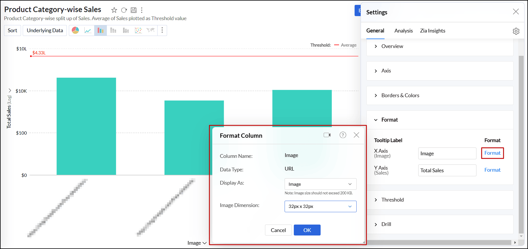
- In the pop-up that appears, choose Image from the Display As drop-down, and select the required dimension from the Image Dimension drop-down.
- You can also provide custom dimensions for the images using the Custom option under the Image Dimension section.
- Click OK to replace the URL text with the corresponding images in the chart.
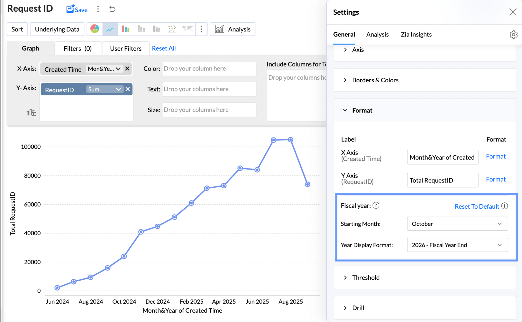
Report Level Fiscal Year Settings
The Fiscal Year setting in the chart options allows you to define the starting month for the fiscal year. This customization applies solely to the current report. This option is shown when a date column is used in the report.
To customize the report level fiscal year settings,
- Click Format.
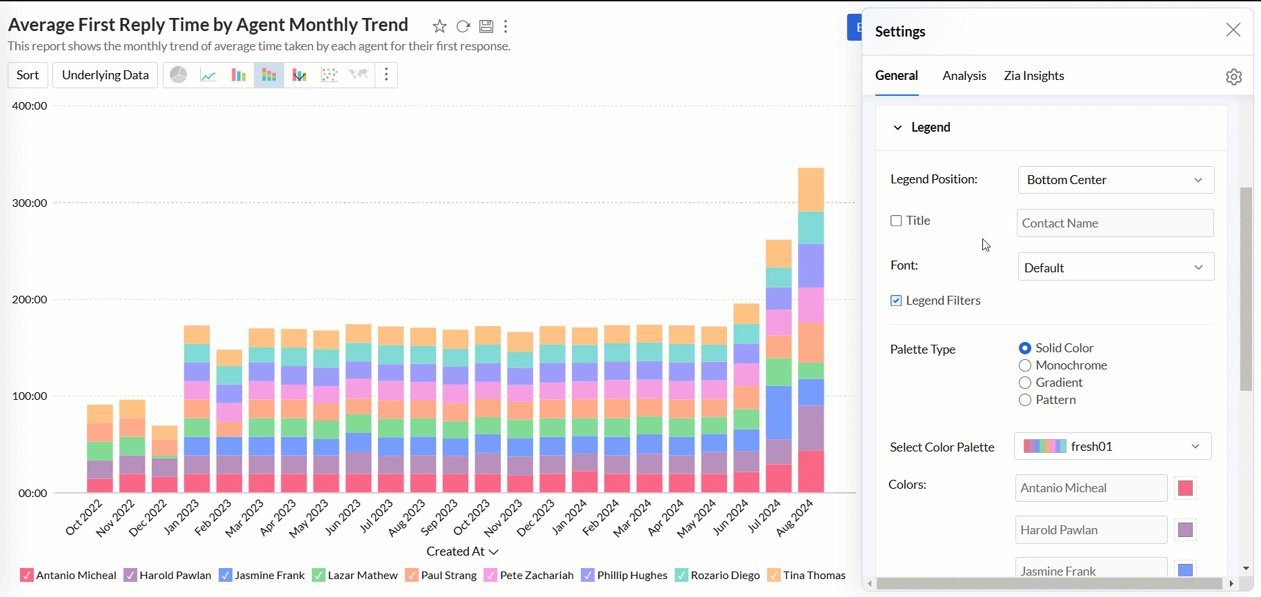
Legend settings
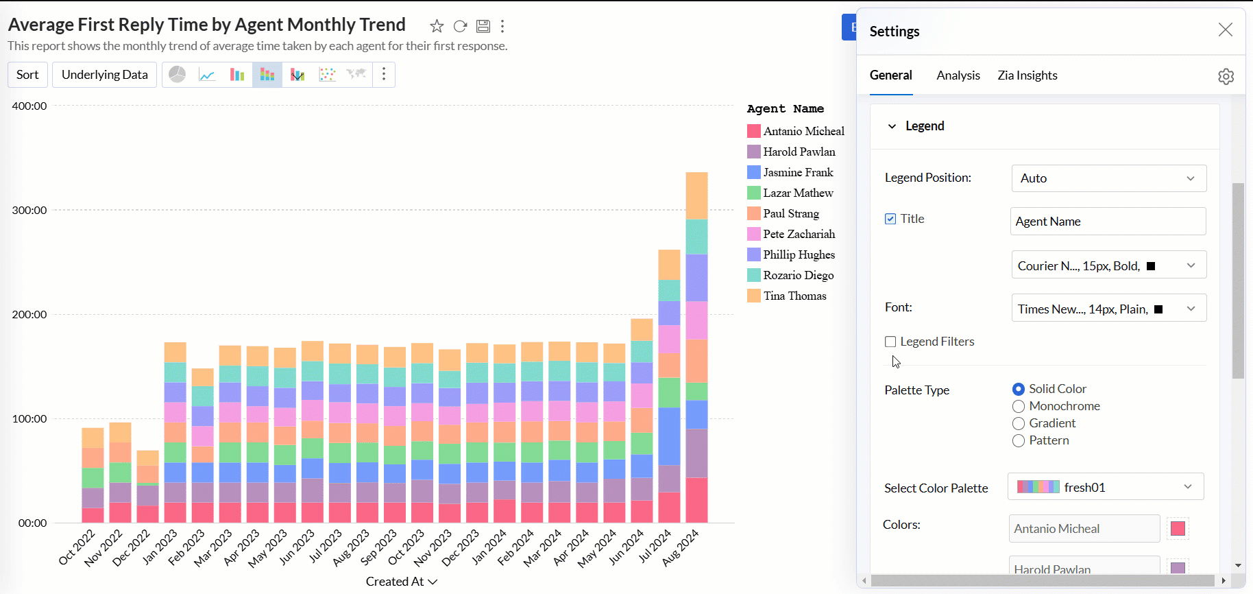
The legend in a chart provides a quick overview of the data series, with each series represented by a color-coded box and its corresponding name. It includes a Legend Title and Legend Items, where each item corresponds to a specific data series.
By default, the legend is positioned on the right side of the chart, and legend items are automatically added based on the data series in the chart. You can customize the legend’s position, title, filters, and the colors of each data series to suit your preferences.
Accessing the Legend settings
- Open the desired chart, and click the Settings icon.
- In the dialog that appears, expand the Legend tab.
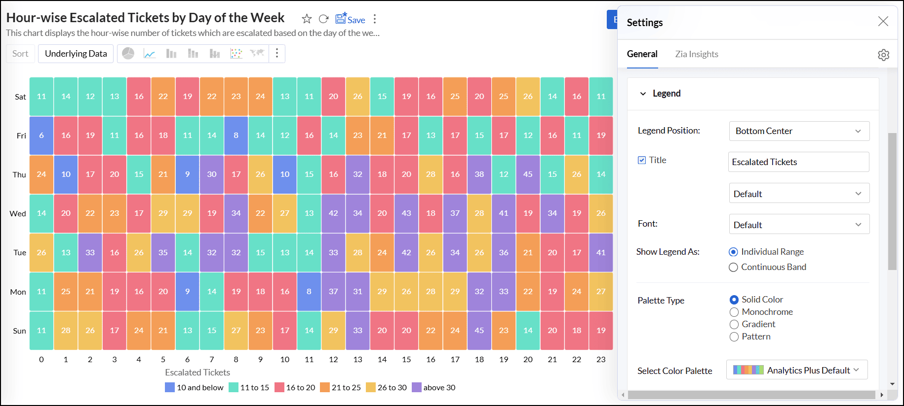
Working with Legend settings
- Legend Position: This option lets you choose the position of the legend within the chart. The available positions are Hide, Auto, Right, Left, Top Left, Top Center, Top Right, Bottom Left, Bottom Center, and Bottom Right.
- Title: This option allows you to specify a title for the legend. You can also customize the font style, size, and color of the legend title.
Font: This option enables you to customize the font style, size, and color of the legend items.
- Legend Style: Specify whether to display the legend items with or without the corresponding values. You can also customize the format to display data using the Format link.
Legend Filters: This option enables legend items to function as filters in the chart's View mode. It allows users to filter data series using legend items dynamically. Click here to learn more about using legend filters to filter a data series.
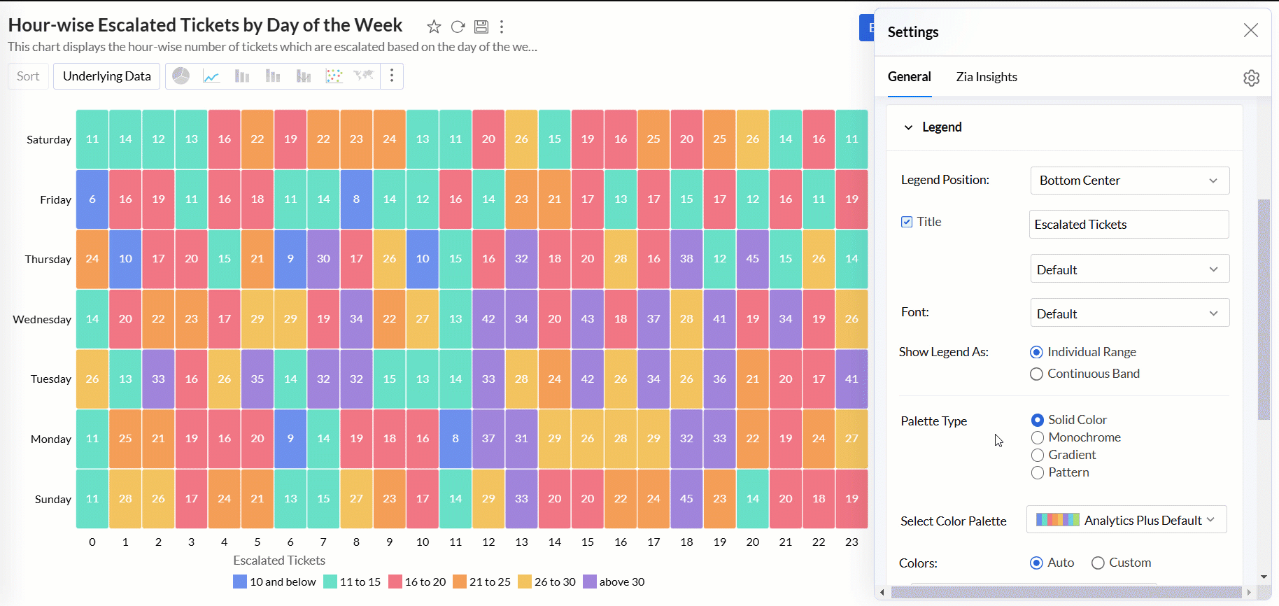
Show Legend As: This option allows you to determine the display style of the legend in relation to the data series in the chart. The available options are:
- Individual Range: The legend displays each data series as a separate entry with its color and label.
- Continuous Band: The legend represents data using a continuous color gradient or band.
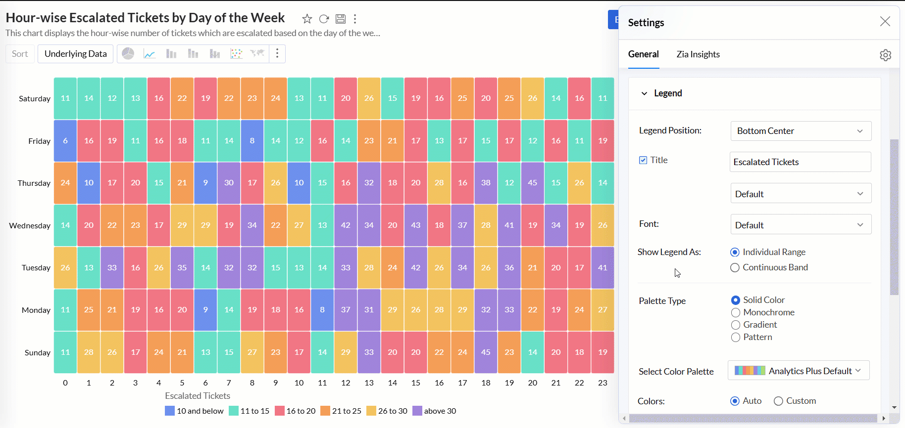
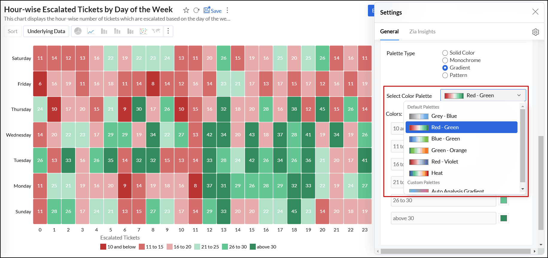
Palette Type: Analytics Plus provides three palette types for customizing the legend colors.
- Solid Color: Each data series in the legend is represented by a single, solid color.
- Monochrome: All data series are displayed in shades of a single color, varying in lightness or darkness.
- Gradient: The option uses a smooth gradient of colors to represent the data series, typically based on a range of values.
- Pattern: This option uses different patterns to differentiate data series.
Color Palette: This option enables you to choose the color palette you wish to apply to your data series. You can select a palette based on the selected Palette Type (Solid Color, Monochrome, or Gradient). Analytics Plus provides a predefined set of color palettes, and you also have the option to create and add custom palettes to fit your needs.
Colors: This option allows you to override the colors of the individual data series of the chart. Once you override the palette, you will find the following options.
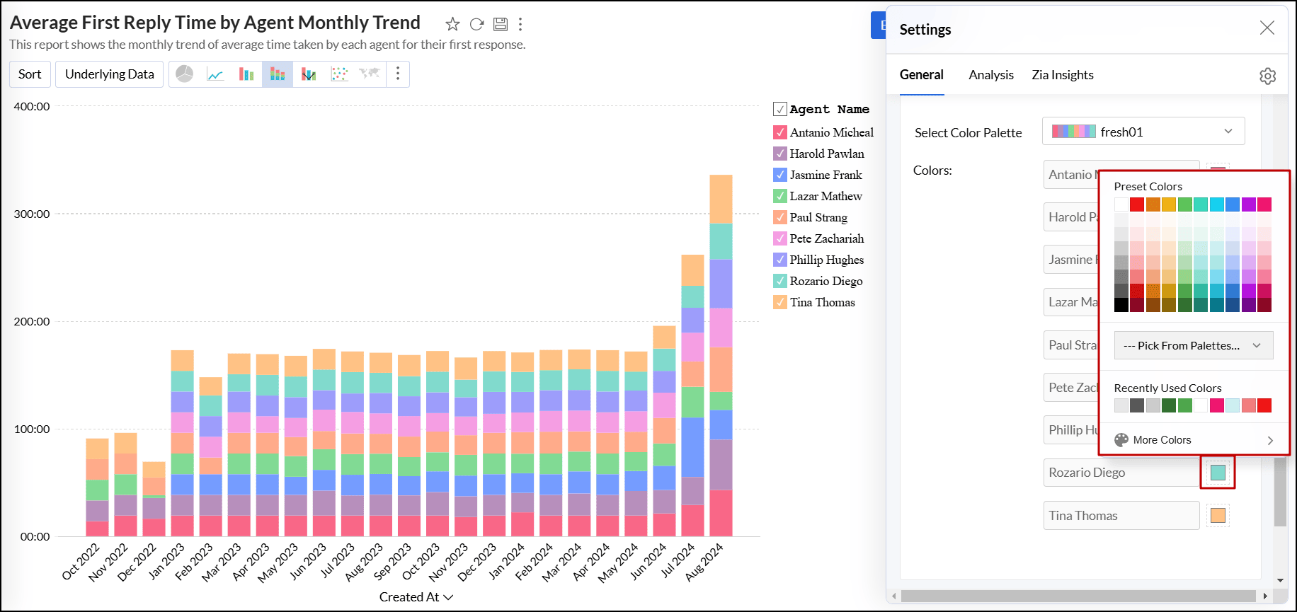
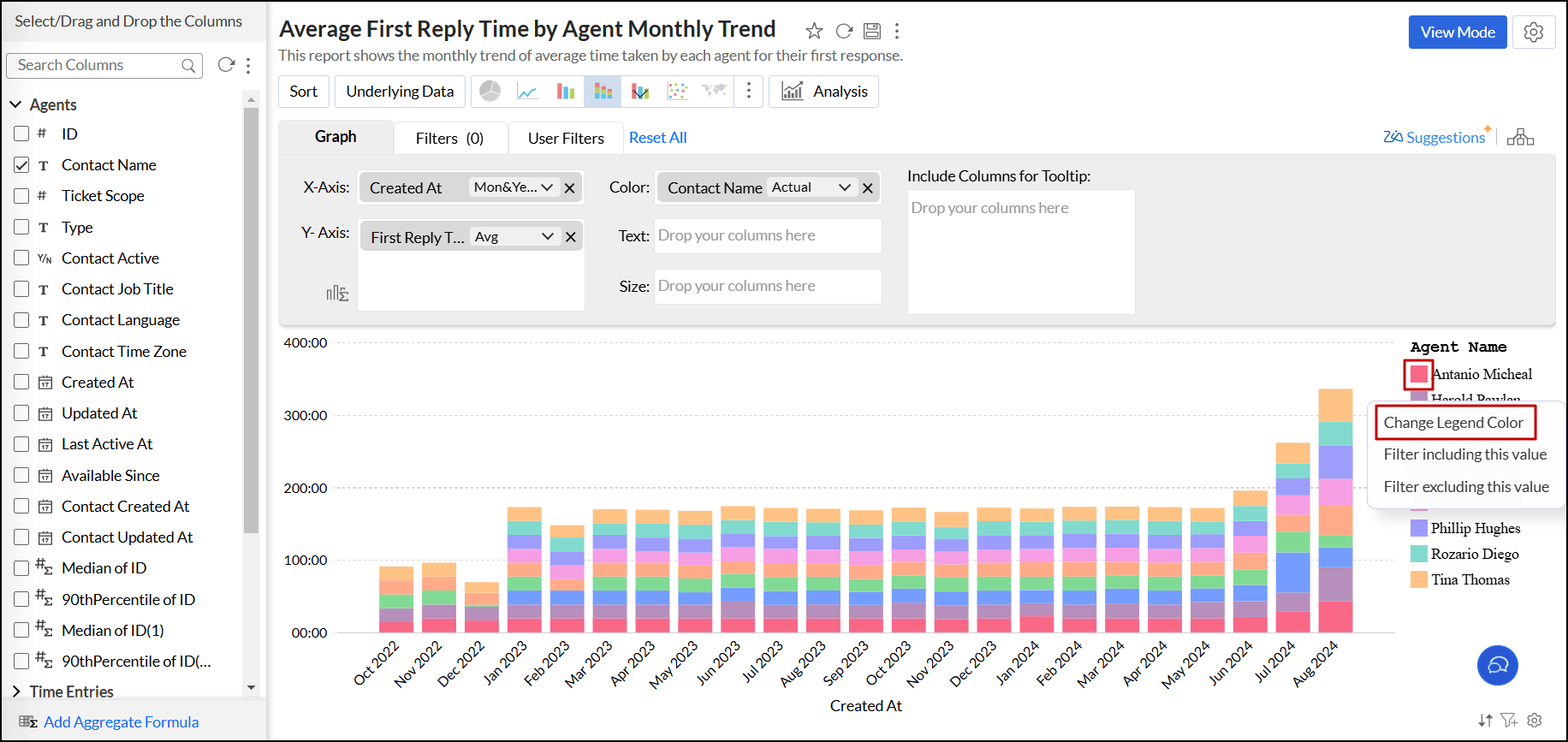
You can also change the color of each data series using the corresponding legend item in Edit Design mode. Click the desired legend item, and select the Change Legend Color option to change the color.
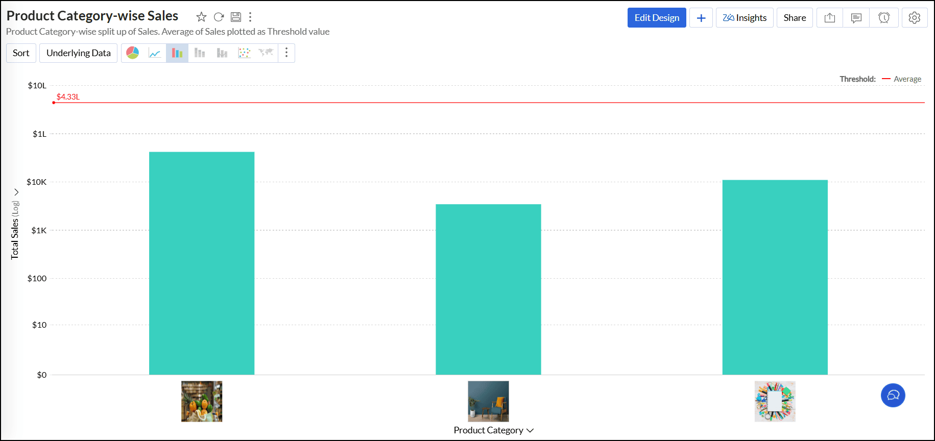
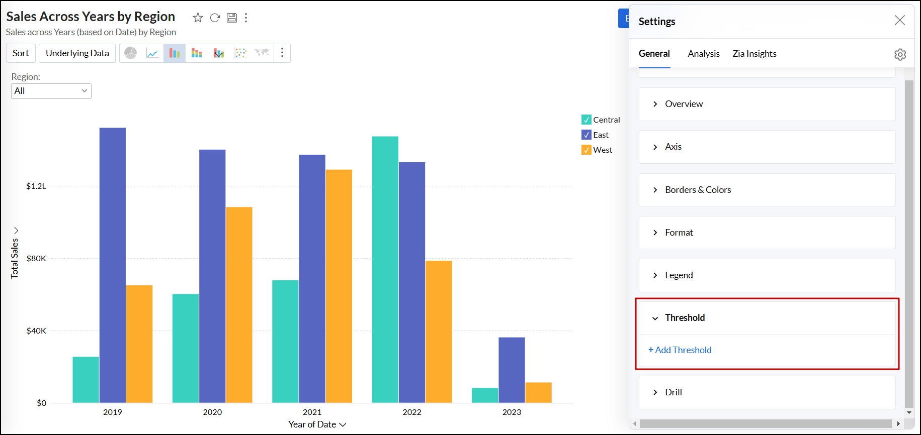
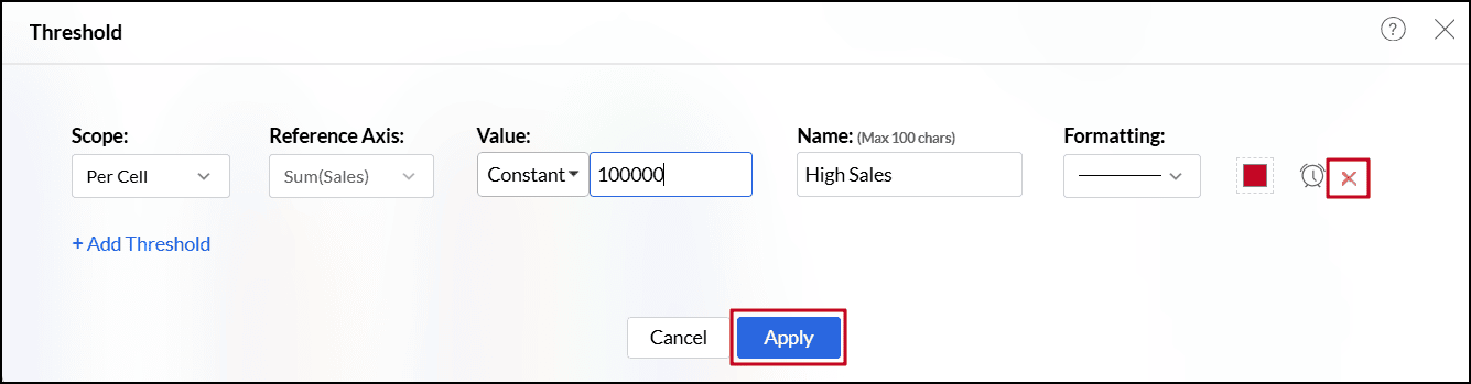
Threshold settings
A threshold is a predefined value or limit that is used to highlight specific data points or regions within the chart. It helps visually distinguish values that meet or exceed a certain threshold. Threshold lines can be added horizontally or vertically at a fixed value on the X or Y-axis of a chart. Analytics Plus enables you to set two types of thresholds.
Follow the steps below to add threshold,
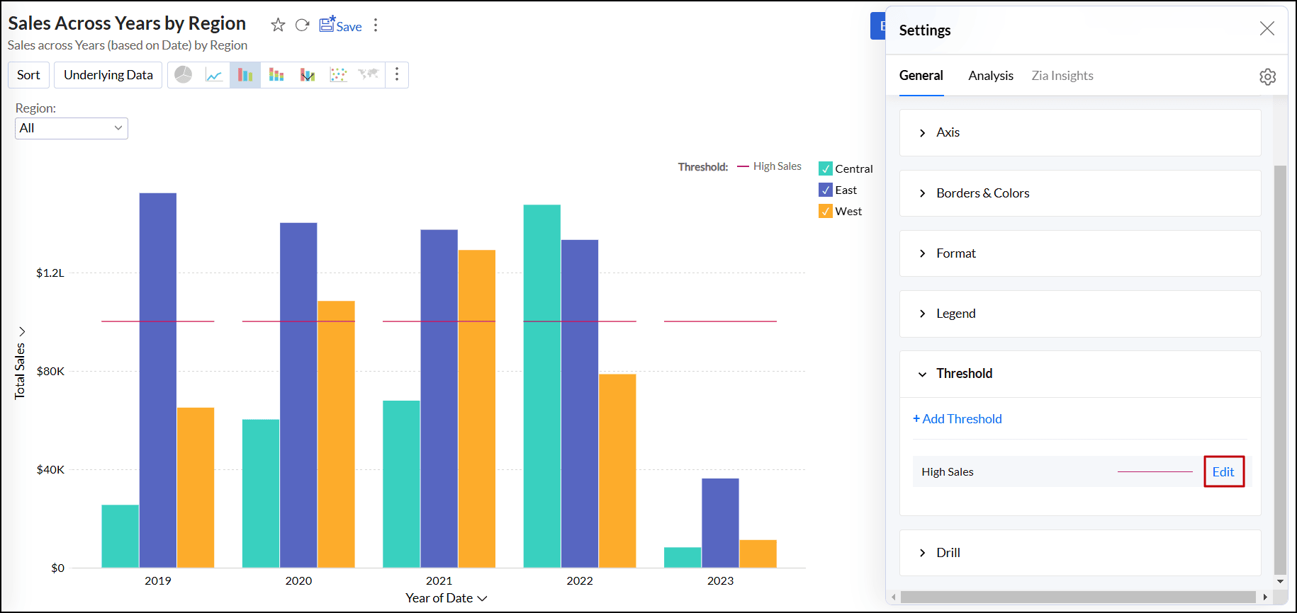
- Open the desired chart and click the Settings icon.
- In the dialog that appears, expand the Threshold tab.
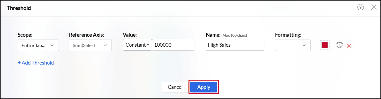
Click the + Add Threshold link.
In the dialog that appears, select one of the following scopes.
- Entire Table: Applies the same threshold for the entire table.
- Per Cell: Applies different threshold lines for each data point represented in the report.
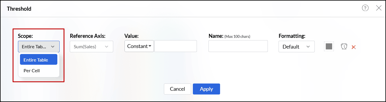
- For charts with multiple y-axes, select the axes you wish to use as reference from the Reference Axis drop-down.
- Choose one of the following options from the Value drop-down.
- A Static Threshold allows you to set a fixed, constant value as a reference line on your report or dashboard. With Static Thresholds, you can easily identify how your metrics are performing relative to a predefined target. Any data point above or below this set value can quickly highlight performance gaps, trends, or exceptions.
- The Dynamic threshold allows you to apply dynamic functions such as Sum, Average, Minimum, and Maximum over the columns in your reference axis or over a different column. Aggregate formulas now support variables inside thresholds. With User Filters, threshold values change automatically based on each user’s filter selection, instead of using fixed values.
- Enter the desired label for the threshold line in the Name text box.
- Select the line type and color from the Formatting drop-down.
- You can also create an alert when the values meet or exceed a certain threshold by clicking the Create Alert icon. Click here to learn more about creating data alerts.
- Click the +Add Threshold link to add more thresholds.
Click Apply once you have added required threshold lines.
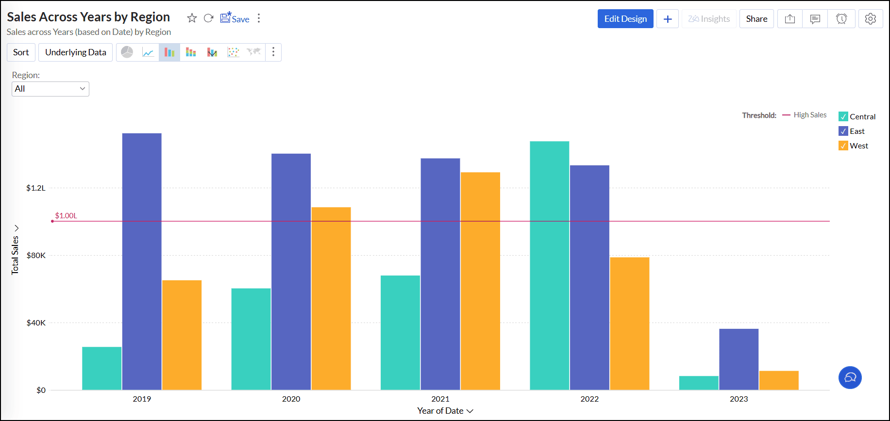
Threshold applied for the entire table:
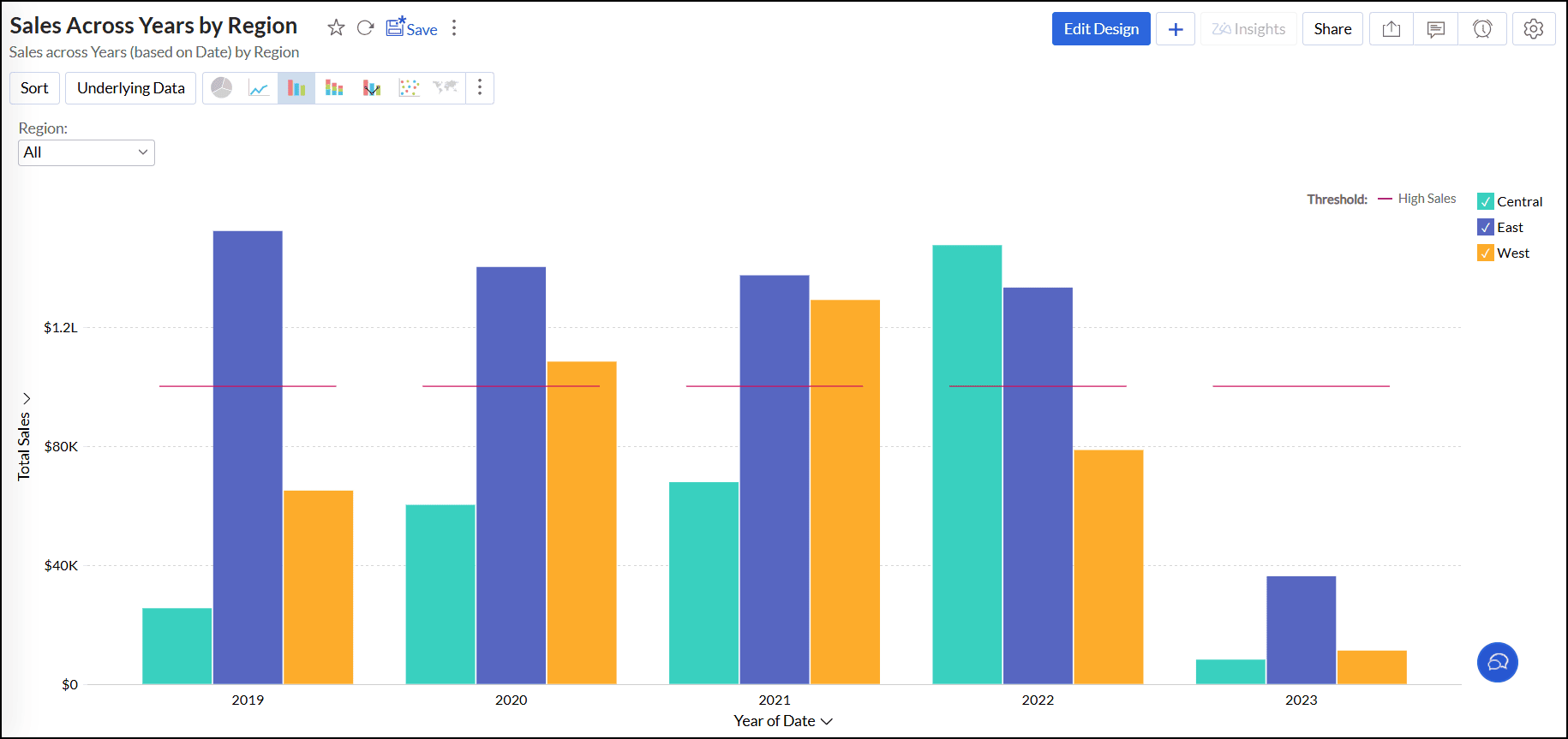
Threshold applied for each data point:
To remove a threshold,
- Open the desired chart and click the Settings icon.
- In the dialog that appears, expand the Threshold tab.
Click the Edit link corresponding to the threshold name that needs to be deleted.
- In the dialog that appears, click the Delete icon.
Click Apply to save the changes.
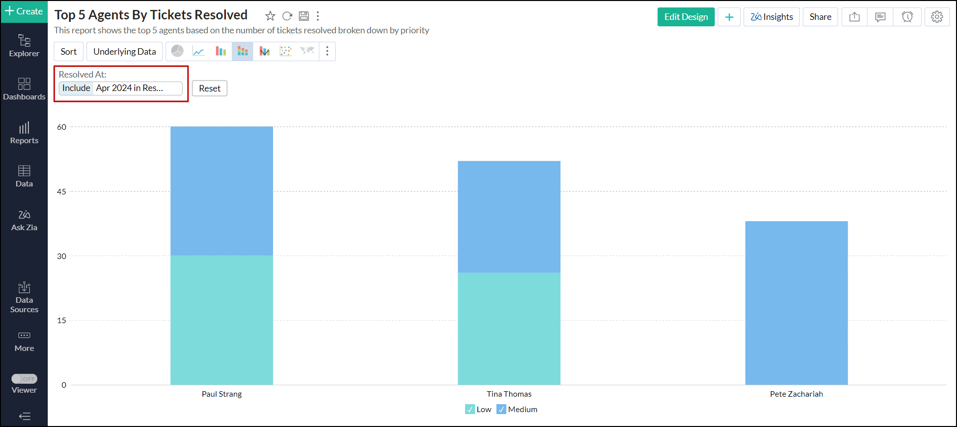
Drill capability
Analytics Plus allows you to view data at various levels of granularity, enabling detailed analysis. It also facilitates comparisons across different segments of the data.
Drill Down
The (data) drill feature enables you to get the granular details in a report. It helps to get insights from the specific categories or sections of the data.
Follow the steps below to set up a drill down path,
- Open the desired chart and click the Settings icon.
- In the dialog that appears, expand the Drill tab.
Enable the Drill Down toggle button, and click the Edit link next to it.
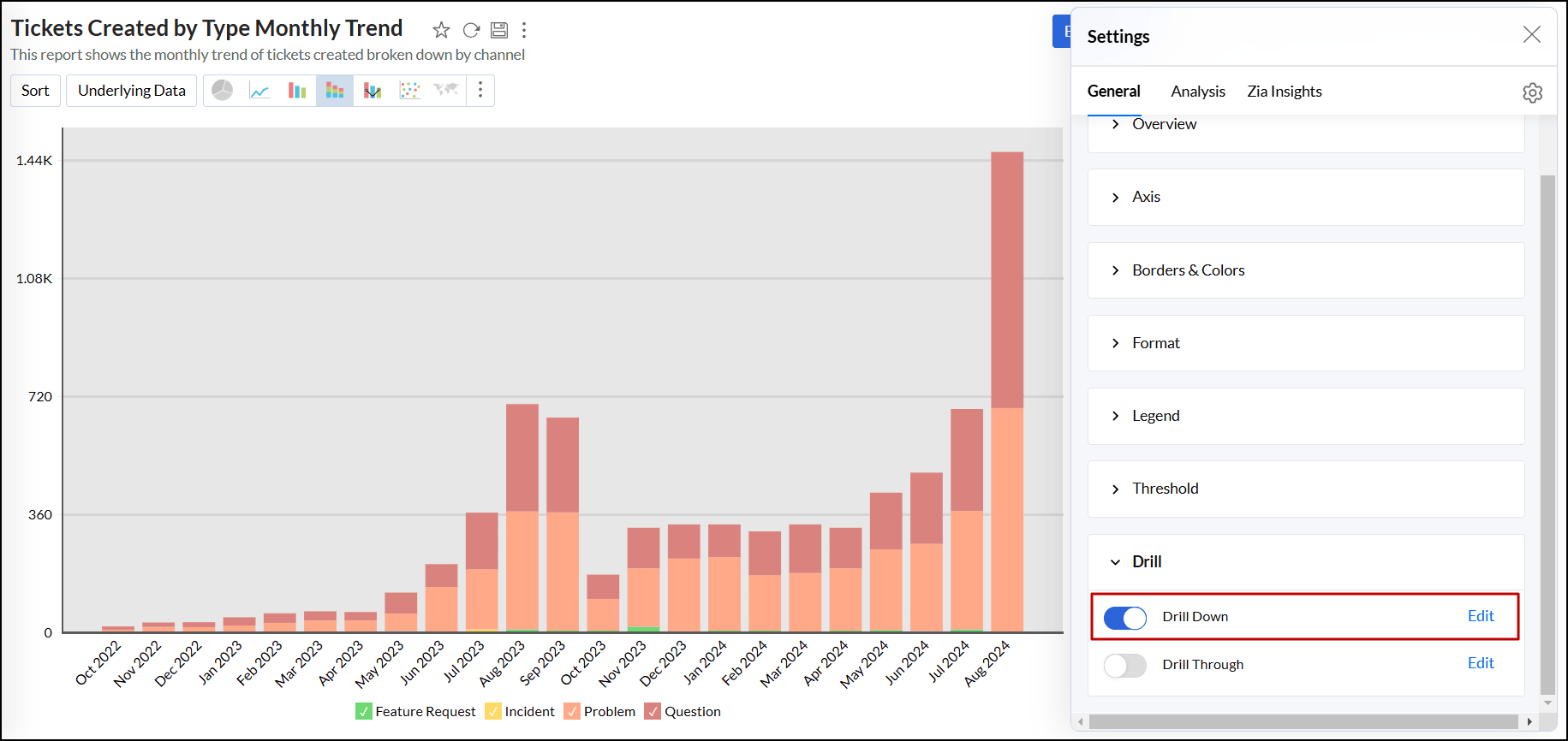
- In the dialog that opens, configure the drill down path.
Click Apply to save the changes.
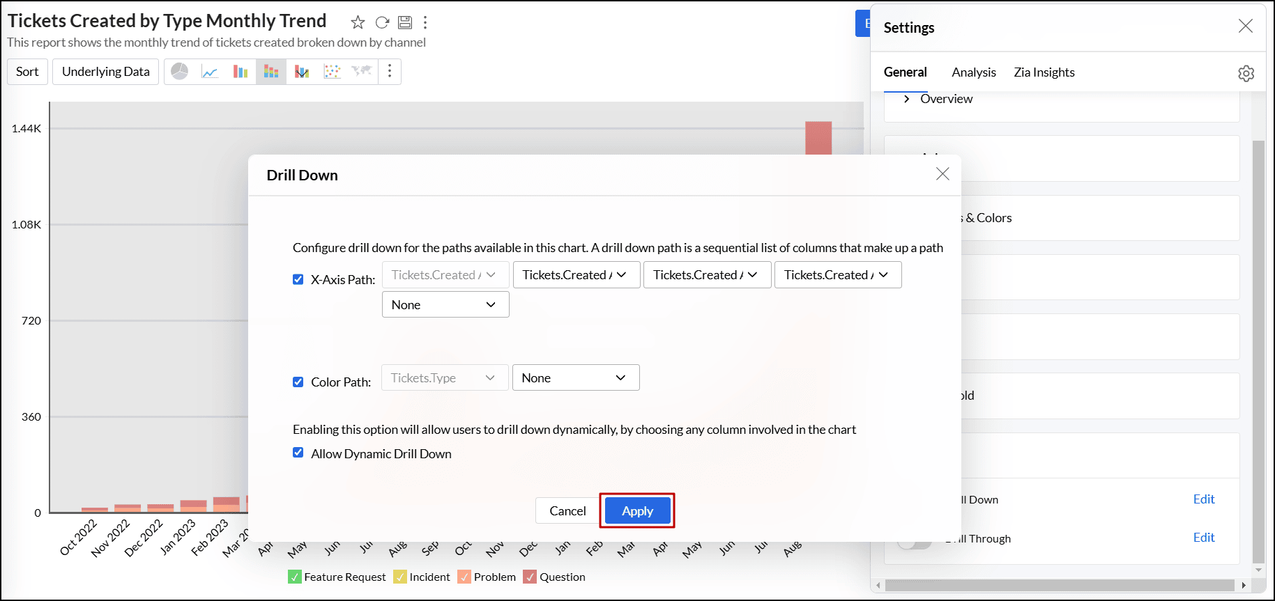
Disable drill down
You can disable the drill down option in your chart by deselecting the required options in the Drill Down tab of the chart's Settings page.
- Drill Down: Deselect this to remove the drill down option from your chart completely.
- X-Axis Path: Deselect this to remove the drill down option based on X-Axis' column path.
- Color Path: Deselect this to remove the drill down option based on the chart's Color column.
- Allow Dynamic Drill Down: Deselect this to remove the dynamic Drill Down By option from the chart.
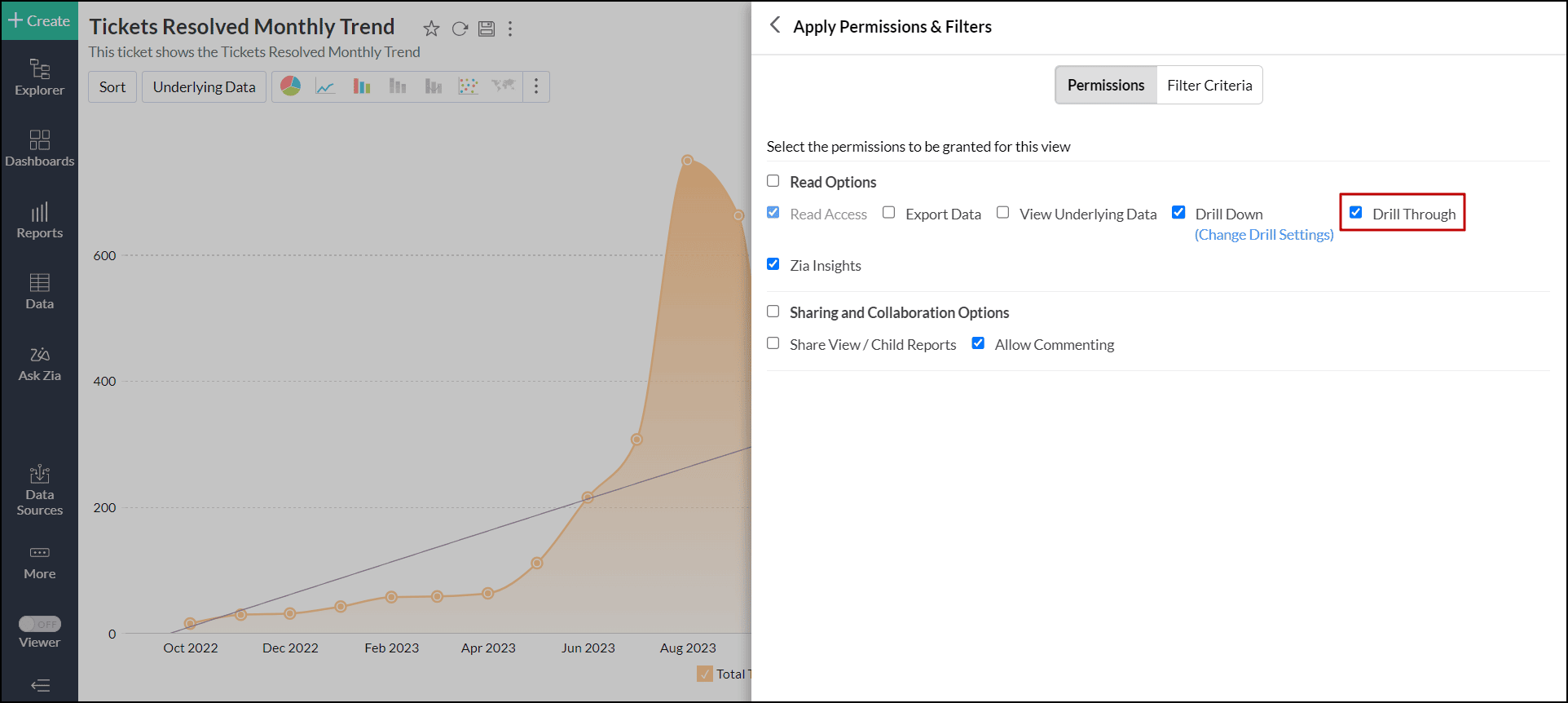
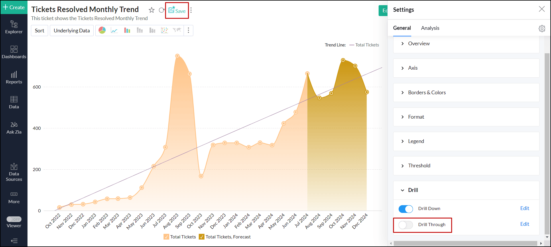
Drill Through
The drill-through function in Analytics Plus allows you to link two related reports, enabling seamless navigation between them. When users drill down into a report, they can open the related report, providing a more detailed and connected view based on the specific data point.
Follow the steps below to set up a drill through,
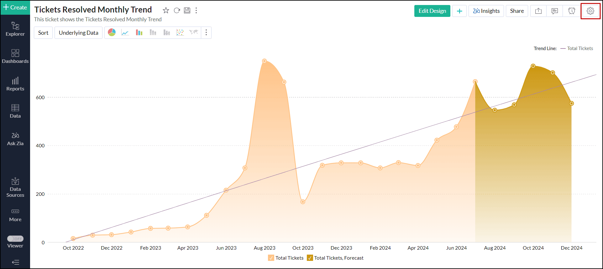
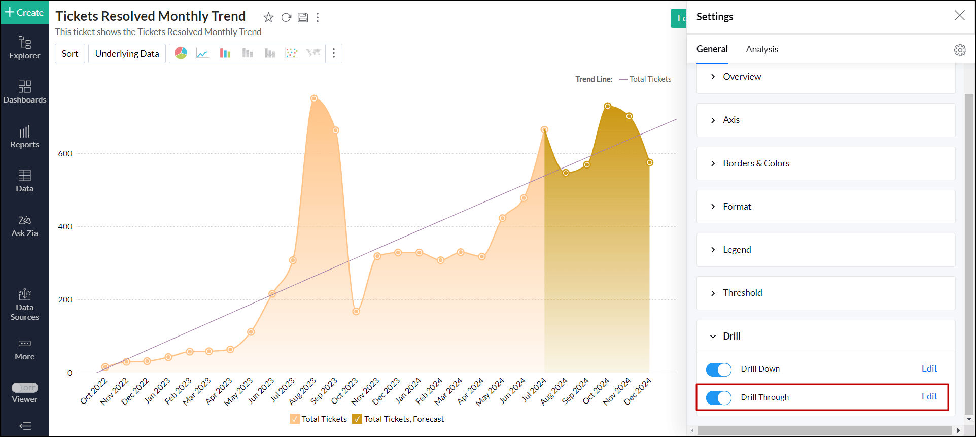
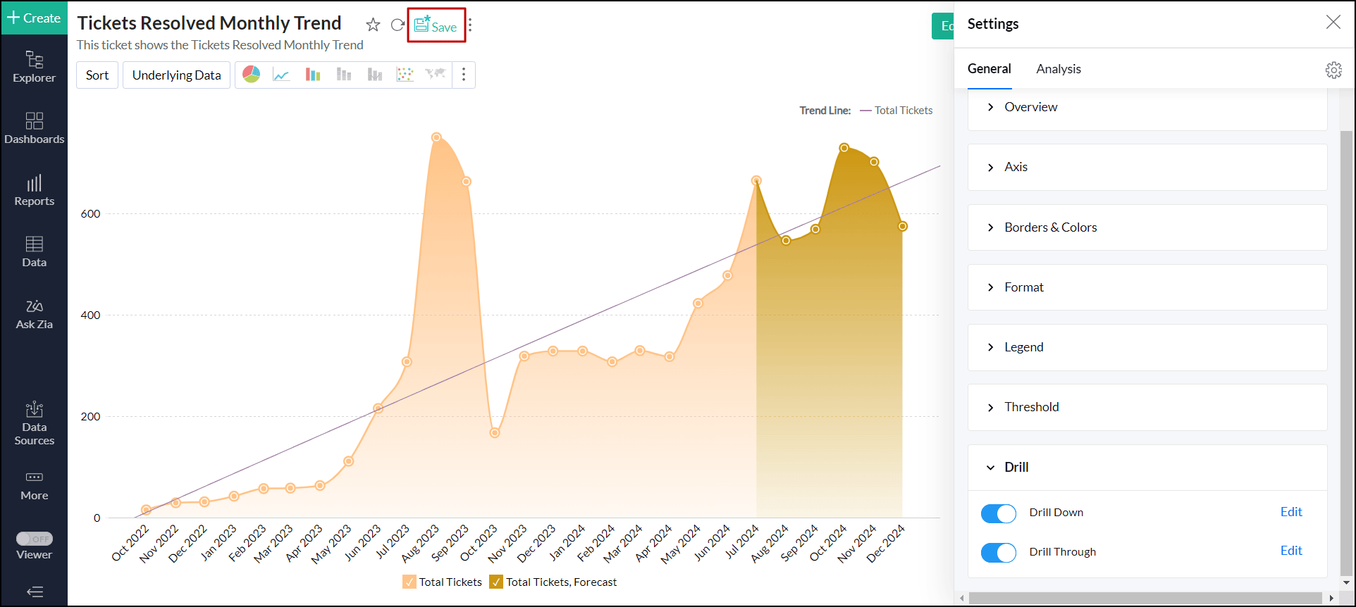
Open the desired chart, and click the Settings icon at the top right corner.
- In the right pane that pops up, scroll down and expand the Drill option.
Enable the Drill Through toggle button, and click the Edit link next to it.
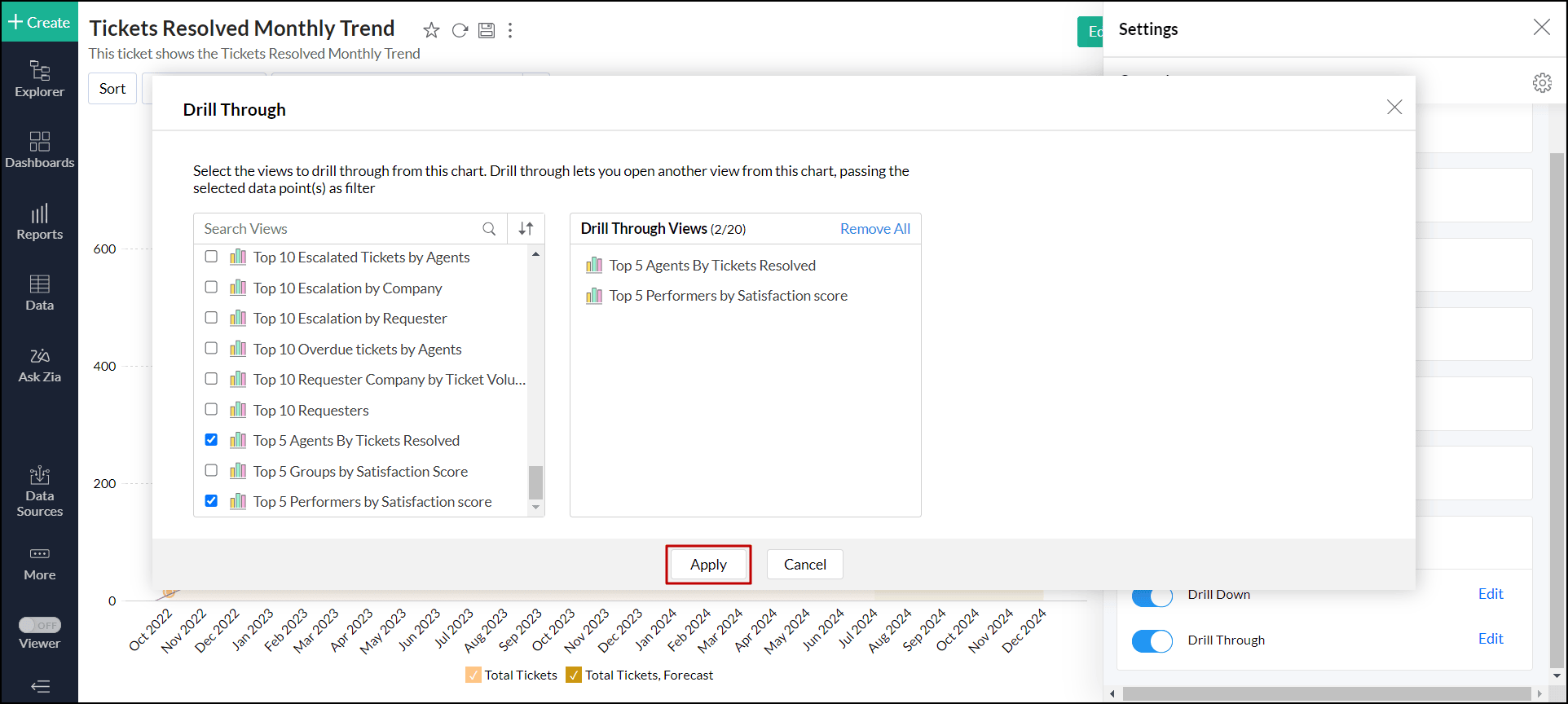
In the dialog that opens, choose the related views you want to drill through from the current view.
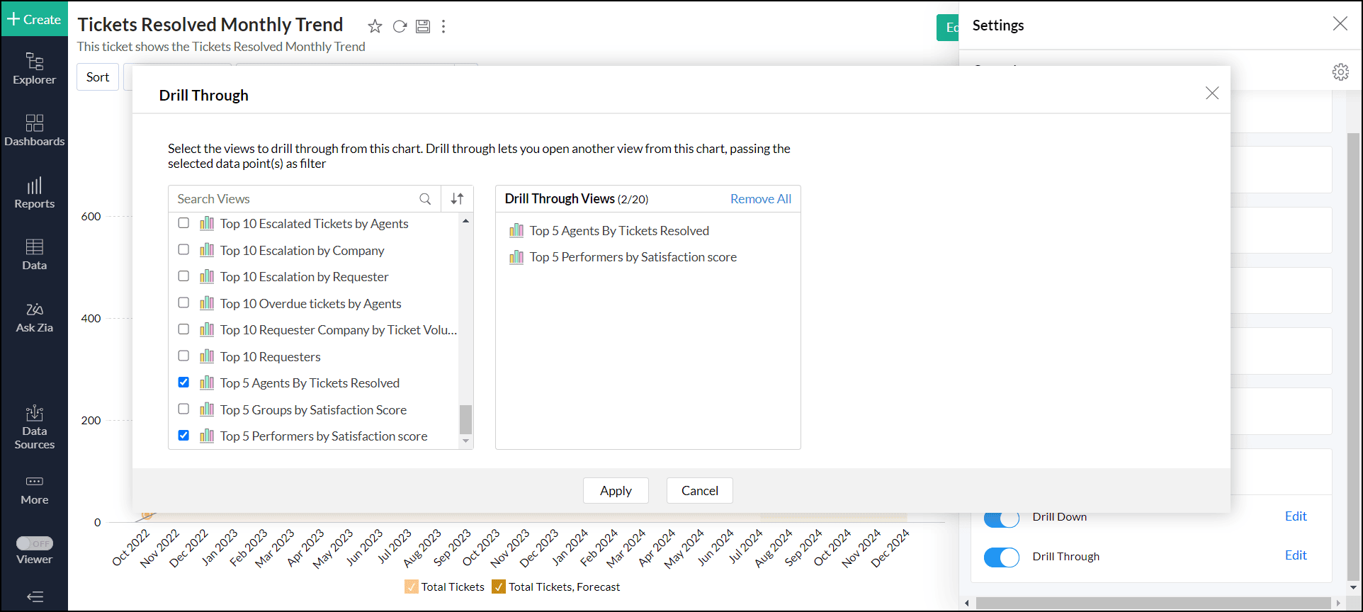
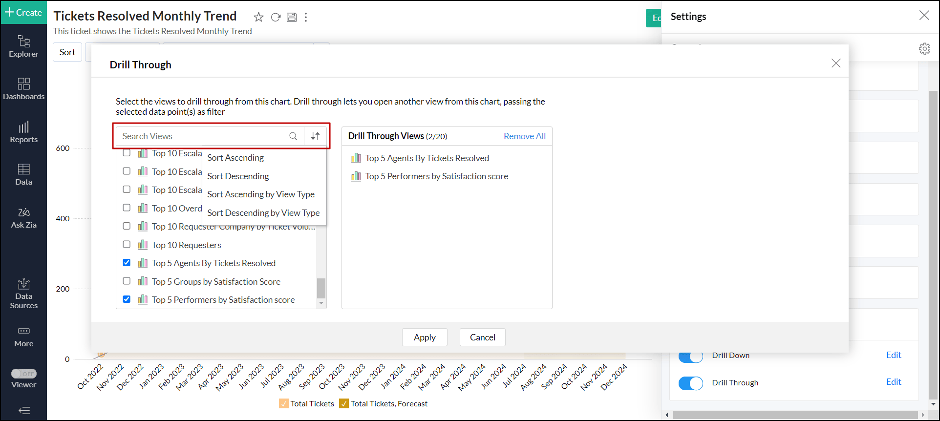
You can search for the specific view using the search bar. You can also sort the views in ascending or descending order based on their name or type for easier selection.
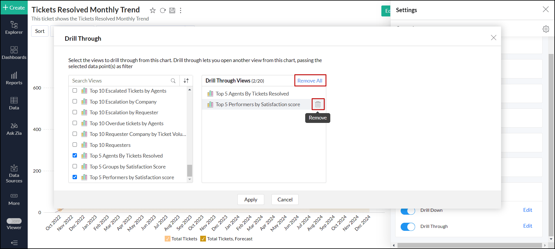
To remove a selected view, hover over the view name, and click the delete icon that appears. Click the Remove All link to remove all the selected views and add new views.
Click Apply.
Click Save to save the report.
Working with drill through
Click any data point in the report and choose Drill Through.
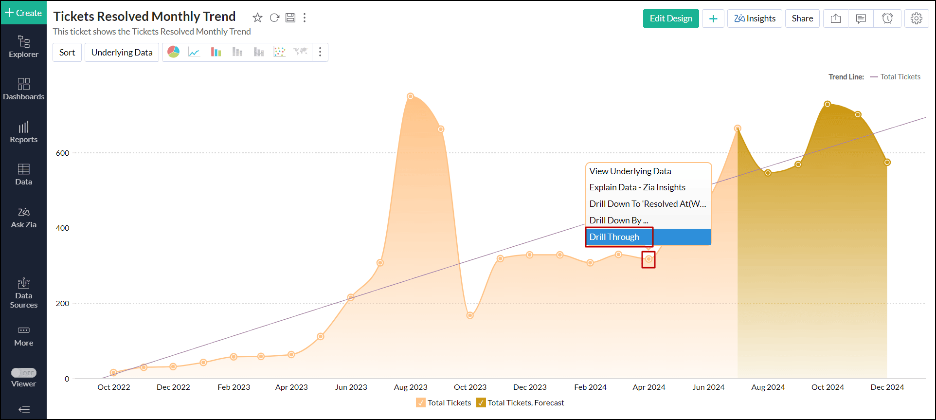
Select the desired report you wish to jump.
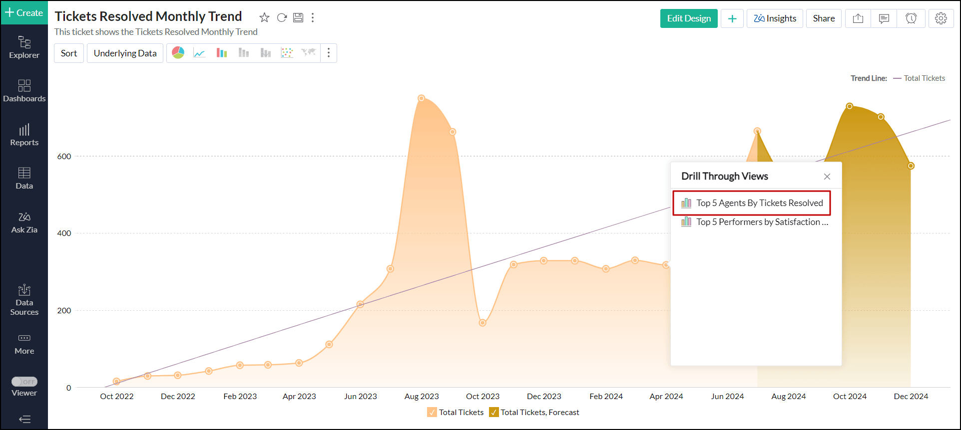
The selected report will open in a new tab with filters applied according to the chosen data point.
Disable drill through
Open the desired chart, and click the Settings icon at the top right corner.
- In the right pane that pops up, scroll down and expand the Drill option.
Disable the Drill Through toggle button, and click Save.
Sharing and collaboration
While sharing views, Analytics Plus allows report owners to enable the Drill Through option, granting other users the ability to drill through the related views.