Creating a dashboard
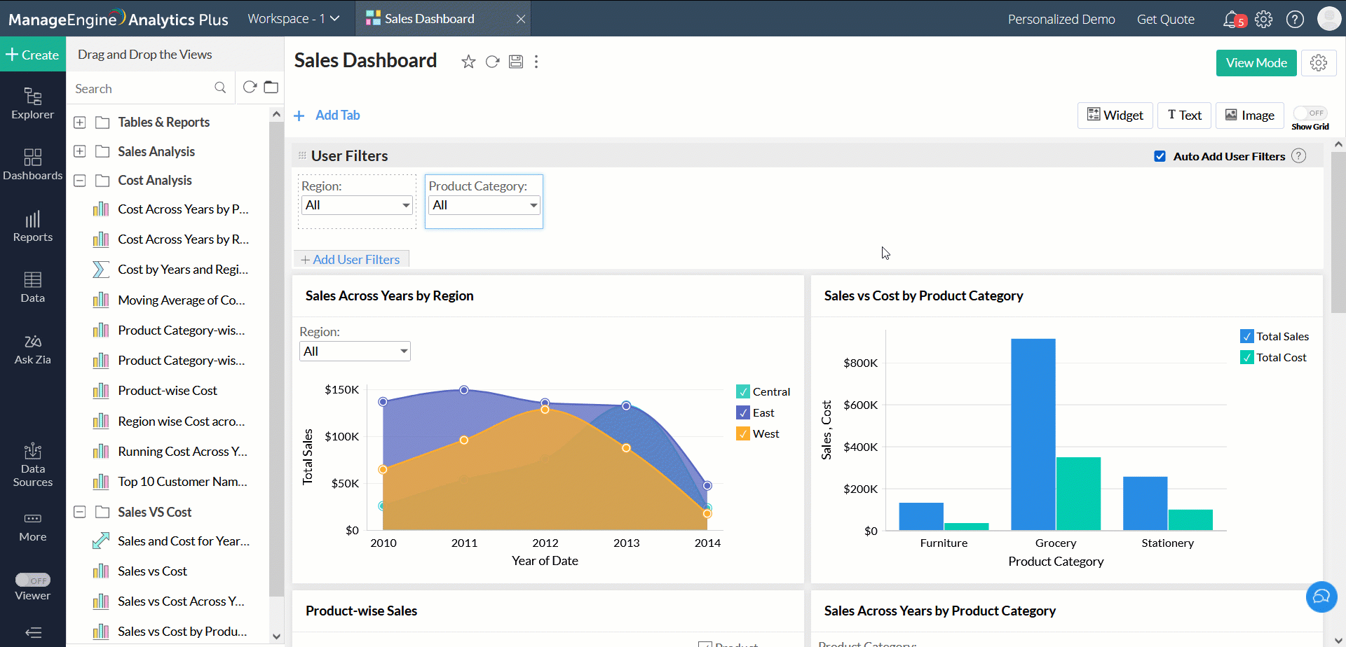
Dashboards allow you to combine multiple reports into a single page for a quick overview. ManageEngine Analytics Plus provides a simple and intuitive drag-and-drop interface to efficiently organize your dashboards as required. Drag-and-drop the reports, widgets, user filters, and rich-formatted text to create a visually rich and interactive dashboard.
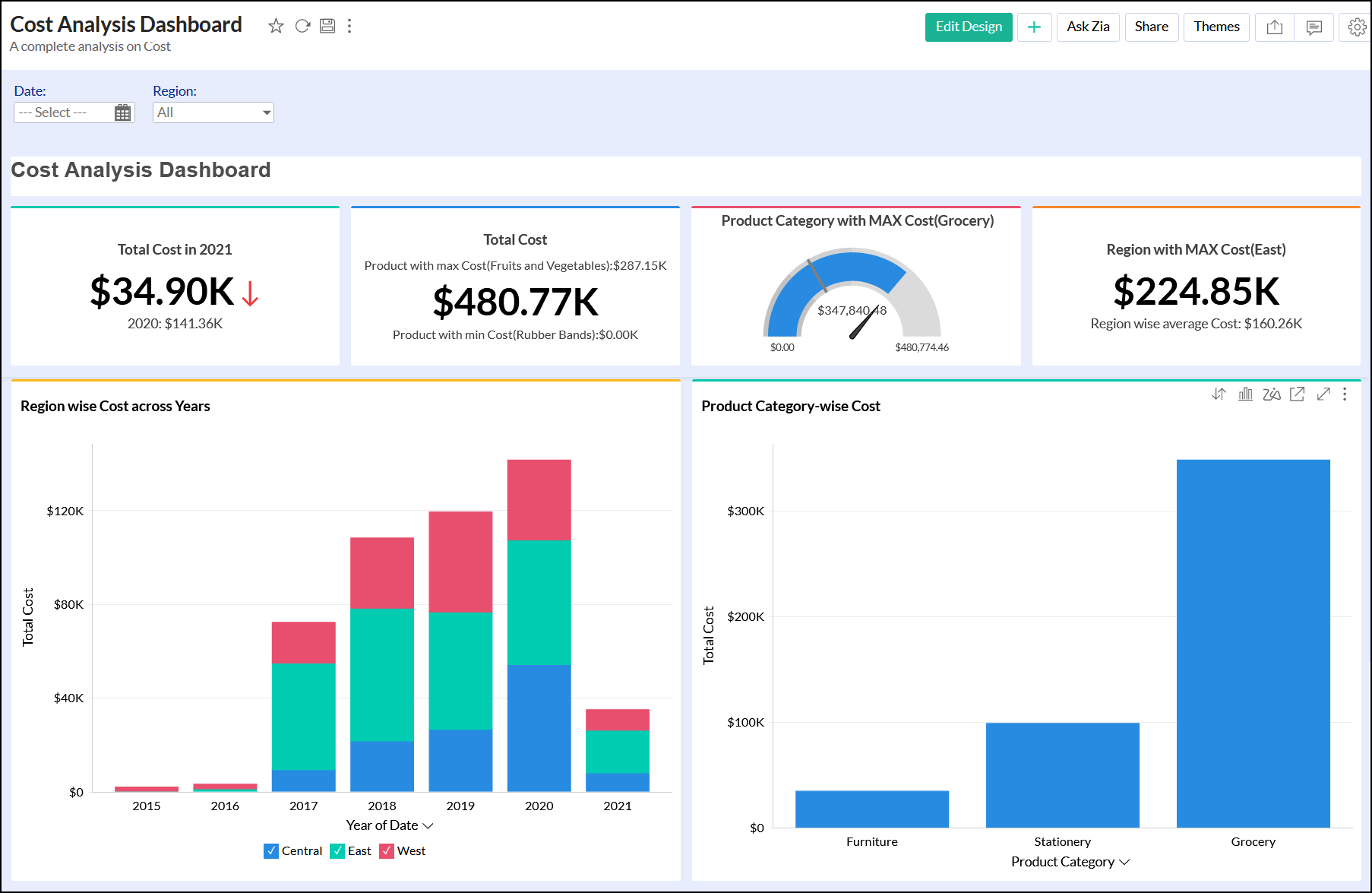
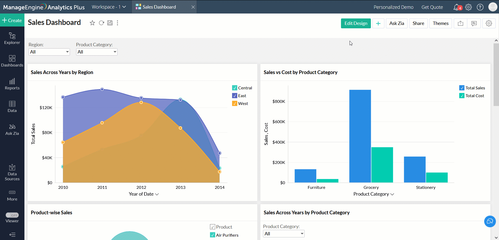
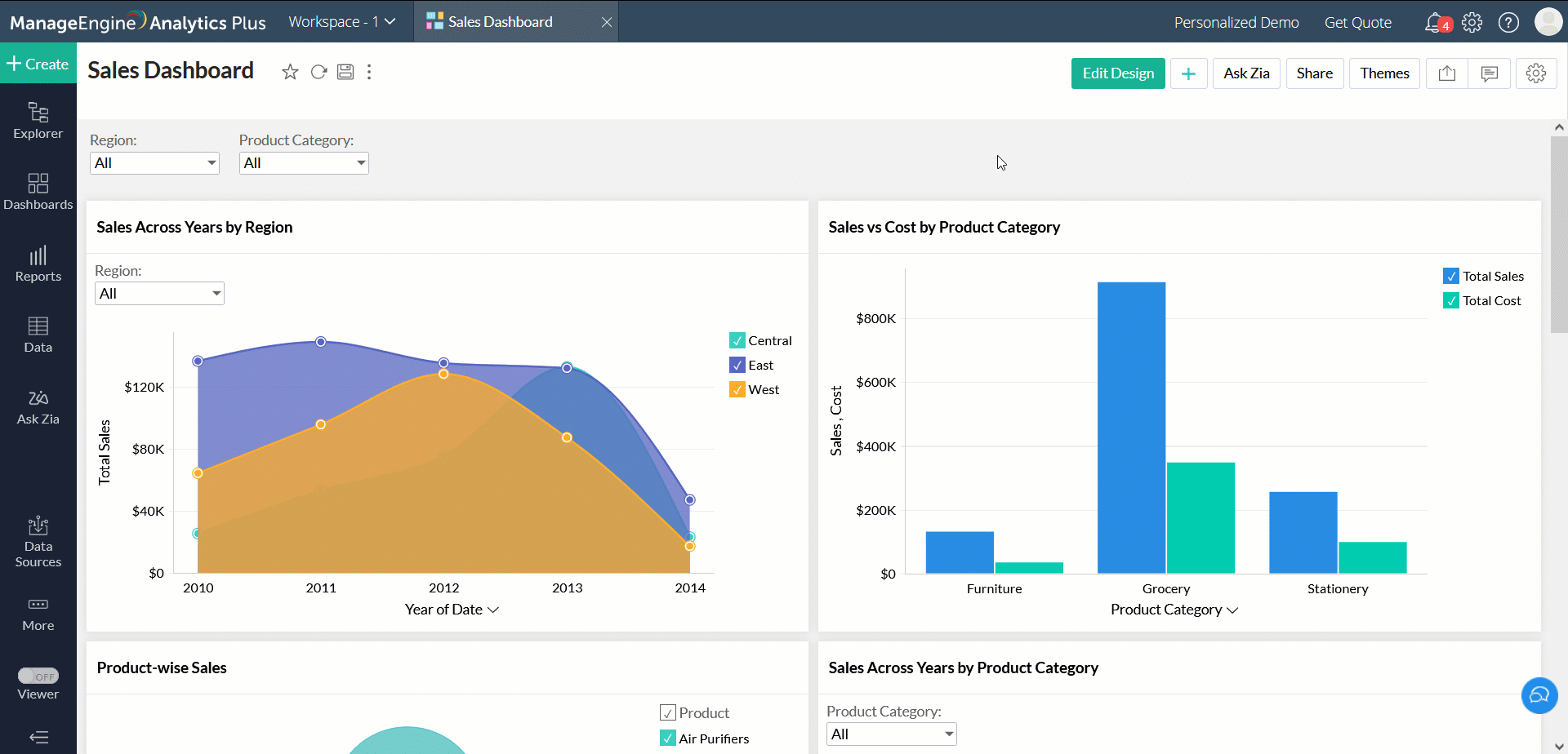
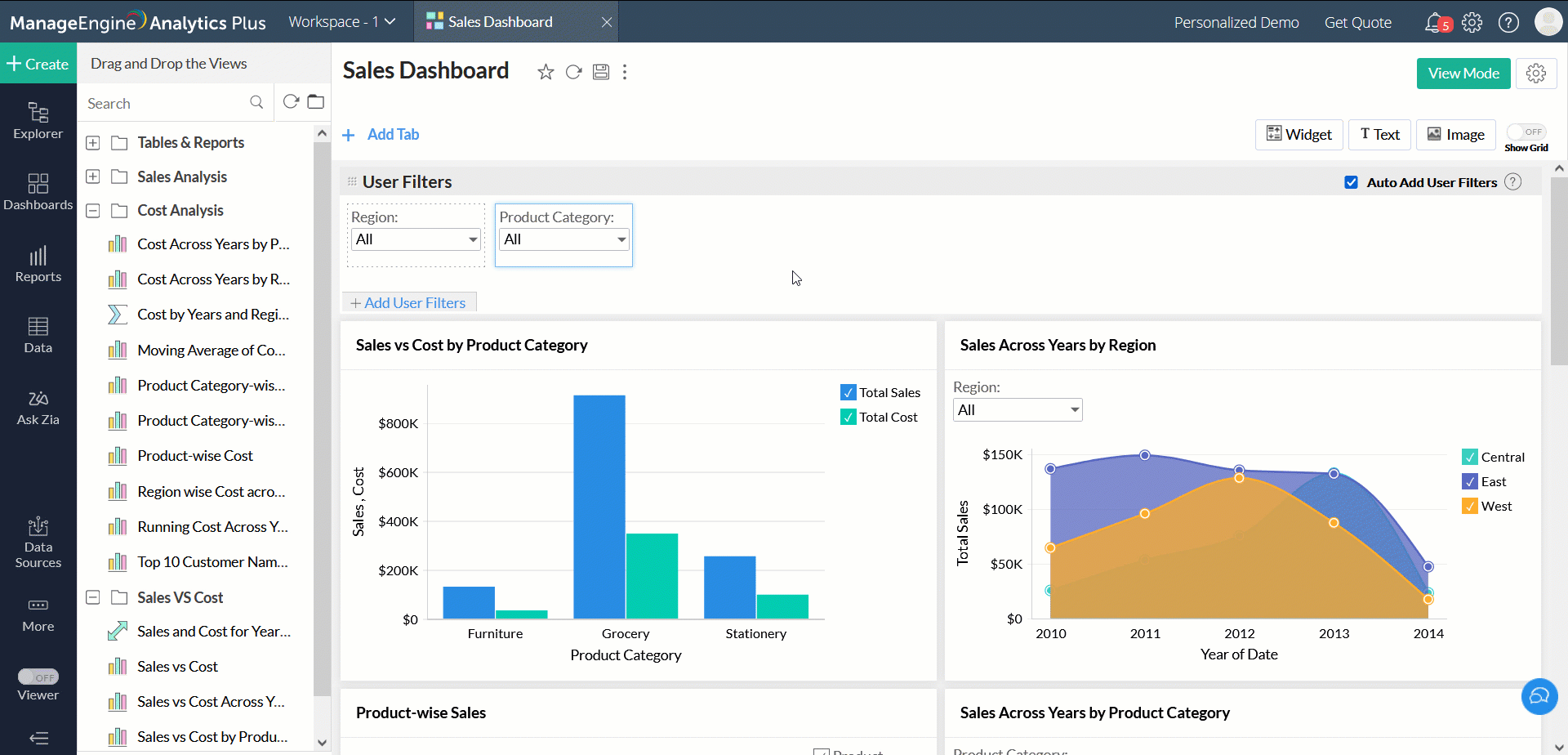
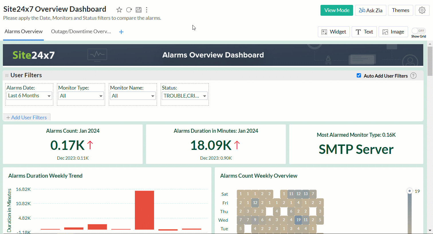
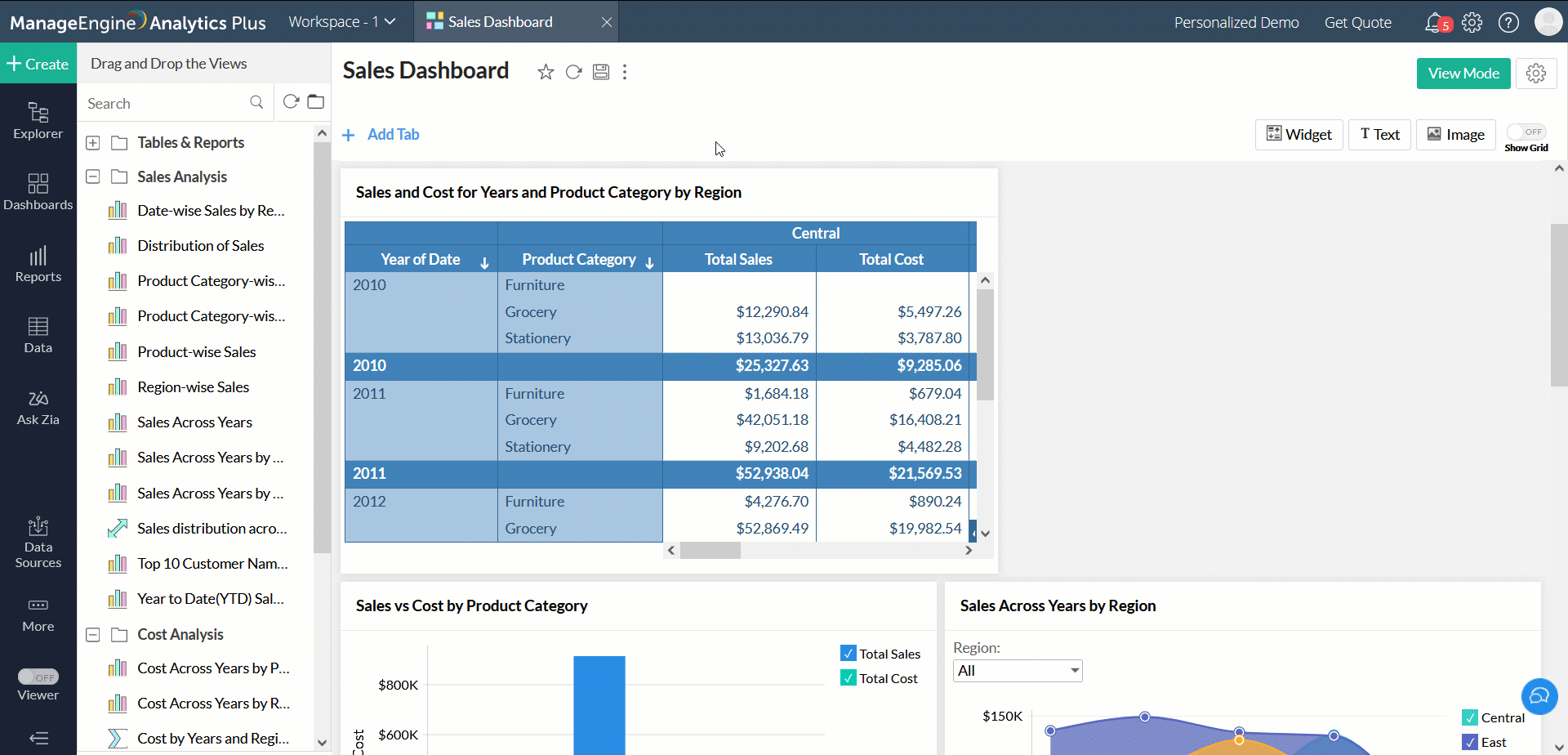
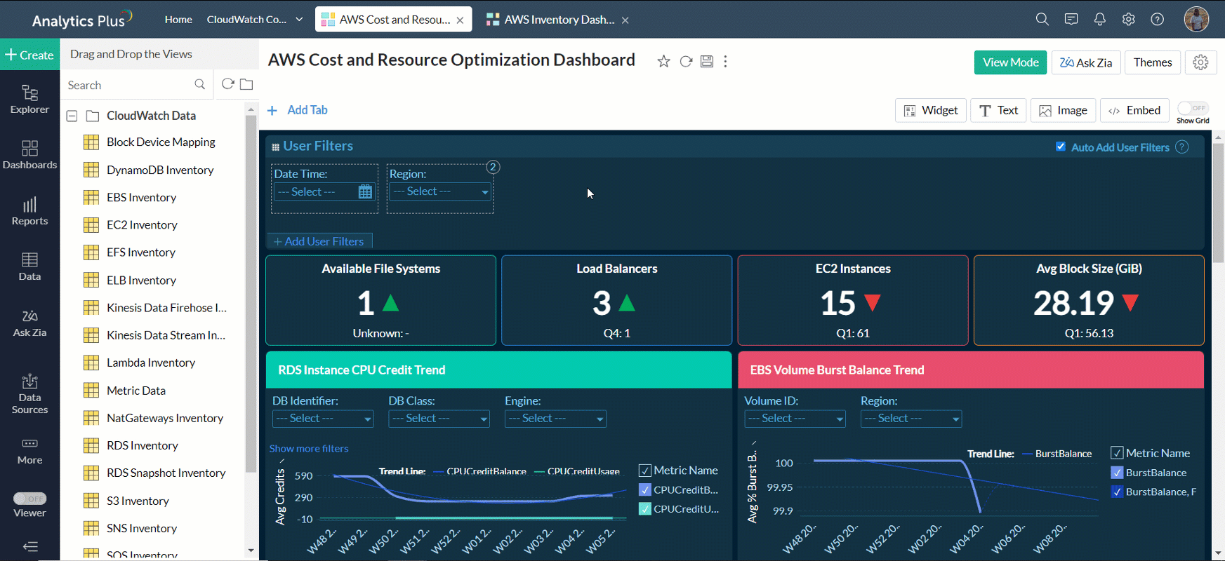
The following is a sample dashboard.
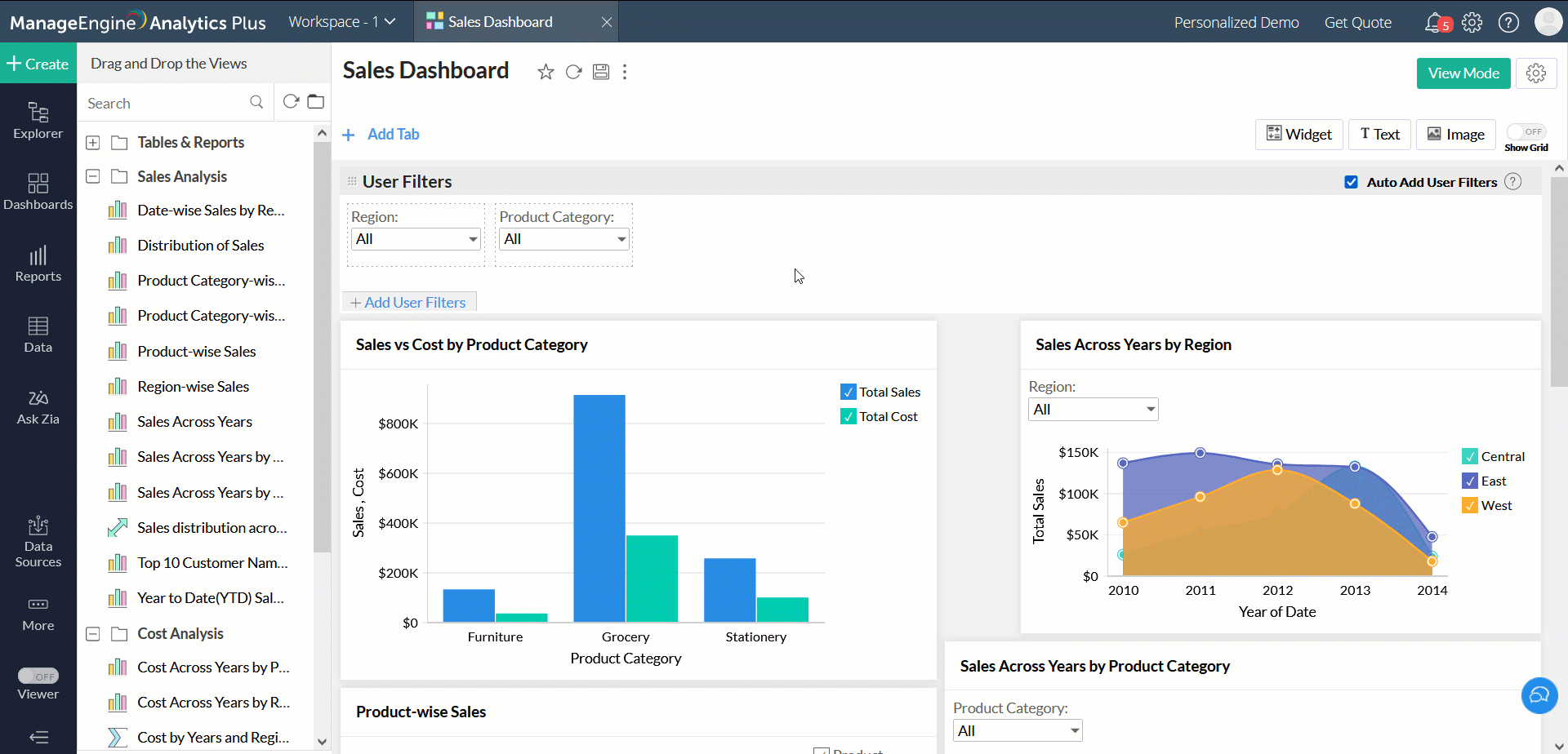
The following is the same dashboard in the Edit Design mode.
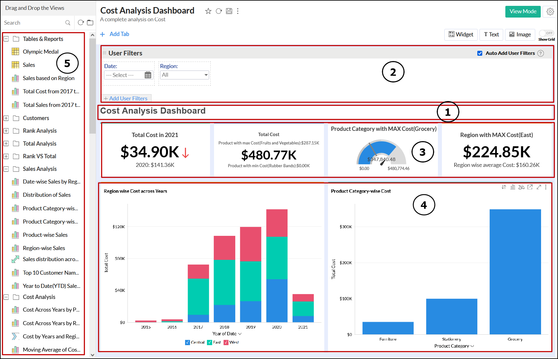
1 - Custom title added in the dashboard
2 - User Filter added in the dashboard
3 - KPI widgets added in the dashboard
4 - Reports added in the dashboard
5 - List of reports in the workspace that can be dragged into the dashboard
This is the default layout of the dashboard. Once you have created a new dashboard, you can alter the layout as needed.
- Creating a dashboard
- Layout components in dashboards
Creating a new dashboard
ManageEngine Analytics Plus allows you to create dashboards with multiple tabs and flexible m x n layouts. You can drag-and-drop reports and other components to your dashboard and organize them based on your requirements.
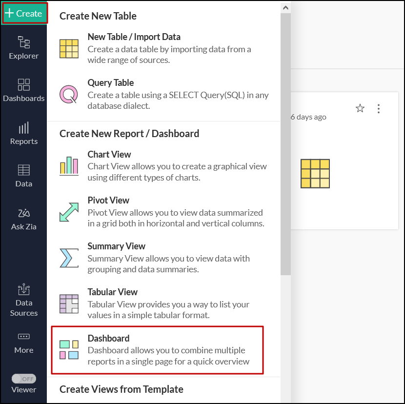
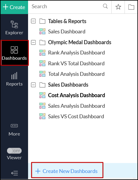
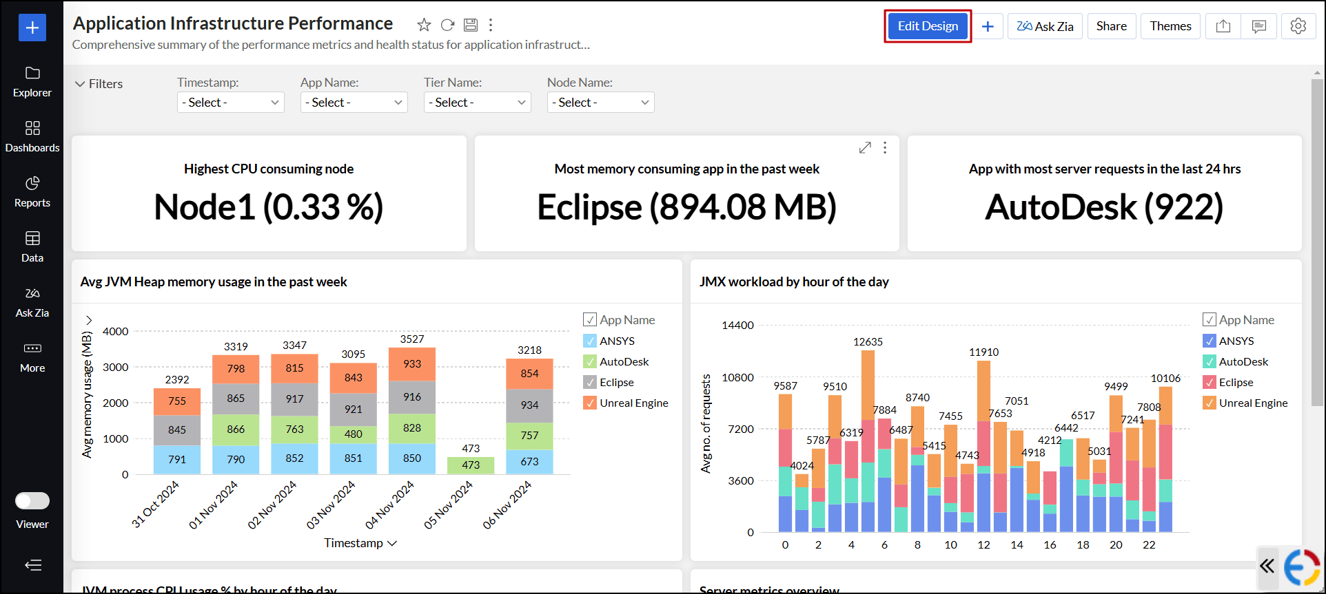
Once your reports are ready, you can start designing a dashboard. To create a new dashboard, click the Create button on the side panel and select the Dashboard option.
You can also create a new dashboard using the Create New Dashboards option under the Dashboard button in the side panel.
The Edit Design window will open as shown in the image below:
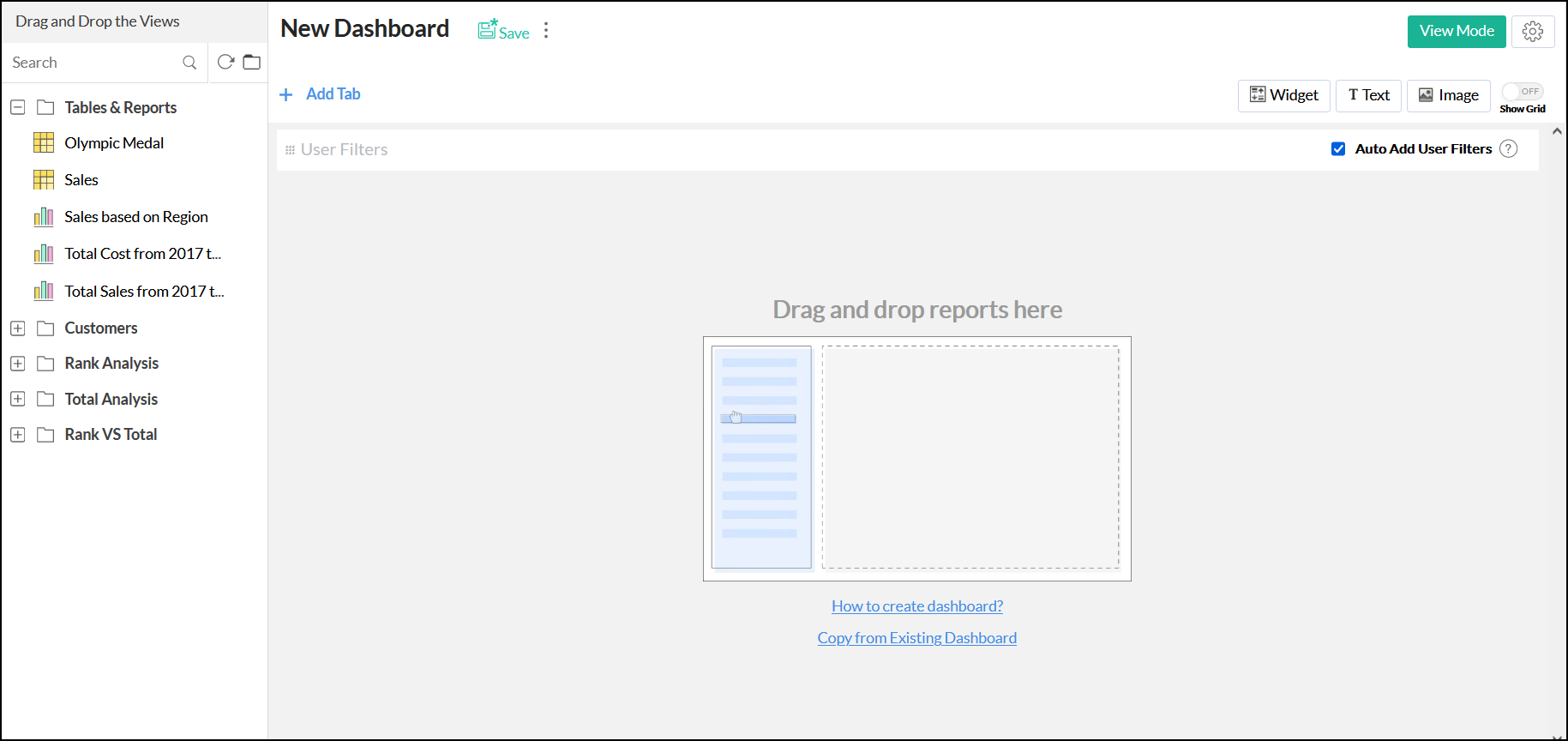
Add the required components to your dashboard. Refer to the following sections to know more about adding various components to your dashboard.
Adding reports
Follow the steps below to add the required reports to your dashboard:
- Open the dashboard in the Edit Design Mode. The reports that are available in the workspace will be listed on the left panel.
- Drag the required ones into the Design Area on the right.
- Click Save.

Adding tabs
Analytics Plus allows you to add multiple tabs to your dashboards, to give you additional layers for your analysis. Each tab can accommodate an entire dashboard or a few reports. A maximum of ten tabs can be added to a dashboard and can be added either while creating a new dashboard or added to existing dashboards.
Follow the steps below to add tabs to the dashboard:
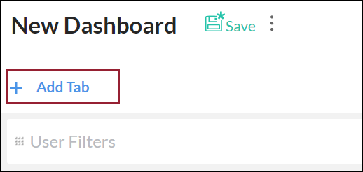
- While creating a new dashboard, click the Add Tab button. The existing views will be listed under a tab named New Tab 1, and a new tab will be created.
To add tabs to existing dashboards, click the Edit Design button, and click the Add tab button that appears in the Edit Design window.
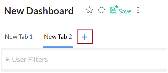
- To add more tabs, click the + icon. You can add a maximum of ten tabs within a single dashboard.
You can also edit existing tabs easily. Follow the steps below to do this:
- To Rename a tab, click the More Options icon that appears on the mouse over on the tab name, and select the Rename option.
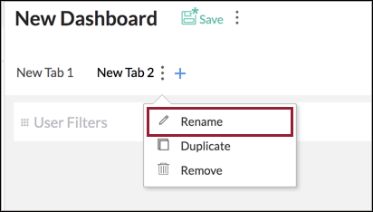
- The Duplicate and Remove options will allow you to duplicate or delete the selected tab.
Adding elements
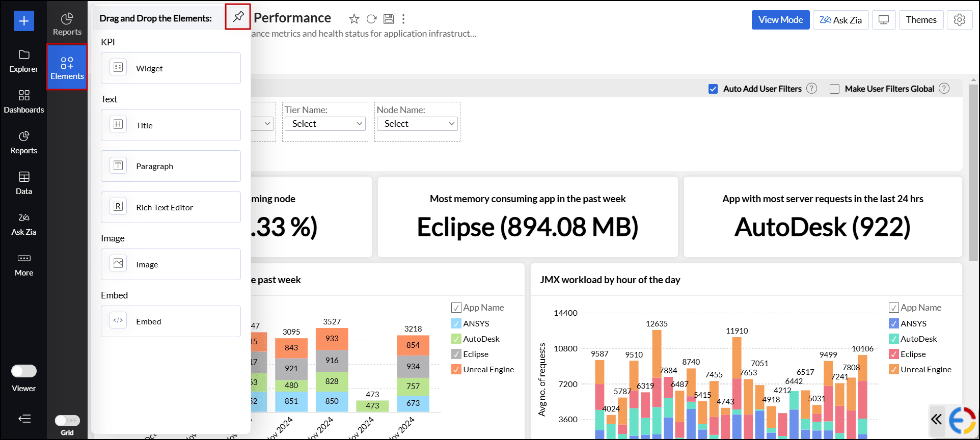
Analytics Plus allows you to add widgets and elements like text and images, which can enrich and enhance your dashboards with relevant contextual information. You can also embed elements like Google Maps, YouTube videos, and online forms using HTML iframe code snippets. Follow the steps below to add elements.
- Open the desired dashboard in Edit Design mode.
- Click Elements from the side panel and drag and drop the elements of your choice.
- Click the Pin icon at the top right corner to keep the Elements menu open and stay in a fixed position.
Adding key performance indicator (KPI)
Analytics Plus offers a widget-based model to monitor and highlight the key metrics prominently in the dashboard for easy comprehension. You can also accompany key metrics with associated comparison indicators to highlight the trend. To add a KPI widget,
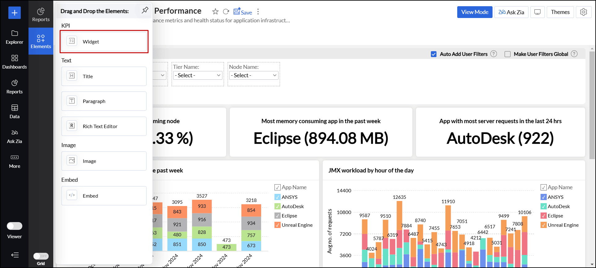
- Open the desired dashboard in Edit Design mode.
- Click Elements from the side panel and drag and drop the Widget element into the dashboard layout. This opens the KPI widget editor with different options. Click here to learn more about working with KPI widgets.
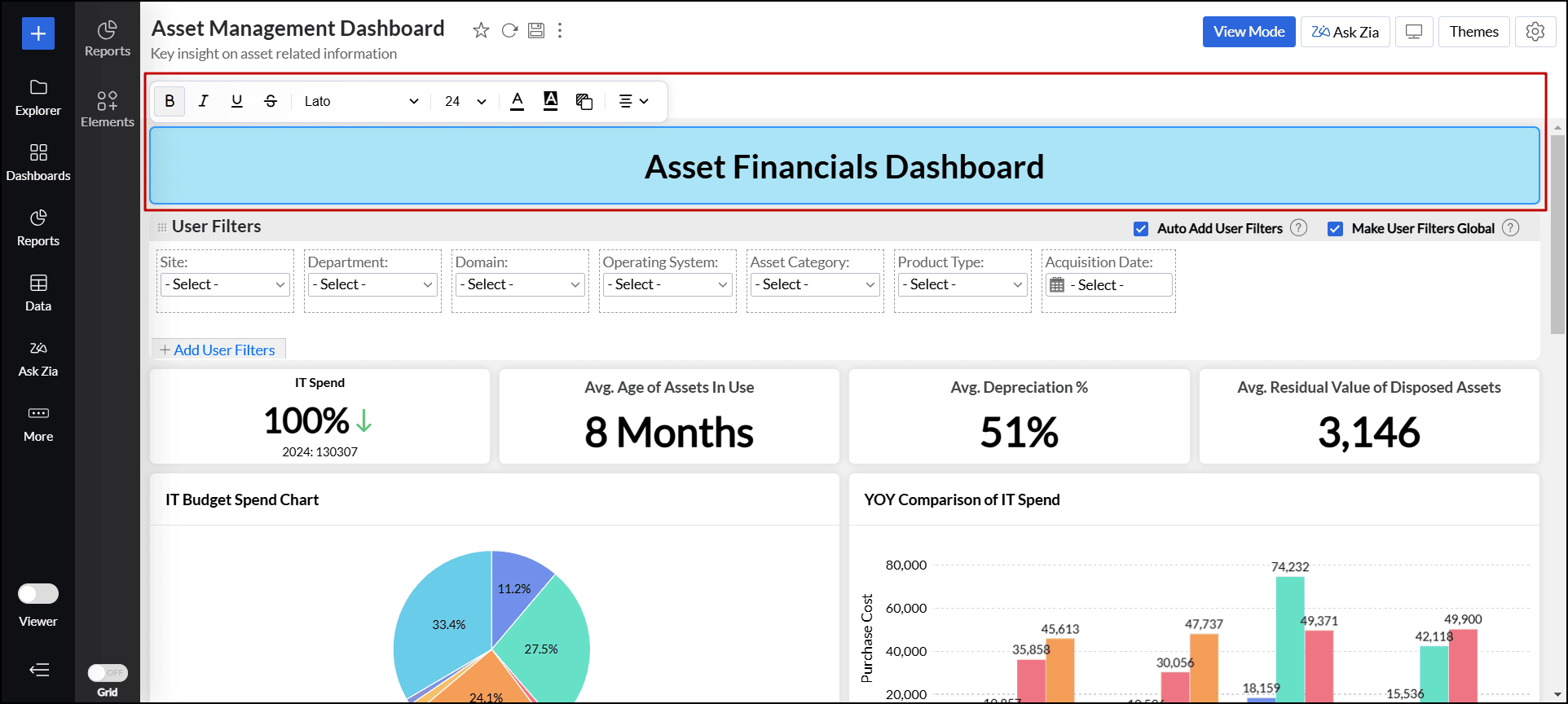
Adding text
Analytics Plus enables you to include text like titles, descriptions, and other formatted texts into your dashboard. To add text element, follow the steps below.
- Open the desired dashboard in Edit Design mode.
- Click Elements from the side panel and drag and drop the appropriate text element into the dashboard layout. The following are the available text elements:
- Titles: Let you add headings with basic font styling options to customize text style, color, and alignment. You can also modify the background color of the card.
- Paragraph: Provides a way to add descriptive text sections to your dashboard, with customization options for font style, color, and alignment. It also supports features like toggle points, indentation, and line height adjustments to improve readability and structure.
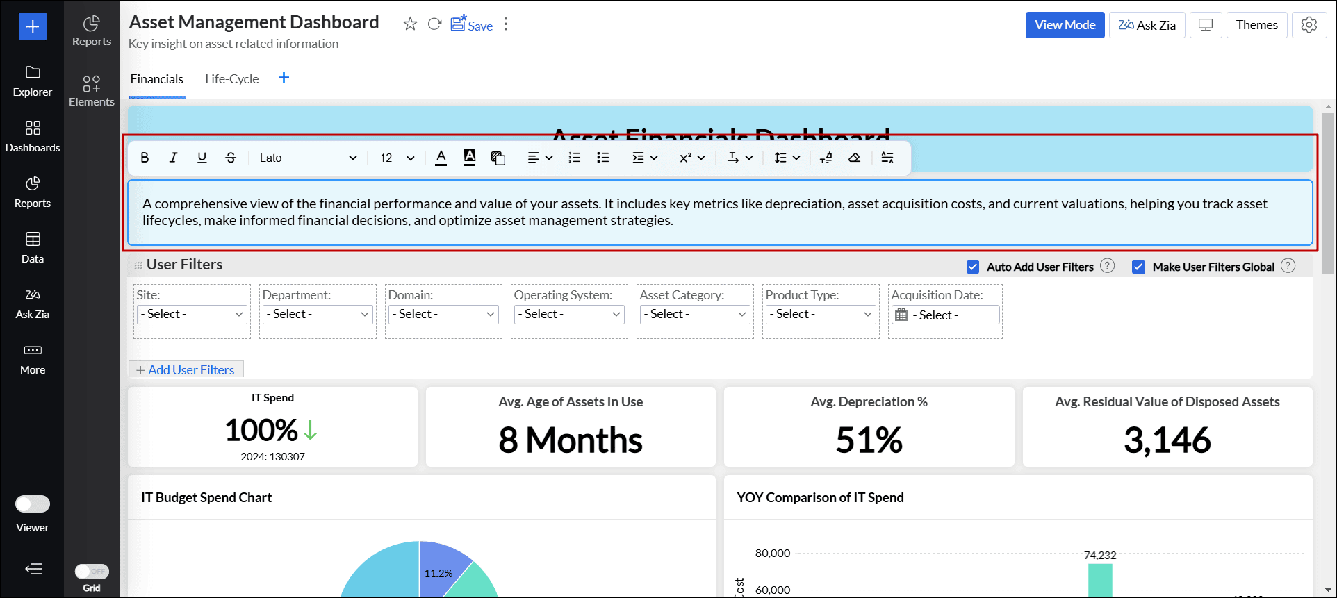
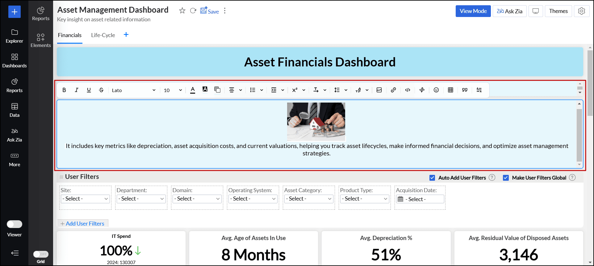
- Rich Text Editor: Enables you to include richly formatted content such as text, quotes, tables, images, HTML code, and more in your dashboards, along with all the customization options available in the Paragraph element.
- Titles: Let you add headings with basic font styling options to customize text style, color, and alignment. You can also modify the background color of the card.
More options
To enable additional card settings for the text element, click the More(vertical ellipsis) icon and choose Options. In the dialog that appears, choose the desired option:
- Wrap text and Auto adjust text area height: This option prevents text overflow and automatically adjusts the height of the text area.
- Include Padding: This option adds space between the content and the text area border.
- Apply Border and Shadow theme: This option applies the same border and shadow theme used by other dashboard components to the text area.
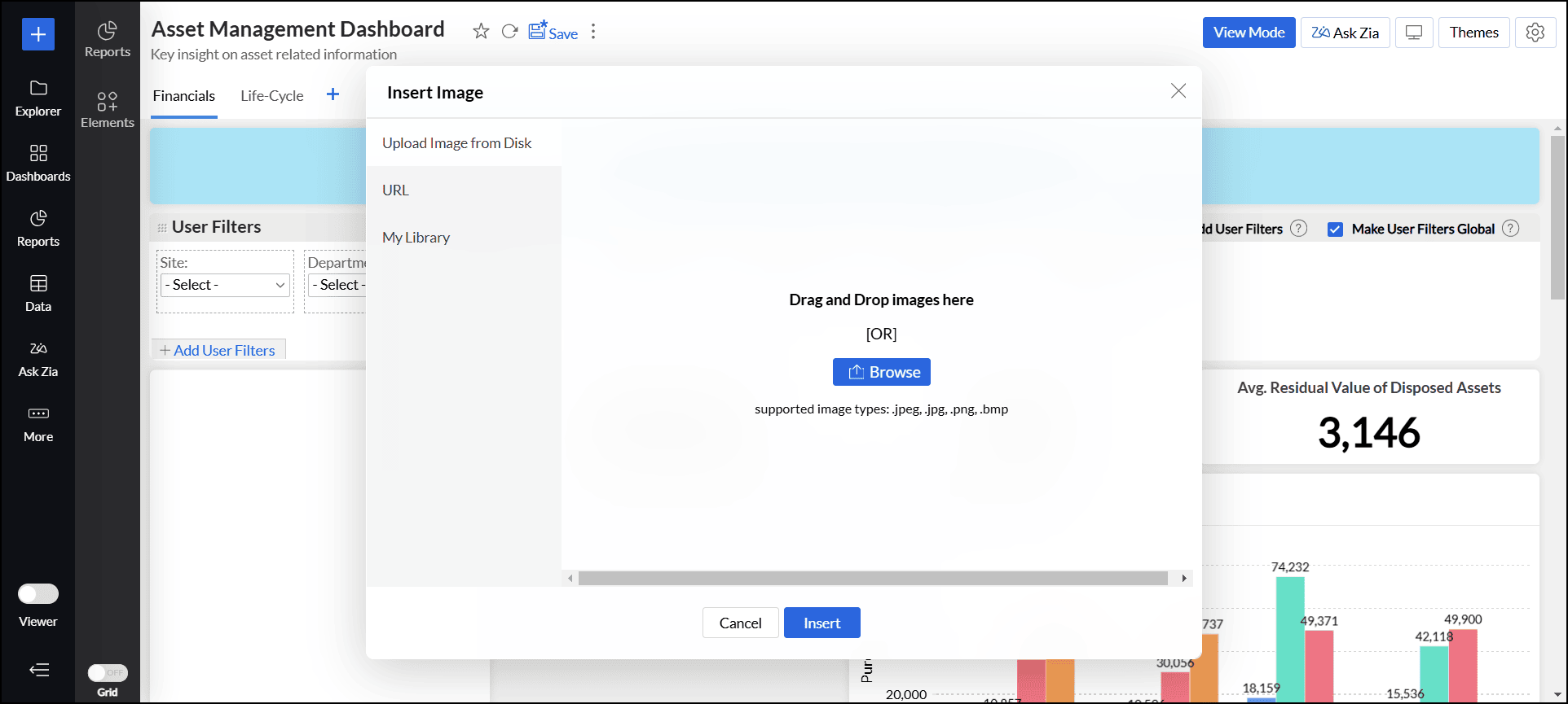
Adding images
Analytics Plus allows you to add images and GIFs to your dashboard to enhance visual appeal and improve contextual understanding of your dashboard. To add an image/GIF to your dashboard,
- Open the desired dashboard in Edit Design mode.
- Click Elements from the side panel and drag and drop the Image element into the dashboard layout.
- In the dialog that appears, you can import an image from any of the three sources, such as Upload Image from Disk, URL, and My Library.
- Select the image and click Insert.
You can also customize or edit the image using the following options:
- Color: Set a different color to the images.
- Brightness: Modify the brightness level to enhance visibility.
- Contrast: Change the contrast to make details more pronounced.
- Transparency: Set the image's transparency to blend seamlessly with other elements.
- Crop to Shape: Crop the image into predefined shapes to fit your design needs.
- Stroke: Add or adjust the border around the image.
- Drop Shadow: Apply a shadow effect to give the image a three-dimensional appearance.
- Rotate: Rotate the image to the desired angle.
- Flip: Flip the image horizontally or vertically for the desired orientation.
- Enable/ Disable card transparency: Control the level of opacity and visibility of the background behind the image.
- Change Image: Replace the image with a new one.
- Reset to default style: Revert any changes made to the image.
More options
To enable additional settings for the image element, click the More(vertical ellipsis) icon and choose Options. In the dialog that appears, choose the desired option:
- Title: This option adds the title of the image at the top of the image element.
- Include Padding: This option adds space between the image and the border.
Adding embed components
Analytics Plus allows you to add embed elements like Google Maps, YouTube videos, and online forms by using HTML iframe code snippets. To add embed components to your dashboard,
- Open the desired dashboard in Edit Design mode.
- Click Elements from the side panel and drag and drop the Embed element into your dashboard.
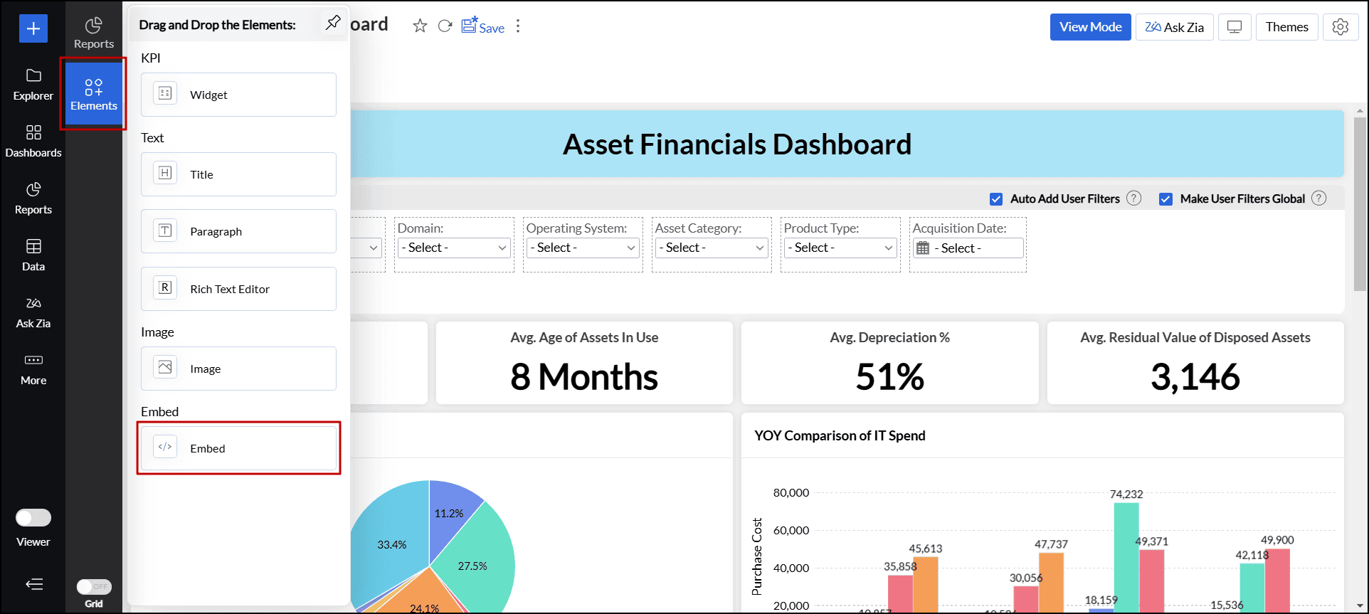
- In the dialog that appears, enter the Title and Embed URL, then click Apply to insert the iframe code.
More options
To enable additional settings for the embed element, click the More(vertical ellipsis) icon and choose Options. In the dialog that appears, choose the desired option:
- Title: This option adds the title of the embed element at the top.
- Include Padding: This option adds space between the embed element and the border.
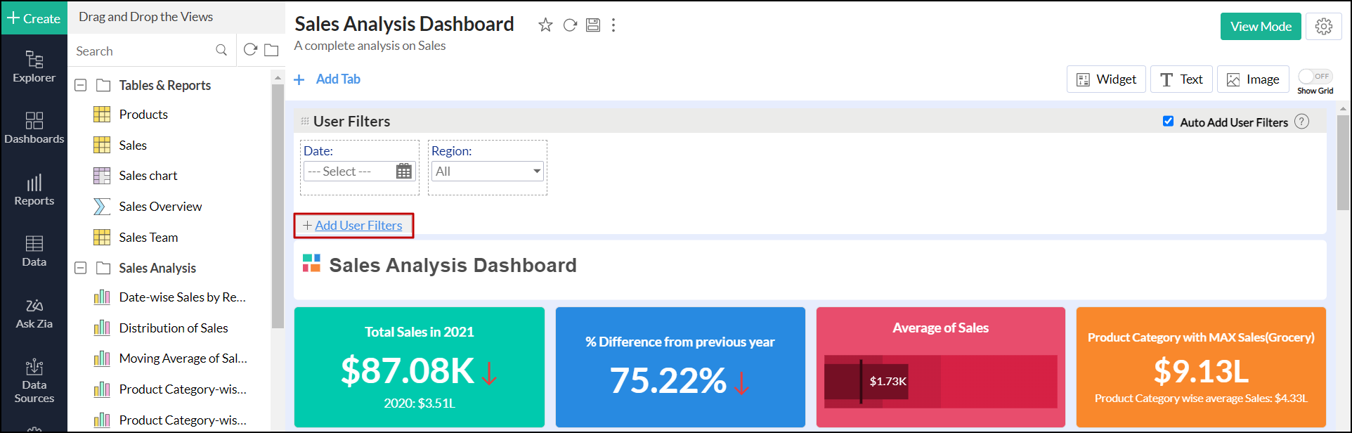
Adding User Filters
ManageEngine Analytics Plus allows you to include dynamic filtering capability in the dashboard view mode using the User Filter option. This enables viewers of the dashboard to apply filters dynamically and view the required information. You can add User Filters to the entire dashboard or to individual reports embedded.
The following sections explain the process of adding user filters in Analytics Plus.
User Filters for dashboard
- Navigate to the User Filters section in the Edit Design mode, and click the Add User Filter button.
- Columns from all the tables used in the dashboard will be listed in the column panel on the left. Drag and drop the required columns to be used as user filters.
- Editing a user filter in dashboards is similar to editing a user filter in charts, pivot, and summary views. Click here to learn more.
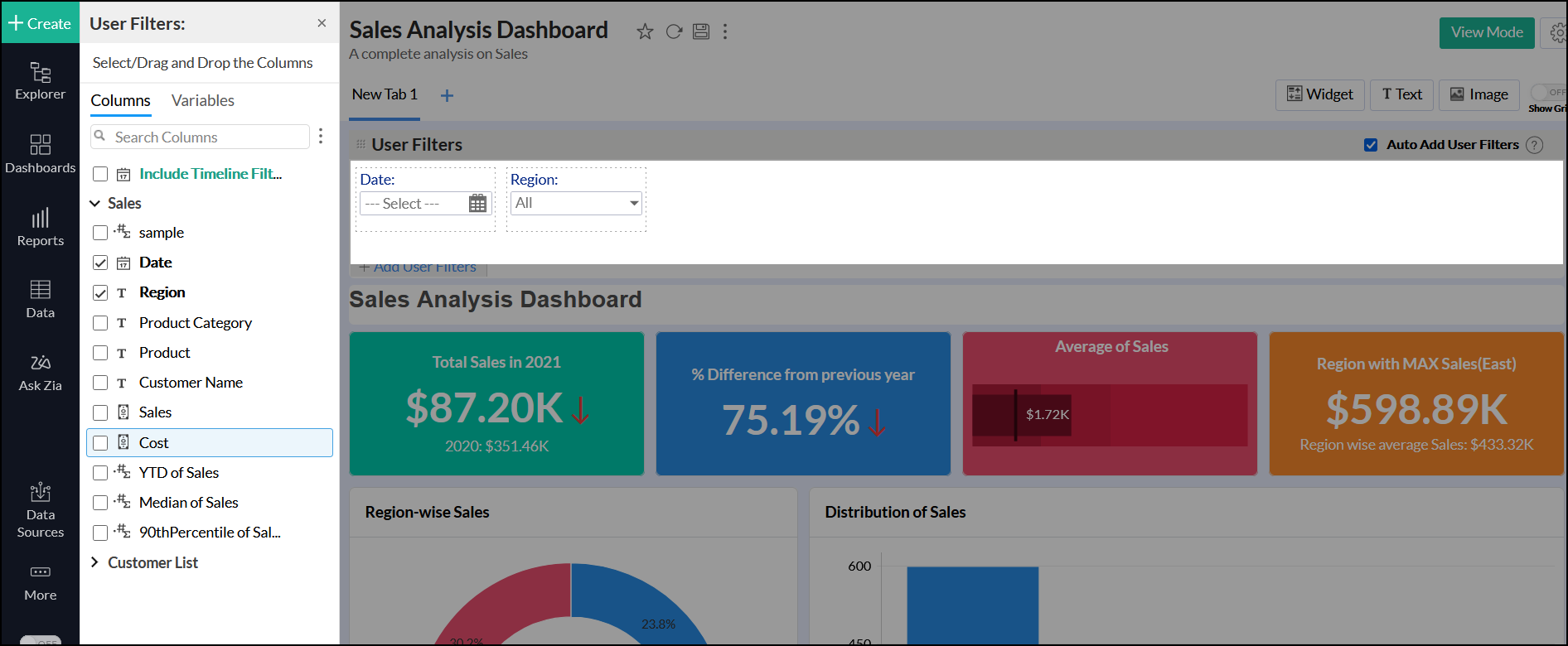
- You can choose to expand or collapse the user filter as required.
Auto add User Filters
Analytics Plus allows you to automatically add a report's user filters to the dashboard. This is an easy and convenient way to add user filters to a dashboard, without having to create them again.
Follow the steps below to do this:
- Select the Auto Add User Filter check box in the User Filters field.
- Add reports that have existing user filters to the dashboard. The user filters in these reports will now be automatically added to the dashboard.
User Filters for Individual Reports
You can also add user filters to individual reports that have been added to a dashboard. Follow the steps below to do this:
- Add a report that has user filters to the dashboard.
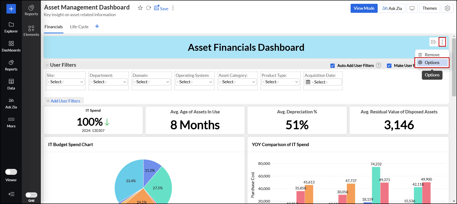
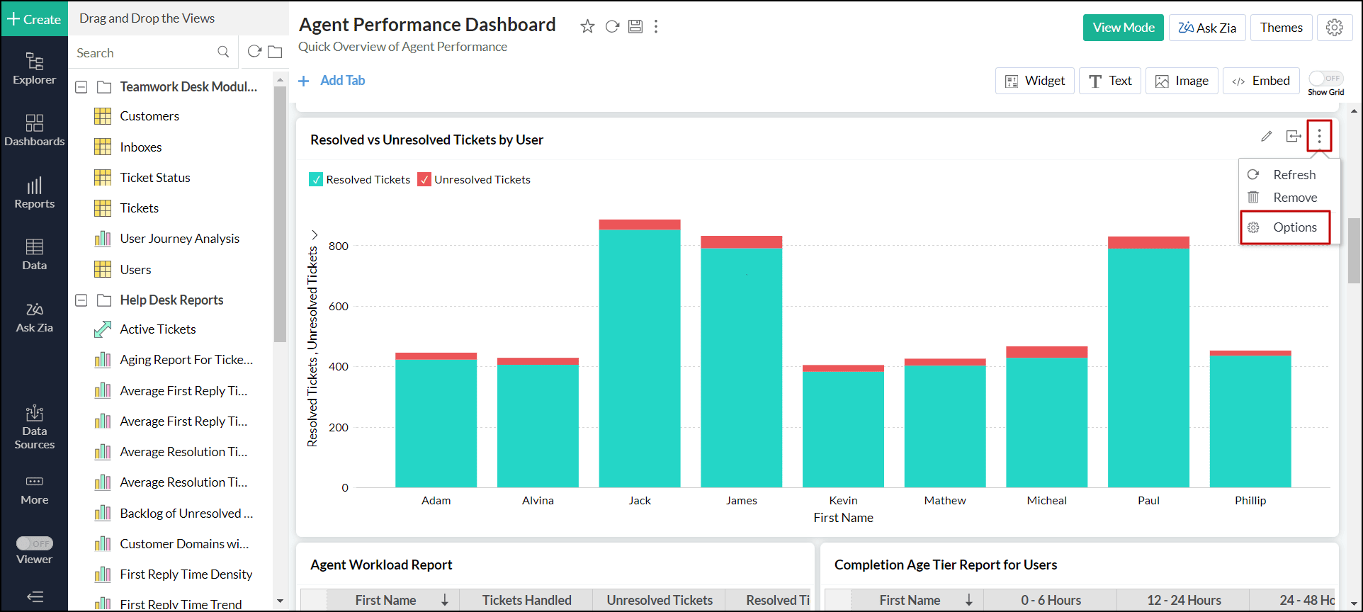
- In the Edit Design mode, click the More icon that appears on mouse over the report, and select Options.
- Select the Show Report Specific User Filter checkbox in the popup that appears, and click Apply. The user filters will be added only to the corresponding report.
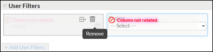
Columns Not Related
ManageEngine Analytics Plus will display an alert over a user filter column when you delete every report that uses this column from the dashboard. This helps you to identify user filters that are no longer relevant and remove them. Hover your mouse over the corresponding column and select Remove from the highlighted options. Please note that you will not be able to save the dashboard without removing it.
Merging User Filters
Dashboards often contain reports from different tables, which may have columns of the same type and records, such as regions, amounts, and product categories. Applying multiple filters of the same type can be confusing and not user-friendly, as it may be difficult to determine which filter applies to which table. To address this, Analytics Plus allows you to merge filters.
Merge filters manually
You can merge user filters by simply dragging and dropping one filter on top of another.

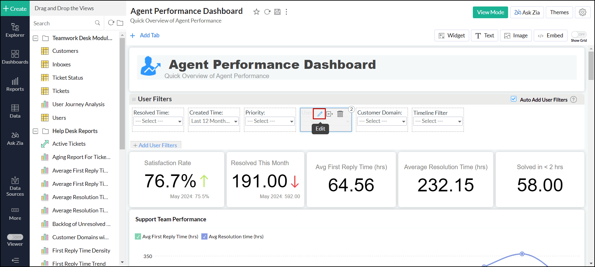
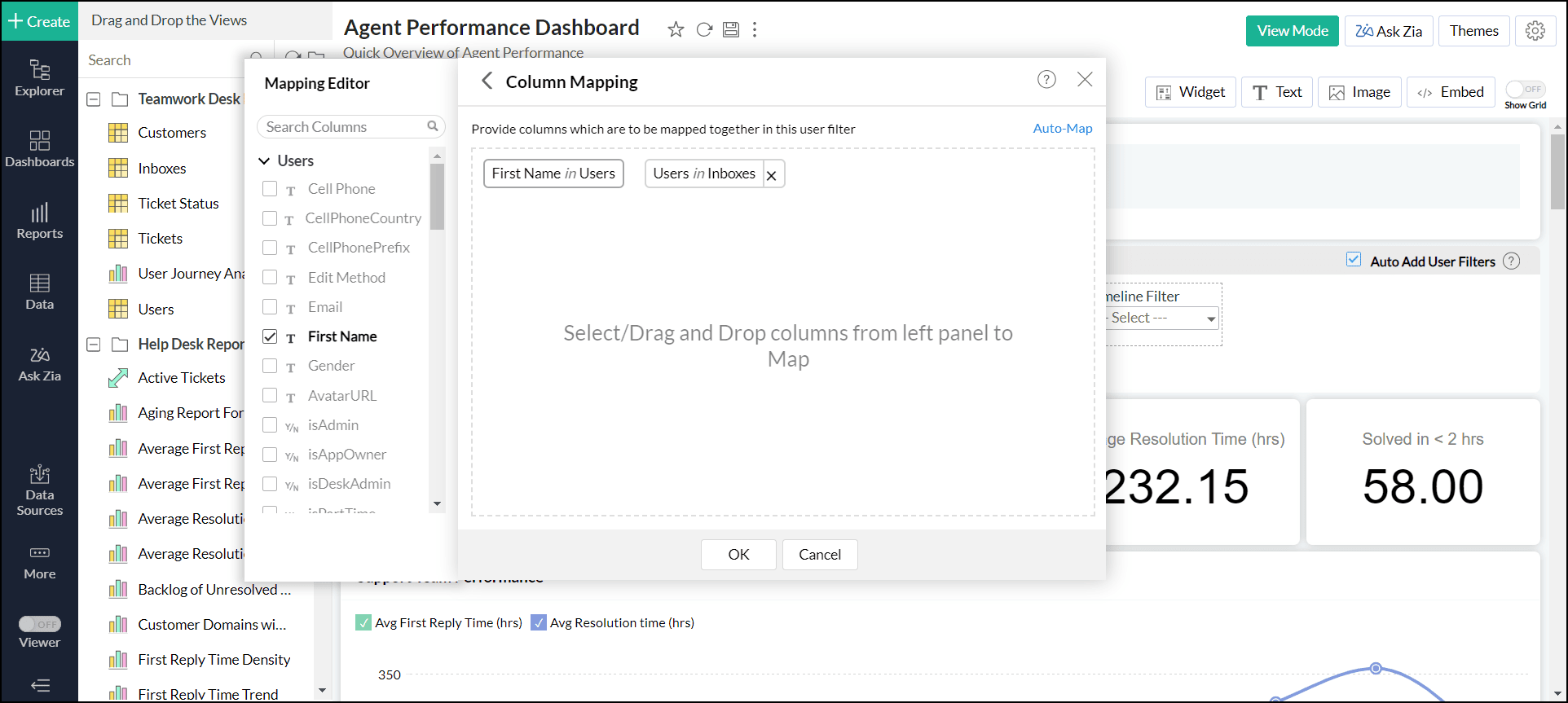
You can modify the merged column mapping by following these steps:
- Click the Edit icon that appears when you hover over the merged filter.
- In the dialog that appears, click the Edit Column Mapping link.
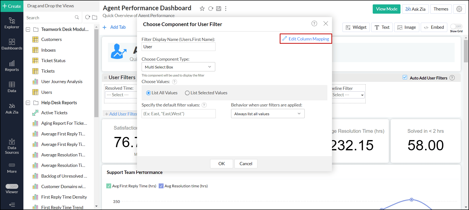
- Modify the column mapping as needed, and click OK.
Note:
- You cannot remove the primary user filter column over which other user filters are merged.
- Values from the primary column alone will be listed as filter values.
- You cannot merge two columns from the same table into the same user filter.
- You cannot merge two columns with different data types in a user filter.
- You can merge columns with similar data types in the same category. For example, Number, Decimal Number, and Positive Number can be merged.
Auto-merge of user filters
Analytics Plus will automatically map and merge columns if the following conditions are met:
- The filter columns should be from different tables.
- The column name should be the same in the tables.
- The columns should have the same data type, subtype, and operation.
- The Auto-Add User Filters option should be enabled in the dashboard designer.

Mapping different columns for individual reports
When applying merged user filters in dashboards, reports are filtered based on the values of the primary user filter column, which serves as the base for merging other user filter columns. However, you can selectively filter individual reports using values from alternative user filter columns:
- Navigate to the required report in the dashboard.
- Click the More (vertical ellipsis) icon > Options.
- Click the Customize link adjacent to the Apply Dashboard Filters checkbox. The customize dashboard filters dialog will open listing all the filters.
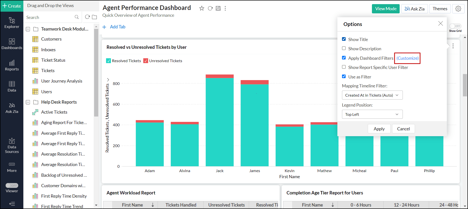
- Select the column you want to map for this report.
- Click Apply.
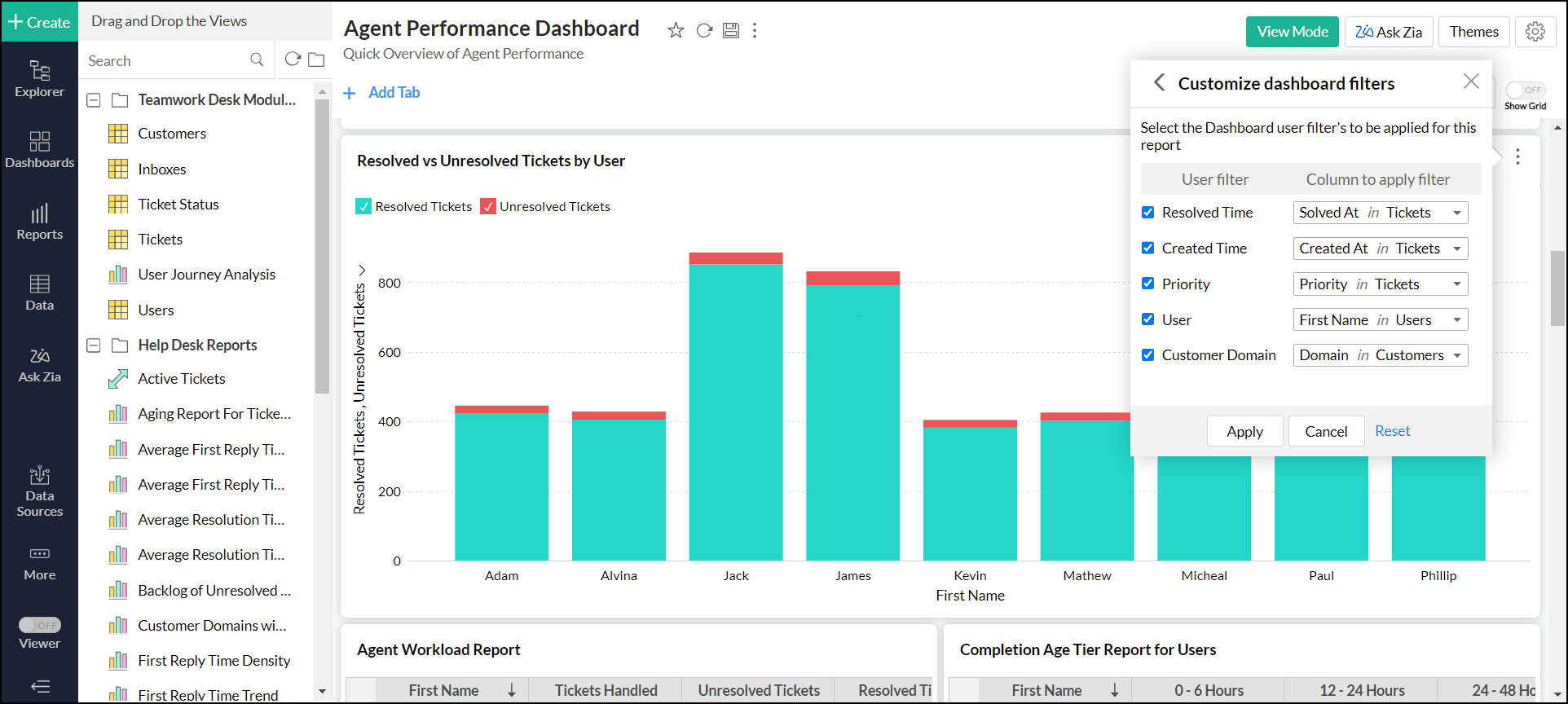
When the merged filter is applied, the configured report alone will be filtered by the set column.
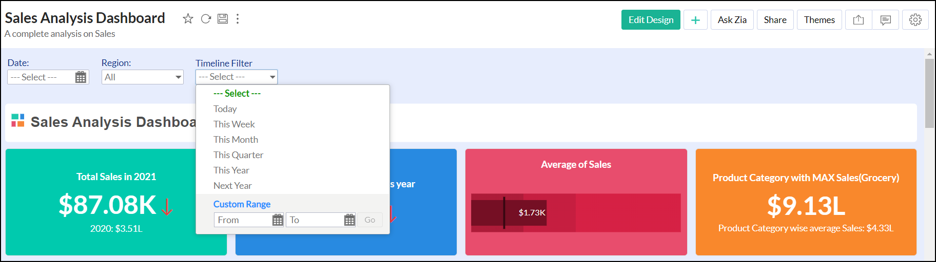
Adding Timeline Filters
Analytics Plus allows you to create a common date or period user filter that can be applied across all reports in the dashboard, independent of the tables over which the reports have been created. This user filter is different from the other filters in that it is not tightly bound to any (date) column in a table.
When you use the timeline filter in a dashboard, Analytics Plus will apply the criteria to all reports, matching it with the best possible date column associated with the report. By default, if the report has a date column, it will be filtered using it. The matching date columns can also be customized. Please note that you can set up only one timeline filter in a dashboard, as this is a common period filter.
Follow the steps below to add a timeline filter.
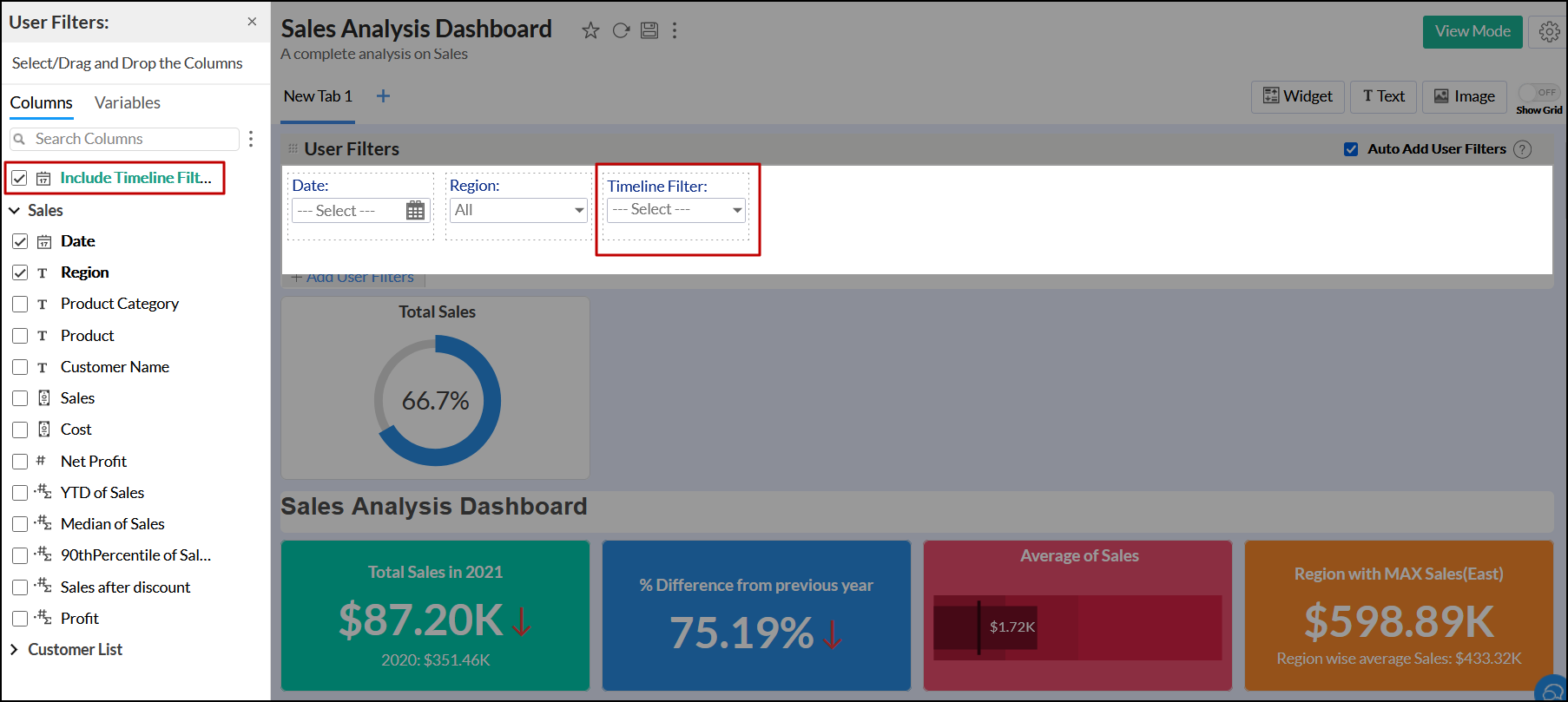
- Open a dashboard in the Edit Design mode, and click the + Add User Filters link.
- Select the Include Timeline Filter check box from the left pane to add a timeline filter.
- Click the Edit icon that appears on the timeline filter on mouse hover.
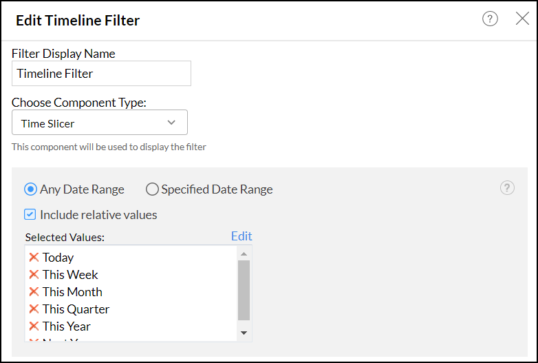
- In the dialog that appears, you can modify the following fields:
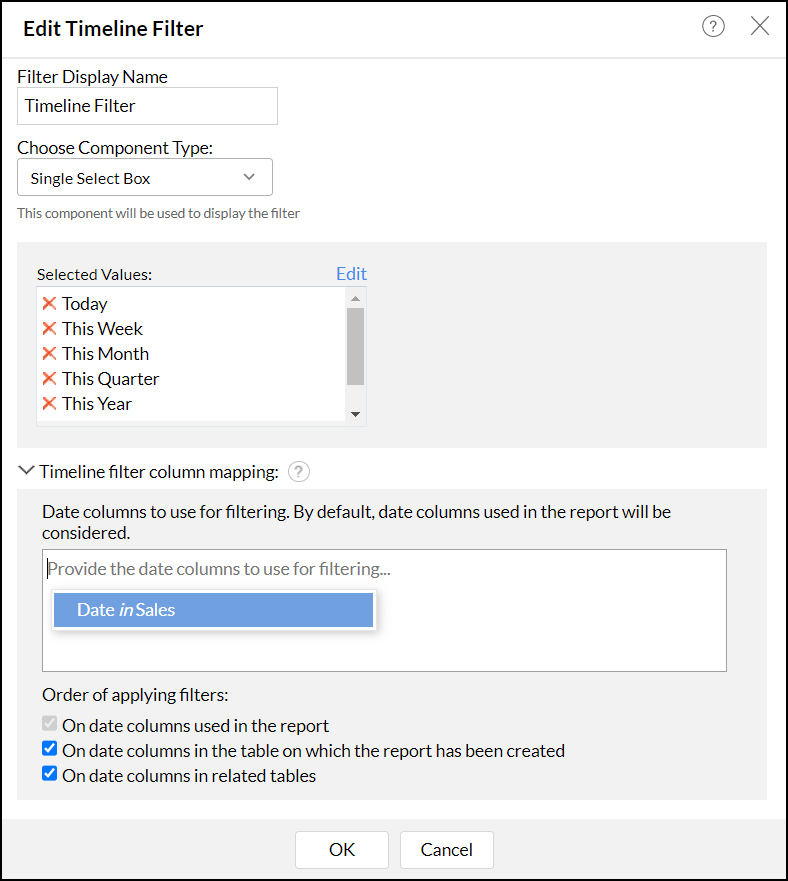
- Filter Display Name: Modify the name of the timeline filter as required.
- Choose Component Type: Select the type of filter as Single Select Box or Time Slicer from the drop-down. Click the corresponding links to learn about each component type in detail.
- Timeline filter column mapping: This option allows you to map columns used for filtering if the table has multiple date columns.
- Order of Applying Filters: This option enables you to specify the order to apply filters. The following are the available options:
- On date columns used in the report: This is the default option which applies the timeline filter across every date column present in the dashboard's reports.
- On date columns in the table on which the report has been created: This option applies the timeline filters over date columns present in the reports' base tables, even if the reports do not contain a date column.
- On date columns in related tables: This option allows you to apply the timeline filter over date columns present in tables that are related to the reports' base table, when the base tables do not contain a date column.
- Click OK to reflect the changes to the filter.
Single select box filter
This option allows you to filter values based on a custom date range and the different relative period values offered by Analytics Plus. By default, the following relative periods will be added as filter items along with the Custom Date Range option. However, you can choose to add more relative periods to your timeline filter. The following are the default values.
- Today
- This Week
- This Month
- This Quarter
- This Year
To add a single select box filter,
- Head to the Edit Timeline Filter dialog.
- Choose the component type as Single Select Box.
- Click the Edit link in the Selected Values section to add more relative periods other than the default values.
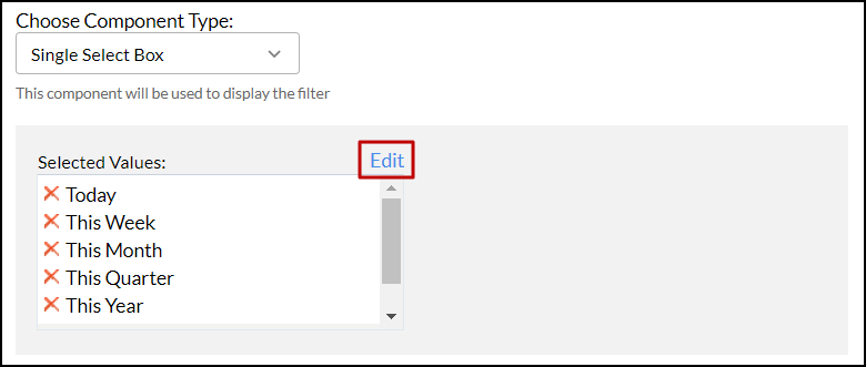
- From the list of available relative periods, choose the required ones.
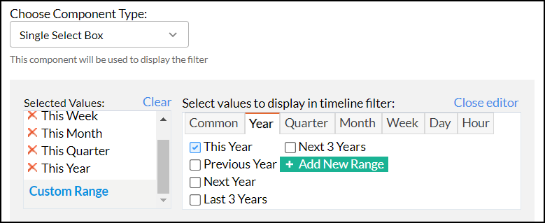
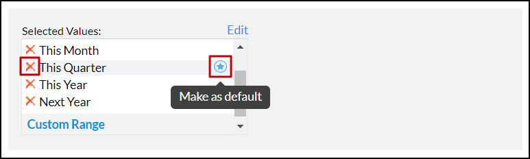
You can remove these values using the Remove icon. To make a value as the default filter, click the Star icon that appears on hovering over the required value.
- After configuring the required options, click OK. The following image shows the Single Select Box timeline filter.
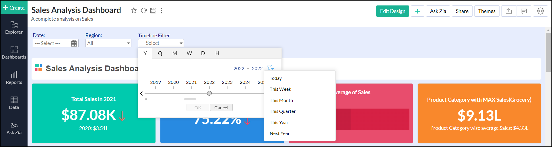
Time Slicer
This option lets you add a dynamic slider with a date range for filtering. Analytics Plus allows you to add an infinite date range or a specific date range filter.
To add a time slicer filter with an infinite date range follow the steps below.
- Head to the Edit Timeline Filter dialog.
- Choose the component type as Time Slicer.
- Select the date range as Any Date Range.
- Enable the Include relative values checkbox to add relative values to the time slicer filter. On enabling, the following values are added by default: Today, This Week, This Month, This Quarter, This Year, and Next Year.
- Click the Edit link in the Selected Values section to add more relative periods other than the default values.
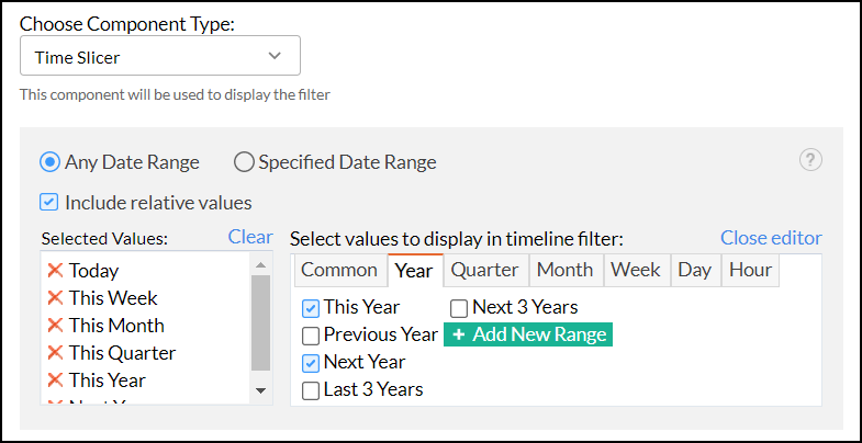
- After configuring the required options, click OK. The following image shows the Time Slicer filter with an Infinite Date Range.
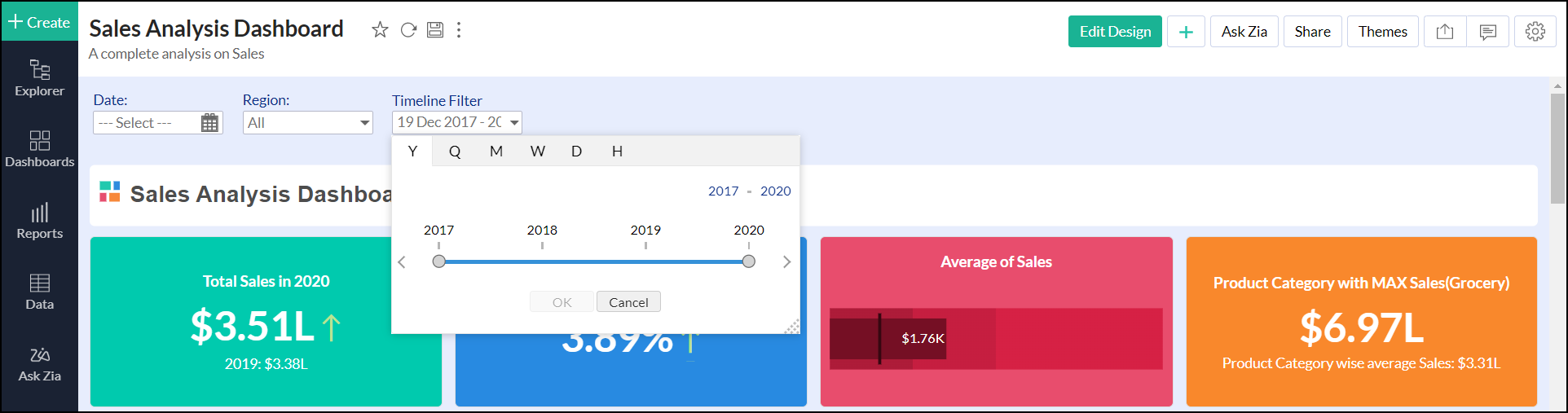
To add a time slicer filter with a specific date range follow the steps below.
- Head to the Edit Timeline Filter dialog.
- Choose the component type as Time Slicer.
- Select the date range as Specified Date Range.
- Specify the date ranges.
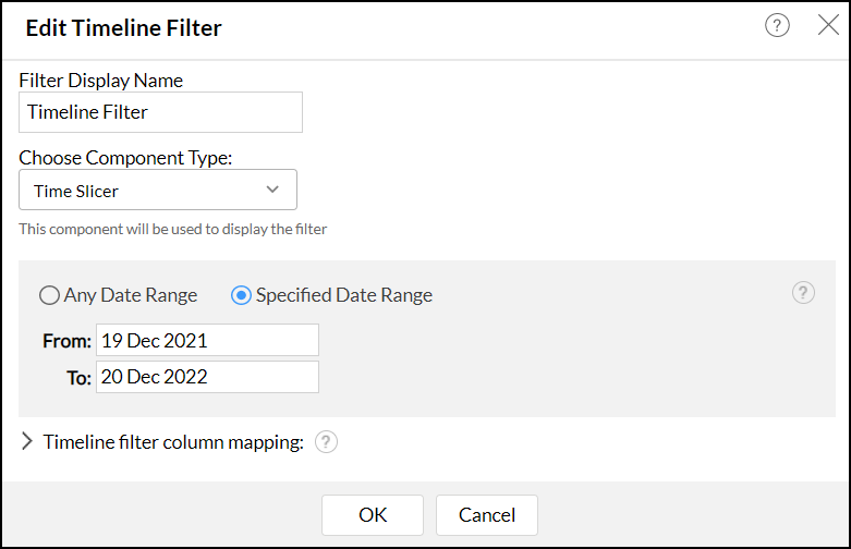
- After configuring the required options, click OK. The following image shows the Time Slicer filter with a Specific Date Range.
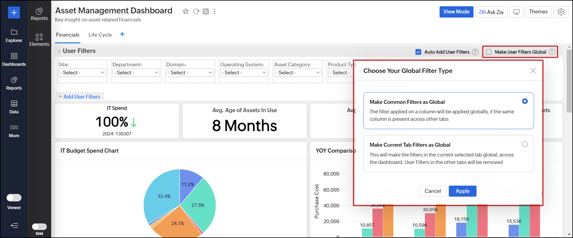
Global user filters
Analytics Plus allows you to have a common user filter across all tabs within a dashboard, enabling users to maintain context across the various tabs in a dashboard. Follow the below steps to apply global user filters.
- Open the required dashboard in Edit Design mode.
- Select the Make User Filters Global checkbox.
- In the dialog that appears, choose one of the following options:
- Make Common Filters as Global: This option lets you use the filters that are common across tabs as a Global filter. It is useful when each tab has separate filters, but a few filters that are common to all tabs.
- Make Current Tab Filters as Global: This option allows you to use the filters of the selected dashboard tab as a Global filter. It is helpful when the reports are based on similar data points but filters are applied by users on one of the primary tabs. Please note that the user filters from the selected tab will overwrite the existing filters across all other tabs in the dashboard. Therefore, ensure that the filters are suitable for every tab before continuing.
- Click Apply.
Working of filters
| Filter Configuration | Overall Behavior | Effect at the tab-level |
| Tab-level user filter | Applies the user filter to that particular tab | Retains Tab-specific filters |
| Common Filters as Global | Applies the common user filters across all tabs in the dashboard | Retains Tab-specific filters that are not common |
| Current Tab Filters as Global | Applies the user filters of any selected tab globally | Removes the tab-specific filters |
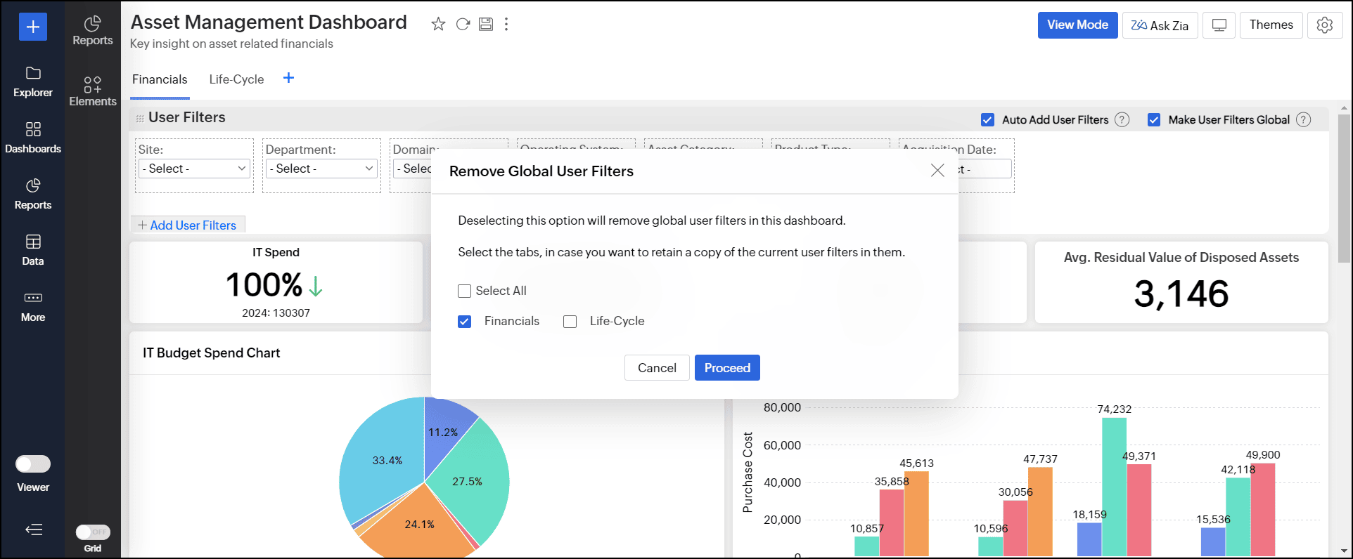
Disable the global user filter
Follow the steps below, depending on the selected option.
- Common Filters as Global: Click the Make User Filters Global checkbox to disable it.
- Current Tab Filters as Global: When disabling the global user filter, Analytics Plus allows you to apply the current tab's filters to other tabs if needed. If you choose not to, the other tabs will have no filters.
- Click the Make User Filters Global checkbox.
- In the pop-up, select the tabs to apply the filters from the current tab.
- Click Proceed.
Reports as Filters
Analytics Plus allows you to configure reports to act as filters on your dashboard. This allows you to dynamically filter dashboards based on the data points in a report.
To enable this feature, open the required dashboard, click the Settings icon at the top right corner and select the Enable Reports to act as Filters option. Click here to learn more about Dashboard Settings.
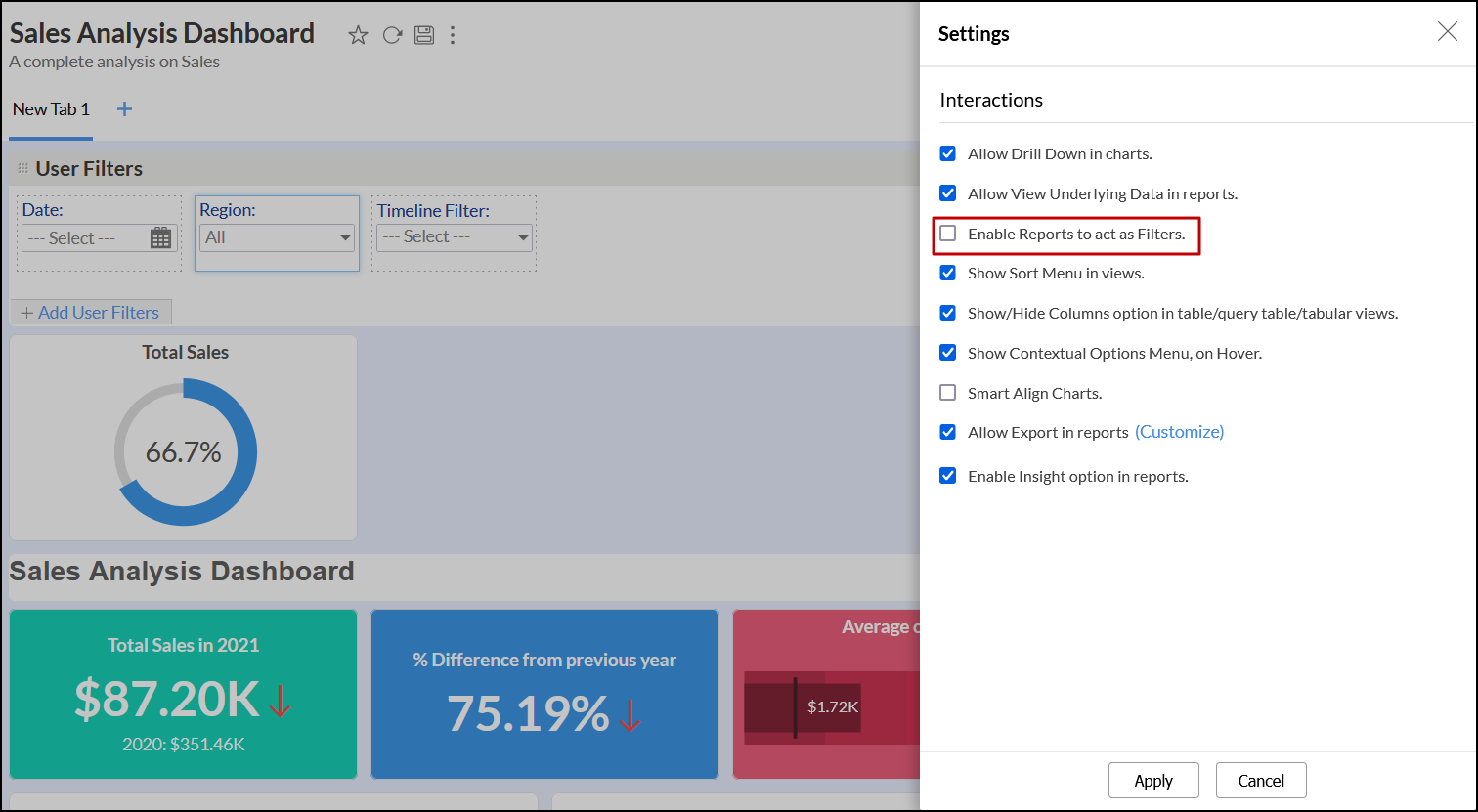
Once the feature is enabled, navigate to a report in the dashboard and click on any data point. The following filtering options will be available:
- Filter including this value: The dashboard will be filtered to display only data corresponding to the selected value.
- Filter excluding this value: The dashboard will be filtered to exclude the data corresponding to the selected value.
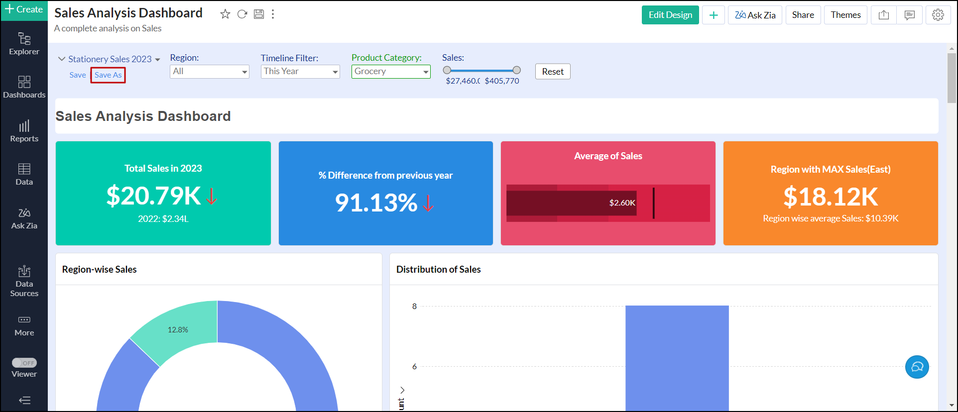
Combine user filters as preset
Analytics Plus allows you to combine multiple user filters and set as a preset filter for dashboards. This filter helps you to apply multiple filters simultaneously in a click. You can also add multiple preset filters to the dashboard. Follow the steps below to create a preset filter.
- Open the dashboard in Edit Design mode, and create the required user filters. Click here to learn more about creating user filters.
- Switch to the View Mode, select the values to apply the filters.
- Click the Save link in the filters section.
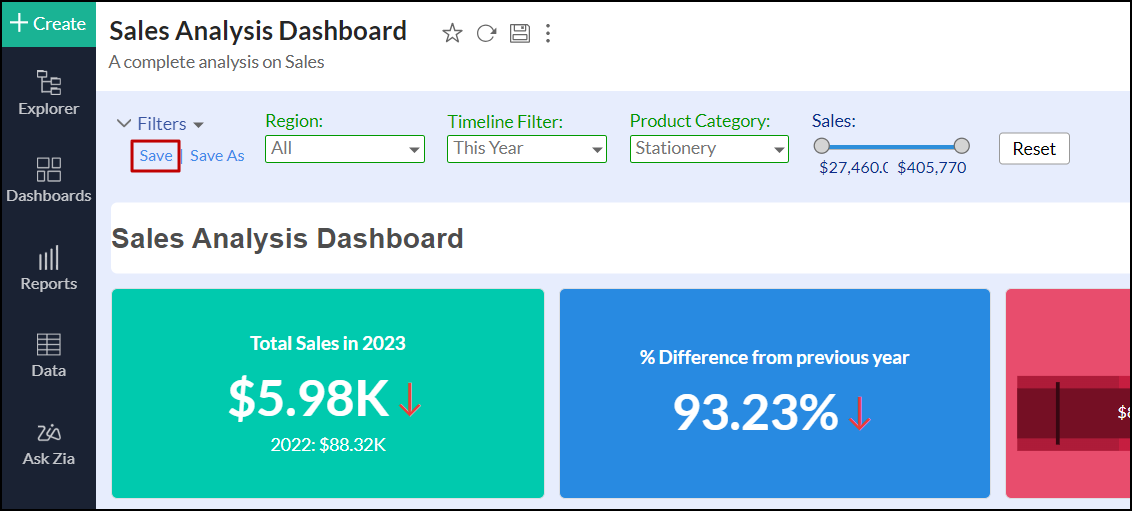
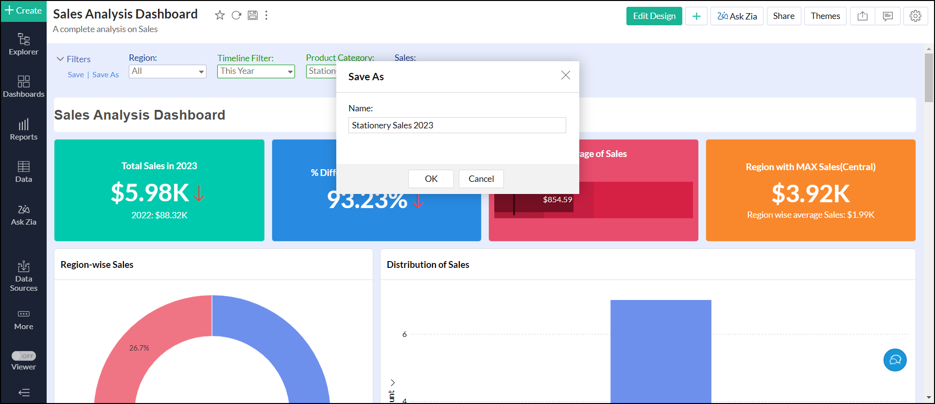
- In the dialog that appears, enter a unique name for the new preset user filter, and click OK.
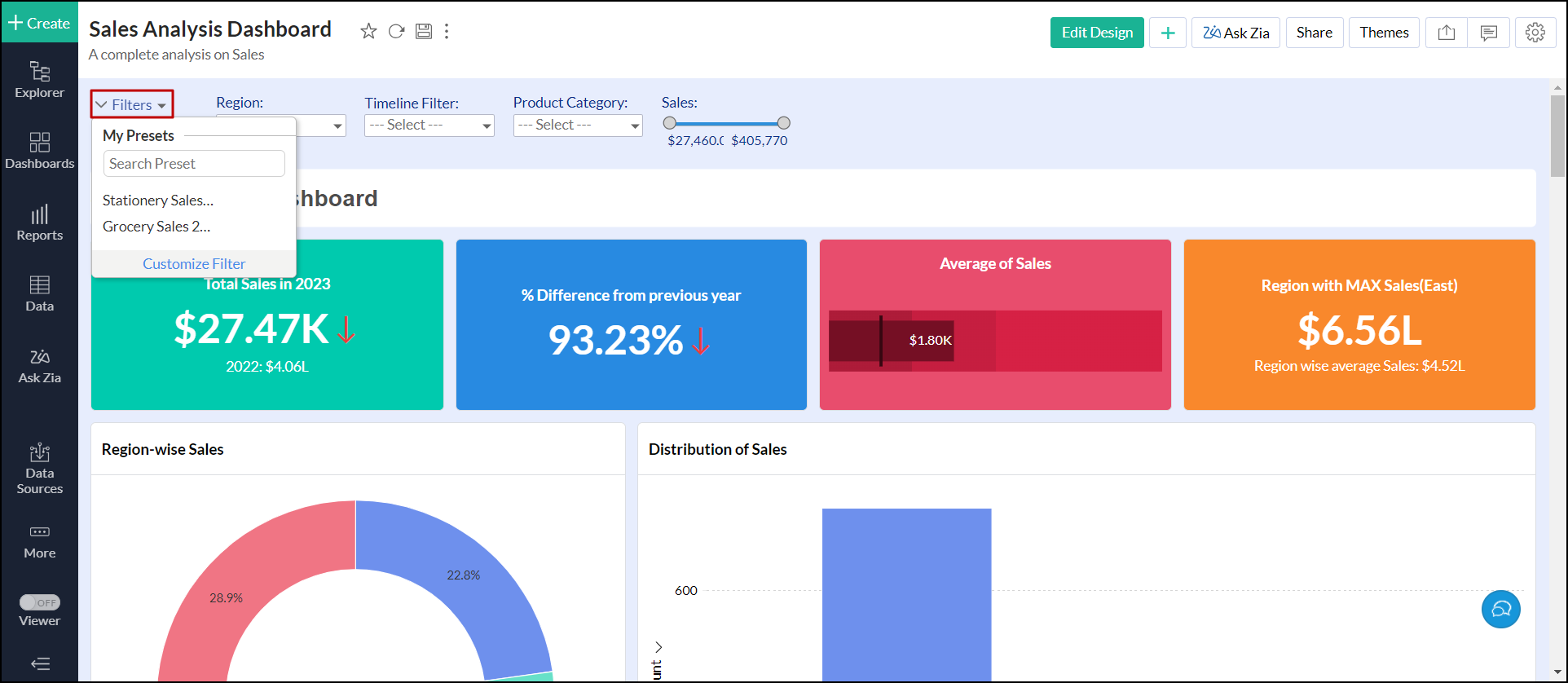
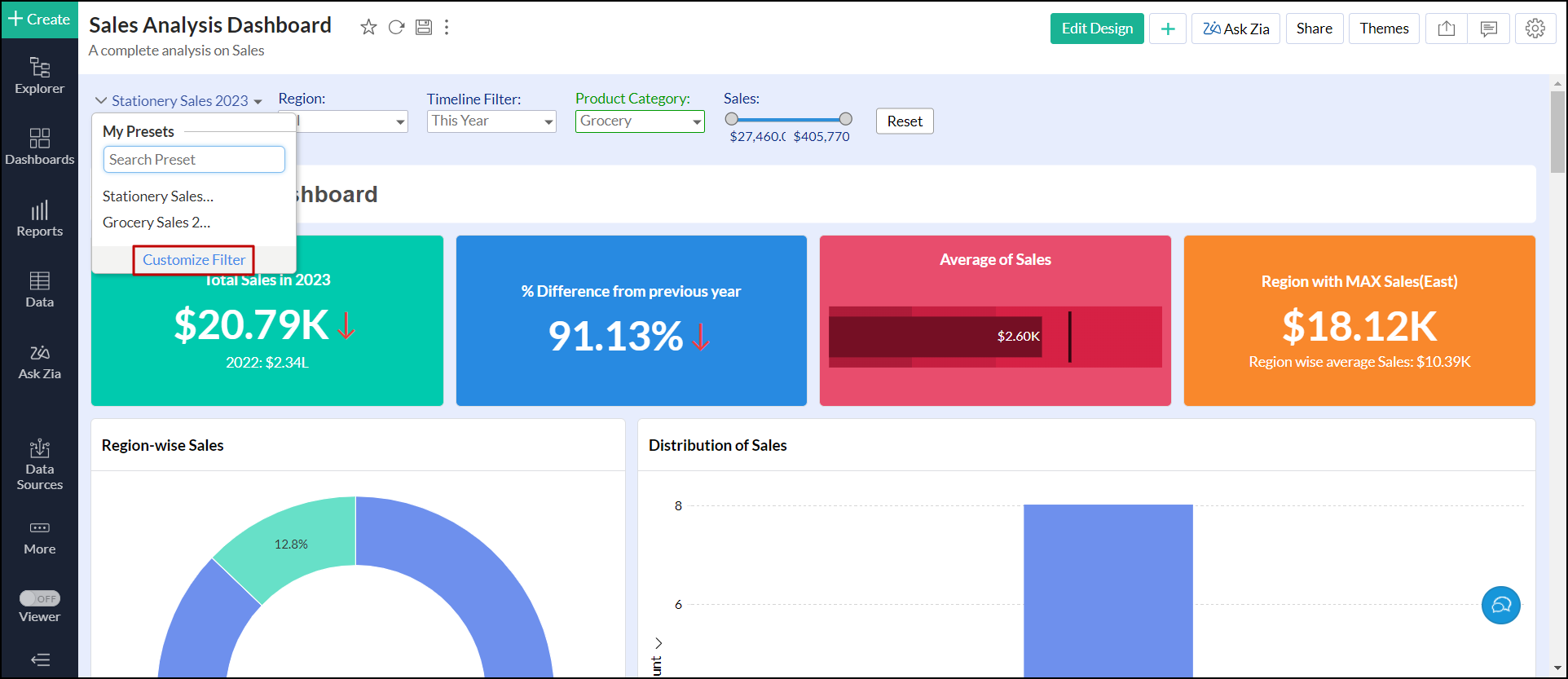
To update the existing preset user filter, open the preset filter from the Filters drop-down. Make the required changes, and click Save.
To save the changes made as a new preset user filter, click Save As. In the dialog that appears, provide a name and click OK to save it as a new preset combination.
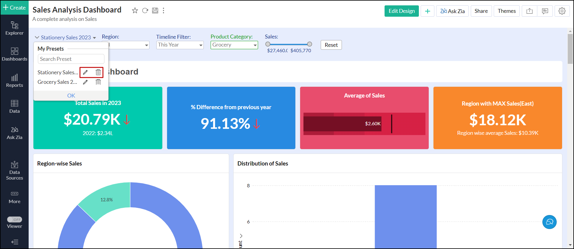
To rename or delete the preset filter, follow the steps below.
- Click the Filters drop-down, and click the Customize Filter link at the bottom.
- Click the Edit or Trash icon of the required user filter that needs to be renamed or deleted.
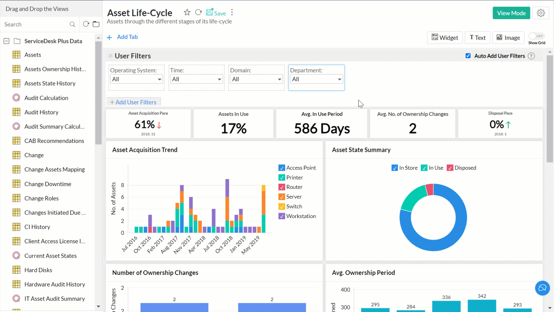
Layout components in dashboards
Analytics Plus provides a flexible, m x n layout dashboard. You can organize the dashboard in any way using the simple drag-and-drop interface in the Edit Design mode of the dashboard.
Reorganizing components
You can easily rearrange the components in a dashboard using the drag-and-drop functionality. As you drag one component, the other components will be rearranged accordingly.
You can also reorganize multiple components together. Select components in the same row or column, and drag them to the required location. The following animation explains the process of re-organizing multiple components.
Reorganizing is not just limited to a single tab, Analytics Plus lets you organize views in a multi-tab dashboard easily. You can move views across the dashboard tabs.
Resizing components
You can resize the components in the dashboard using one of the following options.
Drag to Resize
You can easily resize views by dragging the border. As you drag, a purple line will appear marking the borders of surrounding views. This will be useful to arrange the views in the desired way.

You can also resize multiple components together. Select the components from the same row or column, and drag their border to resize.

Copy and Paste Dimensions
Analytics Plus allows you to apply a uniform dimension to multiple components using the Copy-Paste Dimension option. To do this,
- Select the component with the desired dimensions, and select the Copy Dimensions option from the contextual toolbar that appears at the bottom.
- Select the components you wish to apply the dimensions too, and click Paste. You can choose to copy the width or height, or both.
Fit Components to Width
The Fit components to width option allow you to resize the components to fill the available space proportionately. Select components from the same row and of the same height, and click the Fit to Width option from the contextual toolbar that appears. The components will be resized with proportionate width to fit in the available space.
Fill Space
You can resize components to fill the space in the dashboard layout. The following animation explains how to resize to fill extra spaces.
Remove Components
You can easily remove the components from the dashboard whenever required. To remove a component, click the Remove button that appears on the mouse over.
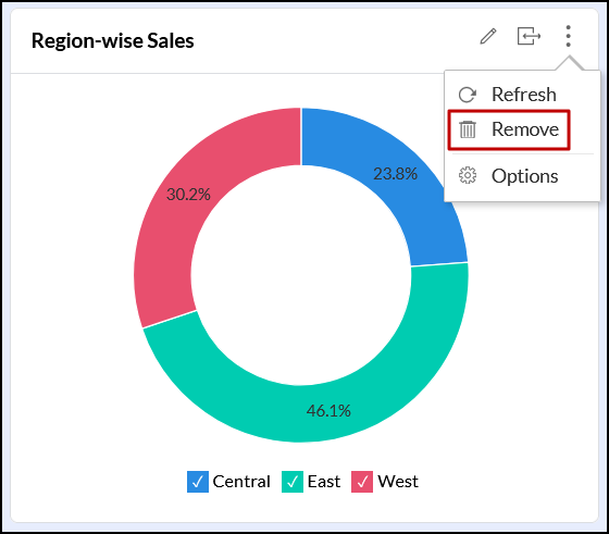
To remove multiple components together, select the components you want to remove and click the Trash icon from the contextual toolbar.

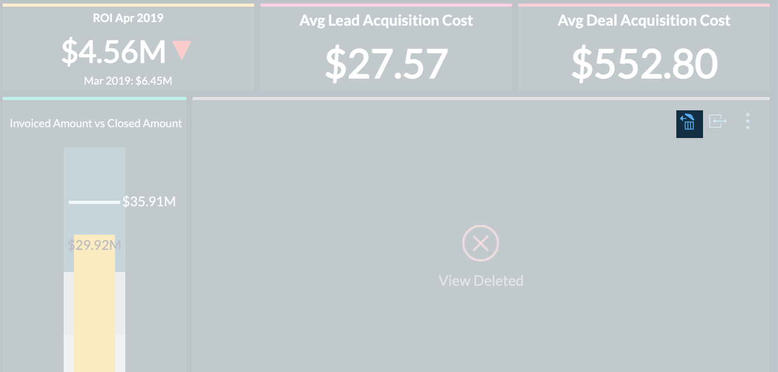
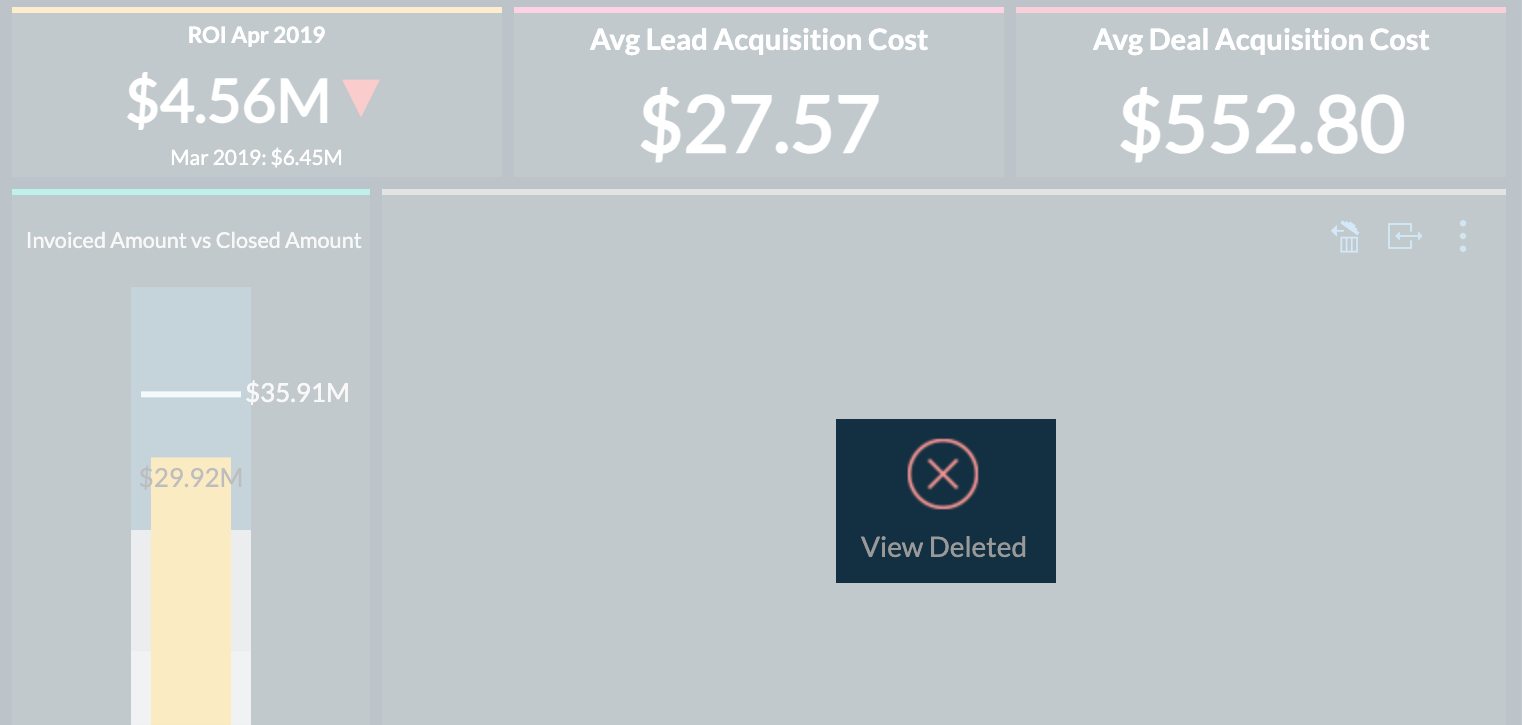
Handle deleted views
In case a view present as part of a dashboard is deleted, you can choose to restore or remove it from the dashboard.
Restore
To restore the view from the dashboard, hover the mouse over the deleted view and click the Restore icon on the top right.
Remove
To remove the view from the dashboard, click the Close icon of the deleted view.
Copy or move views across dashboard
Analytics Plus enables you to reuse reports and KPI widgets by copying and pasting them to different tabs within the same dashboard or across various dashboards. This feature allows you to effortlessly recreate similar reports without altering their alignment. Use Ctrl + C and Ctrl + V on Windows or CMD + C and CMD + V on Mac to copy and paste visualizations.
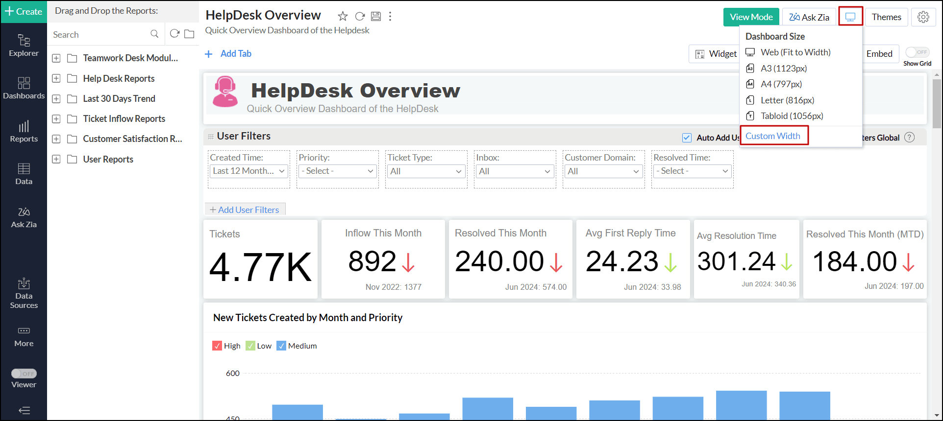
Static width for dashboard
Analytics Plus enables you to customize the size of the dashboard based on your preference. This feature helps you present data more effectively by fitting visualizations to the screen width, minimizing clutter, and creating a more organized layout.
Analytics Plus offers a variety of options, including web, A3, A4, Letter, and Tabloid, or set a custom width to tailor the layout to your needs. To do this, follow the steps below.
- Open the desired dashboard in Edit Design mode.
- Click the Web (Fit to Width) button (represented by a desktop icon) next to the Ask Zia button.
- Select one of the predefined widths or click the Custom Width link to specify your preferred width. The dashboard will resize dynamically according to your selection.