Configure line chart
Line charts are used to depict trends over periods of time such as analyzing long-term trends in sales, financial data, or marketing statistics. The vertical axis usually displays numeric values, while the X-axis indicates certain specific time periods. Configuring them includes setting values for the x and y axes.
To configure a line chart
- Edit your application.
- Select the required page, then open the page builder.
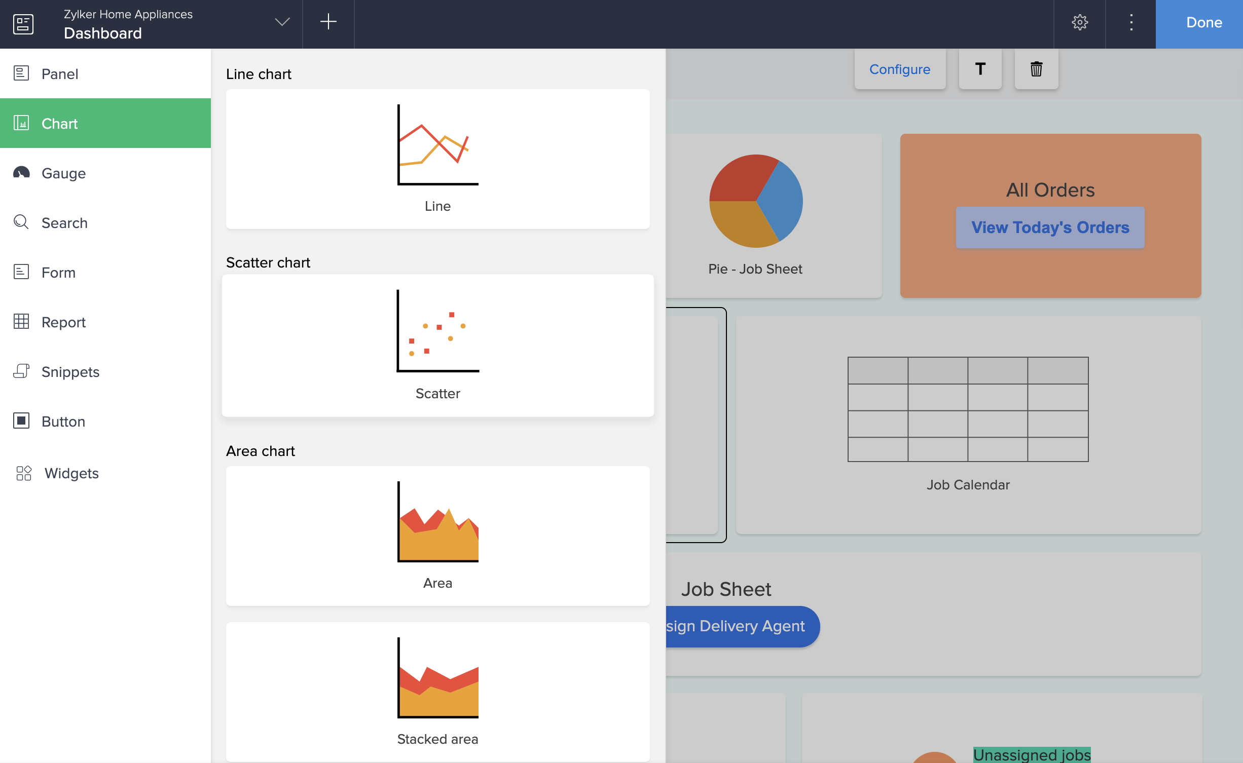
- Click the Chart option from the page elements menu on the left. A menu will slide in.
- Drag and drop a line chart from the chart gallery. The Chart Configuration pane slides in from the right.
- Select a form to represent its data on the chart.
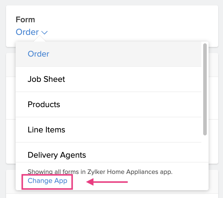 Note: The Form dropdown lists all the forms in the application you are currently working on. To select a form from another application, click the Change App in blue in the footer of the form dropdown. Select another application and click Done to view all the forms in it.
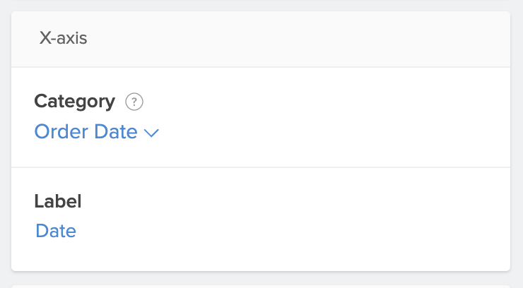
 - Select a field to map the category axis (x-axis) that defines the horizontal axis of the chart.
- Enter a label for the x-axis.
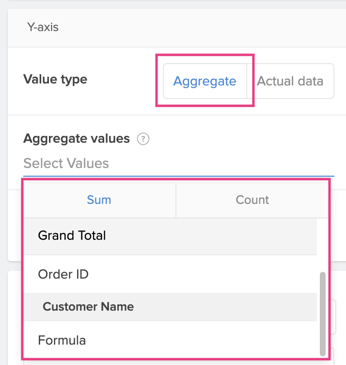
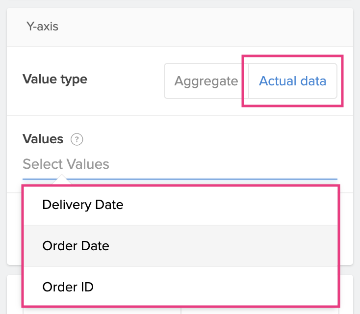
- Choose a value type to be displayed on the y-axis.
- Aggregate: Display the aggregate such as Sum or Count of the field.
- Actual: Display the actual value of the field.
- Aggregate: Display the aggregate such as Sum or Count of the field.
- Enter a label for the y-axis.
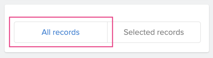
- Evaluate for:
- All Records: Evaluates for all the records in the form.
- Selected Records: Evaluates for records based on the set criteria.
- To set criteria: Click Selected Records > Select Field > Select Operator > Enter a value . Choose AND or OR to add criteria.
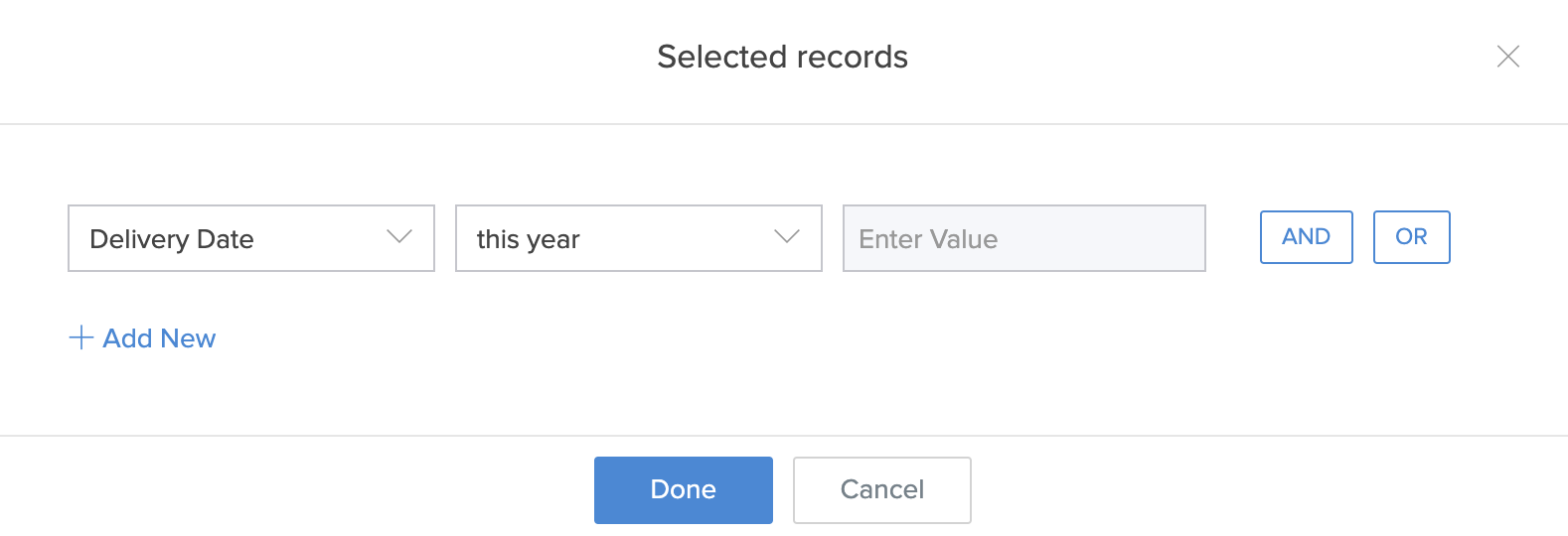
- To set criteria: Click Selected Records > Select Field > Select Operator > Enter a value . Choose AND or OR to add criteria.
- All Records: Evaluates for all the records in the form.
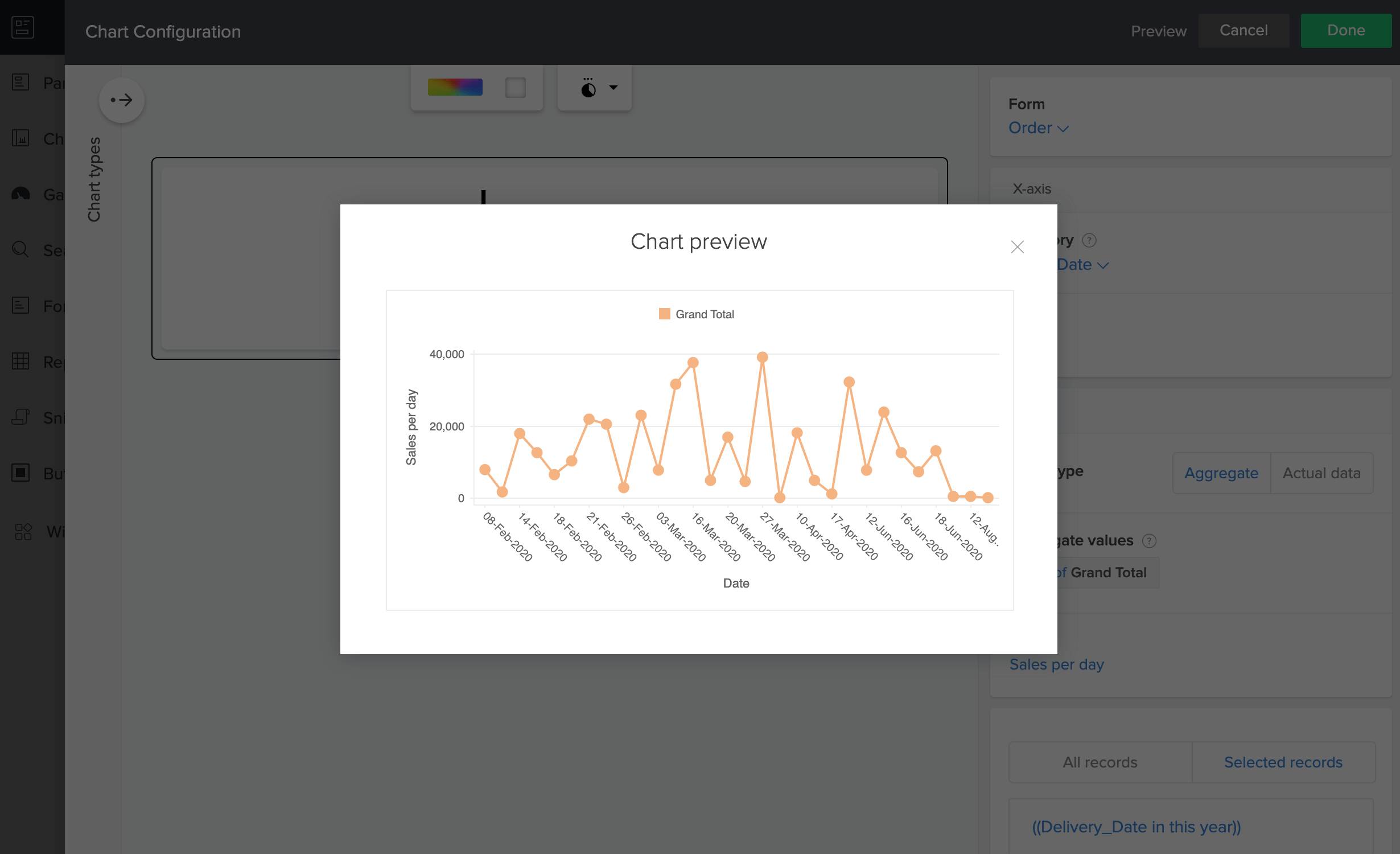
- Click the Preview option at the top right of the Chart Configuration pane to view a preview of the configured chart.
- Close the preview window and make further edits to the chart or click Done to confirm submission.