Dashboard tab in Exchange Reporter Plus
The Dashboard in Exchange Reporter Plus displays a snapshot of the most important information from Exchange Server, Exchange Online, and Skype for Business, using bar graphs, pie charts, tables, and other graphs. Besides the dashboards and organization health status, the Dashboard page of Exchange Reporter Plus also houses the Recent Alerts section that displays the number of alerts split into three categories: Critical, Trouble, and Attention.
Exchange Server dashboard
These graphs display information on vital aspects of Exchange Server, such as server storage levels, mailbox traffic status, and mailbox size growth.
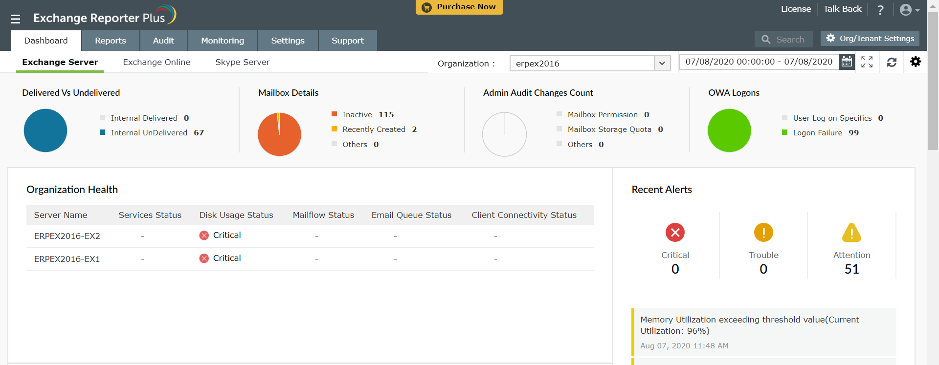
The Organization Health is also displayed, showing the status of services, disk usage, mail flow, the email queue, and client connectivity.
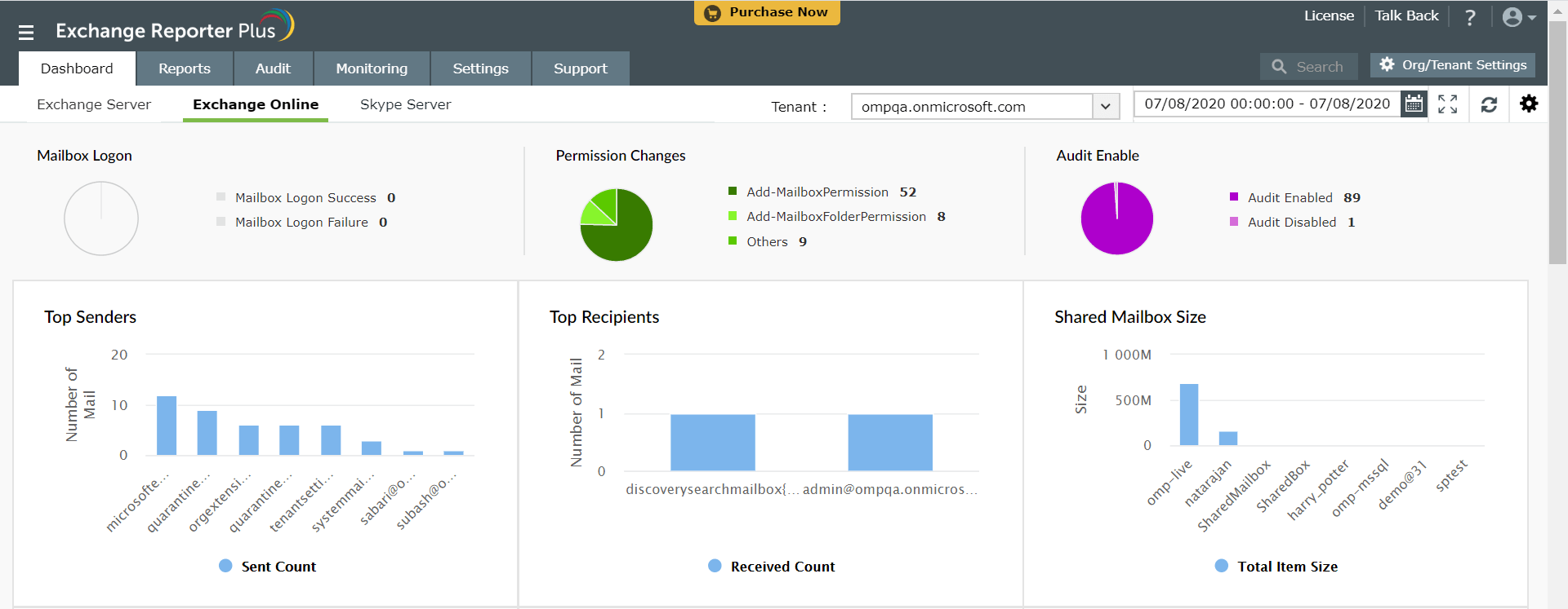
Exchange Online dashboard
These graphs display a summary of all major aspects of your Exchange Online environment, including top senders, top recipients, and mailbox size information.
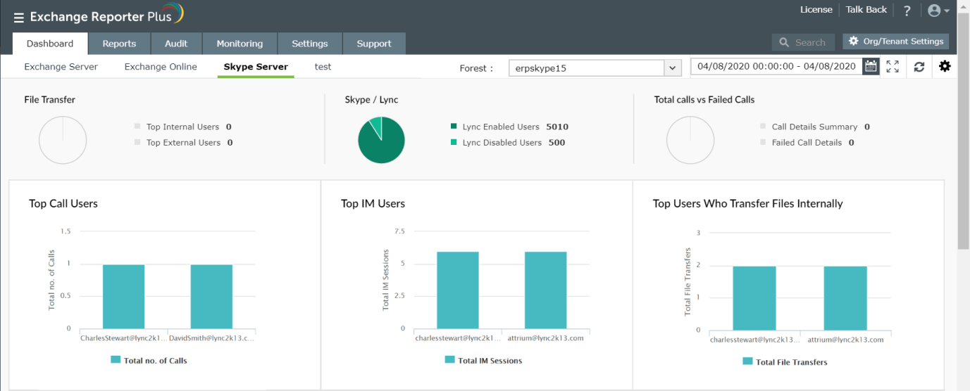
Skype Server dashboard
The Skype for Business graphs provide an overview of the instant messaging sessions, call details, file transfer information, and more.
Customizing the dashboard
To customize the dashboard page,
- Log in to Exchange Reporter Plus.
- Click the Dashboard tab.
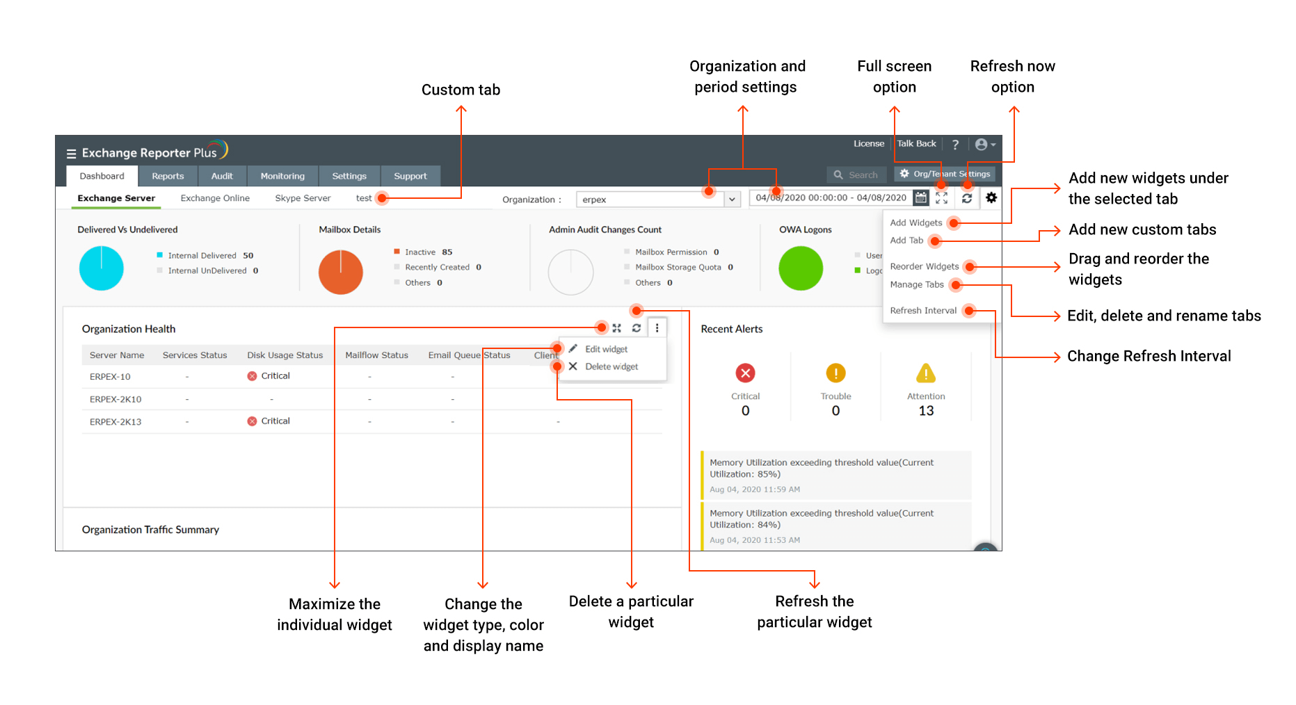
- Navigate across the top pane to find the Organization, Period, Full screen and Refresh now options as marked in the image below.
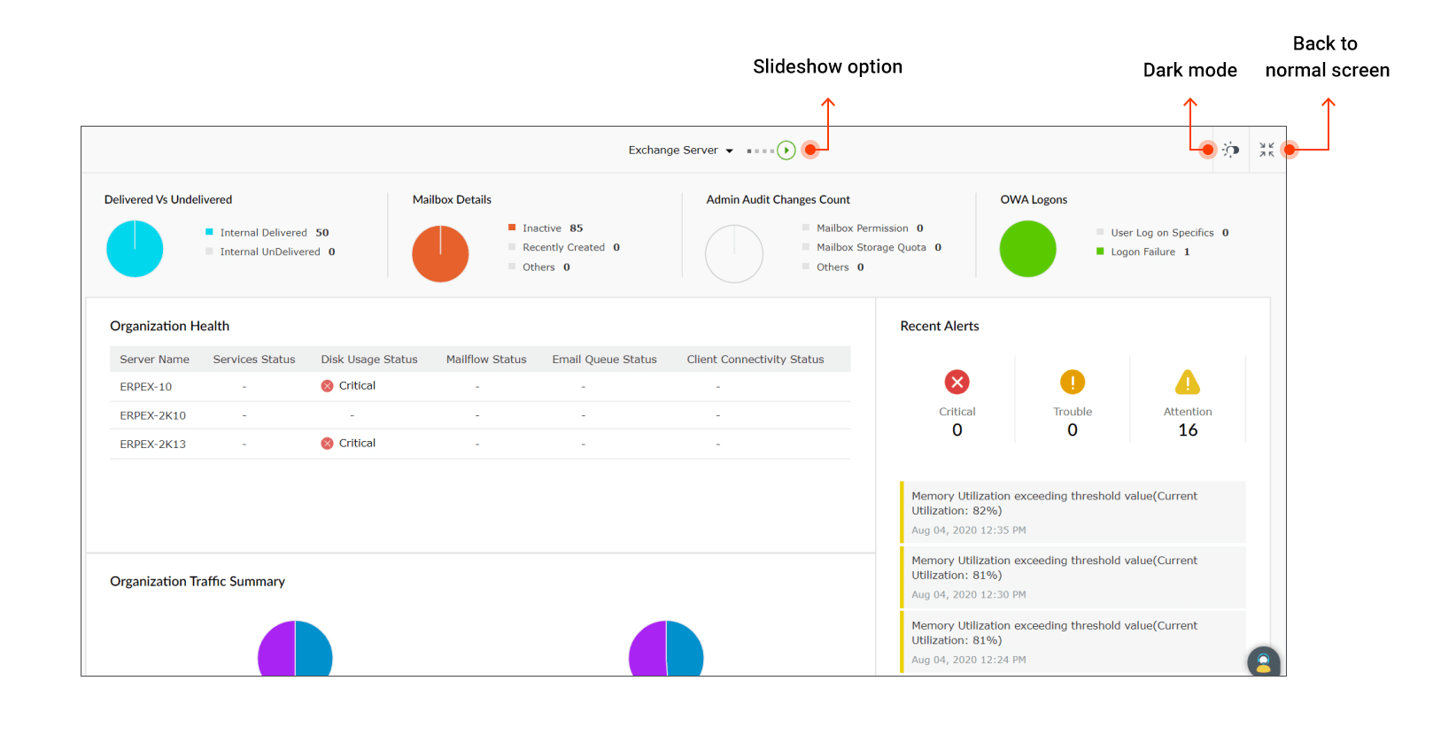
Note: Once you enter the full screen mode, you can use the Slideshow and Dark mode options as shown in the
image below.
- Click the
 icon to find the Add Widgets, Add Tab, Reorder Widgets, Manage Tab, and Refresh Interval options.
- To edit individual widgets, click the icon on the top-right corner of each widget, and choose the Edit widget option.
With the dashboard customization features available in Exchange Reporter Plus you can:
- Add custom tabs and widgets using the Add Widgets and Add Tab options.
- Edit, rearrange and resize the widgets using the Edit widget option.
- Rename and reorder tabs at any time using the Manage Tabs option.
- Get full-screen view of the dashboard with the dark mode and slideshow options.
- Change graph types (pie, bar, column, donut, area, and line graphs) with custom colors or change graphical widgets to data tables using the Edit widget option.
- View Exchange server, Exchange Online and Skype server data for different organizations and period.
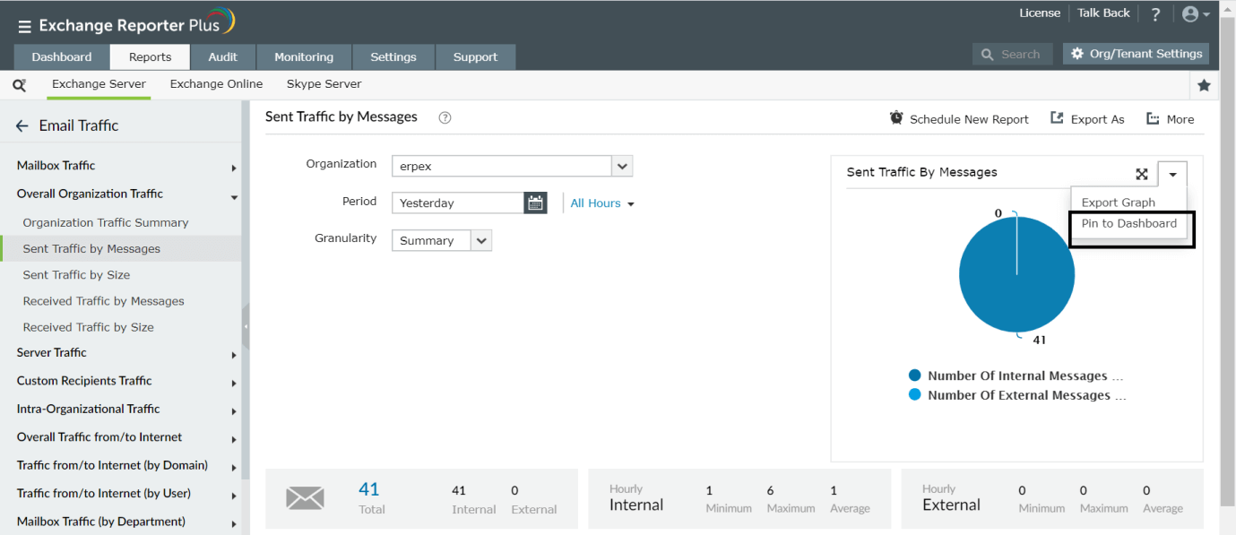
- Pin graphs directly from the reports (while generating them) to the custom dashboards.
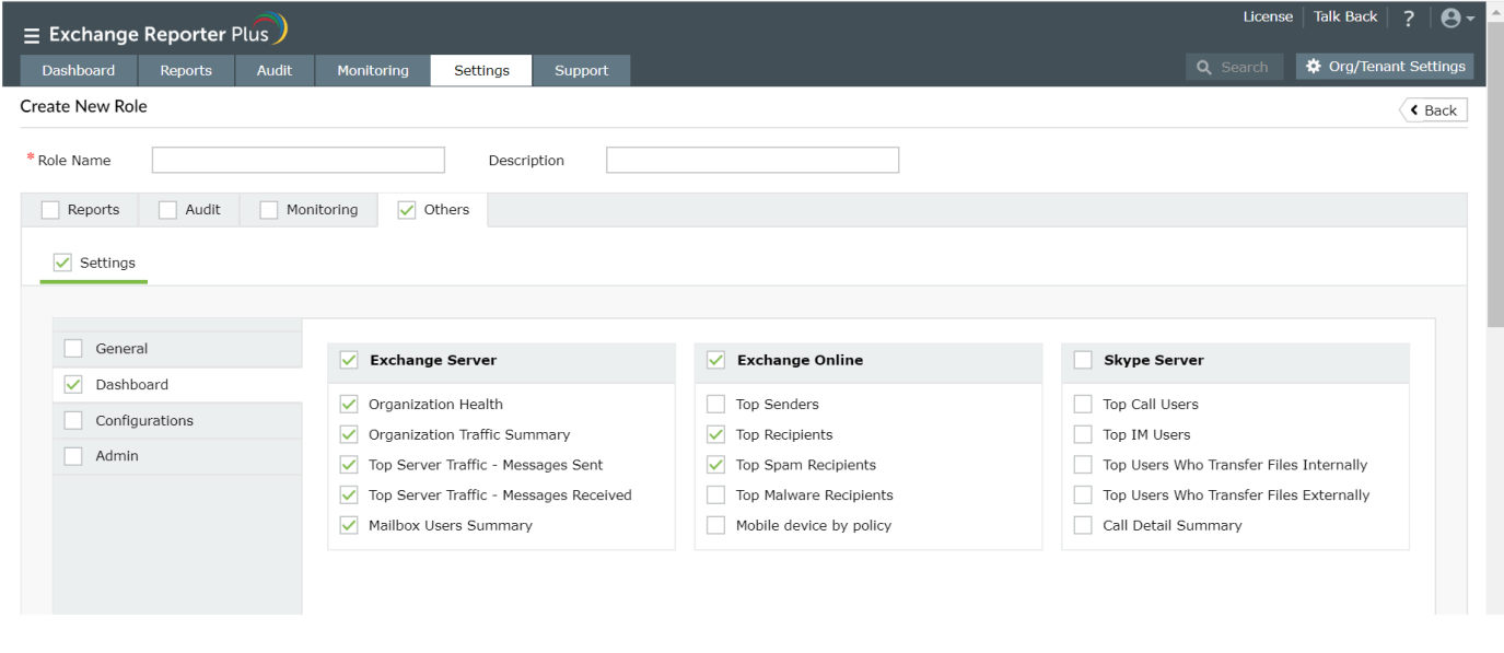
- Manage which dashboards can be viewed and edited by the technicians.
 ADManager Plus
 ADAudit Plus
 ADSelfService Plus
 M365 Manager Plus