- Overview
- Step 1: Collect actual consumption data
- Step 2: Aggregate into fleet-level metrics
- Step 3: Break down by device type
- Step 4: Track the trend
- What the output looks like
Share:
Sustainability reporting has a data problem that sits closer to IT than most organizations realize. In Deloitte's 2024 Sustainability Action Report, 57% of executives cited data quality as their single biggest ESG challenge — and 88% named it as one of their top three. With desktops, laptops, and workstations being a norm for all business to access digital workspaces, their energy consumption plays a significant part in that gap.
The figures that end up in an ESG report under energy consumption and carbon emissions have to come from somewhere, and for most organizations, that somewhere is still one of three things: a rough estimate, a manual export done once a year under deadline pressure, or nothing at all.
This guide walks through how organizations move from raw device-level power consumption data to a live ESG dashboard — covering what the data pipeline looks like, which metrics it produces, and what makes the result useful to a sustainability team rather than just an IT team.
Step 1: Collect actual consumption data from each device
Everything starts with measurement. The most common alternative is estimating energy use from device specifications or average wattage by device type. Although this produces a number, the actual consumption varies significantly based on workload, configuration, and usage patterns. This means that a single wattage figure applied across a fleet of 500 laptops would not be accurate.
Windows provides a direct route to measured device-level energy data through the System Resource Utilization Monitor (SRUM), accessible via the powercfg /srumutil command-line tool. Rather than modelling what a device should draw, SRUM reads what it actually drew at the component level — based on CPU activity, system events, and power state transitions during the previous day's operation.
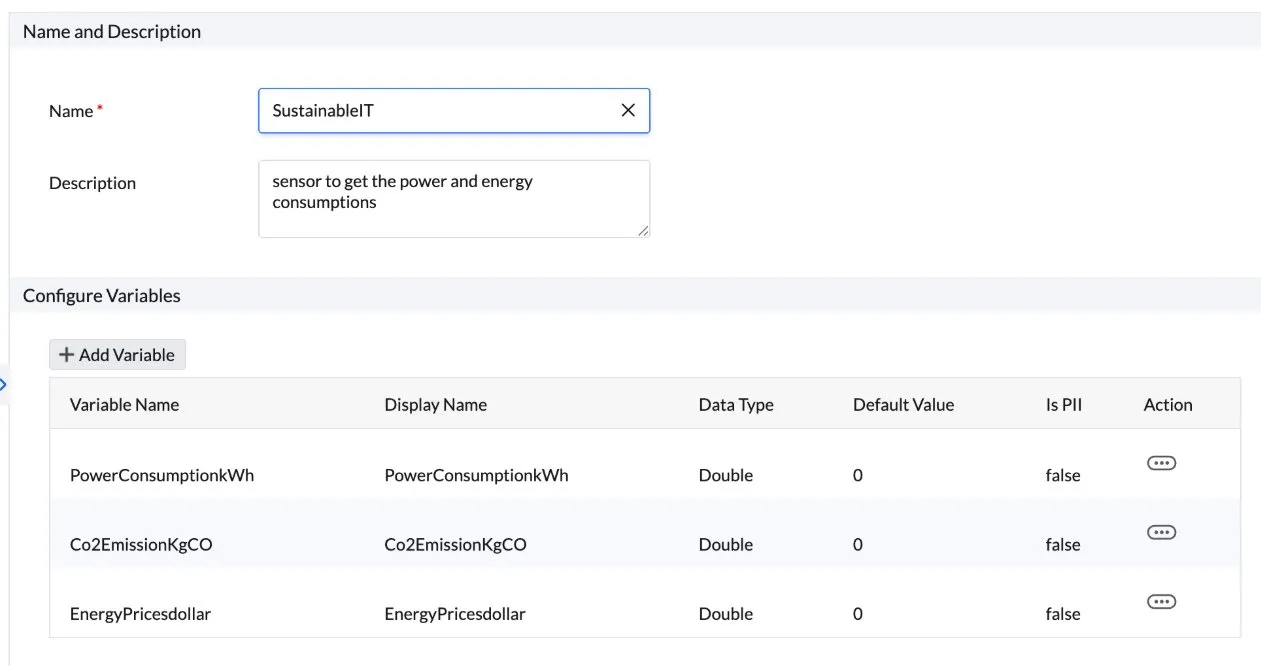
The sustainable IT sensor in DEX Manager Plus leverages this mechanism. When deployed as a sensor, it runs on all managed Windows endpoints — querying powercfg.exe /srumutil, and recording these three values per device:
- PowerConsumptionkWh: actual energy consumed by the device
- Co2EmissionKgCO: that figure converted to CO₂ equivalent using a configurable regional emission factor (the default is 0.5 kgCO₂/kWh, the US grid average)
- EnergyPricesdollar: cost of that consumption based on a configurable electricity price per kWh
No additional hardware. No manual queries. The sensor runs automatically and passes all three values to the dashboard.
Step 2: Aggregate device readings into fleet-level metrics
Individual device readings are the raw material. The dashboard's job is to turn them into the fleet-level figures that IT leadership, sustainability teams, and ultimately ESG reports actually use.
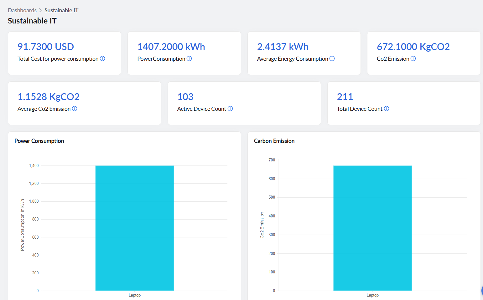
Five headline metrics sit at the top of the sustainable IT dashboard offered by DEX Manager Plus:
- Total power consumption (kWh): the sum of all device-level readings across the fleet for the reporting period. This is the Scope 2 activity figure: the total electricity your endpoints consumed. Under European Sustainability Reporting Standards (ESRS) E1-5, which governs energy consumption disclosure under Corporate Sustainability Reporting Directive (CSRD), the requirement is to report total energy consumption in absolute terms. This figure satisfies that requirement from an endpoint's scope.
- Average energy consumption per device (kWh): total consumption divided by the number of measured endpoints. This metric makes year-on-year comparison meaningful regardless of whether the fleet grew or shrank, and provides the per-device traceability that supports auditability.
- CO₂ emission (kg): the fleet's total carbon output from endpoint energy use, in kilograms. This feeds directly into Scope 2 GHG disclosure. Under ESRS E1-6, organisations must disclose gross Scope 2 GHG emissions in metric tonnes of CO₂ equivalent. Convert the kg figure to tonnes and this is that number for your endpoint estate.
- Average CO₂ emission per device (kg): per-device carbon intensity. Useful for tracking efficiency improvements independently of fleet size, and directly usable as an emissions intensity metric.
- Total cost for power consumption: electricity cost across the fleet, calculated from the kWh total and the configured energy price. Although this is not a requirement in these frameworks, it is often the number that gets a sustainability initiative onto an IT budget.
Step 3: Break the fleet average down by device type
A single fleet-wide average hides the variation that makes action possible. The dashboard's segmentation views answer a more useful question: which part of the fleet is driving consumption?
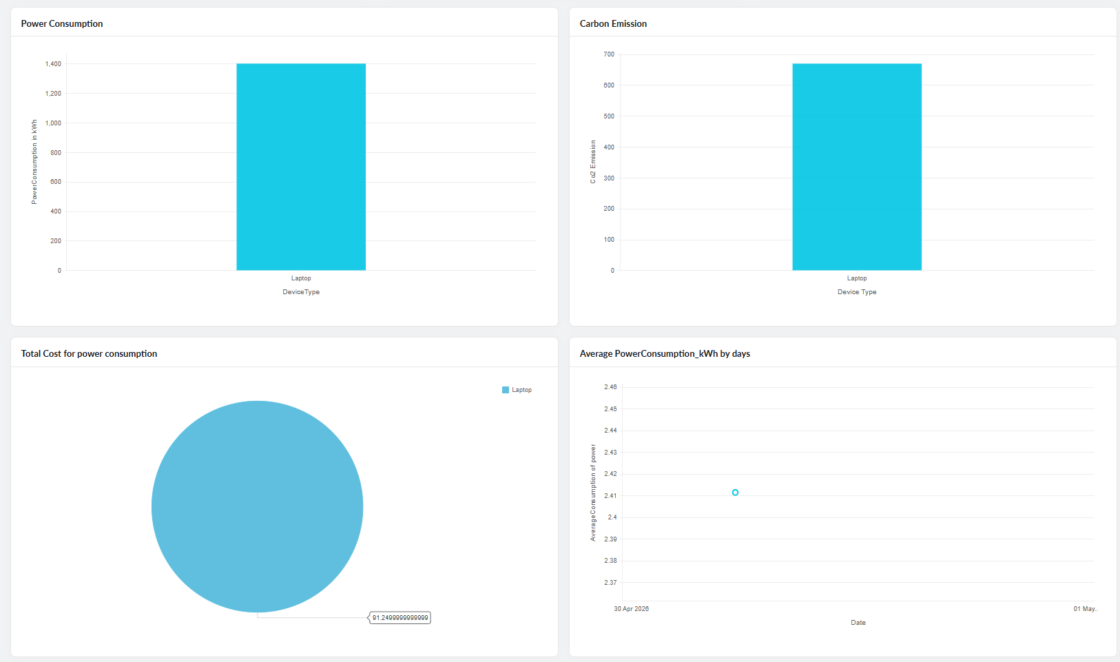
- Energy consumption by device type (kWh): a bar chart showing consumption broken out by device category. Laptops consume 3—10 times less electricity compared to desktops. Knowing which device types are carrying the most energy weight is the first step in targeting a reduction — whether through procurement policy, a targeted refresh cycle, or power configuration changes applied to the highest-consuming segment.
- Carbon footprint by device type (kgCO₂): the same segmentation expressed in carbon terms. The relative picture typically mirrors the energy chart, but this view shows where emissions are coming from within the IT estate, not just how much electricity was consumed in total.
- Total power expense by device type: a pie chart distributing electricity cost across device categories. This is the view that makes the device-type conversation tangible for a finance audience. When a desktop-heavy segment of the fleet is visibly responsible for a disproportionate share of the electricity bill, the case for a laptop-first procurement policy writes itself.
Step 4: Track the trend, not just the snapshot
A current reading tells you where you are. A trend tells you whether you are improving. This also helps with your Scope 2 disclosure for GHG, displaying that these metrics are continuously collected and not just one-off queries.
- Average power consumption by day (kWh): a daily line chart of per-device average energy consumption across the fleet. Because the sensor runs daily on every managed endpoint, this chart populates automatically without any manual input. With a weekly pattern in display, it allows your IT team to monitor whether a specific IT initiative is producing a measurable reduction in consumption — like a power policy rollout, a device refresh, or a configuration change.
It also catches problems. A spike on a particular day or across a particular site is worth investigating. Devices left running overnight, misconfigured power plans, or a specific model drawing abnormally high power all show up in this view before they accumulate into a material reporting error.
What the output looks like for a sustainability team
The end-to-end picture is straightforward. The sensor collects measured device-level data daily. The dashboard aggregates it into fleet totals, per-device averages, device-type breakdowns, and a daily trend series.
For a CSRD-aligned sustainability disclosure, teams typically need:
- Total energy consumption for the reporting period
- GHG emissions in metric tonnes CO₂e
- Relevant intensity ratios
- Disclosure of emission factors and their sources
- A documented methodology explaining data collection boundaries, assumptions, estimation techniques, and the proportion of operational activity or assets covered by measured versus estimated data
All of that comes from a single pipeline. The difference between an IT team that can produce it in an afternoon and one that scrambles to assemble it every year is whether continuous, device-level collection was made the default before the reporting period began — not after it ended.
