Device Timeline — Visual Endpoint Performance & User Activity View
Overview
The Device Timeline provides a chronological, visual view of system performance and user activity on an endpoint. It continuously collects key metrics and displays them on the device’s detail page as an interactive, time-based timeline.
This helps IT administrators quickly understand how a device behaves throughout the day and identify changes, trends, or anomalies without switching between multiple tools.
Why This Feature Matters
Device Timeline helps IT teams:
- Monitor device health proactively through regularly updated performance data.
- Identify performance spikes in CPU, memory, disk, GPU, or network usage.
- Correlate user activity with system behavior to accelerate root-cause analysis.
- Visualize trends over time instead of relying on isolated point-in-time data.
- Detect anomalies automatically with Zia insights that highlight abnormal events.
- Reduce troubleshooting time by consolidating behavioral data into a single view.
How the Device Timeline Works
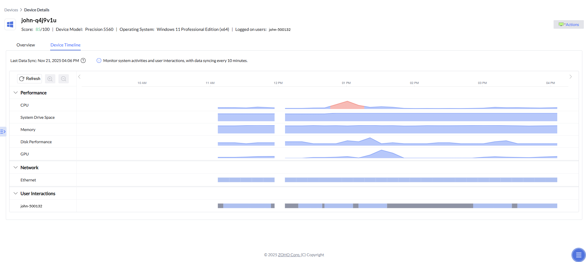
- Endpoint metrics are continuously collected in the background. Every 10 minutes, the system calculates the average values for performance metrics (CPU, memory, GPU, disk, drive space) from that 10-minute window and posts the aggregated data to the timeline.Events based metrics (Alerts,System Boots,etc) data captured at every minute and exact timeline of events is preserved. This ensures that the timeline reflects consistent, interval-based insights rather than moment-by-moment fluctuations.
- Each metric category (for example, Performance, Network, and User Interactions) appears as a separate horizontal timeline.
- Shaded blocks on a timeline represent activity or utilization within each collection interval.
- Hovering over a block displays usage details for that specific time slice.
- Clicking a block opens a detailed insights panel with specifications, usage breakdowns, and any related anomaly information.
- The timeline updates automatically after each data sync, so you always see the latest collected information.
Step-by-Step Instructions
1. Accessing the Device Timeline
To open the Device Timeline for a device:
- Navigate to the Devices view in the console.
- Select the device you want to investigate.
- Open the Device Timeline tab in the device details page.
On the Device Timeline tab, you will see:
- The last data sync time.
- Expandable metric groups (Performance, Network, User Interactions).
2. Reviewing Timeline Metrics
Under the Alerts & Errors, Performance, Network,Activity and User Interactions sections, the timeline can display metrics such as:
- Alerts & Errors - Capture Performance Alerts and Insights events (applicaation crash, High CPU usage, Memory usage,etc)
- CPU -CPU Usage, CPU Interrupts
- System drive space
- Memory - Memory Usage,Memory swap rate, size
- Disk performance - Disk Queue Length
- GPU
- Ethernet
- WiFi
- System Boot
- Configuration Changes - Software Installation and Uninstallation events
- Endpoint Central Actions - Technicians initiated actions (Configuration Deployments, Software Deployments, Patch Deployments and Remote commands)
- User activity patterns
Each metric appears as a track that displays activity across time, helping you spot spikes, dips, or unusual usage patterns at a glance.
3. Viewing Metric Details
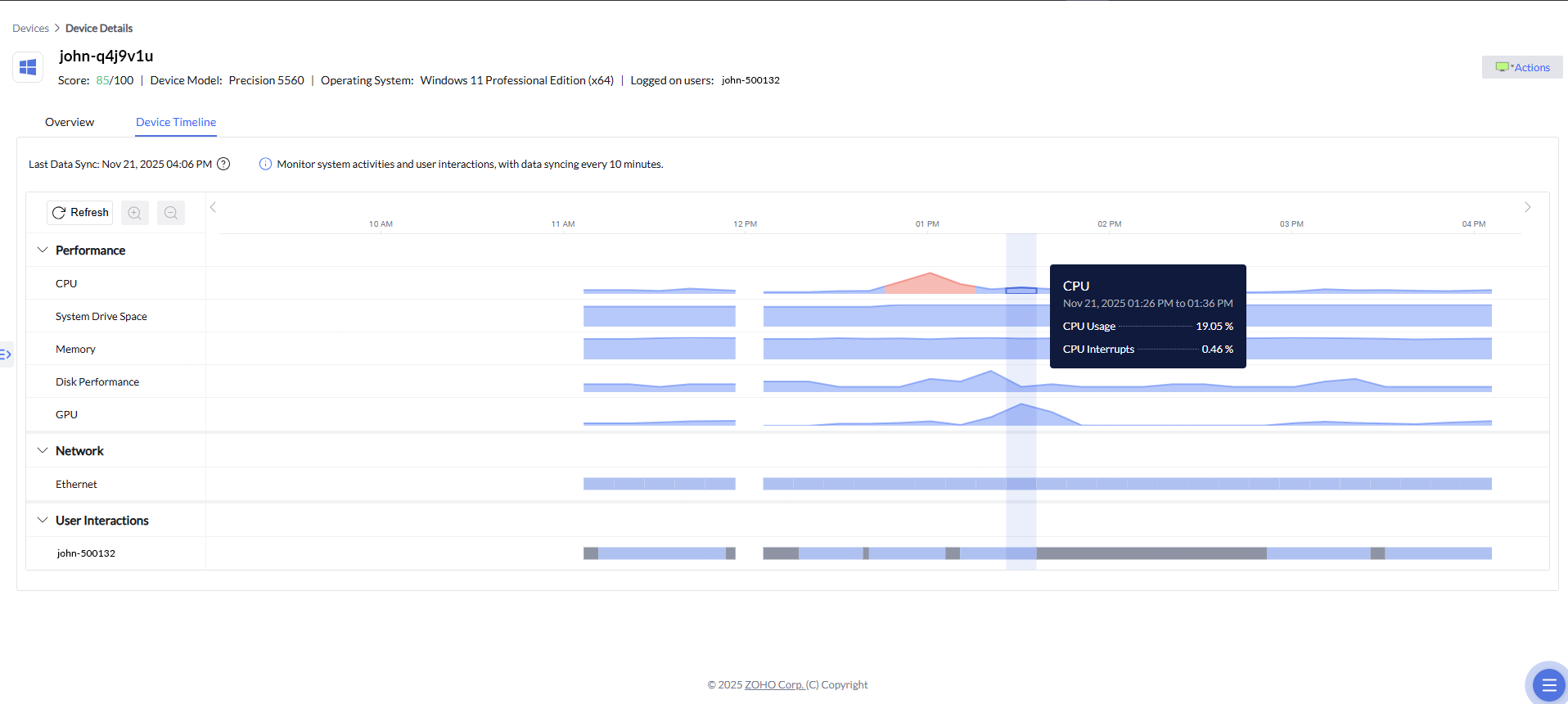
Hover over any activity block to see a quick summary, including:
- The time range for that block.
- Metric values (for example, CPU usage, interrupts).
- Use this on-hover data for a quick, lightweight review without opening the full details pane.

Click a block to open a detailed pane that shows:
- Hardware or subsystem specifications.
- Usage details for the selected time period.
- Any relevant anomaly alerts associated with that time slice.
4. Navigating the Timeline
Use the horizontal scrollbar below the charts to move to earlier or later time periods. Timeline supports zoom-in to 6 hours and zoom-out to 48 hours per view, with horizontal scroll to move across data. You can switch to date from last 7 days filter and access particular day data.
Scroll vertically to switch between different metric categories and tracks.
Use the Refresh button to manually request the latest available data from the endpoint.
Zia Anomaly Detection
Zia Anomaly Detection helps identify unusual system behavior by continuously analyzing CPU, GPU, memory and Disk queue length activity for each device. These metrics are fed into a machine learning model that learns the normal performance baseline over time.
When the model detects a significant deviation ( 10% deviation threshold from the learned baseline) from this established baseline, it generates an anomaly insight. These insights highlight unexpected spikes, drops, or performance irregularities and are surfaced directly to administrators for faster troubleshooting and root-cause identification.

In the example below, Zia highlights:
- CPU usage significantly higher than the expected range.
- The normal operating range for comparison.
- An automatically generated insight explaining the deviation.
These insights are extremely helpful when diagnosing performance abnormalities or understanding sudden changes in device behavior.
Scenario
An IT technician receives a ticket stating, "My laptop was sluggish around 2 PM."
The technician opens the affected user's Device Timeline for that day. On the CPU track, Zia has highlighted a red anomaly band at 1:55 PM, indicating that CPU usage ran well above the device's normal baseline. Hovering on the band reveals 94% CPU for that 10-minute window, and the Top Contributing Processes panel names a browser process as the primary consumer.
Just two minutes earlier, at 1:52 PM on the Configuration Changes track, a browser auto-update event sits directly above the spike. On the Endpoint Central Actions track, no technician action was recorded in that window, confirming the change did not originate from IT.
The technician clicks the CPU anomaly, reviews the Zia anomaly message, and rolls back the browser update.
Root cause identified in under a minute, from a single screen.