Forecasting
Analytics Plus allows you to predict future data trends effectively, using the forecasting feature. It is based on powerful forecasting algorithms that analyze your past data in depth, and come up with the best forecast for the future. You can set up forecasting in charts within minutes, without worrying about the underlying complexity.
Setup
- What is Forecasting?
- What are the various prerequisites to set up forecasting?
- How do I set up Forecasting?
- Can I set up forecasting over multiple Y-Axis?
- Can I set up forecasting over a chart with colors?
- How does forecasting work in Analytics Plus?
- Why are the forecasted points shown differently for the shared users?
- Is the underlying data option available for forecasted data points?
- Can I view the forecast model information applied to the data?
Troubleshooting Tips
- Forecasting is disabled as the data is completely ignored.
- Forecasting is disabled as there is not enough data to identify pattern.
- Forecasting is disabled as there are more than 40% empty values.
- Column cannot be forecast as more than 5 data points is required.
Setup
1. What is Forecasting?
Forecast in Analytics Plus is based on powerful forecasting algorithms which predict future trends based on deeply analyzing past data.
2. What are the various prerequisites to set up forecasting?
The following are the prerequisites to set up forecasting:
- A minimum of seven data points are required to ensure accurate forecasting.
- The chart should be in one of the following types: Line chart, Bar chart, Stacked Bar chart, Scatter chart, Area chart, Stacked Area chart, Web chart, and Combo chart (without Bubble charts).
- The X-axis of the chart should contain a date column.
- The Y-axis should contain at least one metric column.
- At least 60% of the past data points should not be null.
- Numeric columns cannot be used as filters in the chart, as forecasting based on filtered data may provide inaccurate results.
- Analytics Plus supports forecasts for trend lines, what-if analysis, and anomaly detection.
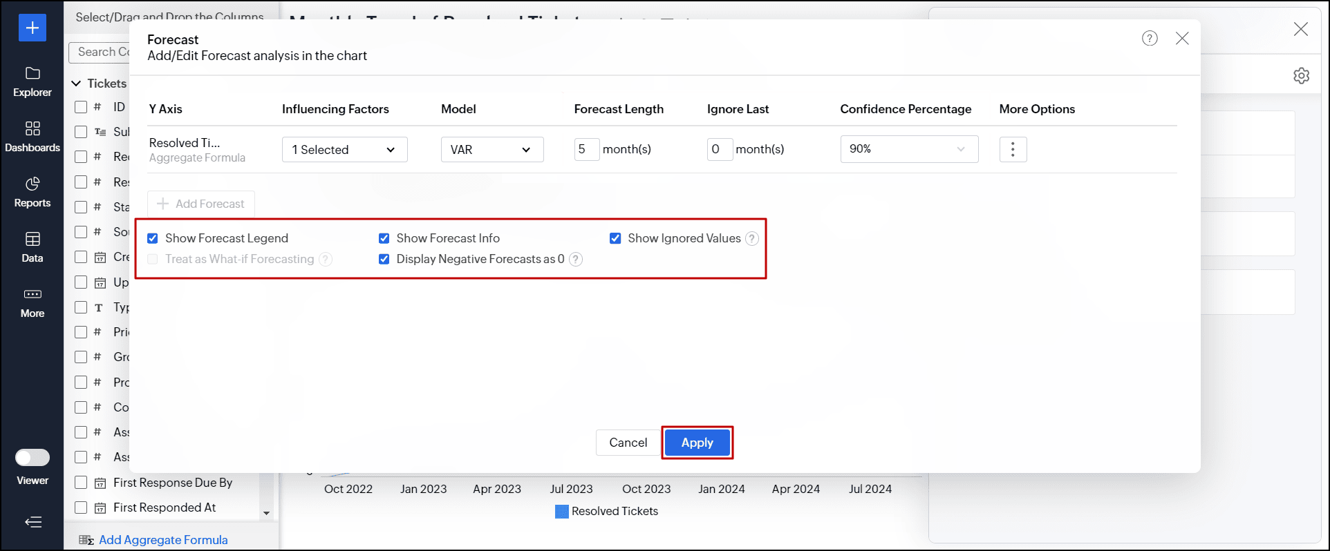
3. How do I set up Forecasting?
To set up forecasting in charts, follow the steps below:
- Open the required chart for which you need to set up forecasting in Edit Design mode.
- Click the Analysis button, and choose the Forecast option.
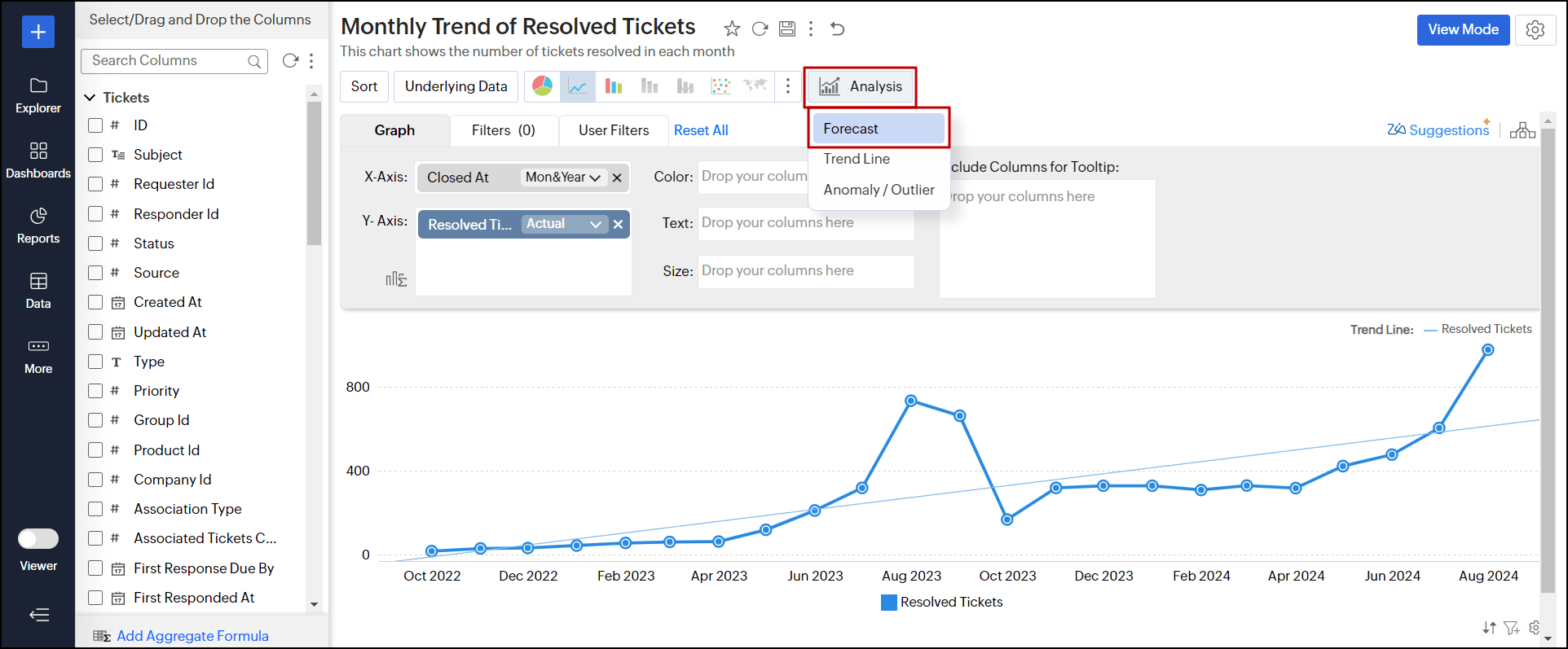
You can also navigate to Settings > Analysis tab > expand the Forecast section and click the + Add Forecast link.
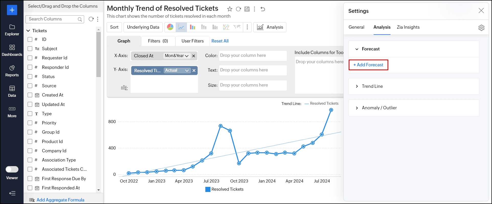
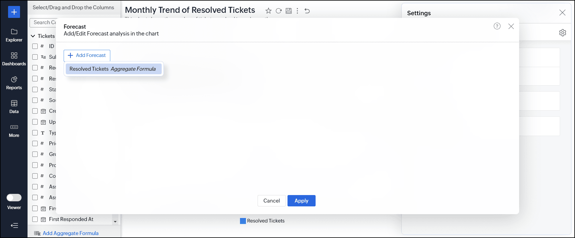
- In the dialog that appears, click the + Add Forecast button and choose the column for which you intend to forecast values.
- Select the dependent factors (columns) for prediction from the Influencing Factors drop-down. It helps to enhance the accuracy of forecasting by accounting for closely related factors that affect the metric being forecasted. For instance, including influencing factors like the availability of technicians or the average resolution time of individual technicians in this example can help achieve more precise forecasts. You can add a maximum of five influencing factors to forecast data.
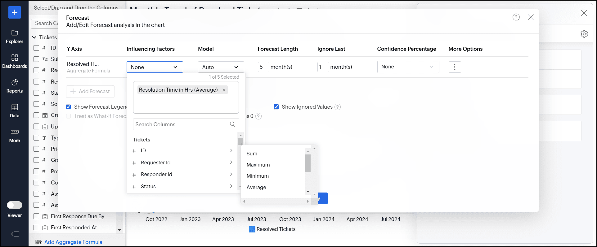
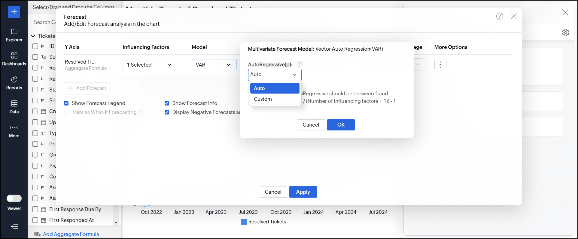
- The best forecast Model is auto-selected based on the characteristics of the data. The Vector Auto Regression model is applied by default when you choose the influencing factors for forecasting.
However, you can also choose the model and specify the parameters for analysis. Refer to the forecasting models document to learn more.
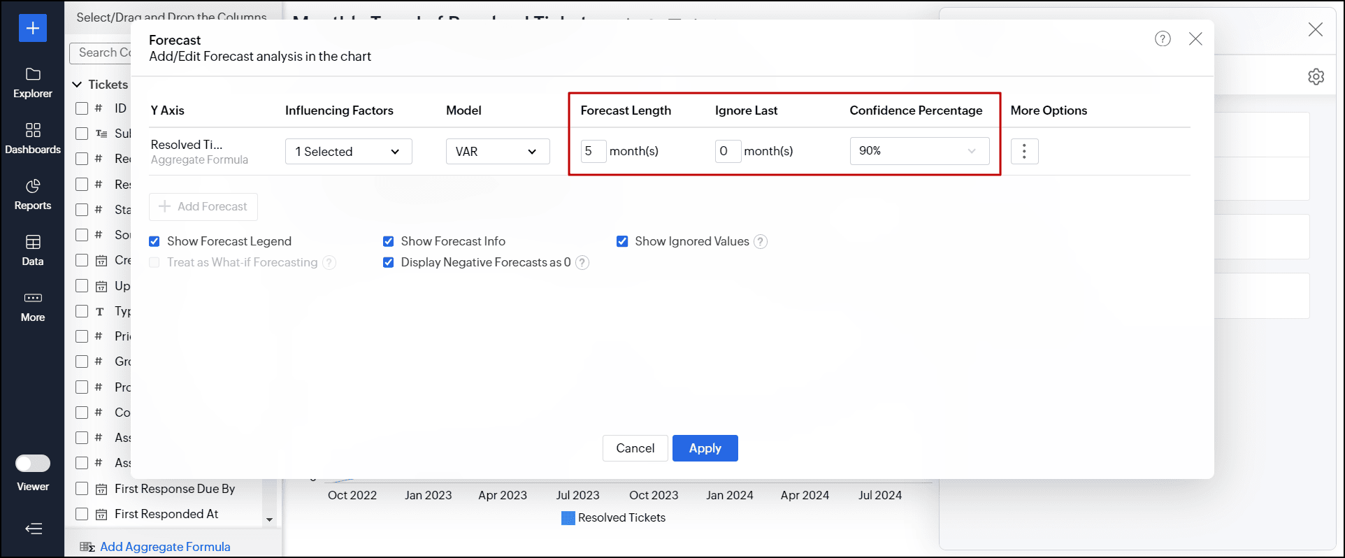
- Specify the number of data series you need to forecast in the Forecast Length field.
- In the Ignore Last field, provide the number of data series to be ignored while forecasting the data. It helps exclude cases where the data might be incomplete for the last or current period and cross-verify if the chosen model predicts the correct value.
- Choose the confidence interval in which the data point is likely to occur from the Confidence Percentage drop-down. Please note that this option applies only to the line chart.
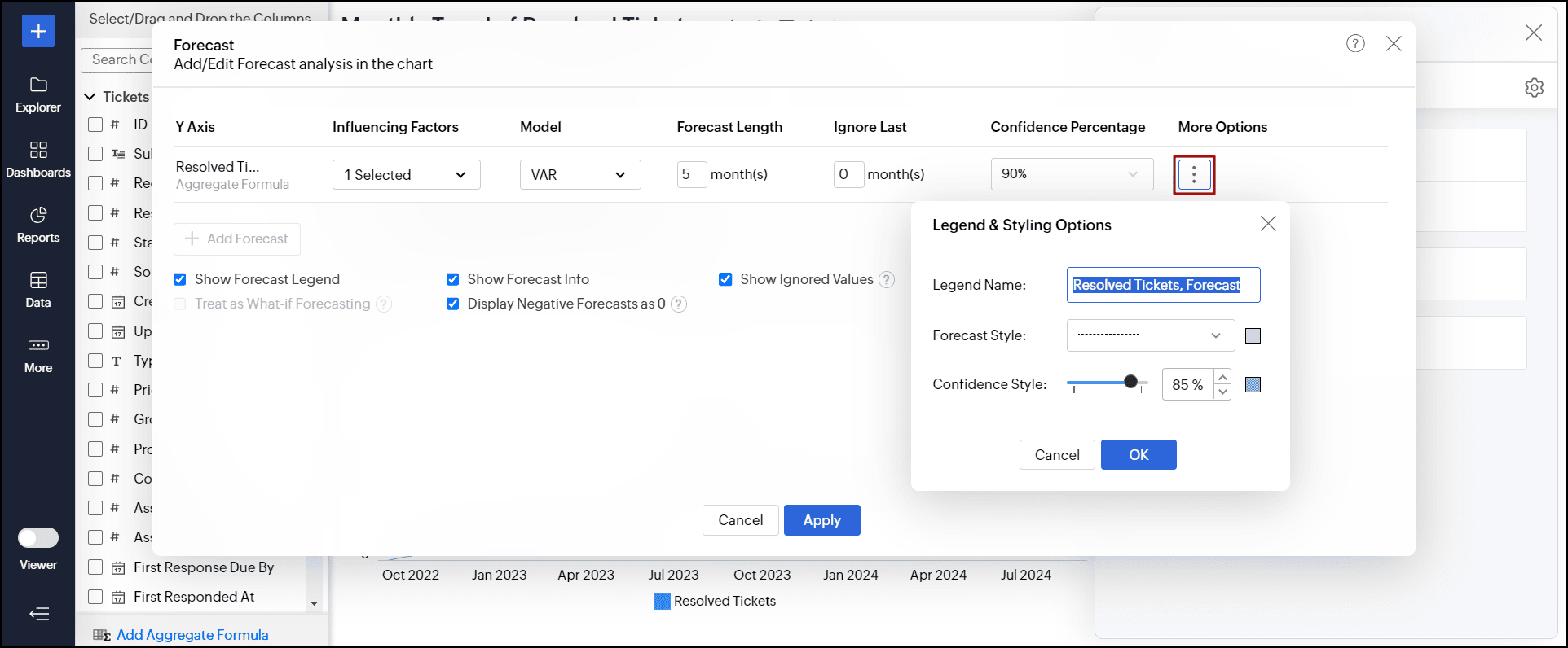
- Click the More Options icon to customize the Legend & Styling options.
- Provide a title for the forecasted series in the Legend Name field.
- Choose the required color and the line format for forecasting the data using the Forecast Style option. If you have chosen a confidence percentage, you can select the required style using the Confidence Style option.
- Click the + Add Forecast option to apply forecast for more than one metric column (multiple y-axes).
- Select the following options as required:
- Show Forecast Legend: Displays a legend to differentiate between forecasted and actual values.
- Show Forecast Info: Displays detailed information about the models used for forecasting and performance metrics. Enabled by default, users can access the forecast information in both View and Edit Design modes.
- Show Ignored Values: Shows the values that were excluded from the forecasting process.
- Treat as What-if Forecasting: This option forecasts future outcomes by selectively changing inputs through variables and user filters.
- Display Negative Forecasts as 0: This option replaces all the negative forecasted values with 0.
- Click Apply.
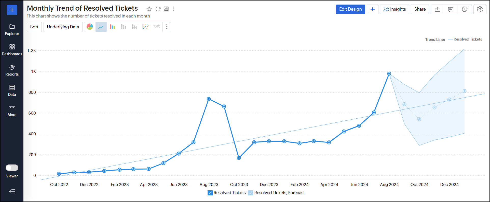
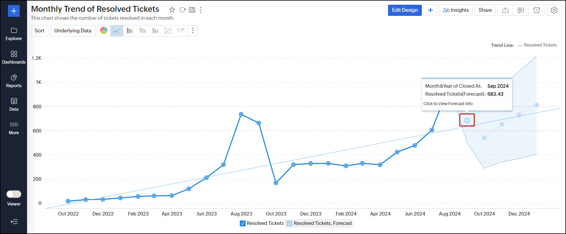
The following line chart is forecasted with a 90% confidence score.
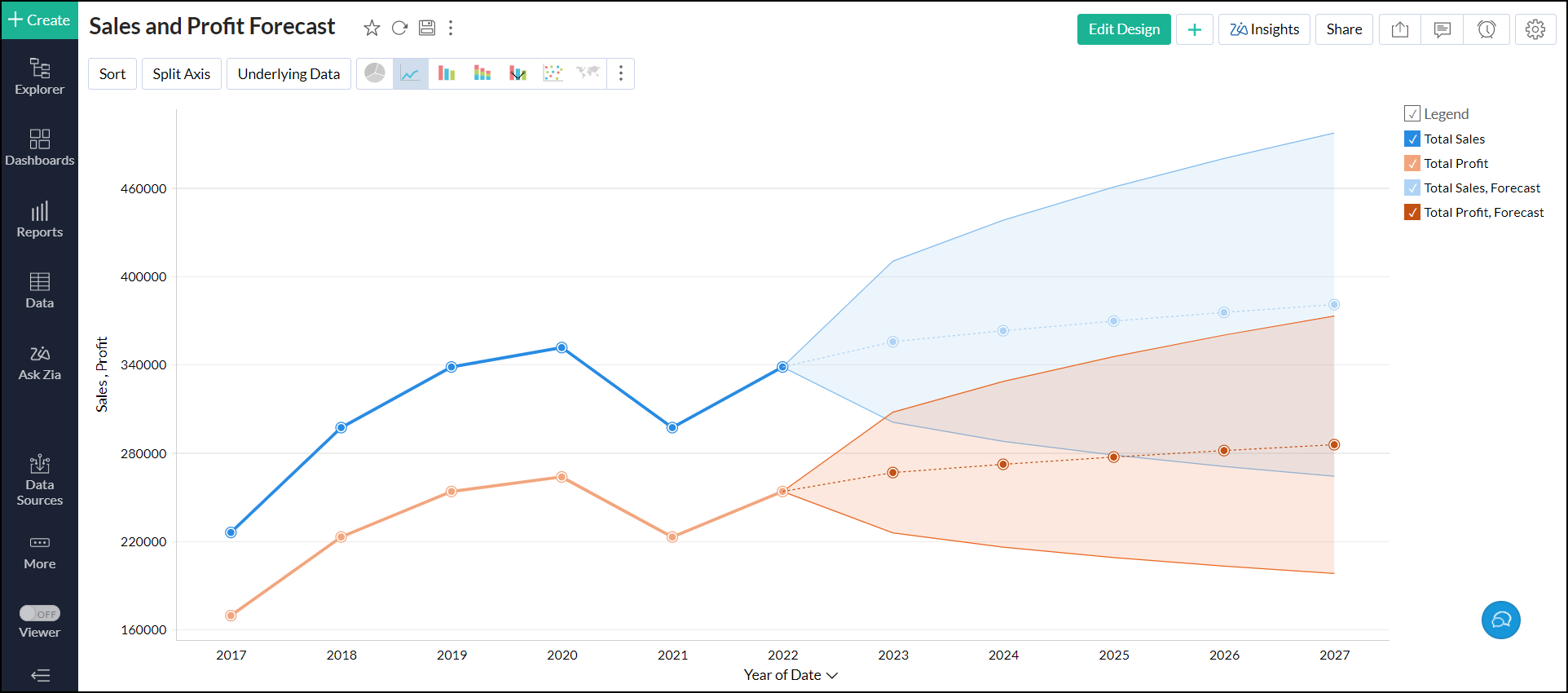
4. Can I set up forecasting over multiple Y-Axis?
Yes. Analytics Plus allows you to set up forecasting over multiple Y-axis in charts.
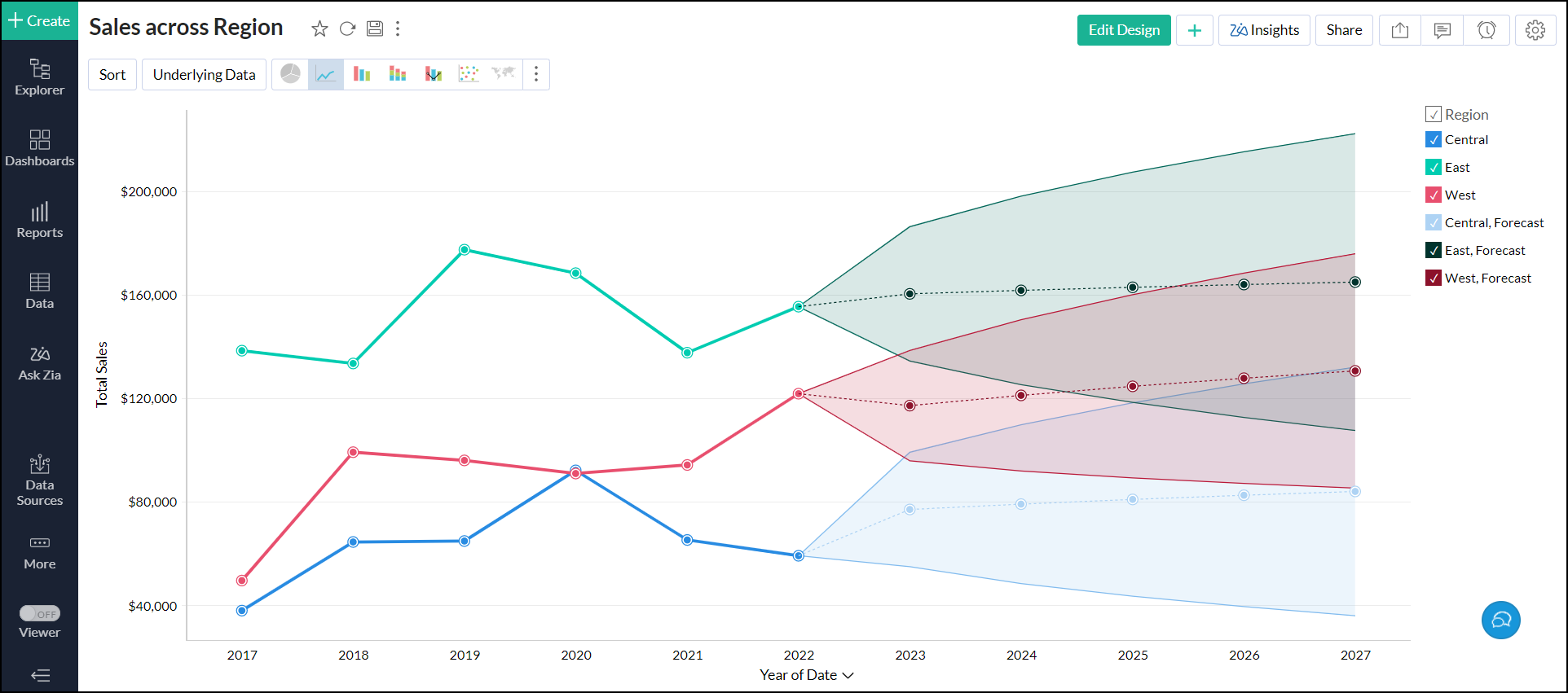
5. Can I set up forecasting over a chart with colors?
Yes. Analytics Plus enables you to set up forecasting in charts that have columns on the Color shelf. To do this, apply forecasting based on Y-axis to forecast all the color series.
6. How does forecasting work in Analytics Plus?
Analytics Plus offers a powerful forecasting engine that predicts future data points based on past data. The forecasting engine offers a range of customization such as the number of units to be forecasted, the number of data points to be ignored in the past data and the formatting to be applied over the forecasted data points.
The following points detail how forecasting works in Analytics Plus:
- The forecasting engine analyses past data points and identifies periodicity using autocorrelation techniques.
- The seasonality, trend, and randomness of the data are computed, which is then fine-tuned using iterative processing.
- The forecasting engine then runs linear, logarithmic, and exponential regressions to categorize the data series as linear, logarithmic, or exponential.
- The accuracy of these predictions is verified using hindcasting. This is a type of backtest that uses the prediction results to estimate past data points and verifies it with the actual data from the past.
- Once the verification is complete, the forecasting engine displays the forecasted data points.
Click here to learn more.
7. Why are the forecasted points shown differently for the shared users?
If you have shared the chart with different filter criteria to users, then the number of past data points will vary for different users. Hence the forecasted points are also different for shared users.
8. Is the underlying data option available for forecasted data points?
No. Analytics Plus does not generate any underlying data for the forecasted data points. So the View Underlying Data and Drill Down options are not able for the forecasted data points.
9. Can I view the forecast model information applied to the data?
Yes, Analytics Plus lets you view the forecast model information applied over the charts. It provides details about the model used and statistical data to assess the accuracy of the forecasting model. This option becomes available once forecasting is applied. The information is specific to each metric being forecasted.
Analytics Plus lets you access the forecast model information in both the View and Edit Design modes. To do this, follow the below steps.
In View mode, click any one of the forecasted data points.
In Edit Design mode, click the Settings icon > Analysis tab > expand the Forecast section and click the Edit link. In the dialog that appears, click the Forecast Info icon that appears on mouse over the required forecast.
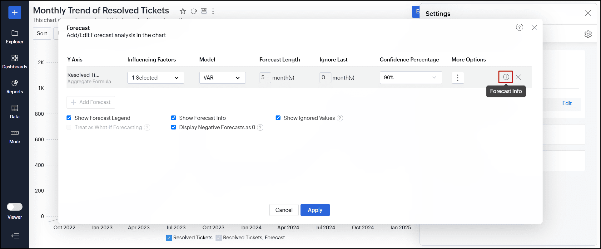
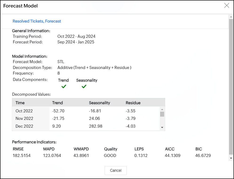
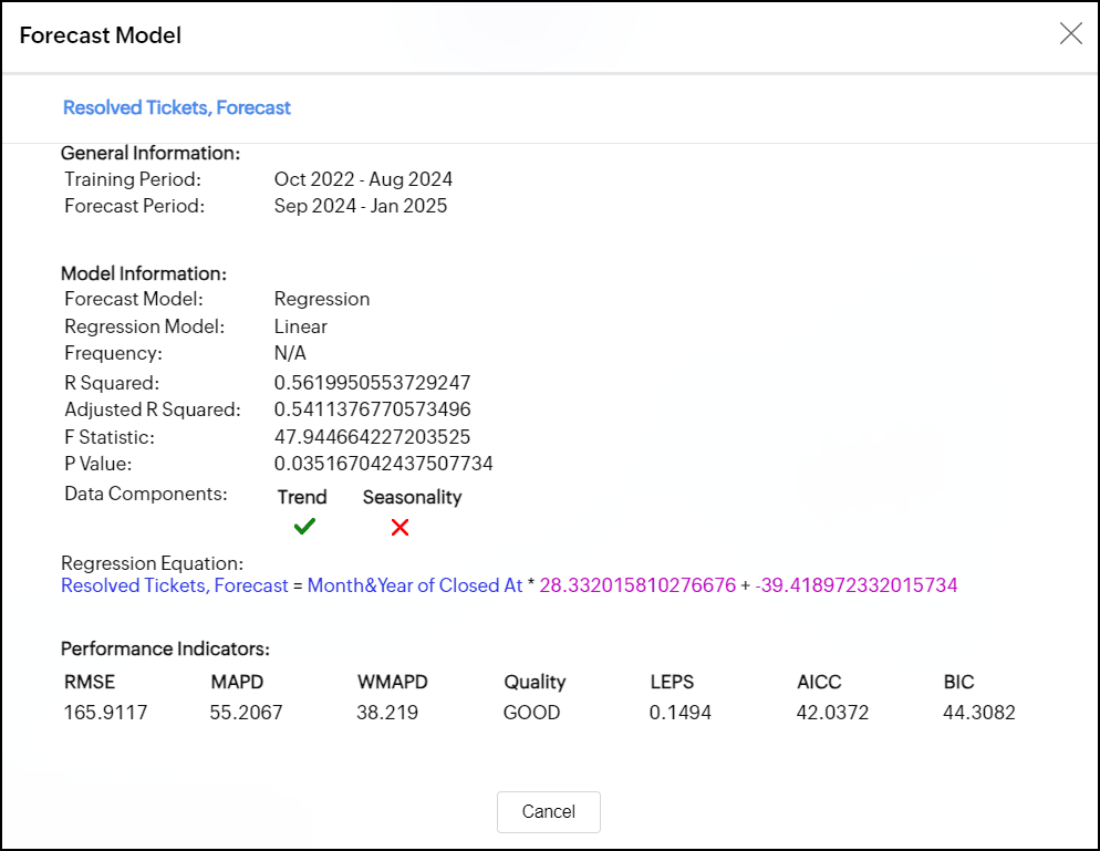
The forecast model dialog appears with the following information:
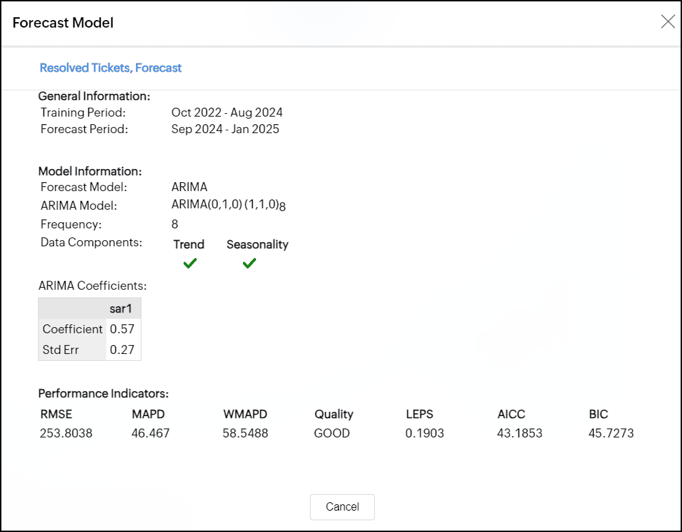
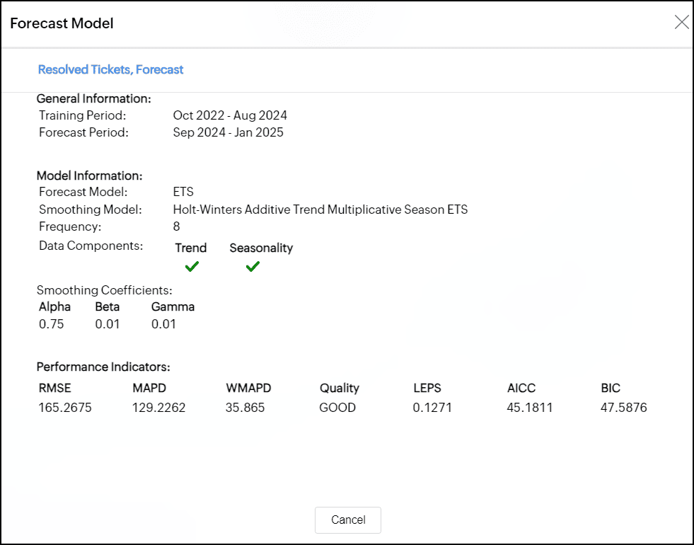
General Information
This section displays the following information:
- Training Period: Displays the historical data range used for forecasting data points.
- Forecast Period: Displays the time frame for which the data is forecasted.
Model Information
This section displays the type of forecast model applied over the chart.
- Forecast Model: Displays the Forecast model used for prediction. Analytics Plus supports five prediction models: ARIMA, STL, ETS, Regression, and Vector Auto Regression.
- Sub Model: Displays the name of the sub-model applied over the chart.
- Frequency: Gives the frequency of the time series.
- Data Components: Displays whether trend and seasonality are present in the given data.
Elements of the forecast models
This section displays the sub-methods and parameters or coefficient values of the forecast model used for analysis.
ARIMA Model
The ARIMA model forecasts time series values by analyzing past data, incorporating both seasonal and non-seasonal trends. The non-seasonal component accounts for overall trends and short-term fluctuations that lack a consistent pattern, while the seasonal component identifies recurring patterns at regular intervals.
The ARIMA model is characterized by three main parameters:
- AR (AutoRegressive): This part uses past values of the time series to predict future values. It is denoted as p, the number of past values used to predict future ones. For example, if p = 2, the model uses the two most recent values to make a prediction.
- Integrated (d): This parameter helps make the time series stationary, meaning its characteristics do not change over time. It is represented as d, the number of times we need to adjust the data to remove trends or seasonal patterns so it behaves consistently.
- MA (Moving Average): This part looks at the relationship between a data point and the errors from previous predictions. Unlike AR, which relies on past values, MA uses past forecast errors to help make predictions. It is denoted as q, the number of past errors we consider in the Moving Average (MA) part to make forecasts.
In ARIMA value (p, d, q) (p, d, q)m, the first ordered triplet (p, d, q) represents the non-seasonal component, and the second ordered triplet represents (p, d, q)m represents the seasonal component.
Exponential Smoothing
Exponential smoothing is a forecasting method that predicts future values by taking an average of past observations, with more weight given to recent data.
STL
In the STL model, the data is divided into three components: Trend, Seasonality, and Residuals. The model info dialog provides details about the decomposition method and decomposed values used for smoothing the parameters.
Regression
Regression is a statistical method that helps to understand and model the relationship between a dependent variable and one or more independent variables. The forecast info dialog shows the Regression model and the statistical methods used to assess its performance. The types of regression models include linear, logarithmic, exponential, power, and polynomial.
The following are the statistical methods used to assess the performance of the regression model.
- R-Squared: This measures how well the model fits the data by indicating the proportion of variation in the dependent variable that can be explained by the independent variables. It shows what percentage of changes in the outcome are explained by the factors in the model.
- Adjusted R-Squared: This adjusts the R-Squared to prevent over fitting. The model with the highest Adjusted R-Squared is preferred, as it indicates a better fit without unnecessary complexity.
- F-statistic: This assesses the overall significance of the model, checking whether the independent variables collectively have a statistically significant effect on the dependent variable.
- P-value: This evaluates the significance of individual independent variables in the model, helping to determine if the relationship between the independent and dependent variables is statistically meaningful.
Vector AutoRegression
A Vector AutoRegression (VAR) model is used when multiple time series affect each other. Each series' forecast relies on its past values and the past values of the other series. This model is applicable only when influencing factors are selected for forecast.
The forecast info dialog shows how many past observations are used. In a VAR(p) model, p indicates the number of periods the model looks at past values to make predictions.
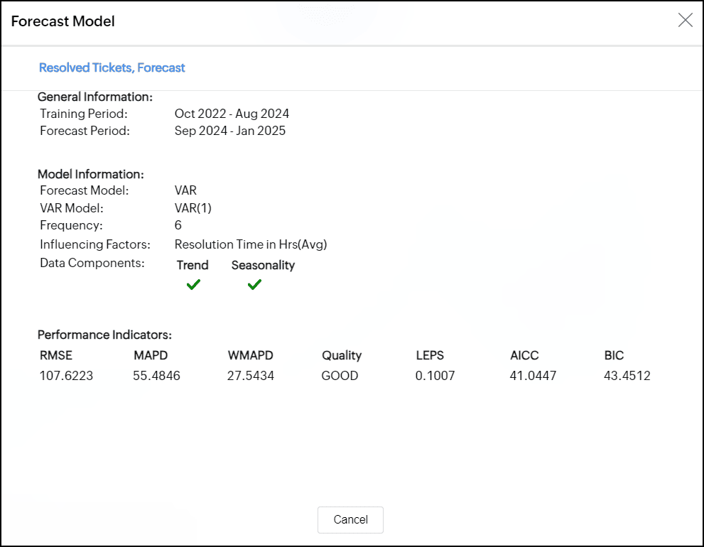
Performance Indicator
- Root-Mean-Square Error: The RMSE calculates the mean difference between actual and forecasted values.
- Mean Absolute Percentage Deviation: The MAPE calculates the average absolute percentage difference between actual and forecasted values.
- Weighted Mean Absolute Percentage Difference: The WMAPD calculates the average of the absolute percentage deviations between the actual and forecasted values, with each deviation weighted according to a specified criterion.
- Linear Error in Probability Space: The LEPS calculates the mean absolute difference between the forecast cumulative distribution value and the observation. The quality of the forecast model is given based on LEPS.
- Quality: The Quality of the forecasting model is decided based on the LEPS value.
- If LEPS is greater than 80%, the forecast model accuracy is considered Good.
- If LEPS is between 30% and 80%, the model's accuracy is deemed Acceptable.
- If LEPS is less than 30%, the accuracy is classified as Poor.
- Bayesian Information Criterion: The BIC is another method used for model selection in statistics.
Troubleshooting Tips
1. Forecasting is disabled as the data is completely ignored.
This error occurs when the ignore all the past data points from Ignore Last setting is enabled. Disable the setting to resolve the error.
2. Forecasting is disabled as there is not enough data to identify pattern.
This error occurs when there is no sufficient data produced to the forecasting engine to come up with forecasted data points.
3. Forecasting is disabled as there are more than 40% empty values.
This error occurs when the given data points have more null values. Null values might lead to inaccurate forecasting of data, so the forecasting engine discards the process when the null values are more than 40% in the given data.
4. Column cannot be forecast as more than 5 data points is required.
This error occurs if the data points to be considered for forecasting are less than 5 points. To produce an accurate forecast, the chart should contain more than 5 data points.