Chart Types Primer
- Pie Chart
- Ring Chart
- Bar Chart
- Butterfly Chart
- Stacked Chart
- Scatter Chart
- Line Chart
- Bubble Chart
- Bubble Pie Chart
- Heat Map Chart
- Combination Chart
- Area Chart
- Funnel Chart
- Web Chart
- Map chart
- Histogram
- Chart type KPI Widgets
You can create various types of charts such as Area, Bar, Bubble, Line, Pie, Stacked, Scatter, Funnel and Web charts by simply dragging and dropping the required columns into the respective shelves in the design area.
Before we proceed any further into understanding the chart types and the combination of columns that can be used to create them, it is necessary that we first know about the functions associated with each column.
Listed below are the associated functions used in Analytics Plus:
- Dimension: a column that has discrete values (eg. String and date column).
- Aggregate: a column with an aggregate function applied contains aggregate values like sum, average etc. This even includes aggregate formula columns.
- Measure: Measure column is nothing but a column containing numerical values that can be measured.
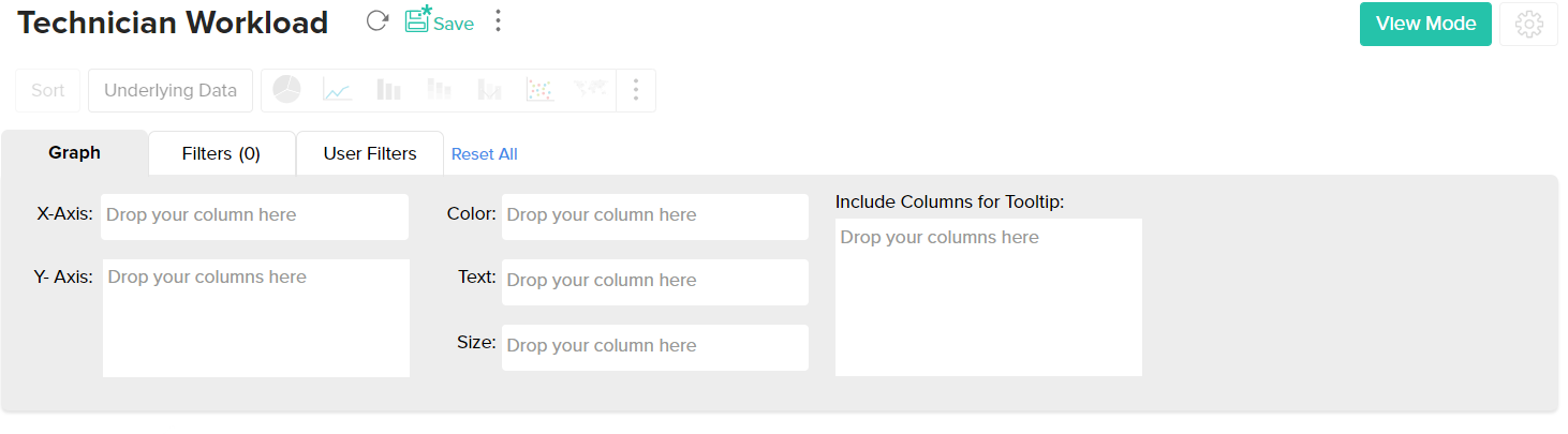
The chart designer looks as shown below. You can create charts by simply dragging and dropping the columns in their respected shelves. To know much more in detail about creating charts, you can refer to this help documentation.
The chart types that are not applicable for the combination of columns that you use while creating the chart will appear faded (disabled). Let us now see in detail about each chart type and the combination of column types used to create them.
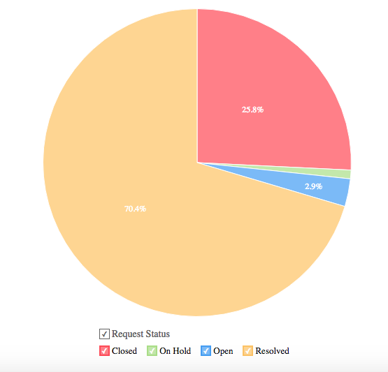
Pie Chart
Pie charts are used to represent percentage or proportional data. A pie chart can be converted to any of its equivalents like ring chart, funnel chart, bar chart, line chart, scatter chart, area chart or web chart.
Given below is a combination of column types which when dropped in the mentioned shelves will help you generate a pie chart.
| X axis | Y axis | Color | Text | Tooltip |
Case 1 | Dimension | Aggregate | -- | Aggregate/ Measure (Optional) | Aggregate/ Measure (Optional) |
Case 2 | Dimension/ Aggregate | Optional | -- | Aggregate/ Measure (Optional) | Aggregate/ Measure (Optional) |
Case 3 | Optional | Aggregate/ Dimension | -- | Aggregate/ Measure (Optional) | Aggregate/ Measure (Optional) |
Example: Requests by status
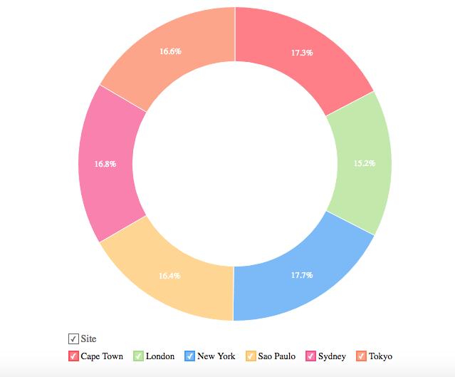
Ring Chart
Ring chart or otherwise called as a doughnut chart is used to represent data in rings. A ring chart displays the contribution of each value to the overall total expressed in percentage. Ring chart can be converted to any of its equivalents like pie chart, funnel chart, bar chart, line chart, scatter chart, area chart or web chart.
Given below is a combination of column types which when dropped into their respective shelves as mentioned will generate a ring chart.
| X axis | Y axis | Color | Text | Tooltip |
Case 1 | Dimension | Aggregate | -- | Aggregate/ Measure (Optional) | Aggregate/ Measure (Optional) |
Case 2 | Dimension/ Aggregate | Optional | -- | Aggregate/ Measure (Optional) | Aggregate/ Measure (Optional) |
Case 3 | Optional | Aggregate/ Dimension | -- | Aggregate/ Measure (Optional) | Aggregate/ Measure (Optional) |
Example: Region-wise Requests
 Example: Region-wise Requests
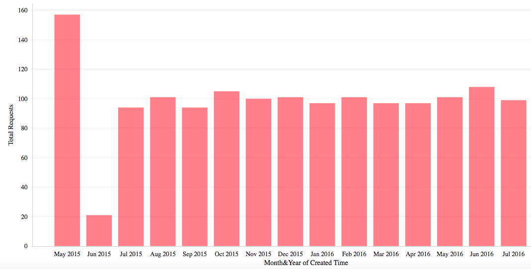
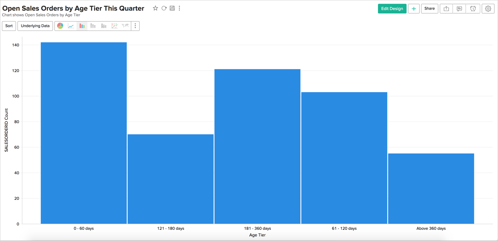
Bar Chart
Bar charts are used when you have to compare data classified into discrete groups. They are generally used to categorize data, or represent two or more metrics of a particular category. They display values as individual bars whose height is determined by the value plotted and grouped by each category. A Bar chart can be converted into any of its equivalents like Line, Scatter, Area, Stacked Bar, Stacked Area or Combo chart depending on the category.
The below combination of column types will help you create a bar chart.
| X axis | Y axis | Color | Text | Tooltip |
Case 1 | Dimension | Aggregate | Dimension/ Aggregate/ Measure (Optional) | Aggregate/ Measure (Optional) | Aggregate/ Measure (Optional) |
Case 2 | Dimension | Multiple Aggregate fields | Dimension/ Aggregate/Measure (Optional) | Aggregate/ Measure (Optional) | Aggregate/ Measure (Optional) |
Case 3 | Dimension/ Aggregate | Optional | Aggregate/ Measure (Optional) | Aggregate/ Measure (Optional) | Aggregate/ Measure (Optional) |
Case 4 | Optional | Dimension/ Aggregate | Aggregate/ Measure (Optional) | Aggregate/ Measure (Optional) | Aggregate/ Measure (Optional) |
Example: Requests count by month
Butterfly Chart
A butterfly chart is a type of bar chart that can be used to compare two different data sets. Also known as a Tornado or Divergent chart, this chart plots the data as two horizontal bars with the X-axis in the center, thereby resembling butterfly wings.
The following combination of column types allows you to create a butterfly chart.
| X axis | Y axis | Color | Text | Tooltip |
Case 1 | Dimension | Aggregate | Dimension | Aggregate / Optional | Aggregate / Optional |
Case 2 | Dimension | Multiple Aggregate fields | - | Aggregate / Optional | Aggregate / Optional |
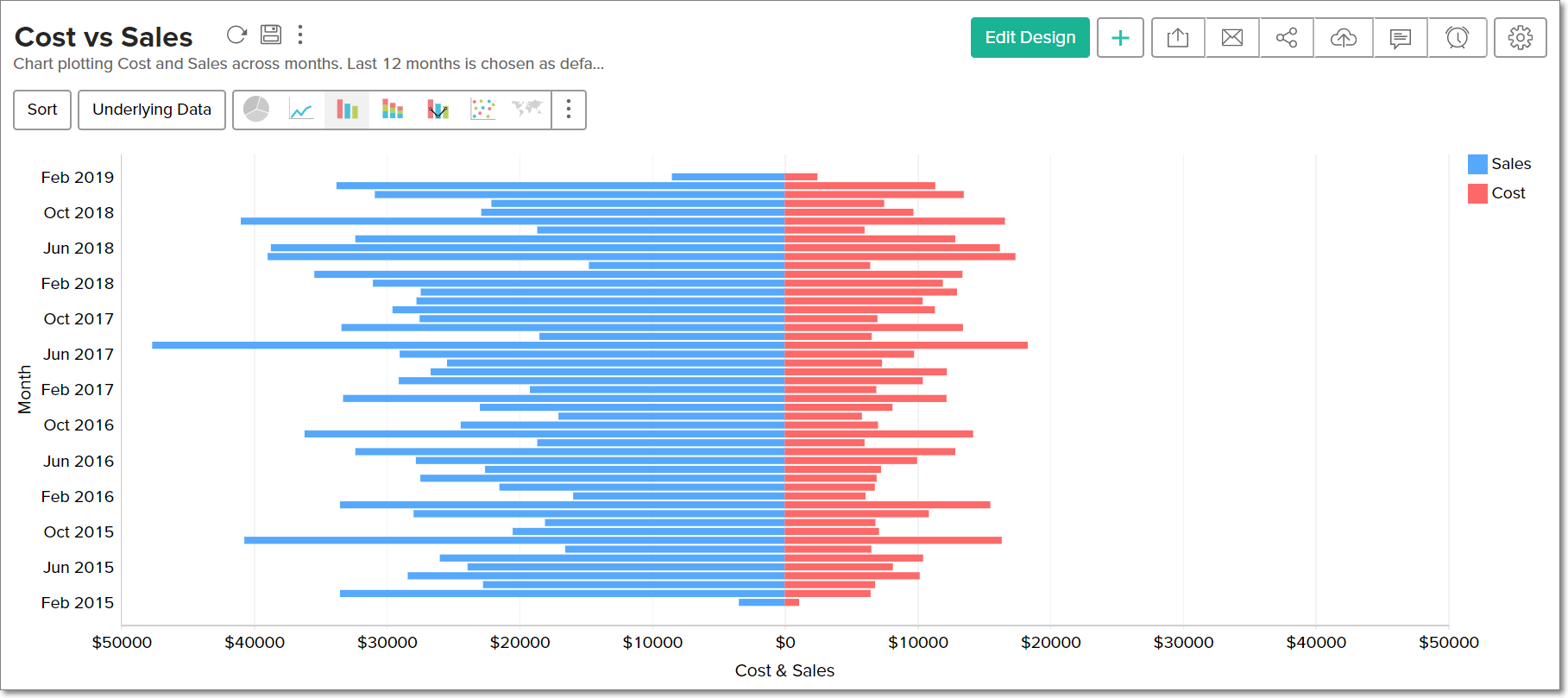
To learn more about Butterfly charts, click here.
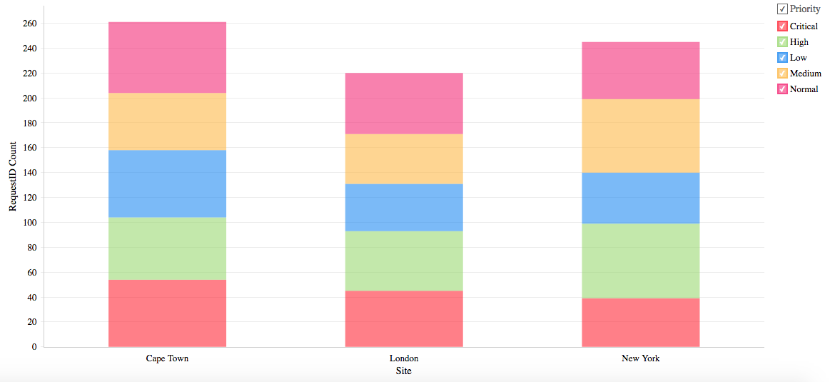
Stacked Chart
A Stacked chart allows you to easily analyze the patterns and trends in your data by comparing the parts of your dataset to the whole. In other words, it plots the contribution of each value to the total across categories. There are two types of stacked charts - Stacked Bar and Stacked Area.
Stacked Bar Chart
You can use the below combination of columns to create a stacked bar chart.
| X axis | Y axis | Color | Text | Tooltip |
Case 1 | Dimension | Aggregate | Dimension/ Aggregate/Measure | Dimension/ Aggregate (Optional) | Dimension/ Aggregate (Optional) |
Case 2 | Optional | Dimension/ Aggregate | Dimension/ Aggregate/Measure | Dimension/ Aggregate (Optional) | Dimension/ Aggregate (Optional) |
Case 3 | Dimension/ Aggregate | (Optional) | Dimension/ Aggregate/Measure | Dimension/ Aggregate (Optional) | Dimension/ Aggregate (Optional) |
Example: Priority-wise requests for each region
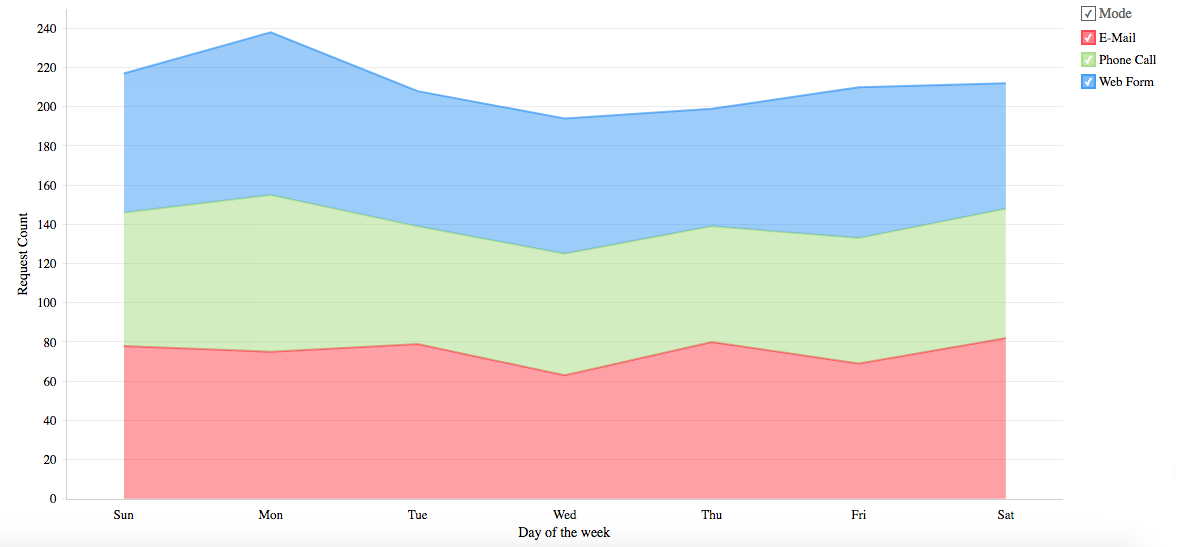
Stacked Area
You can use the below combination of columns to create a stacked area chart.
| X axis | Y axis | Color | Text | Tooltip |
Case 1 | Dimension | Aggregate | Dimension/ Aggregate/ Measure | Aggregate (Optional) | -- |
Case 2 | Dimension | Multiple Aggregate fields | -- | Aggregate (Optional) | -- |
Example: Mode-wise ticket in-flow by weekday
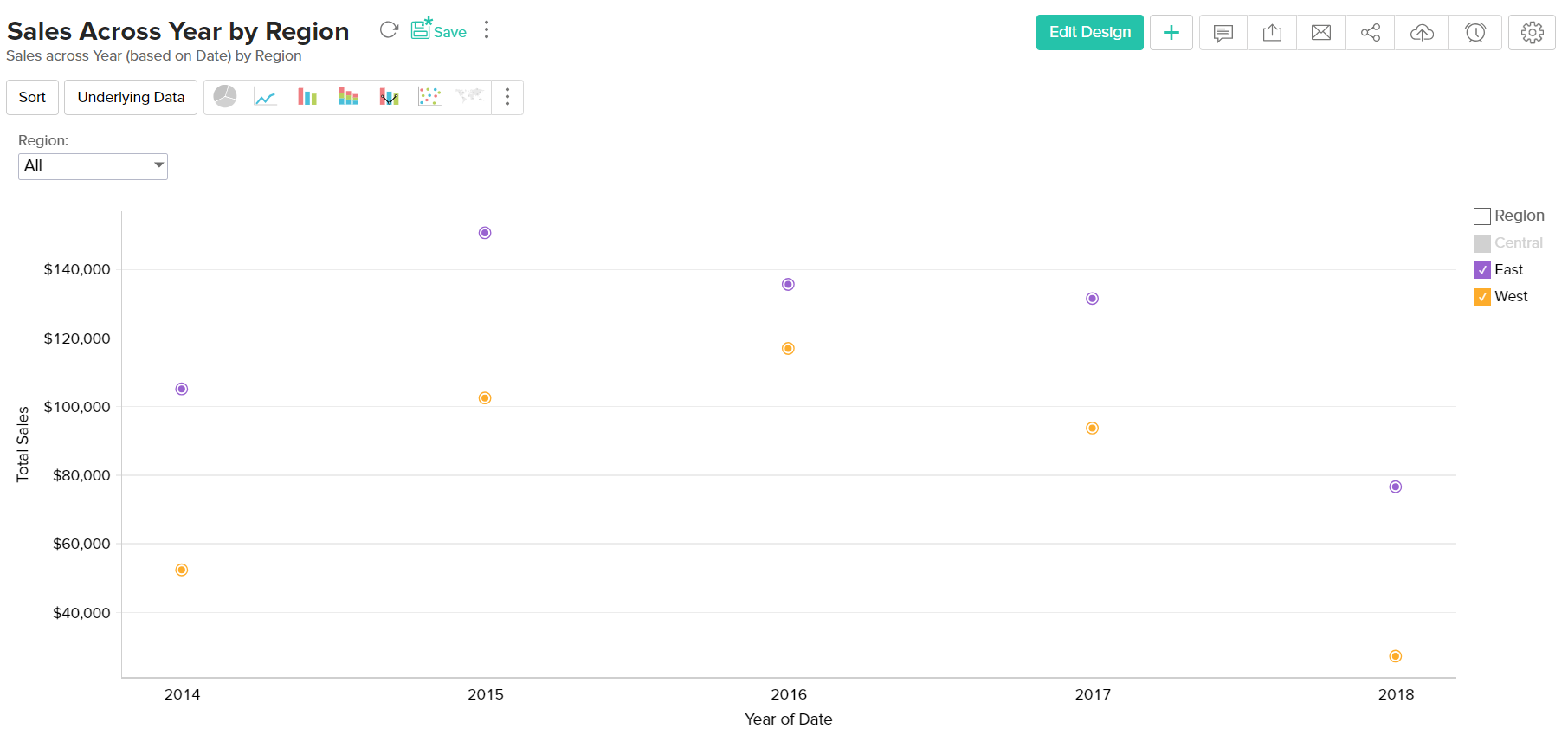
Scatter Chart
Scatter charts are commonly used for plotting and comparing numeric values, such as scientific, statistical, and engineering data. It is generally used for comparison between two numerical axes with uneven intervals and ranges. You can interchange a scatter chart with a line chart.
The following combination of column types will help you generate a scatter chart.
| X axis | Y axis | Color | Text | Tooltip |
Case 1 | Dimension | Aggregate/ Dimension | Aggregate/ Dimension/ Measure (Optional) | Aggregate/ Dimension/ Measure (Optional) | Aggregate/ Dimension/ Measure (Optional) |
Case 2 | Aggregate | Aggregate/ Dimension | Aggregate/ Dimension/ Measure (Optional) | Aggregate/ Dimension/ Measure (Optional) | Aggregate/ Dimension/ Measure (Optional) |
Case 3 | Dimension/ Aggregate | Optional | Aggregate/ Dimension/ Measure (Optional) | Aggregate/ Dimension/ Measure (Optional) | Aggregate/ Dimension/ Measure (Optional) |
Case 4 | Aggregate/ Dimension | Optional | Aggregate/ Dimension/ Measure (Optional) | Aggregate/ Dimension/ Measure (Optional) | Aggregate/ Dimension/ Measure (Optional) |
Example: Sales across year by region.
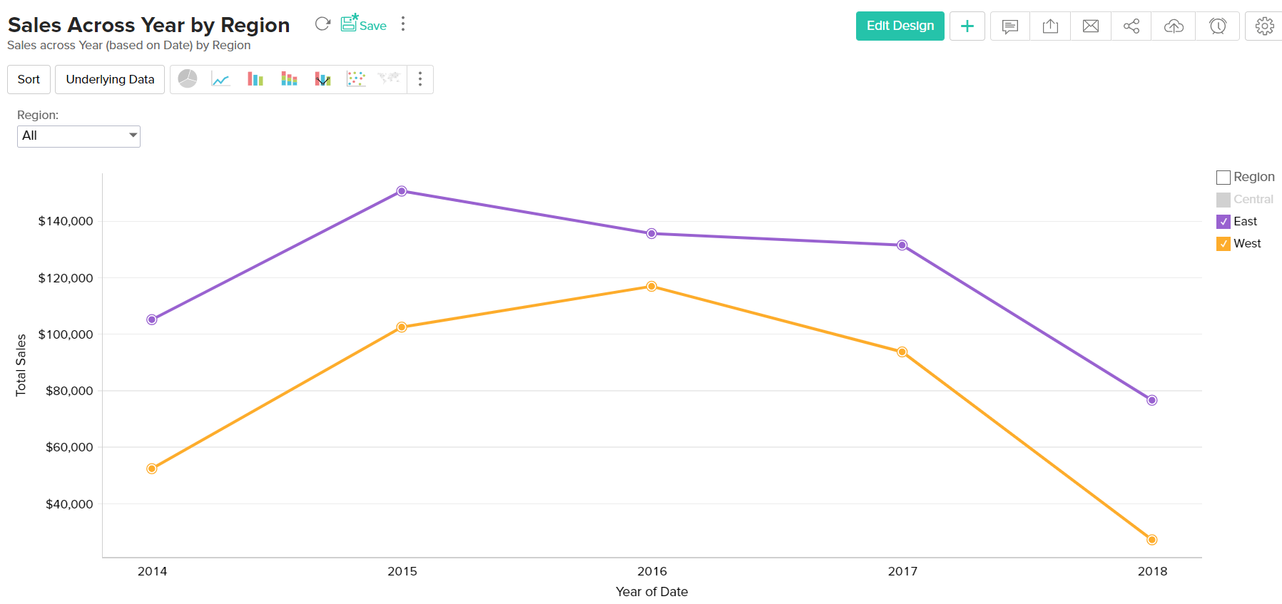
Line Chart
A line chart is used to analyze series trend across a time period. You can interchange a line chart with a scatter chart.
Any of the below combination of column types will generate a line chart.
| X axis | Y axis | Color | Text | Tooltip |
Case 1 | Dimension | Aggregate/ Dimension/ Optional | Dimension/ Aggregate/ Measure (Optional) | Dimension/ Aggregate/ Measure (Optional) | Dimension/ Aggregate/ Measure (Optional) |
Case 2 | Optional | Aggregate/ Dimension | Dimension/ Aggregate/ Measure (Optional) | Dimension/ Aggregate/ Measure (Optional) | Dimension/ Aggregate/ Measure (Optional) |
Case 3 | Aggregate/ Dimension | Optional | Dimension/ Aggregate/ Measure (Optional) | Dimension/ Aggregate/ Measure (Optional) | Dimension/ Aggregate/ Measure (Optional) |
Example: Sales across year by region
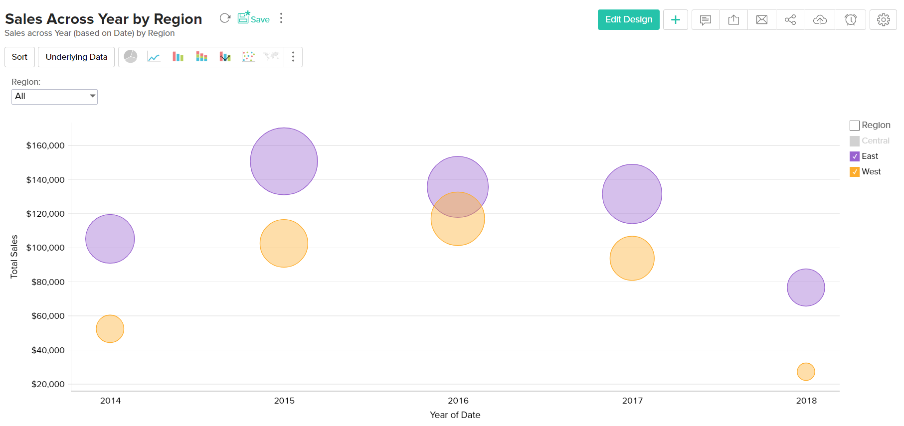
Bubble Chart
Bubble charts are really useful if you want to visualize your data highlighting the magnitude/weight of a data point with sizing. You can use a bubble chart wherever a Scatter plot is used, with scatters points being replaced by bubbles. The size of the bubble will be determined by the data column dropped in the new Size shelf of the Chart designer.
The following combination of column types will help you generate a bubble chart.
| X axis | Y axis | Color | Text | Size | Tooltip |
Case 1 | Dimension | Aggregate/ Dimension | Aggregate/ Dimension/ Measure (Optional) | Aggregate/ Dimension/ Measure (Optional) | Aggregate | Aggregate/ Dimension/ Measure (Optional) |
Case 2 | Aggregate | Aggregate/ Dimension | Aggregate/ Dimension/ Measure (Optional) | Aggregate/ Dimension/ Measure (Optional) | Aggregate | Aggregate/ Dimension/ Measure (Optional) |
Case 3 | Dimension | Optional | Aggregate | Aggregate/ Dimension/ Measure (Optional) | Aggregate | Aggregate/ Dimension/ Measure (Optional) |
Case 4 | Aggregate | Optional | Dimension | Aggregate/ Dimension/ Measure (Optional) | Aggregate | Aggregate/ Dimension/ Measure (Optional) |
Case 5 | Optional | Dimension | Aggregate | Aggregate/ Dimension/ Measure (Optional) | Aggregate | Aggregate/ Dimension/ Measure (Optional) |
Case 6 | Optional | Aggregate | Dimension | Aggregate/ Dimension/ Measure/ Optional | Aggregate | Aggregate/ Dimension/ Measure/ Optional |
Example: Sales across year by region
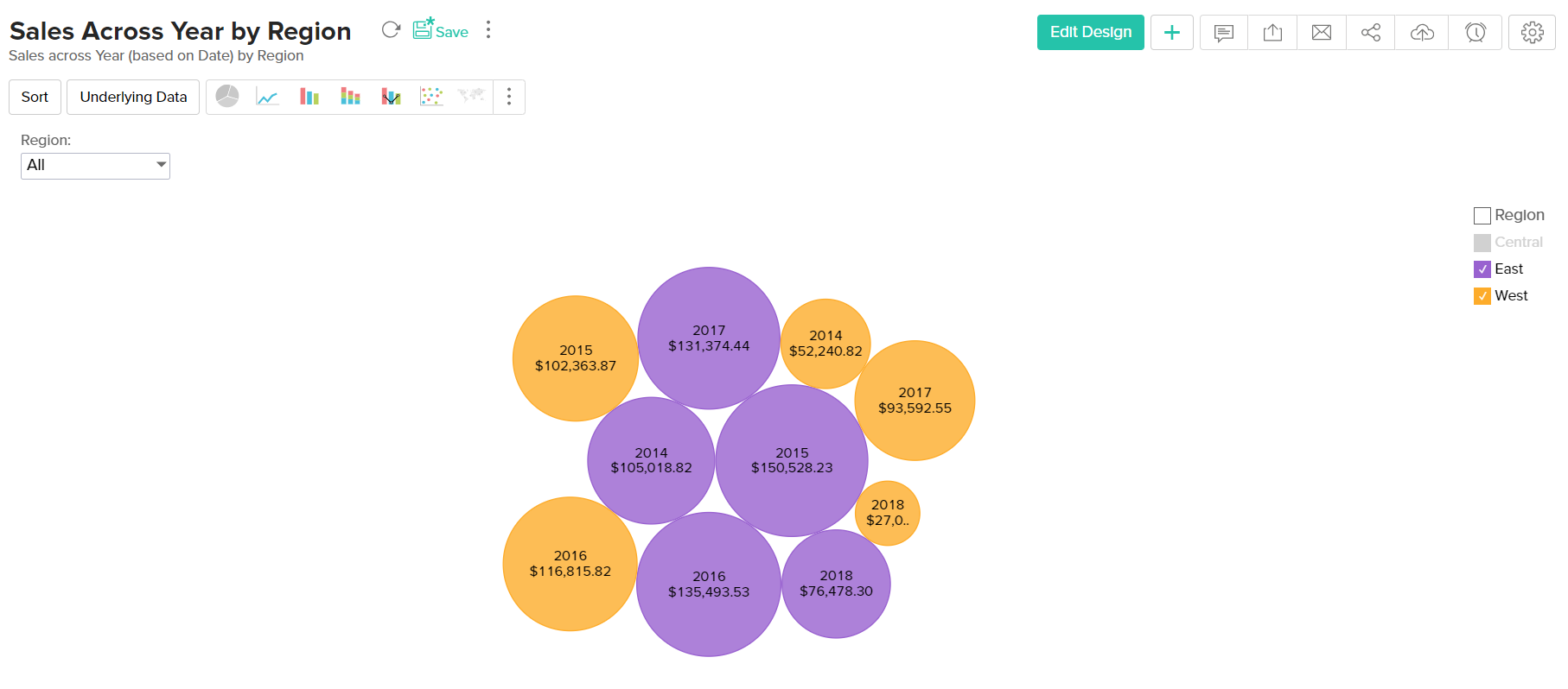
Packed Bubble Chart
The Packed Bubble chart type is used to display data in a cluster of circles or bubbles. They are used to display the values disregarding the axes. The difference between a normal bubble chart and a packed bubble is that the latter is tightly packed rather than spread over a grid. You can use a packed bubble chart to visualize large amount of data in a small space.
The following combination of column types will help you generate a packed bubble chart.
| X axis | Y axis | Color | Text | Size | Tooltip |
Case 1 | Dimension | Aggregate/ Dimension | Aggregate/ Dimension/ Measure (Optional) | Aggregate/ Dimension/ Measure (Optional) | Aggregate | Aggregate/ Dimension/ Measure (Optional) |
Case 2 | Aggregate | Aggregate/ Dimension | Aggregate/ Dimension/ Measure (Optional) | Aggregate/ Dimension/ Measure (Optional) | Aggregate | Aggregate/ Dimension/ Measure (Optional) |
Case 3 | Dimension | Optional | Aggregate | Aggregate/ Dimension/ Measure (Optional) | Aggregate | Aggregate/ Dimension/ Measure (Optional) |
Case 4 | Aggregate | Optional | Dimension | Aggregate/ Dimension/ Measure (Optional) | Aggregate | Aggregate/ Dimension/ Measure (Optional) |
Case 5 | Optional | Dimension | Aggregate | Aggregate/ Dimension/ Measure (Optional) | Aggregate | Aggregate/ Dimension/ Measure (Optional) |
Case 6 | Optional | Aggregate | Dimension | Aggregate/ Dimension/ Measure (Optional) | Aggregate | Aggregate/ Dimension/ Measure (Optional) |
Example: Sales across year by region
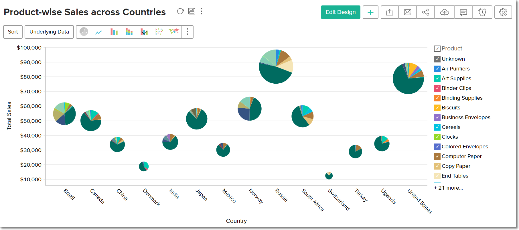
Bubble Pie Chart
Bubble Pie Chart is a combination of pie and bubble charts. This is useful when you need to compare data with multiple variables. The following combination of column types allows you to create a bubble pie chart.
| X Axis | Y Axis | Size | Color | Text | Tooltip | |
| Case 1 | Dimension | Aggregate | Aggregate | Dimension | Aggregate (Optional) | Optional |
| Case 2 | Dimension | Multiple Aggregate fields | Aggregate | - | Aggregate (Optional) | Optional |
Example: Product wise sales across Countries
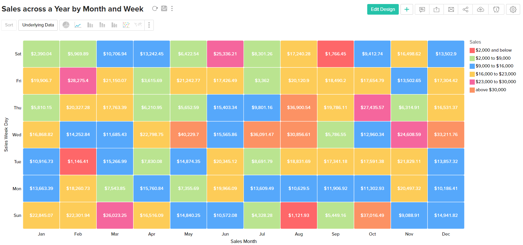
Heat Map Chart
Heat map is a chart that displays data values as colors inside a matrix. This is a two-dimensional grid chart, where each color represents the data.
You can also choose to derive the size and color intensity of each cell based on the data. This will be pretty useful for categorizing and visualizing data based on factors like volume of occurence, intensity, performance scale (bad to good) etc.,
The following combination of column types can be used to create a combination chart.
| X Axis | Y Axis | Color | Text | Tooltip | |
| Case 1 | Dimension | Dimension | Aggregate | Aggregate (Optional) | Aggregate (Optional) |
Example: Sales across a Year by Month and Week.
Combination Chart
The combination chart is a combination of two or more types of charts. You can combine bar, line, area, bubble and scattered in one chart, which is useful when you wish to represent varied data.
The following combination of column types can be used to create a combination chart.
| X axis | Y axis | Color | Text | Tooltip |
Case 1 | Dimension | Multiple Aggregate fields | -- | Optional | Optional |
Case 2 | Dimension | Aggregate | Dimension | Optional | Optional |
Example: Incoming, Resolved and Same Week Resolution Service Requests
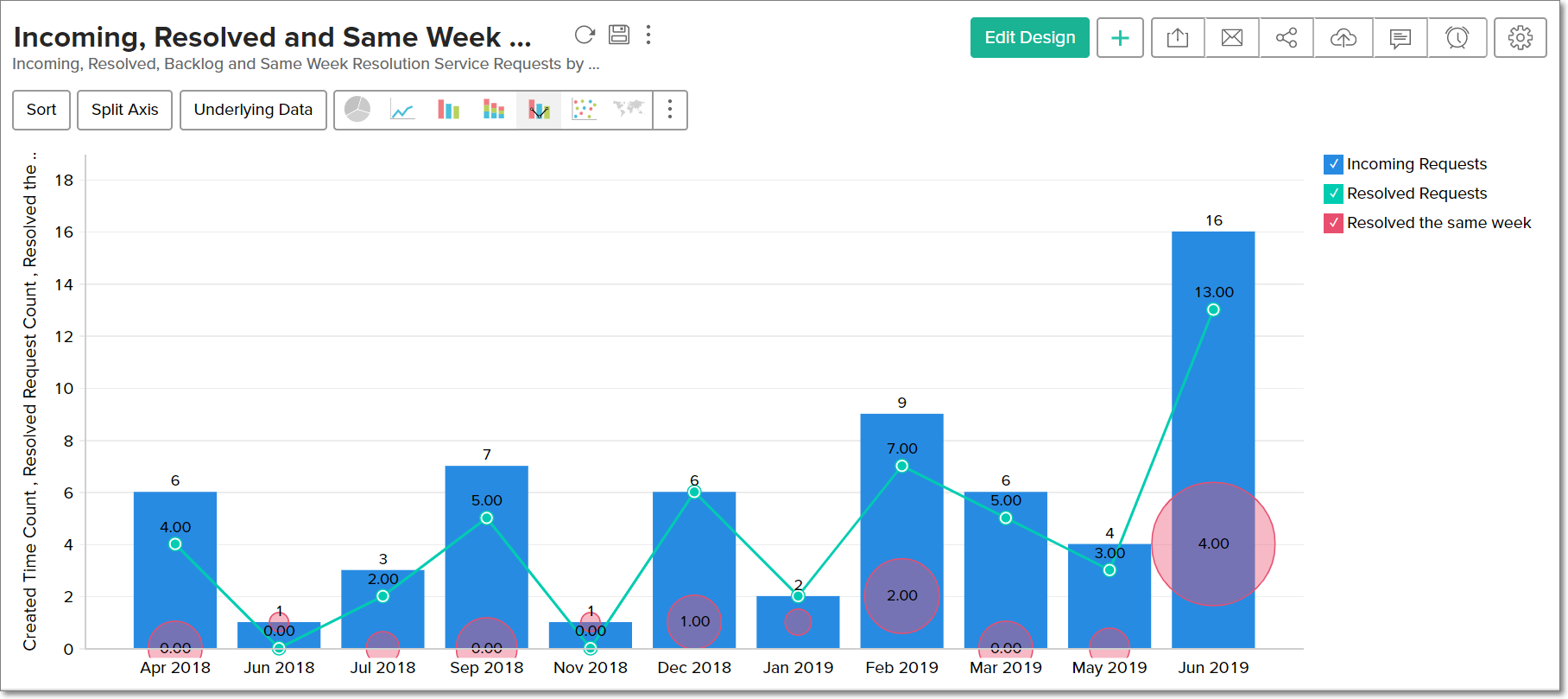
To create a Combination chart, navigate to the Combination tab of the chart Settings page. Select the type of combination chart from the Select a combo chart type drop down, assign a chart type for each data series using the Series section, choose the required chart style using the Select the style of the chart drop down, and click Apply.
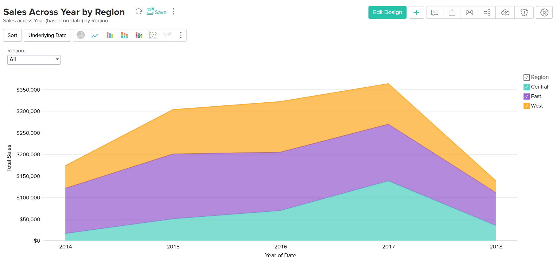
Area Chart
Area charts shade the area beneath the lines and therefore help you more readily to compare data magnitudes. They are mainly useful for emphasizing the change in metrics across time. You can interchange an area chart with a web chart.
Given below is a combination of column types which will help you generate an area chart.
| X axis | Y axis | Color | Text | Tooltip |
Case 1 | Dimension | Aggregate | Dimension/ Aggregate/ Measure (Optional) | -- | -- |
Case 2 | Dimension | Aggregate | Dimension/ Aggregate/ Measure (Optional) | Aggregate | Aggregate |
Example: Sales across year by region
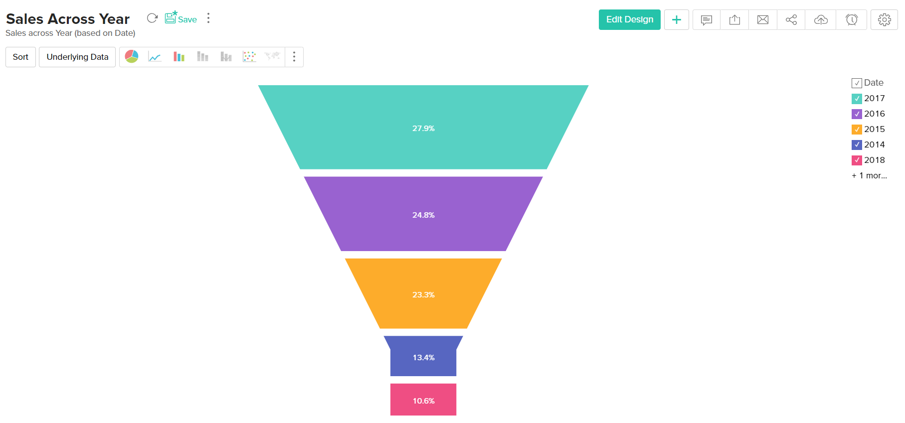
Funnel Chart
The funnel chart is used to represent a progressive flow/reduction of a business metric across phases.
The below combination of column types can be used to create a funnel chart.
| X axis | Y axis | Color | Text | Tooltip |
Case 1 | Dimension | Aggregate | -- | Aggregate/ Measure (Optional) | Aggregate/ Measure (Optional) |
Case 2 | (Optional) | Aggregate | -- | Aggregate/ Measure (Optiona)l | Aggregate/ Measure (Optional) |
Example:Sales across year
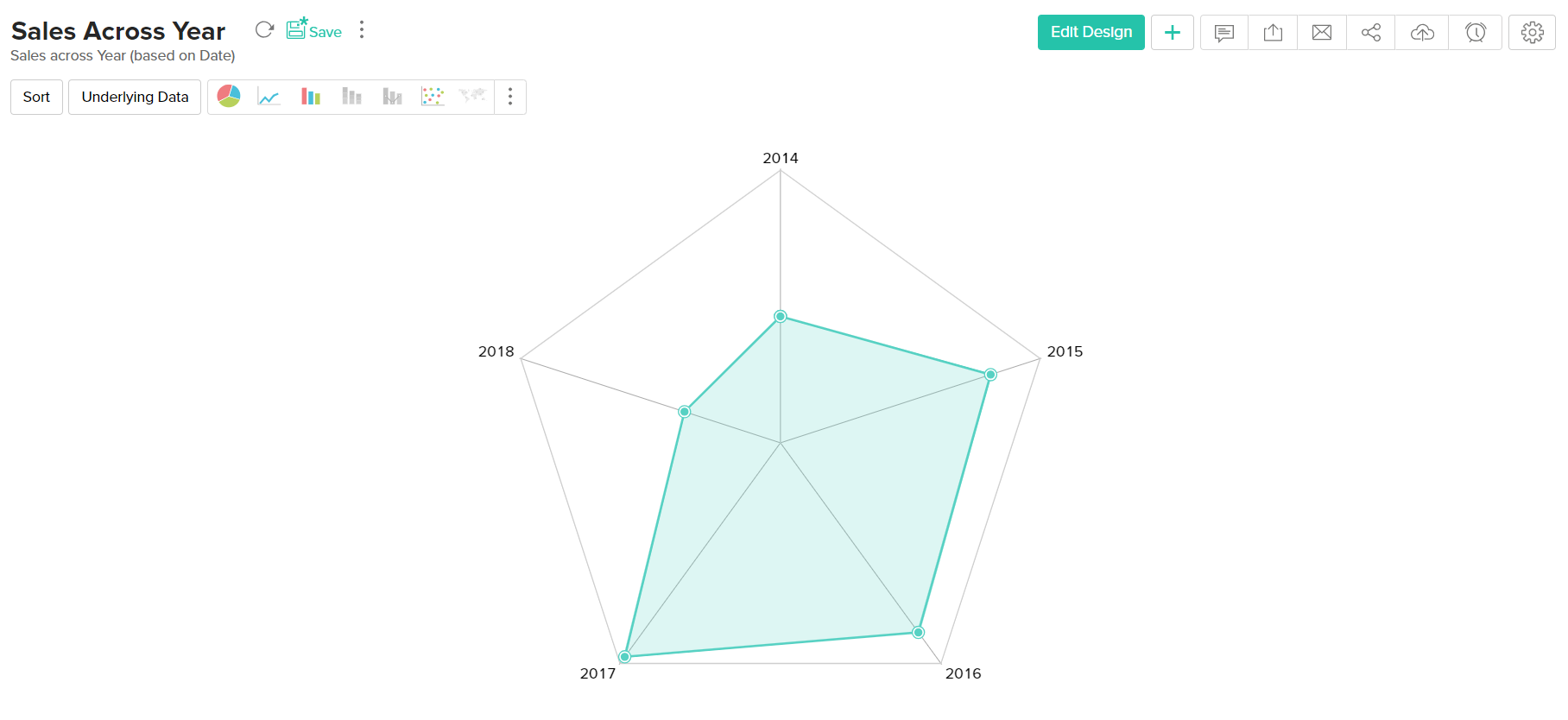
Web Chart
Web charts help in studying the comparison between different data series. It compares the values of a number of data series represented with data markers in proportion with a center point.
Given below is a combination of column types which will help you generate a web chart.
| X axis | Y axis | Color | Text | Tooltip |
Case 1 | Dimension | Aggregate | Dimension (Optional) | -- | Aggregate/ Measure (Optional) |
Example: Sales across Year
Map chart
A map chart can be used to tag metrics against geographical locations on a map view. You can create map charts using location specific columns in your data. This location information can be continent, country, county, state/province, city, or latitude and longitude.
Here's a table with possible combinations of column types to create map charts:
| Region | X-axis | Y-axis | Color | Text | Tooltip |
| Type | Geo location | Aggregate | Dimension/ Aggregate/ Measure (Optional) | Dimension/ Aggregate/ Measure (Optional) | Aggregate/ Dimension/ Measure (Optional) |
Note: To export a map chart, ensure that Google Chrome version 59 or above is installed in your workstation.
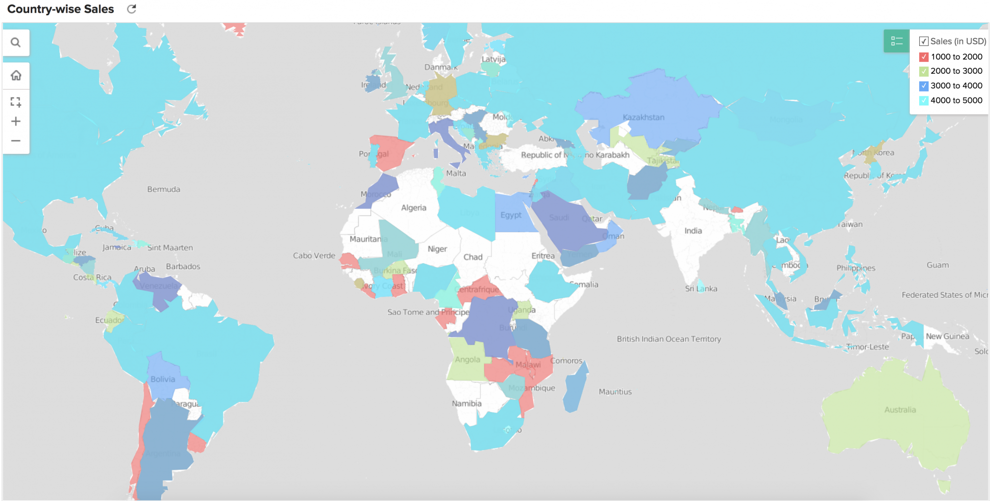
Click here to learn more.
Histogram
A histogram is a variation of bar chart where, instead of plotting values over discrete intervals, the values are plotted over continuous categories. Histogram charts are useful in plotting frequency distributions.
The following combination of column types can be used to create histogram charts:
| X Axis | Y Axis | Color | Text | Tooltip | |
| Case 1 | Dimension | Aggregate/ Optional | - | - | - |
| Case 2 | Optional | Aggregate | - | - | - |
| Case 3 | Aggregate/ Optional | Dimension | - | - | - |
| Case 4 | Aggregate | Optional | - | - | - |
Chart type KPI Widgets
The chart type KPI widgets of Analytics Plus allows you to highlight your data metrics using chart visuals. These are different from the actual charts and are focussed on displaying a single value. Click here to learn more.
| X Axis | Y Axis | Color | Text | Tooltip | |
| Case 1 | Dimension | Dimension | Aggregate | Aggregate (Optional) | Aggregate (Optional) |