Customizing dashboards
ManageEngine Analytics Plus offers a wide range of customizing options for your dashboard. With the easy-to-use interface, you can customize the dashboard's design and quickly create a visually rich dashboard.
- General settings
- Customize Zia insights placement in Dashboards
- Customizing the theme
- Report specific customizations
- Text and Image specific customizations
- KPI Widget specific customizations
General settings
You can customize the various interactions available within a dashboard from the dashboard's Settings section. To access this, click the Settings icon on the top right of the required dashboard.
![]()
The Settings page will appear, with the following interactions:
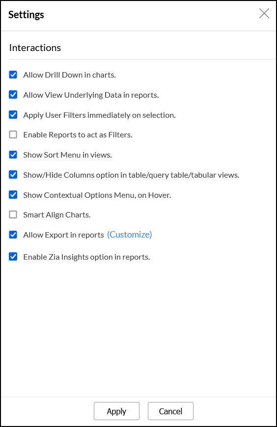
- Allow Drill Down in charts: This option allows you to enable or disable the drill down functionality for all charts in the dashboard.
- Allow View Underlying Data in reports: This option allows you to enable or disable the view underlying data functionality across all reports in the dashboard.
Apply User Filters immediately on selection: This option lets you choose how user filters behave on the dashboard. Selecting this option lets you apply user filters individually. When unchecked, users have to click the Apply button to apply the selected user filter criteria across the dashboard.
- Enable Report to act as filters: This option allows you to enable or disable the report as filter functionality, which filters the dashboard using the reports' data. Click here to learn more about this functionality.
- Show Sort Menu in views: Selecting this checkbox allows you to display a sort icon across every view on the dashboard.
Show/Hide Columns option in table/query table/tabular views: This option allows you to enable or disable the show/hide columns option across all tabular views in the dashboard.
Show Contextual Options Menu, on Hover: This option allows you to display various contextual menu options on mouse over the dashboard's reports.
- Smart Align Charts: Selecting this option allows Analytics Plus to automatically align the various views in a dashboard based on the available space.
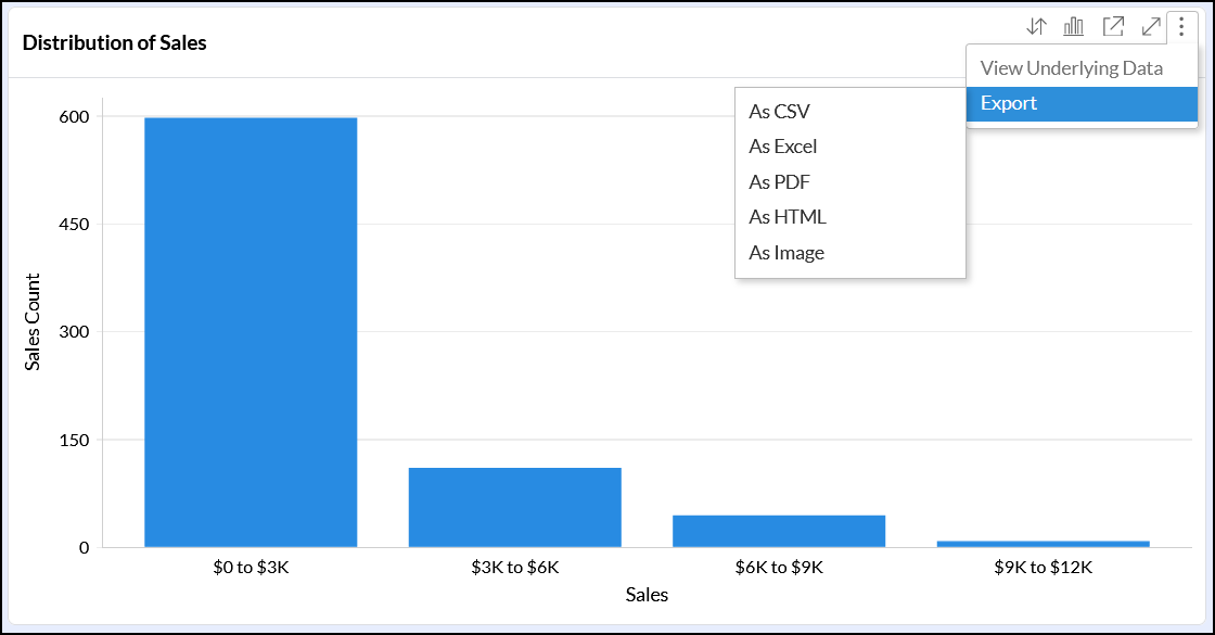
Allow Export in report: This option allows you to enable or disable the various export options available for the reports in the dashboard. You can customize the exported file's formats using the Customize link.
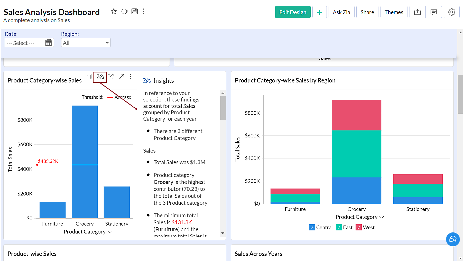
Enable Insight option in reports: This option allows you to leverage Zia Insights for each report in the dashboard and gain descriptive and detailed insights within seconds. Click here to learn more about Zia Insights.
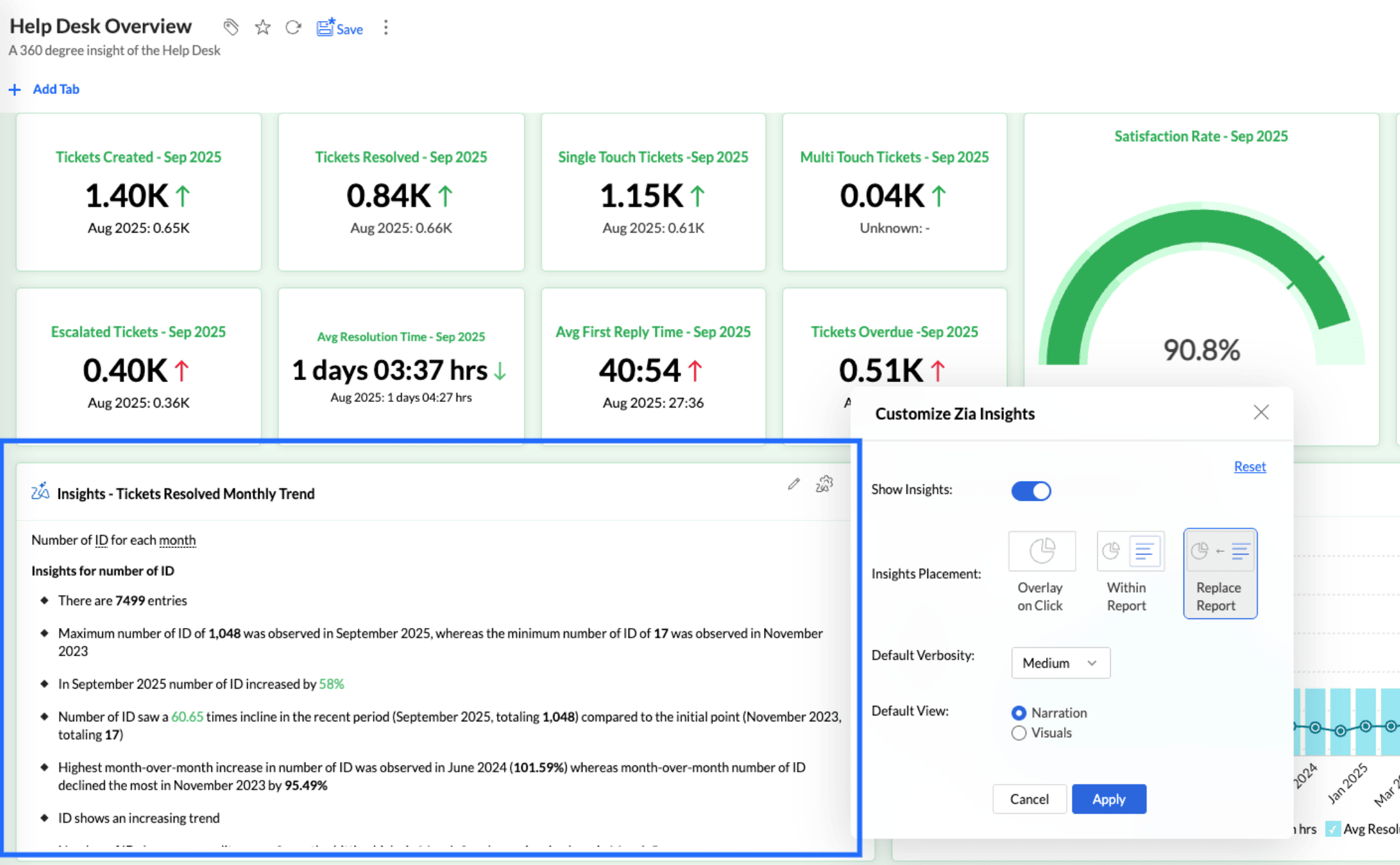
Customize Zia insights placement in Dashboards
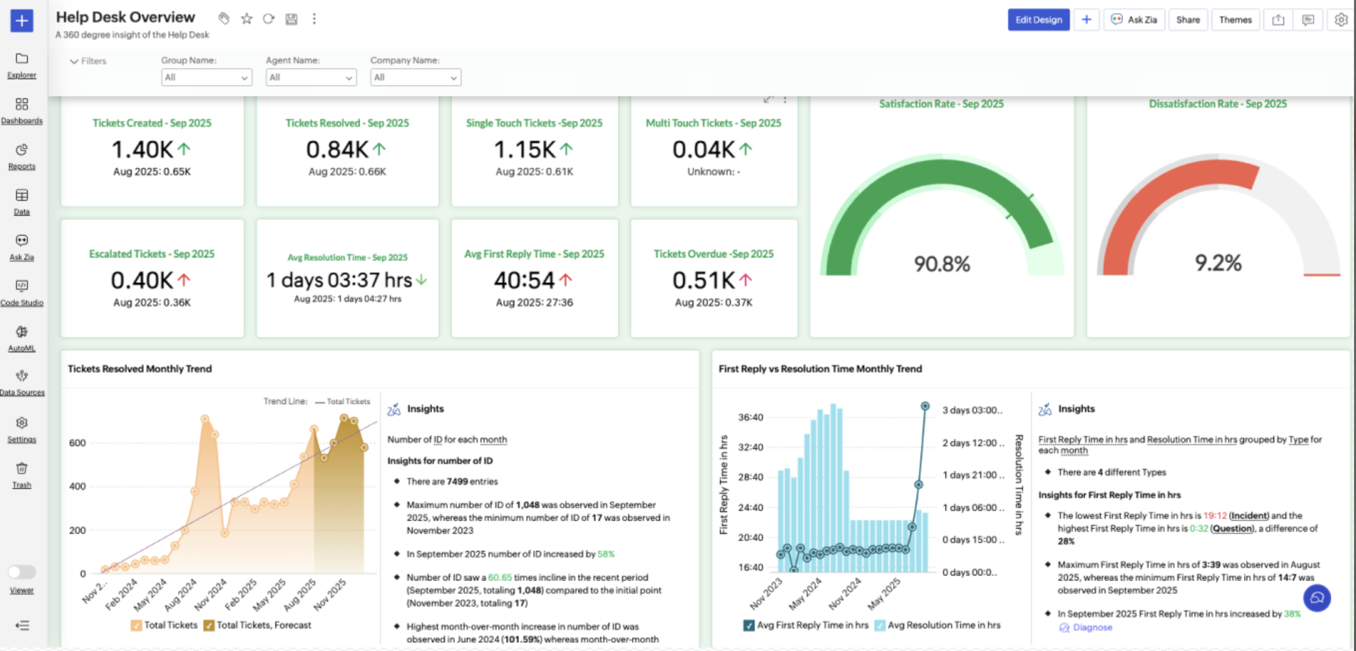
The Customize Zia Insights option allows you to control how AI-generated insights are displayed for a report. These settings allows you to display Zia Insights for a particular report always.
To enable this option,
Access the dashboard in Edit mode.
Click the Zia Settings icon.
Enable Zia Insights
The Show Insights option is enabled by default for reports. Based on whether you need to display insights for a report, you can choose to enable or disable this option.
Insights Placement
Insights Placement lets you control how and where AI insights appear for a report, so users can consume insights without disrupting their analysis workflow.
Overlay: Displays insights in a floating panel that opens on demand, allowing users to review insights without leaving or altering the report view.
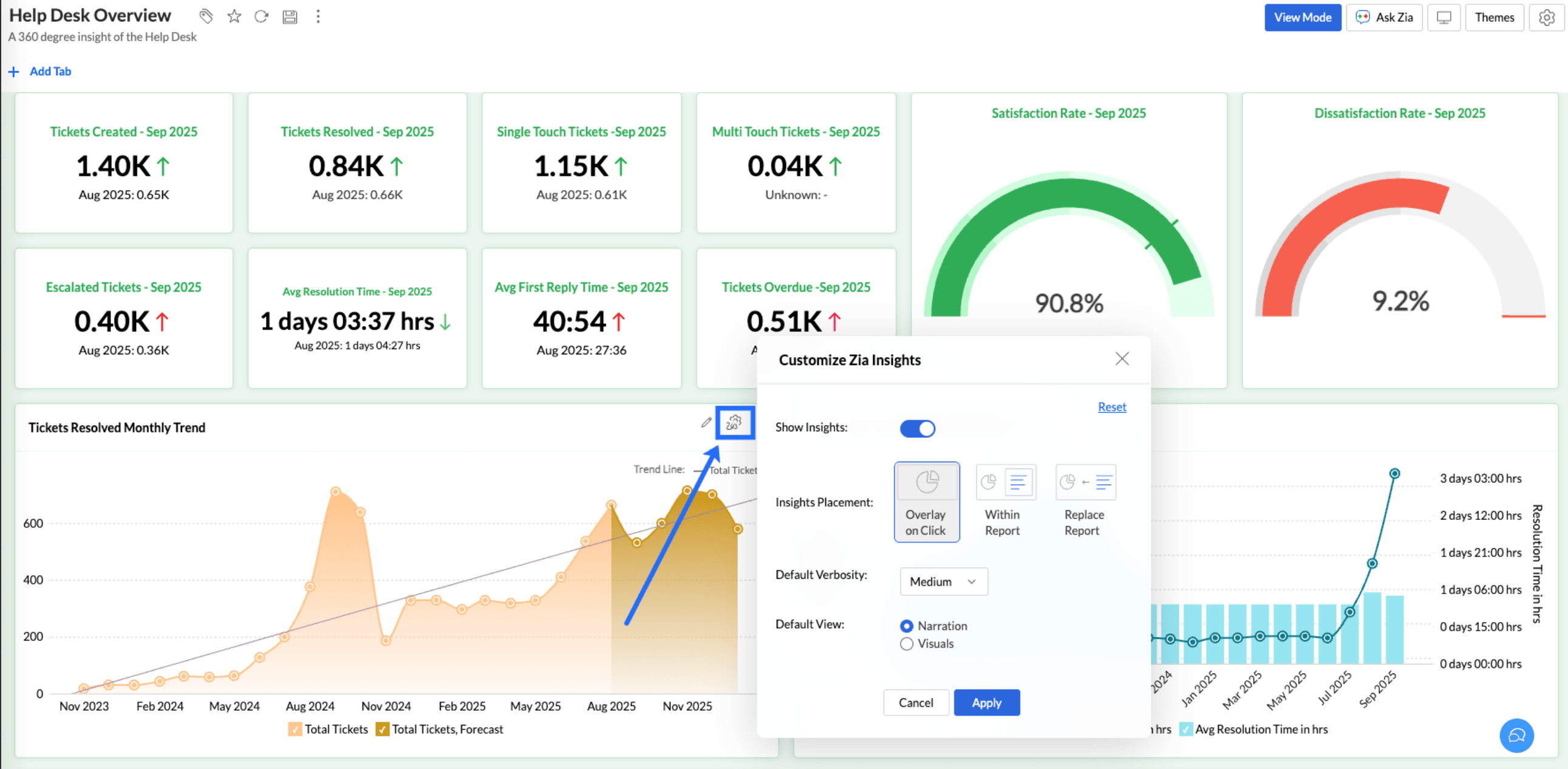
Within Report: Embeds insights directly within the report, enabling users to view data and insights together in a single, continuous view.
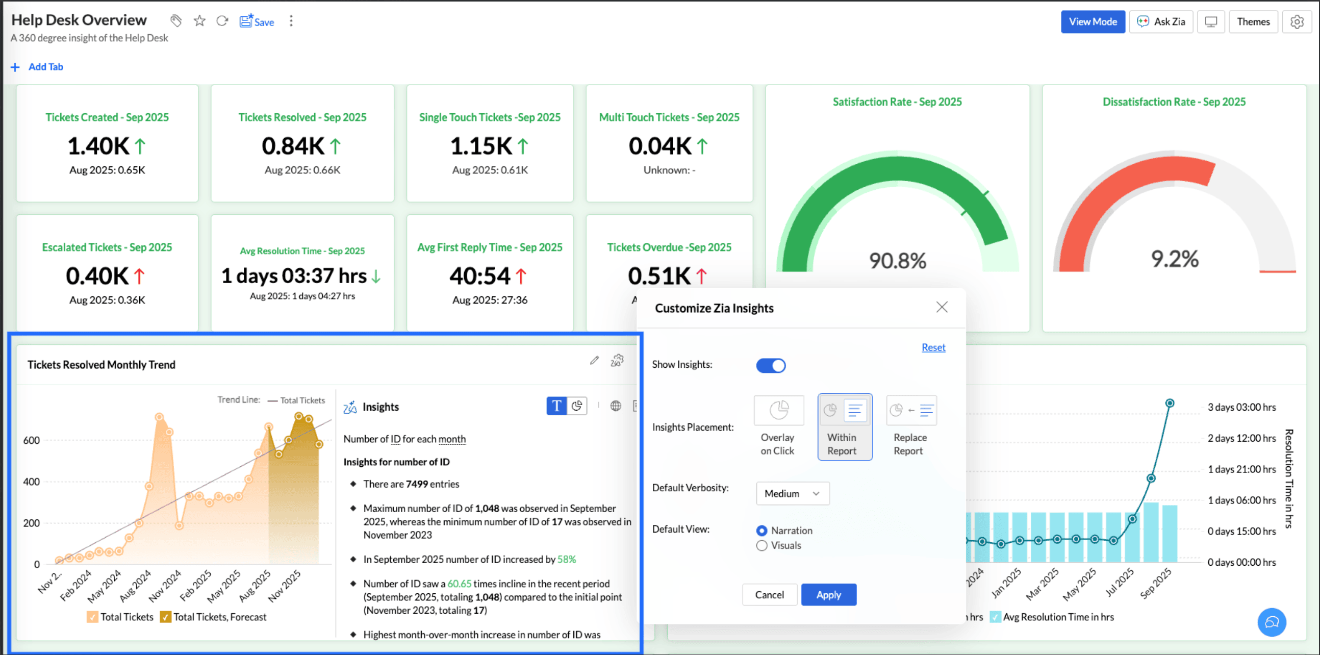
Replace Report: Displays insights as the primary view by replacing the report entirely, offering an insight-first experience focused on conclusions rather than raw data.
Customizing the theme
ManageEngine Analytics Plus allows you to customize the look and feel of your dashboard with themes. It provides six preset themes with various options to customize dashboard colors, card style, chart effect, and report palettes as required.
The following steps explain the process of customizing your dashboard.
Open the required dashboard and click the Themes button on the top right corner. The Dashboard Themes dialog appears, displaying six preset themes and layouts.
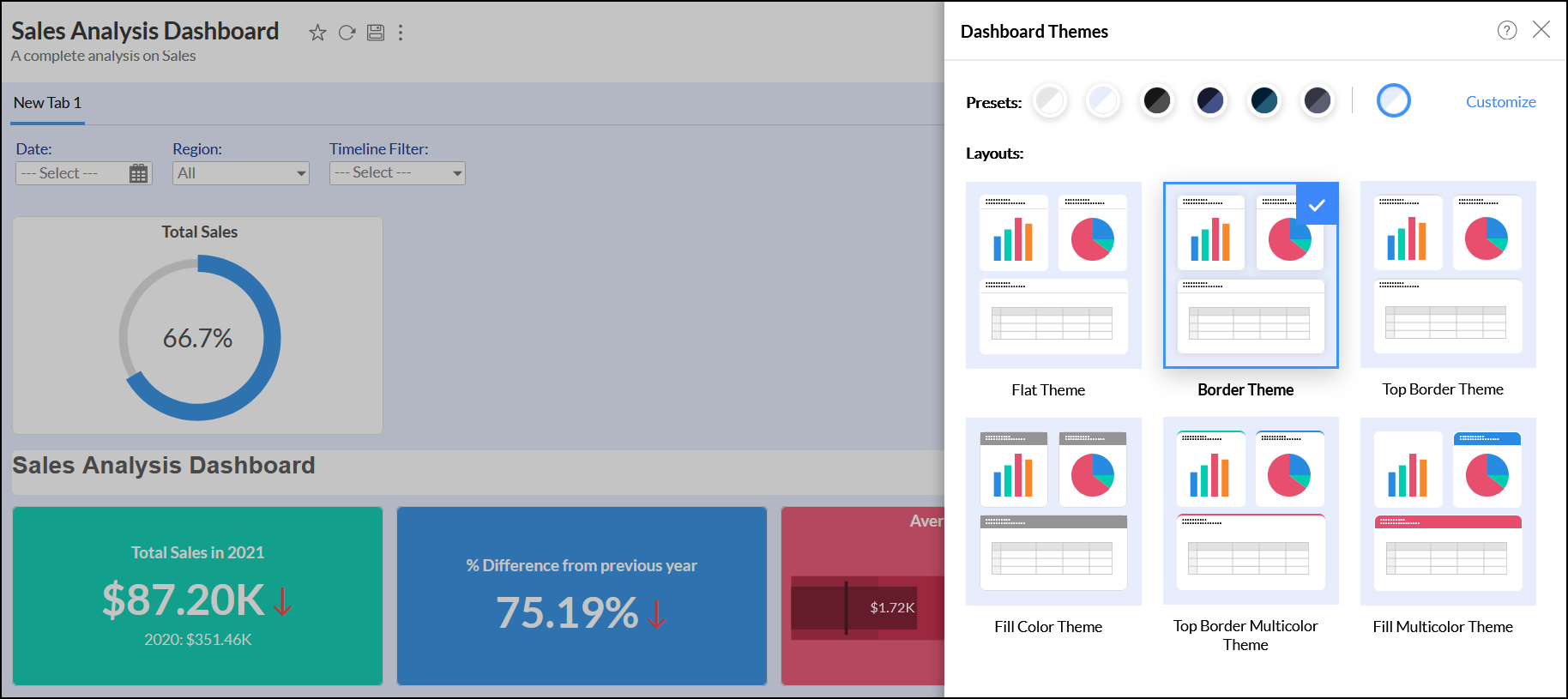
- Select the required preset.
Select the desired layout design from the available six different layouts.
- Flat Theme: This is a simple theme with different colors for the dashboard and card (reports, tables, and KPI widgets) background.
- Border Theme: Theme with a border for all cards.
- Top Border Theme: Theme with border on top of all the cards.
- Fill Color Theme: Theme with a color filling for the card title.
- Top Border Multicolor Theme: Theme with multiple borders on top of each card.
- Fill Multicolor Theme: Theme with a multiple color filling for each card title.
You can also customize the card border color, width, filling color, background, etc, applied in these layouts. Refer to the customizing dashboard theme section to know more.
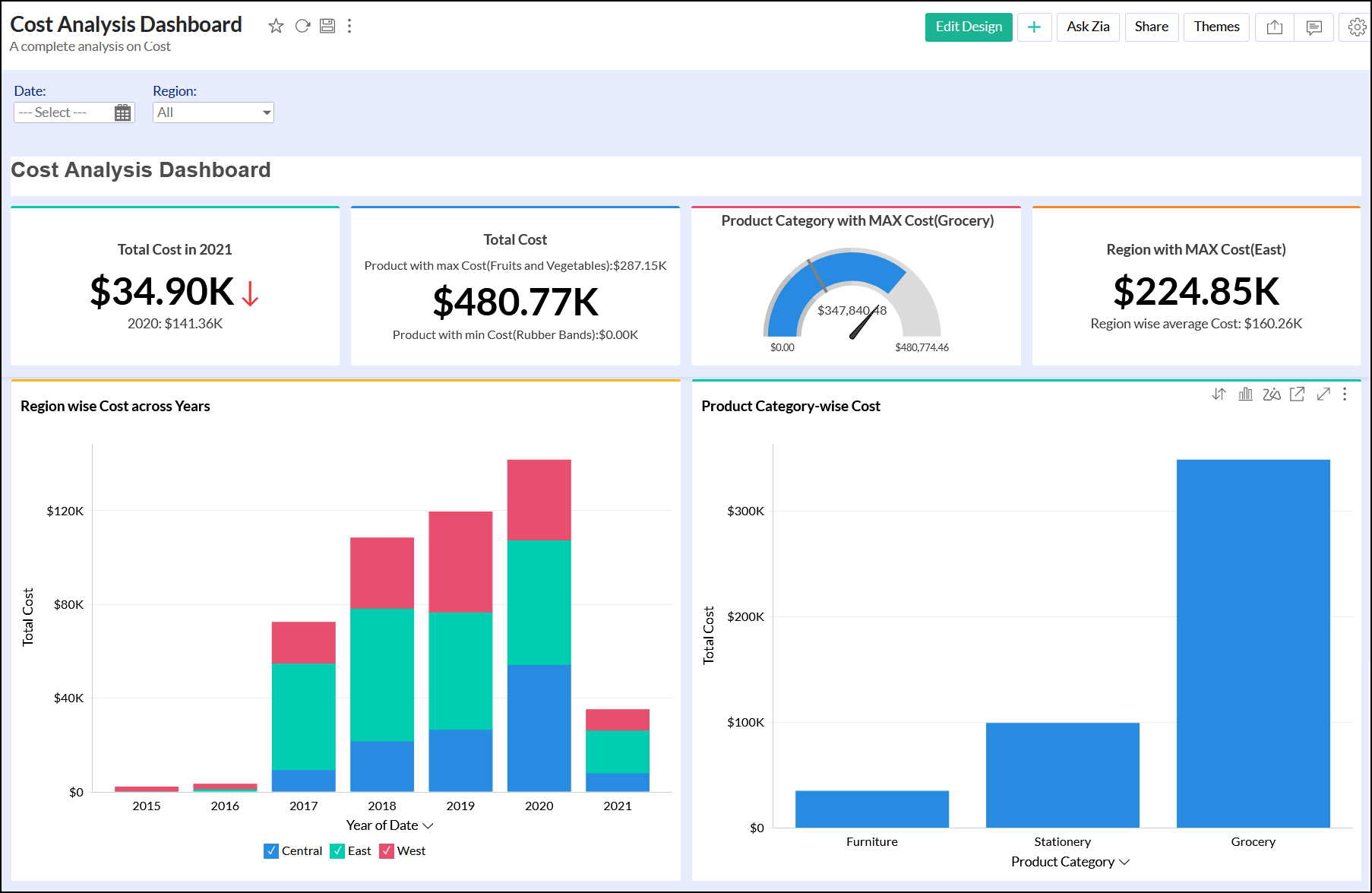
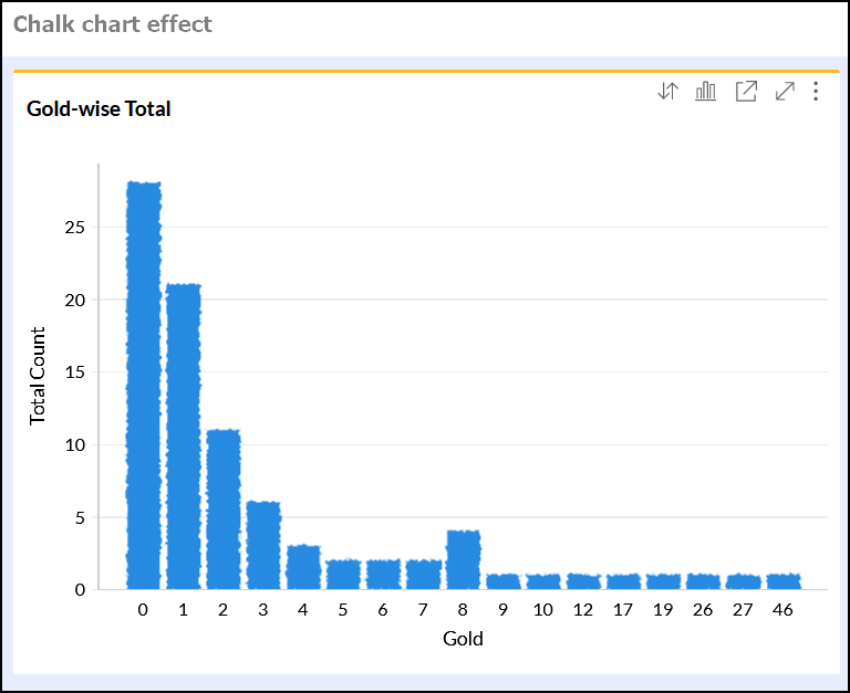
The following image depicts a sample dashboard with the Top Border Multicolor Theme.
Apart from the six preset and layouts, ManageEngine Analytics Plus allows you to apply custom the preset and theme for your dashboards. Refer to the following sections to know more about customizing preset and layout themes.
Customizing the preset
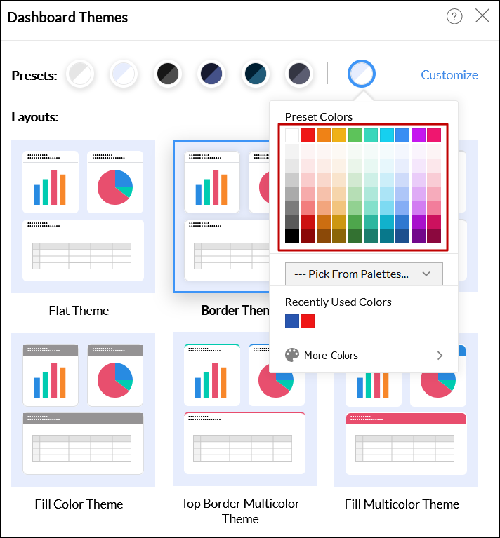
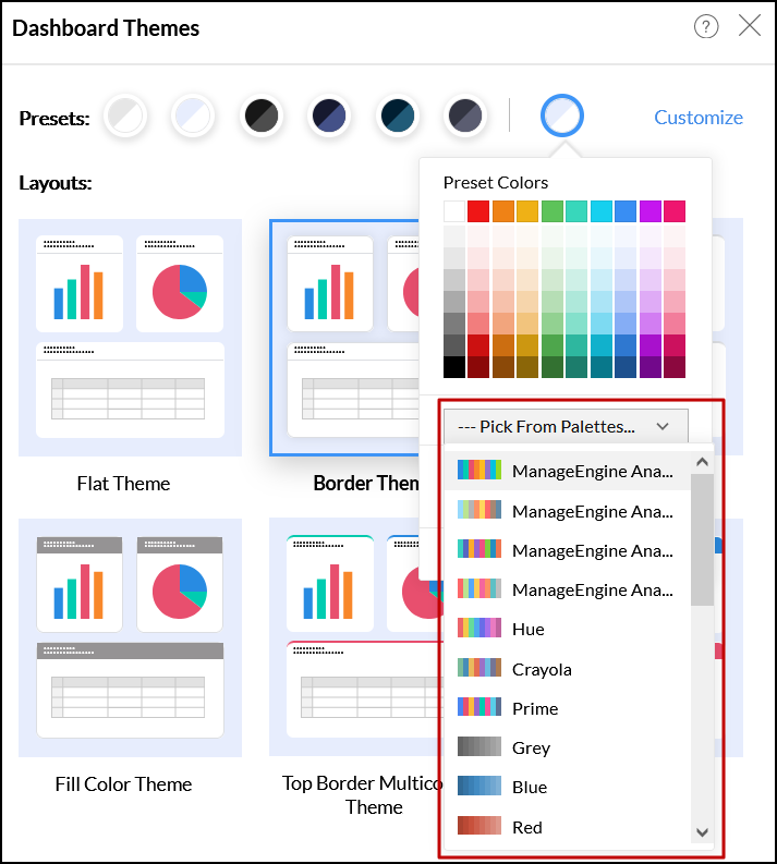
Analytics Plus allows you to choose the preset for your dashboard in three ways. To do this, click the preset color icon in the preset section.
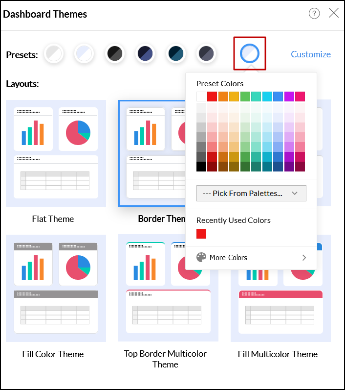
Choose the desired color from the variety of available colors.
Click the Pick From Palettes dropdown to choose from the variety of color palettes.
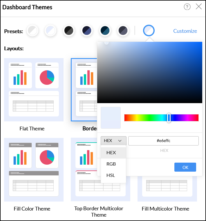
Click the More Colors option, to choose a custom color shade. Move the color slider to choose your color or add the color code in HEX, RGB, and HSL formats in the popup that appears.
Customizing Dashboard theme
To modify the theme, click the Customize link at the top right corner of the Dashboards Themes screen.
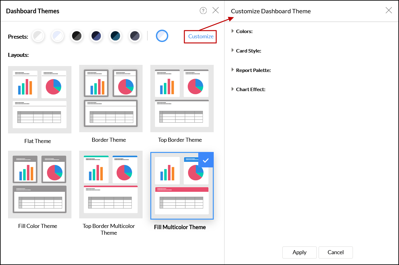
The following customization options are available in the Customize Dashboard Theme dialog that appears:
Colors: This section allows you to change the background and card colors in the dashboard. The available options will vary based on the selected layout.
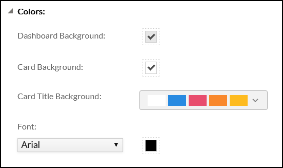
- Dashboard Background: This option allows you to choose the dashboard background.
- Card Background: This option allows you to choose the card colors.
- Card Border: This option allows you to choose the card border color and choose the desired border width (in pixels) from the dropdown.
- Card Title Border: This option allows you to choose the card title border color and choose the desired border width (in pixels) from the dropdown.
- Card Top Border Width: This option allows you to choose the desired card top border width (in pixels) from the dropdown.
- Font: This option allows you to specify the font style and color to be used.
- Card Top Border: This option allows you to choose the color and width for the card's top border. This option is applicable only for Top Border and Top Multi Border themes.
- Card Title Background: You can choose the required border color set using this dropdown option applicable only for Fill color and Fill Multicolor themes.
Card Style: This section allows you to customize the style and layout of the various visualizations (cards) in a dashboard.
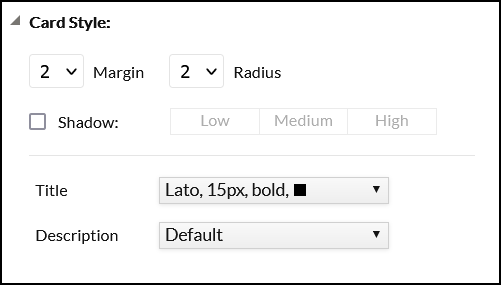
- Margin: This option allows you to select the margin to be applied between the cards. You can set the margin between 0-10. Choosing Zero (0) sets no margin/spacing between views.
- Radius: This option enables you to select the border radius to be applied on the rounded corner of the cards. You can set the radius between 0 - 20.
- Shadow: This option allows you to choose the intensity of the shadow effect.
- Title and Description: This option allows you to select the font, style, and size of the card's title and description.
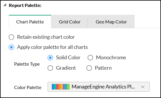
- Report Palette: This section allows you to customize the color palette of the various reports in the dashboard.
- Chart Palettes
- Retain existing chart color: Select this radio button to retain the existing chart color.
Apply color palette for all charts: Select this radio button to apply a new color palette to the charts in the dashboard, and choose the required palette type and color palette.
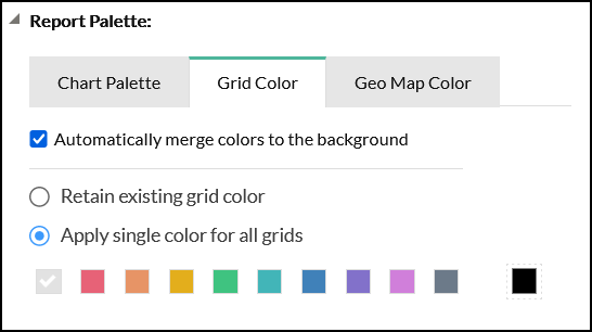
- Grid Color
- Automatically merge colors to the background: Select this checkbox to automatically merge the grid color with the dashboard background for better visualization.
- Retain existing grid color: Select this radio button to retain the existing grid colors.
Apply single color for all grids: This option allows you to apply a new color theme across all grids.
Geo Map Color
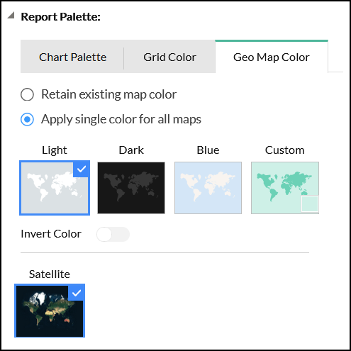
- Retain existing map color: This option allows you to retain the existing map color as is.
- Apply single color for all maps: Select this radio button to apply a common color across all map charts in the dashboard. You can choose from the preset themes, or specify a custom one using the Custom option.
Invert Color: Use this toggle button to interchange the colors used to highlight countries with the map's background color.


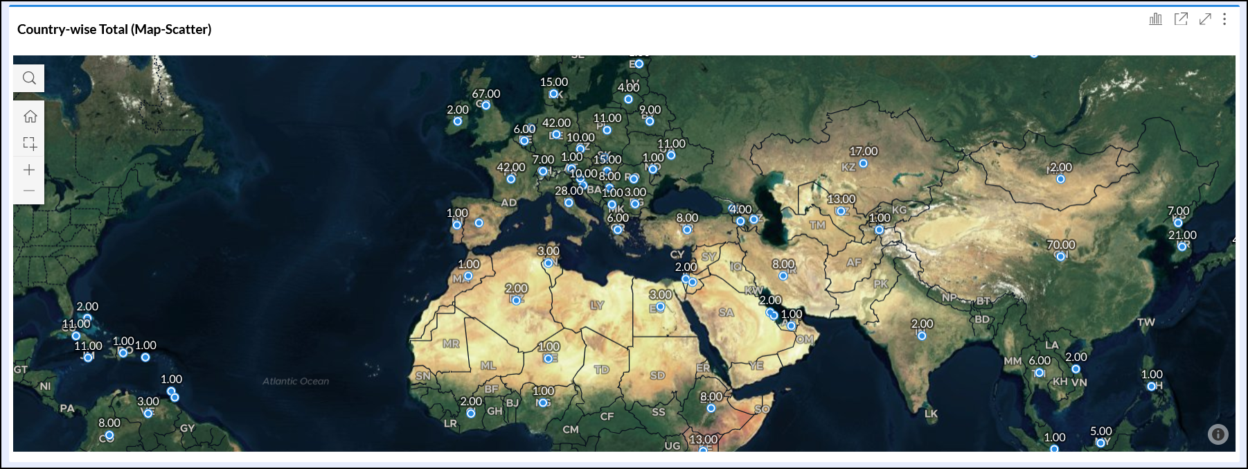
Satellite: This option allows you to use the live satellite image for your map charts. The below image depicts a map chart with the satellite option enabled.
- Chart Palettes
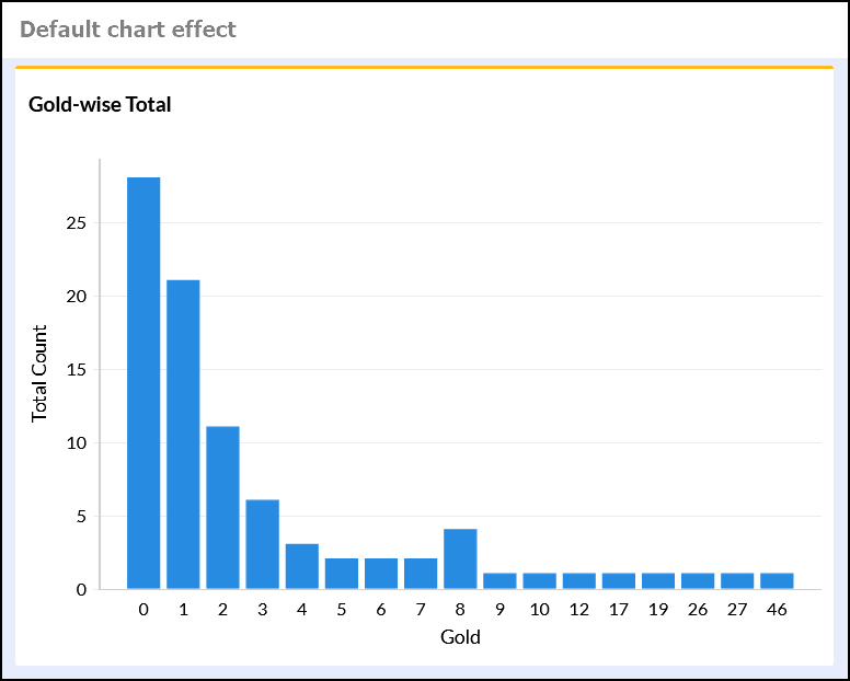
- Chart Effect: This section allows you to apply custom chart effects across the dashboard.
- Retain existing chart effect: Select this radio button to retain the charts' existing customizations.
Apply chart effect for all the charts: Select this radio button to apply a common color effect across all charts in the dashboard, and choose the required effect from the options that appear. The available options are Default, Chalk, and Freehand.

Report specific customizations
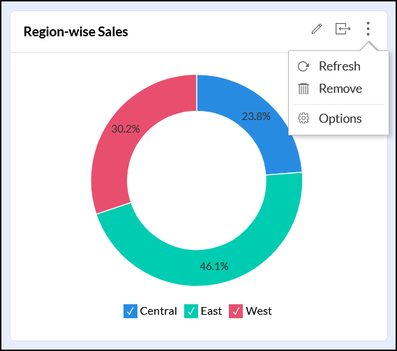
ManageEngine Analytics Plus provides context-specific options to customize the reports present within a dashboard. These report-specific customization options will appear on the mouse over the required report in the Edit Design mode of the dashboard.
- Edit: This option allows you to access the chart in the Edit Design mode, where you can modify the chart as required.
- Expand/Contract: This option allows you to change the dashboard layout to a single or double column display for the corresponding view in that row.
- Refresh: This option allows you to reload the values in the report.
- Remove: This option allows you to delete the selected report from the dashboard.
Options: This allows you to access additional report-specific options, which vary based on the report.
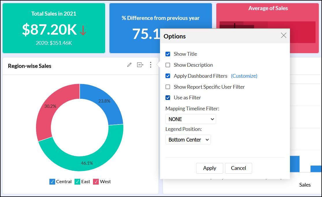
The following table displays the various settings available under the Options section.
Option Description Applicable View Type Show Title Use this option to show or hide the corresponding report's title. All views Show Description Use this option to show or hide the corresponding report's description. All views Apply Dashboard Filters This option allows you to apply or exclude the dashboard's user filters from the selected report. To learn more about user filters in dashboards, click here. All views Use as Filter This option allows you to enable or disable the Enable Reports to act as Filter feature for the selected report. This option is enabled by default. All views Mapping Timeline Filter This option allows you to map the desired date columns to be used for filtering the reports. Choose the required value from the drop-down. All views Show Report Specific User Filter This option allows you to add reports' user filters to individual reports that have been added to a dashboard. To learn more about this filter, click here. Charts and pivot views Legend Position Modify the report legend's position using the various options in the drop-down box. Charts Search Box This option allows you to include or exclude the search option in a table. Tables
Text and Image specific customizations
Analytics Plus offers various options to customize the text and images added to a dashboard. These options will appear on mouse over the required text or image components in Edit Design mode.
- Edit: Use this link to access the text editor and modify the content as required.
- Fill: This option allows you to resize the text component to fill the available space in the dashboard layout.
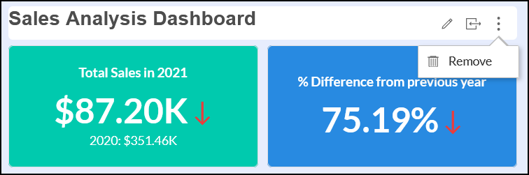
- Remove: This option allows you to delete the selected text or image from the dashboard.
KPI Widget specific customizations
Analytics Plus provides various options to customize the KPI widgets in the dashboard, which appear on mouse over the required widget in the Edit Design mode.
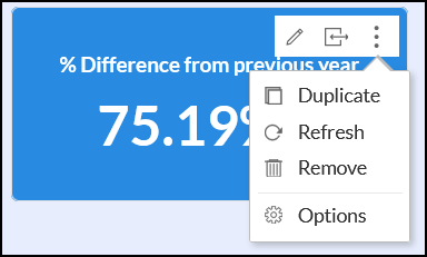
- Edit: Use this link to access the KPI Widget editor screen, and modify the widget as required.
- Fill: This option allows you to resize the KPI component to fill the available space in the dashboard layout.
- Duplicate: This option allows you to create duplicate the corresponding KPI widget.
- Refresh: This option allows you to refresh the widget data to reflect the latest change.
- Remove: This option allows you to delete the selected KPI widget from the dashboard.
Options: This allows you to access additional KPI widget-specific options.
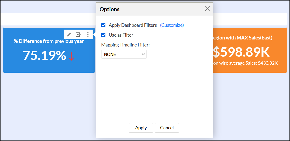
- Apply Dashboard Filters: Select this checkbox to apply the dashboard's user filters from the selected KPI Widget. To learn more about user filters in dashboards, click here.
- Use as Filter: Select this option to configure the KPI Widget to act as a filter in your dashboard. This functionality is similar to configuring a report to act as a filter, however, this will only be enabled for the corresponding KPI widget.
- Mapping Timeline Filter: This option allows you to map the desired date columns to be used for filtering the reports. Choose the value from the dropdown.