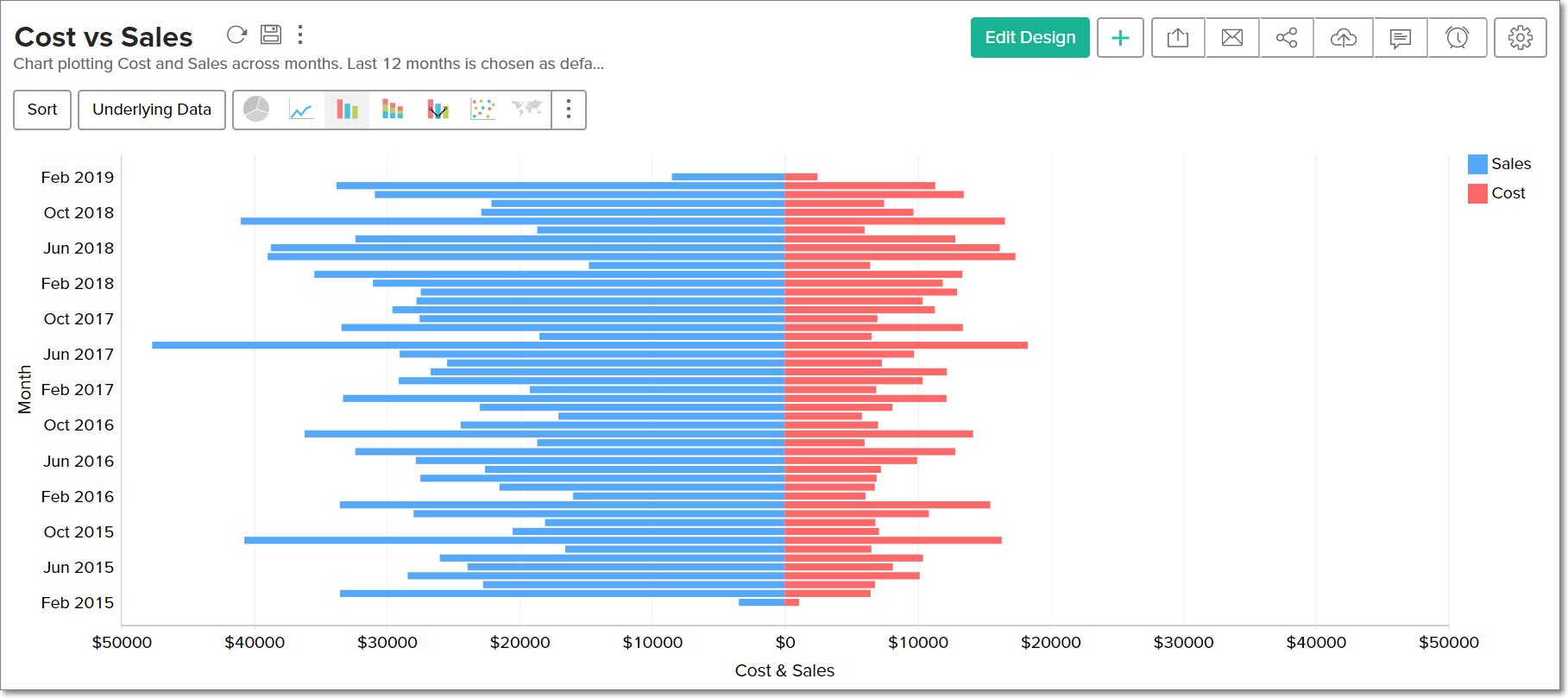
Butterfly charts
A butterfly chart is a type of bar chart that can be used to compare two different data sets. Also known as a Tornado or Divergent chart, this chart plots the data as two horizontal bars with the X-axis in the center, thereby resembling butterfly wings.
Creating a Butterfly chart
You can create butterfly charts in Analytics Plus in two ways:
Single series Butterfly charts
A butterfly chart can be created using a single metric (Y-axis) grouped by multiple dimensions (X-axis and Color). The butterfly chart will compare the Y-axis data based on the values in the Color shelf.
Follow the below steps to create a single series butterfly chart:
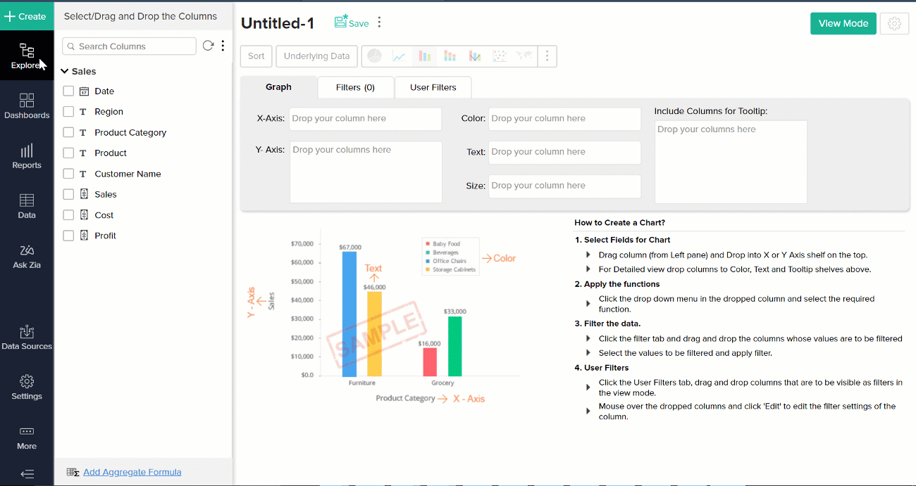
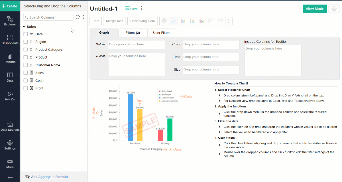
Click the Create button from the side panel, and select Create Chart View.
In the Chart Designer, drop a dimension column in the X-axis shelf, a metric column in the Y-axis shelf and any column in the Color shelf. The data will be compared based on the values in the Color shelf.
Click the Click Here to Generate Graph button, and change the chart type to Butterfly.
Butterfly charts can compare only two values at a time. If there are more than two values in the column in the Color shelf, by default, the first two values will be used to compare the data. You can use the Legends in the chart's View Mode to select other values for comparison.
Multiple series Butterfly charts
Butterfly charts can also be created using multiple metrics (multiple Y-axis), grouped by a single dimension (X-axis).
Follow the below steps to create a multiple series butterfly chart:
Click the Create button from the side panel, and select Create Chart View.
In the Chart Designer, drop multiple metric columns in the Y-axis shelf and any dimension column in the X-axis shelf.
Click the Click Here to Generate Graph button, and change the chart type to Butterfly.
If there are more than two columns in the Y-axis, by default, the first two columns will be used to compare the data. You can use the Legends in the chart's View Mode to select other values for comparison.
Possible combinations for creating Butterfly charts
| X axis | Y axis | Color | Text | Tooltip |
Case 1 | Dimension | Aggregate | Dimension | Aggregate / Optional | Aggregate / Optional |
Case 2 | Dimension | Multiple Aggregate fields | - | Aggregate / Optional | Aggregate / Optional |