Working with Chart
- On Mouse Over Effects
- Legend Filter
- Using User Filters
- Sorting a Chart
- Changing Chart Types
- Split/Merge Axis
- View Underlying Data (Data Drill Down)
- Exporting a Chart
- Sharing a Chart
- Publishing a Chart
ManageEngine Analytics Plus offers a wide range of interactive options on a chart when accessed by a end-user. The options include interactive chart highlighting, changing chart type, dynamic filtering of data displayed, sorting, viewing underlying data, exporting of charts, sharing and publishing. In this section we will discuss about each of these options in detail.
On Mouse Over Effects
ManageEngine Analytics Plus provides interactive on-mouse-over effects in a chart. You can mouse-over a particular data point in the chart to highlight the corresponding point or view the corresponding data as tooltip. You can also mouse-over a data series provided in the legend to highlight the corresponding data series in the Chart. Refer to the following screenshots which exhibit the on-mouse-over interactive option.
Legend Filter
When designing a chart, if you have enabled Show Legend Filter option in Settings -> Legend tab (Refer here), a check box next to each legend item will be added as shown below.

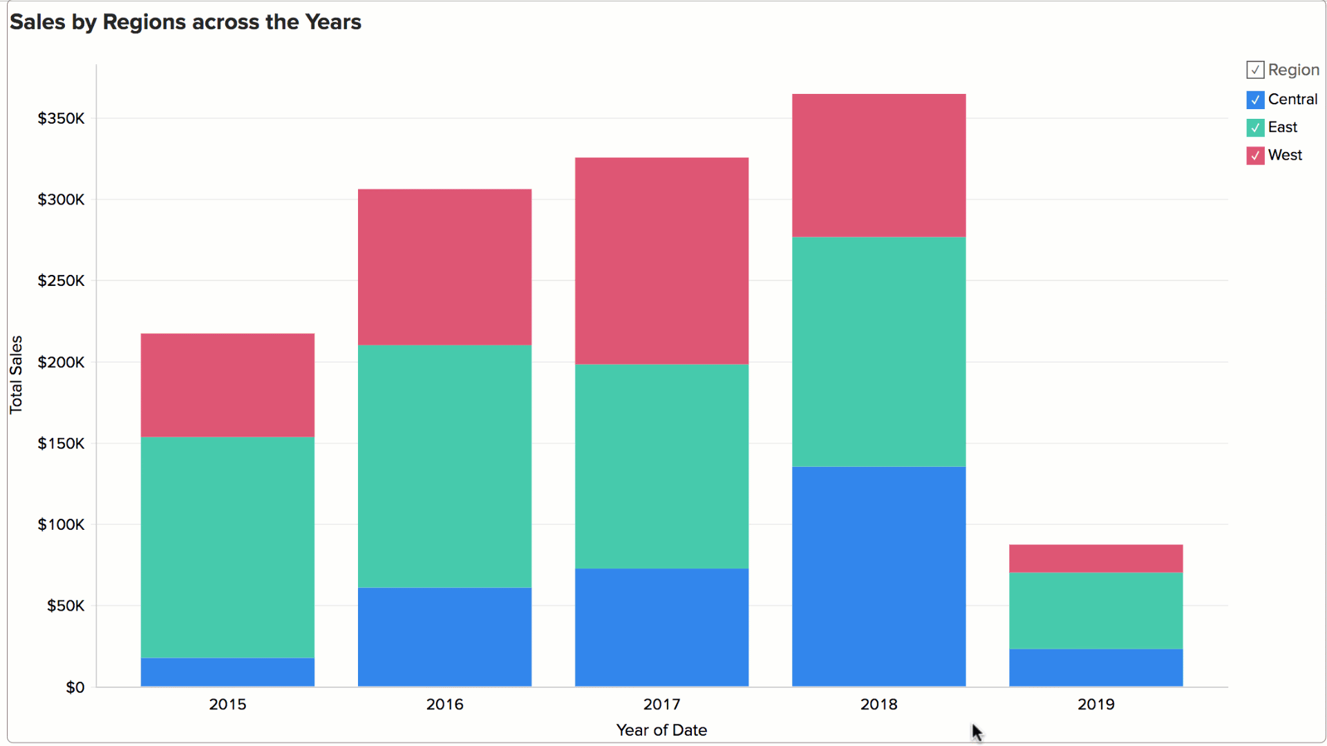
If Legend Filters are exposed then users of the chart can dynamically filter the data series in a chart by selecting/deselecting the corresponding legend item connected to the data series. For instance, in a chart that displays date wise sales in each region, if you want to display only East and West region data, hover the mouse on the legend and deselect the Central legend item. This removes the Central region data and will dynamically regenerate the chart with the remaining data as shown below.

In case you want to select/deselect all legends items at a time, select the check box provided adjacent to the legend title.
Using User Filters
In ManageEngine Analytics Plus, chart owners can add User Filters to their charts, to provide dynamic filtering capability to the users. User Filters in a chart enables users to dynamically filter the data displayed in the chart by selecting or deselecting the appropriate values in the filter columns provided.
Following is brief description on how to use the provided user filters for various column types:
Date type columns:
Incase of a user filter on a Date type column, options to select date ranges or a multiple select combo box to select the required dates will be provided to allow users to select values depending on the component type chosen by the chart owner.
To filter displayed chart data using User Filter provided on a Date type column, do the following:
- Select a date range either by typing in the date or by choosing the date with the calender picker.
- If a filter drop down list has been provided, multiple dates can be selected by checking the boxes next to the required date.
- Click OK to apply filter.

Numeric type columns:
Incase of a user filter on a Numeric type column, a slider or a multiple select combo box will be provided to allow users to select values depending on the component type chosen by the chart owner.
To filter displayed chart data using User Filter provided on a Numeric type column, do the following:
- Choose a specific numeric range by adjusting the slider bars accordingly.
- If a filter drop down list has been provided, multiple values can be selected by selecting the boxes next to the filter items.
- Click OK to apply filter.

Category(String) type columns:
Incase of a user filter on a Category(String) type column, a single or multiple select drop down box will be provided to select values depending on the component type chosen by the chart owner.
To filter displayed chart data using User Filter provided on a Category/String type column, do the following:
- Invoke the filter drop down list containing the filter values.
- Select the required filter values in the filter drop down list.
- If the filter drop down list provides check boxes next to the filter items, multiple values can be selected simultaneously as shown below.
- Click OK to apply the filter.


Select Others filter item, if you want to display data corresponding to all other remaining items that are not listed in the user filter drop down.
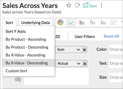
Sorting a chart
Analytics Plus allows you to sort the chart metrics by Axis and by Legend. You can sort the chart in ascending or descending order and also apply a custom sort to meet your requirements.
To sort your chart, click the Sort button, and select the required option from the drop down menu that appears.
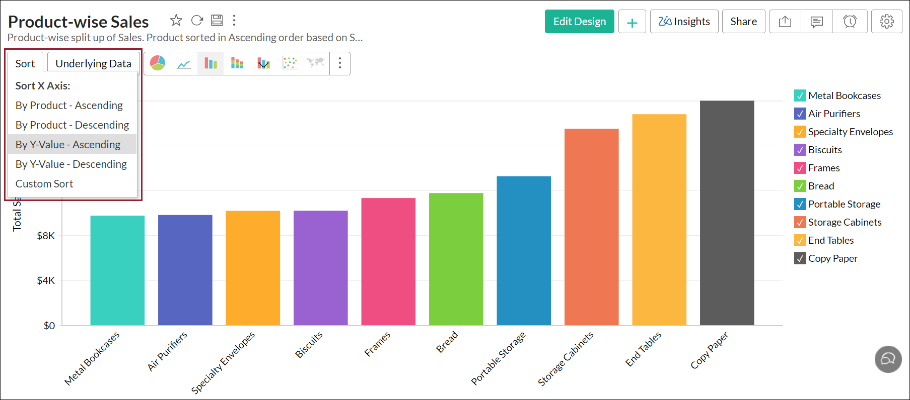
Sort by axis
You can sort your chart based on the values in your X and Y axis columns. The following are the available options:
By <X-axis> - Ascending: Sorts the chart in ascending order based on the X-axis values.
By <X-axis> - Descending: Sorts the chart in descending order based on the X-axis values.
By Y-value - Ascending: Sorts the chart in ascending order based on the Y-axis values.
By Y-value - Descending: Sorts the chart in descending order based on the Y-axis values.
Custom Sort: This option allows you to sort columns containing texts as required.
Sort by Legend
You can also sort your chart based on the chart legend values in either the ascending or the descending order, or apply a custom sort.
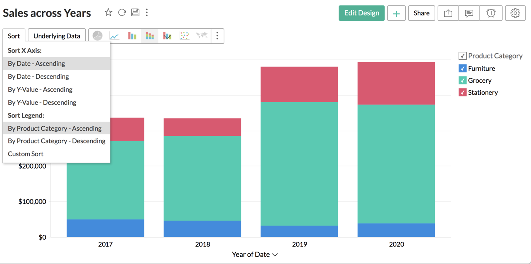
Note: You can sort charts only when either a Category OR a Date column is a available on the X or the Y axis.
Custom Sort
When your chart contains Category (String) column in one of the axes and Numeric column in the other, you can sort the chart based on your own custom defined order. This is called Custom Sort.
For example if a chart displays medals won by each country in Athletics. By default this will be ordered alphabetically in ascending order (like Bronze, Gold & Silver). Using custom sort, you can order the medals in a natural priority order like Gold, Silver and Bronze, irrespective of the alphabetical order as shown below.

Steps to sort chart by your own custom defined order:
- Open the Chart to sort.
- Click the Sort button in the toolbar and then click Custom Sort. The Custom Sort Order dialog box will open.
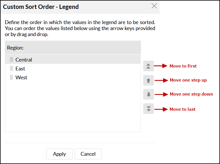
- Order the column values listed using the arrow keys provided or by drag and drop.
Note: The Custom Sort Order dialog box will list all values in the column. The filter criteria applied on the chart will not be applied here.In case the value is no longer available in the underlying data, you will find an option to delete it from the Charts custom sort dialog.
- Select the Make this Global check box, if you want to set this order as the default, when custom sort is applied for this column (in this chart or any other chart in which this column is part of). Setting this option will also override the sort order in any chart already created, with global custom order set based on this column.
- Click Apply button, the chart will be organized as you define.
When you share the chart, the order that you have defined will be set as the custom sort order for your shared users. They cannot define/modify the custom sort order. When you share the data tables to users for creating their own chart, then the user can define their own custom sort order for the chart they create.
Points to Note on Sorting:
- In case of a chart having multiple Y-axes, sorting is allowed only if you have a category or date column in the X-axis.
- Sort by Value options will be disabled in case of multiple Y-axes charts.
Changing Chart types
A chart can be easily changed to another chart type any time at a click of a button. Tool bar provides you with the options to choose between Pie, Bar, Stacked Bar, Line, Scatter and Table chart types at the top level. If you do not find the chart type that you are looking for, then click on Other Charts button in the toolbar and select the chart type that you want to apply, from the Chart Options dialog box that appears. After selecting the required chart type in the dialog box, click OK.

Split Axis/Merge Axis
In ManageEngine Analytics Plus, when you create a Line, Scatter, Bar and Combination chart with multiple Y-axes, by default each Y-column will be plotted in its own axis i.e., with split (separate) axis. However, you can choose to combine or merge them per your requirements.
To merge all the axes in your chart, click the Merge Axis button in the toolbar. You can click the Split Axis button that now appears to switch back.
To merge only specific axes from your chart, simply drag and drop the axes you wish to combine. To remove a merged axis, click the Split axis icon that appears on mouse over the merged axis in the chart.
Note: Charts with multiple Y-axes will be shared to users with Split or Merge axis based on the mode in which it was designed.
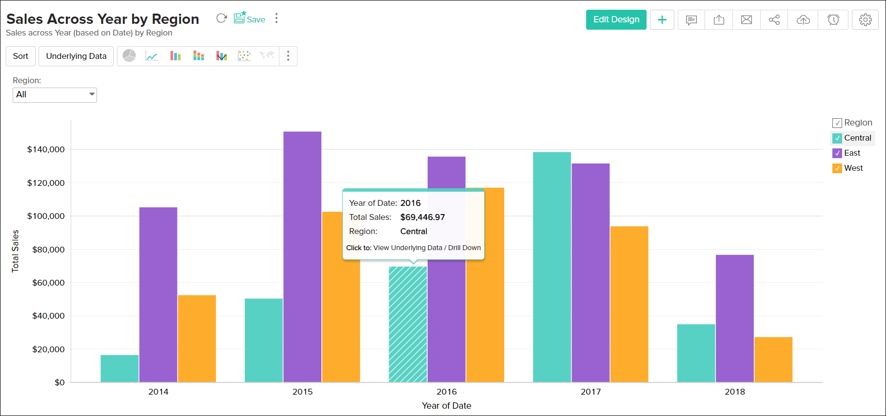
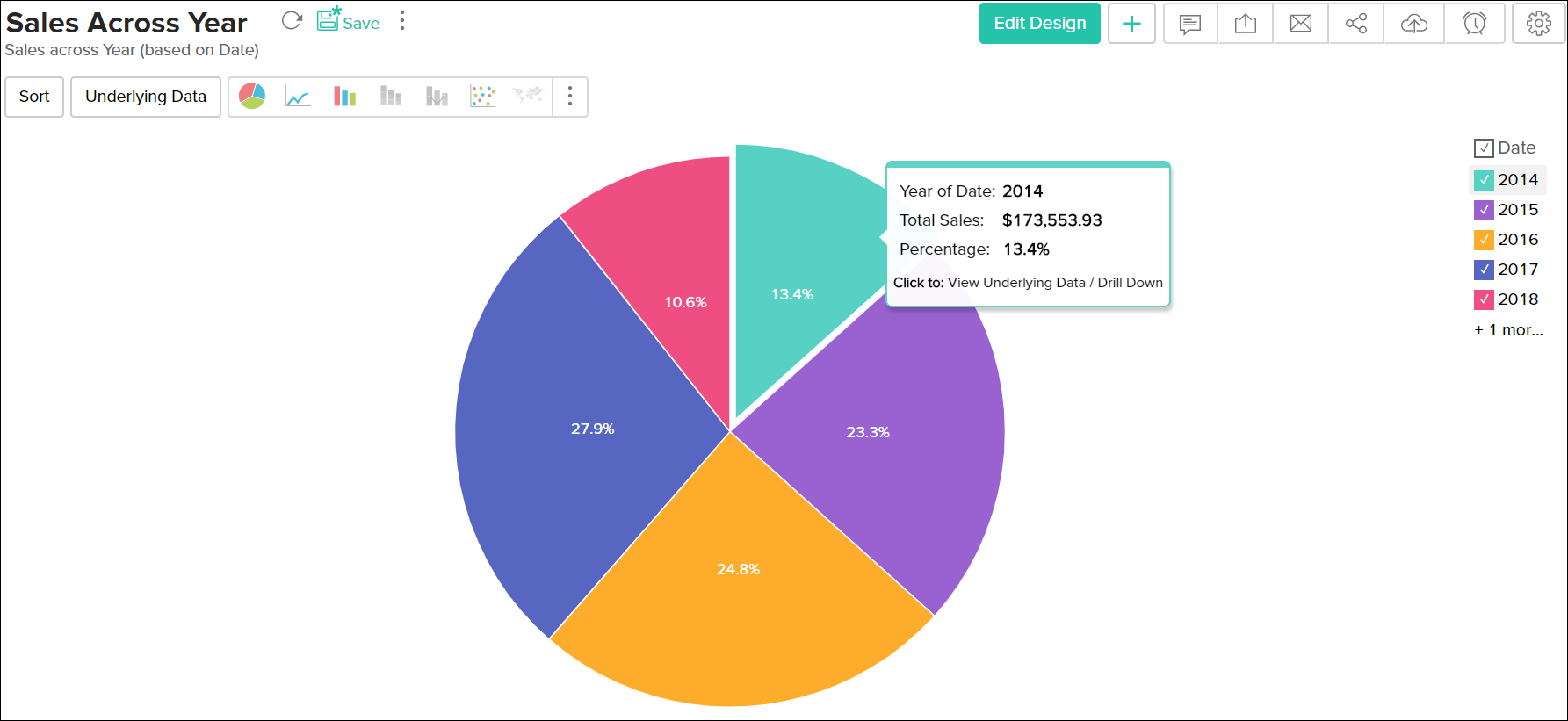
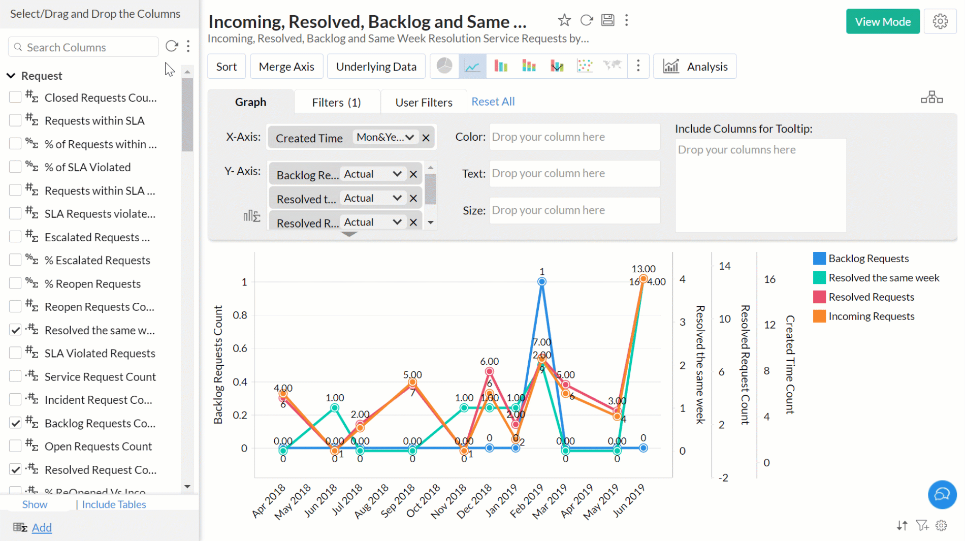
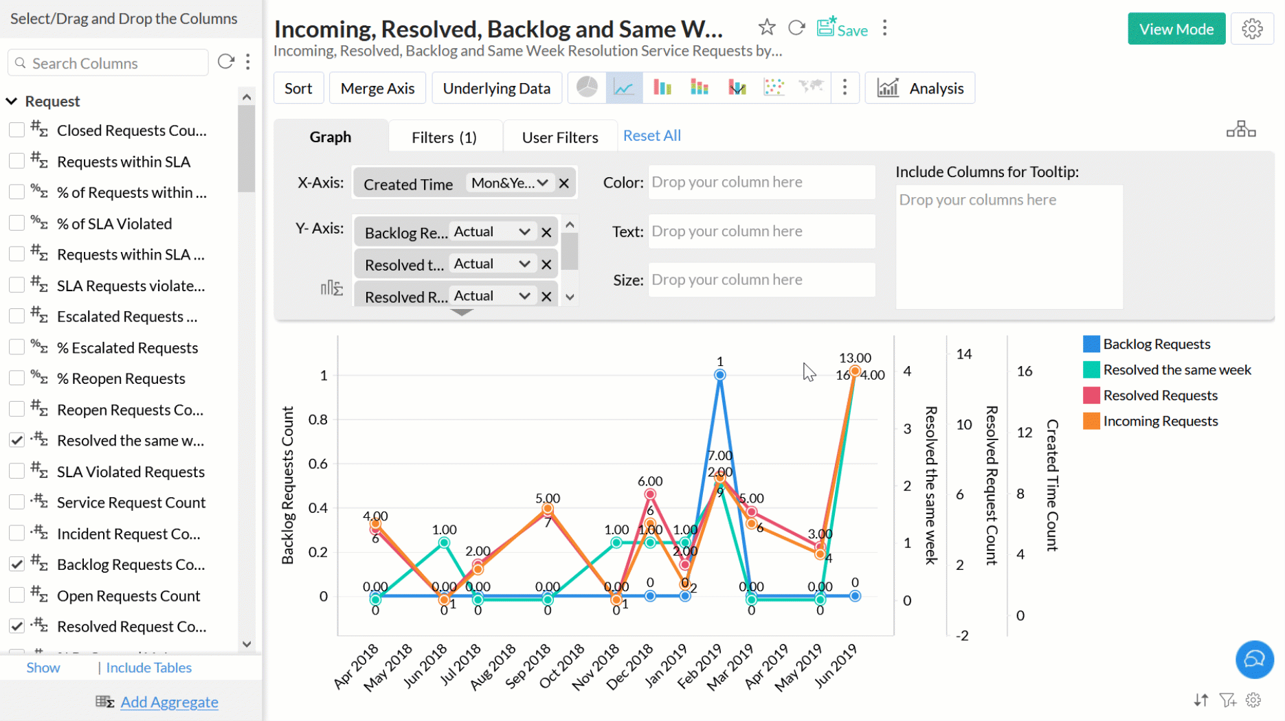
View Underlying Data(Data Drill Down)
Often you need to view the data that makes up your chart. ManageEngine Analytics Plus provides two options to view (drill into) the chart data. These options are:
- View Underlying Data
- Chart Drill Down
You can view these options by clicking the corresponding chart series.

View Underlying Data
The View Underlying Data option allows you to view the underlying data of the data point. You can click on any data point in the chart to view the underlying data of that corresponding point in a pop up table. You can also view the entire data making up the chart by clicking on the Underlying Data option in the toolbar.
The following screenshot shows the underlying sales data from Region "East" in the year "2014" displayed, when you click on the corresponding bar on the chart.

The table popup dialog showing the underlying data provides options to search, filter and sort the data displayed. You can also export the underlying data into variety of file formats like CSV, XLS, PDF and HTML.
Chart Drill Down
The Chart Drill Down option enables you to do deeper exploratory analytics on a chart. You can click on any point in the chart and visualize the underlying data points as a new chart.

You can also ignore the value in the Color tile and drill down on the entire data present in the chart using the Ignore Color Selection toggle button.
Analytics Plus provides a default Drill Down path for charts, which can be configured as needed. To know how to set the drill down path refer to Set Drill Down Path section.
Switch axis
Analytics Plus allows you to switch your chart's axis dynamically, to view the chart per your requirements. To do this, open the required chart and click the X-axis label at the bottom. The Switch Axis popup appears, listing the columns included in the chart's drill down path. Select the required column and the chart will be displayed with the new X-axis values.
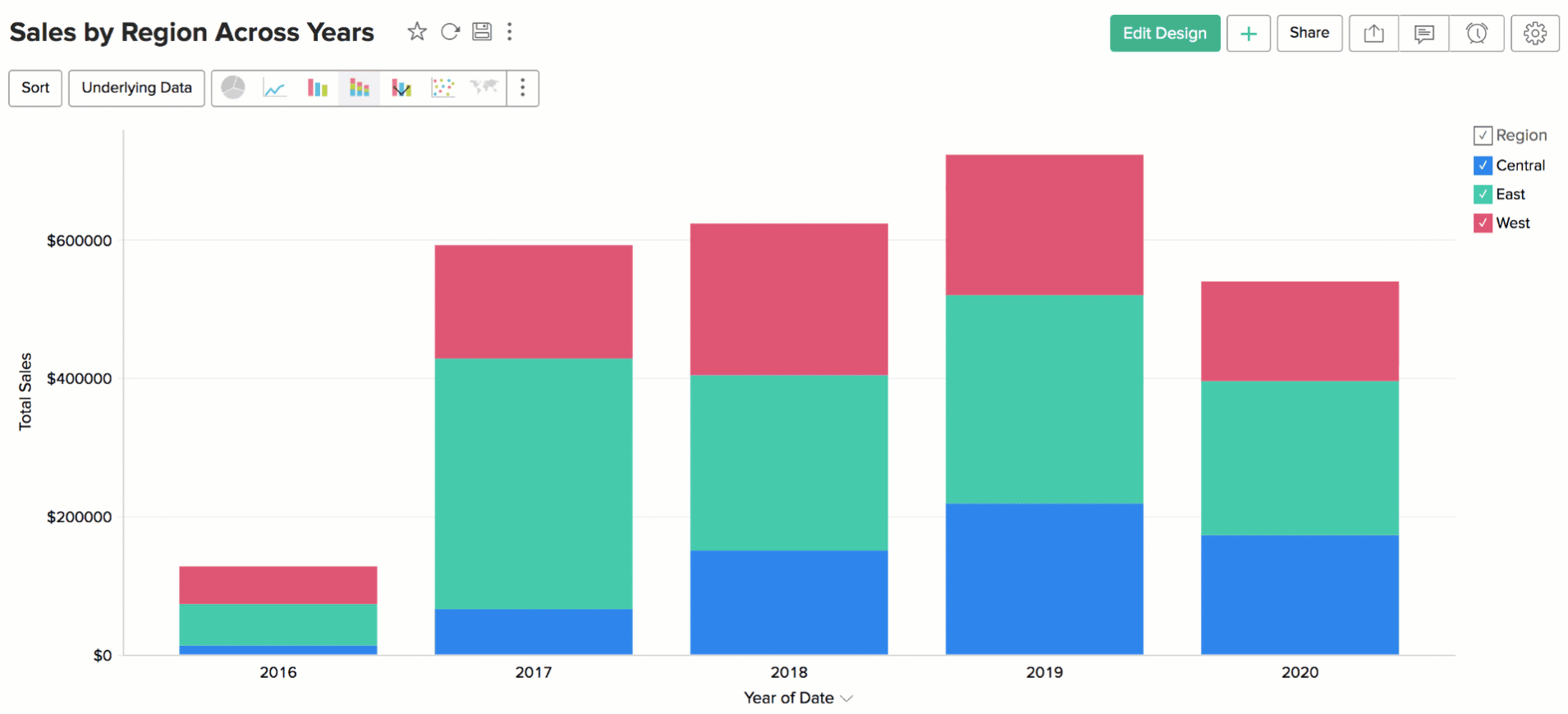
Chart operations such as drill down will work with the new axis that is chosen. The new axis will be retained until the next page refresh.
Exporting a Chart
ManageEngine Analytics Plus allows you to export charts that you have created into various file formats like CSV, PDF, XLS, HTML or Image files. To export a chart:
Exports the underlying data of the chart as a Excel file.
- Image - Exports the chart as a GIF or PNG image.
- In the export settings window that opens, set the required options and then click Export button at the bottom to export.

Refer the Exporting a View section to learn more.
Sharing a Chart
In ManageEngine Analytics Plus you can easily share charts that you have created, for other users access. You can also set specific permissions on the shared charts, so that the users would be allowed to do only permitted actions when they access the chart. The various share options are provided under the Share menu in the toolbar.
Refer Sharing and Collaborationto know how to share your Charts.
Note: Share option will be enabled only to users who have been provided that permission during sharing.
Publishing a Chart
ManageEngine Analytics Plus allows you to publish/embed charts that you have created, into your websites/web pages or as easy to access URLs. ManageEngine Analytics Plus also allows you to control the access privileges and permissions provided to the users who access the chart.
Refer Publishing Options to know how to Publish your Charts.
Note: This option will be enabled only to the Server Administrator and Workspace Administrator.