Predefined tabs and widgets
Last updated on:
In this page
Overview
The Log360 dashboard provides a near real-time view of security-related data through graphs and charts. It helps you identify anomalies, analyze threats and attack patterns, and understand log trends at a glance. The dashboard is organized into tabs, each containing widgets that present specific security information.This guide explains the purpose of each dashboard tab and describes how the widgets help visualize key security data.
Dashboard tabs:
The dashboard comes with the following default subtabs:
- Events Overview
- Network Overview
- Security Overview
- M365
- Incident Overview
- Threat Analytics
- Detection Overview
- AD Audit
Each tab comprises numerous widgets.
Events Overview
This tab presents an overview of various key events monitored by the product console. The widgets in this dashboard provide insights on the various critical events generated in the network within the specified time frame.
The Events Overview tab has the following widgets:
| Widget Name | Function | Widget image |
|---|---|---|
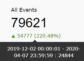
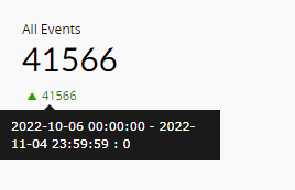
| All Events | This widget presents the total number of events/logs collected by the SIEM module within the given time frame. |
|
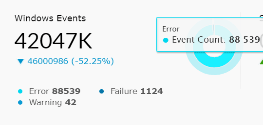
| Windows Events | This widget presents the total number of Windows-based events collected by the SIEM module within the chosen time frame. In addition to that, the pie chart splits the Windows Events into error events, failure events, and warning events. Success/info events are filtered and not displayed. |
|
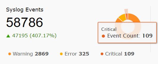
| Syslog Events | This widget presents the total number of Syslog events collected within the given time frame. Furthermore, the pie chart splits the syslog events into warning, error, and critical events. |
|
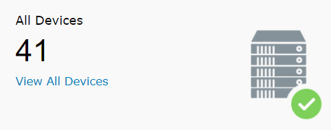
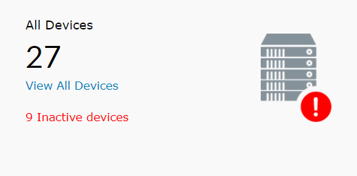
| All Devices | This widget provides a count of all the enabled devices from which log data is being collected. The server image in the corner will have a green tick if all logs are being collected successfully. A warning icon indicates that logs aren't being collected from some of the devices. Additionally, this widget has a View All Devices link. Clicking on the link will redirect you to the device dashboard page, which will provide detailed information of each device. Clicking on All Device will take you to the Devices tab, from where you can create a new list of Scheduled Reports |
|
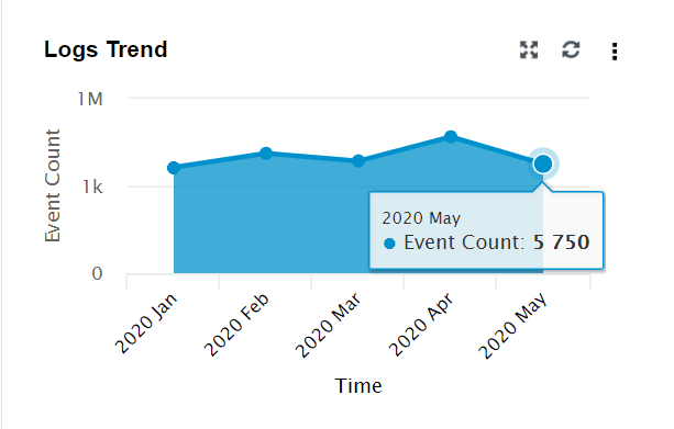
| Logs Trend | This widget presents a time-based log count trend of all events/logs ingested into the SIEM module. The X-axis represents the time range, which is based on the calendar range you choose. If you choose the time range as less than 24 hours, then the graph will present you with hourly log trend data. The Y-axis represents the Event Count. |
|
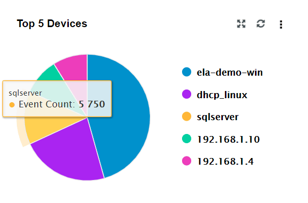
| Top 5 Devices | This widget presents the top 5 devices based on event count. |
|
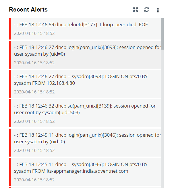
| Recent Alerts | This widget presents the 50 most recent alerts for the given time range. |
|
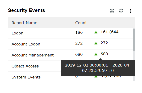
| Security Events | This widget shows a summary of various security events such as Logon, Account Logon, Account Management, and Object Access. |
|
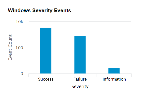
| Windows Severity Events | This widget displays a graph in which the X-axis represents the Severity of a Windows Event and the Y-axis represents the Event Count. |
|
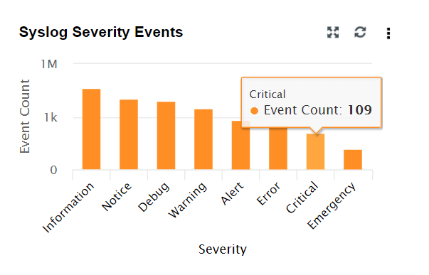
| Syslog Severity Events | This widget displays a graph in which the X-axis represents the Severity of a Syslog Event and the Y-axis represents the Event Count. |
|
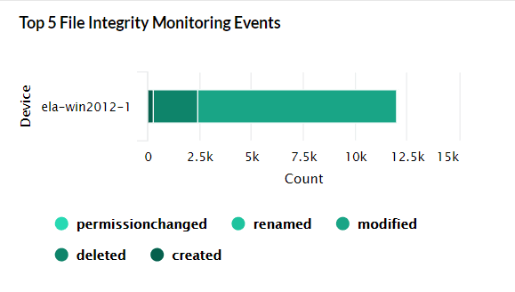
| Top 5 File Integrity Monitoring Events | This widget presents a 3D graph which displays the details of the top 5 file servers based on the log count. Each row contains additional data of various file-based events. |
|
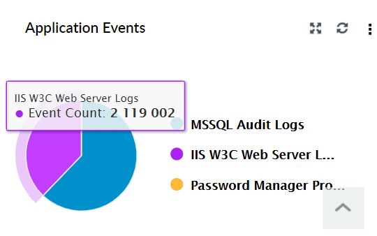
| Application Events | This widget displays a pie chart of the top 10 applications like IIS, DHCP etc based on event count. |
|
Network Overview
This tab gives an overview of various network-related events monitored by generating graphical reports. The widgets in this dashboard provide insights on the various critical events generated in the network within the specified time frame.
The Network Overview tab has the following widgets:
| Widget Name | Function | Widget image |
|---|---|---|
| All Events | This widget presents the total number of network-based events collected by the SIEM module within the given time frame. Network-based events refer to events collected from network devices such as firewalls, switches, and routers. |
|
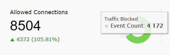
| Allowed Connections | This widget presents the count of all the connections that were allowed by the network device. The pie chart highlights the allowed connections from the total number of connections that occurred in the network within the specified time. |
|
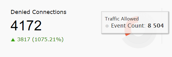
| Denied Connections | This widget presents the count of all the connections that were denied by the network device. The pie chart highlights the denied connections from the total number of connections that occurred in the network within the specified time. |
|
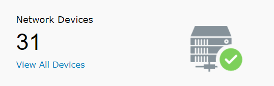
| Network Devices | This widget provides a total count of network devices that are added for monitoring. |
|
Security Overview
This tab provides an overview of the key security events monitored. The widgets in this dashboard provide insights on the various critical events generated in the network within the specified time frame.
The Security Overview tab has the following Widgets:
| Widget Name | Function | Widget image |
|---|---|---|
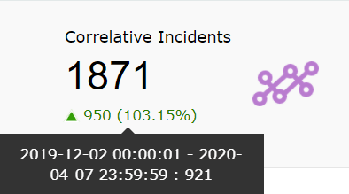
| Correlative Incidents | This widget refers to the number of incidents detected via SIEM module's correlation engine. |
|
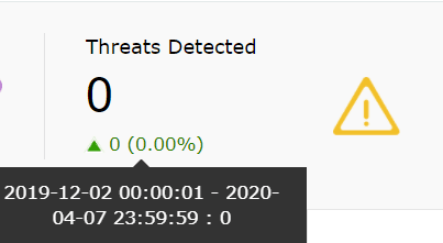
| Threats Detected | This widget shows the logs from Threat Sources that are identified as threats by the SIEM module. These logs are selected based on predefined detection rules. |
|
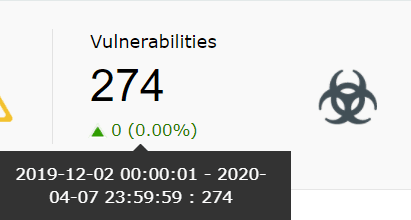
| Vulnerabilities | This widget displays the total number of vulnerabilities detected by the vulnerability scanner(s) whose data are being imported into SIEM module. |
|
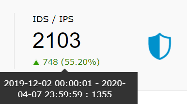
| IDS/IPS | This widget presents the total count of IDS/IPS events within the chosen time frame. |
|
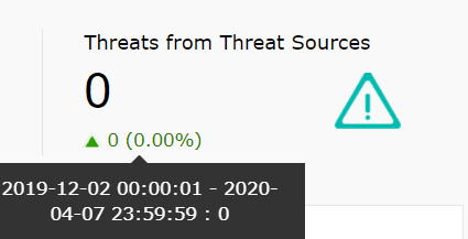
| Threats from Threat Sources | This widget presents the total number of threats from the configured Threat Sources (such as Symantec, McAfee, Malwarebytes etc) within the chosen time frame. |
|
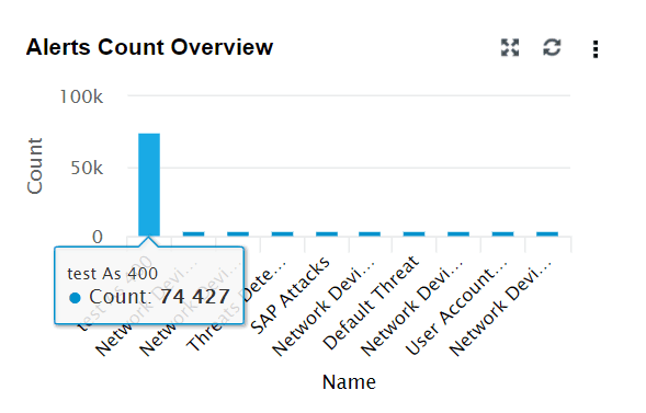
| Alert Count Overview | This widget provides an overview of each configured alert profile. The X-axis denotes the alert profile, and the Y-axis denotes the count. |
|
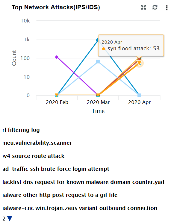
| Top Network Attacks (IPS/IDS) | This widget includes a graph showing a time based trend for IDS/IPS events. The X-axis represents the time range. It will be based on the calendar range you choose. The Y-axis represents the event count, and the Z-axis represents the IDS/IPS event type. Top 10 events are displayed based on the event count. |
|
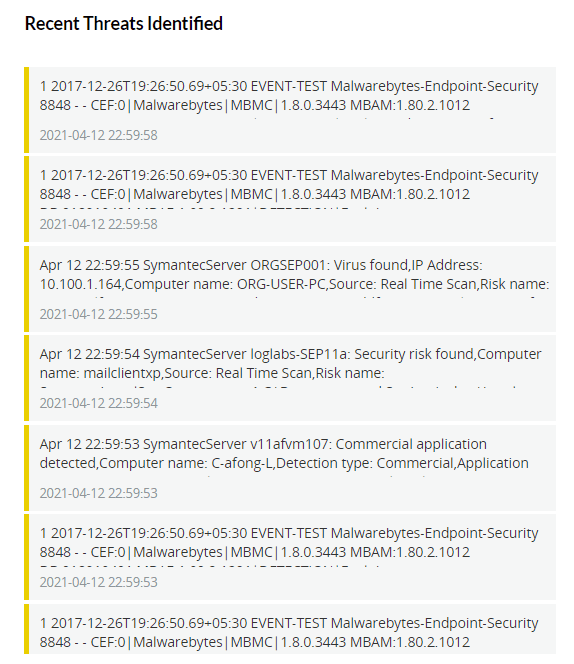
| Recent Threats Identified | This widget displays the most recent 50 threats based on the calendar range. |
|
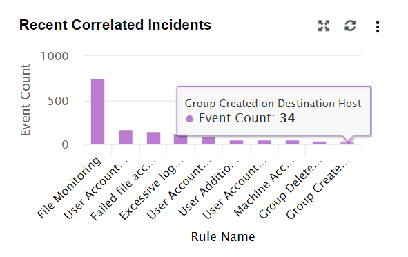
| Recent Correlated Incidents | This widget is similar to Alert Count Review. It provides an overview of the recent correlated incidents. The X-axis denotes the correlation rule, and the Y-axis denotes the event count. |
|
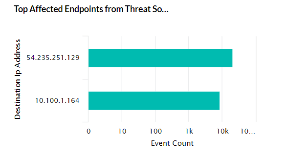
| Top Affected Endpoints from Threat Sources | This widget shows the Top 5 endpoint devices in which threats were detected by Threat Sources (Symantec, McAfee, etc) |
|
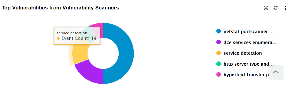
| Top Vulnerabilities from Vulnerability Scanners | This widget includes a pie chart that displays the top 5 vulnerabilities (selected on the basis of event count) detected in endpoint devices by the vulnerability scanner. |
|
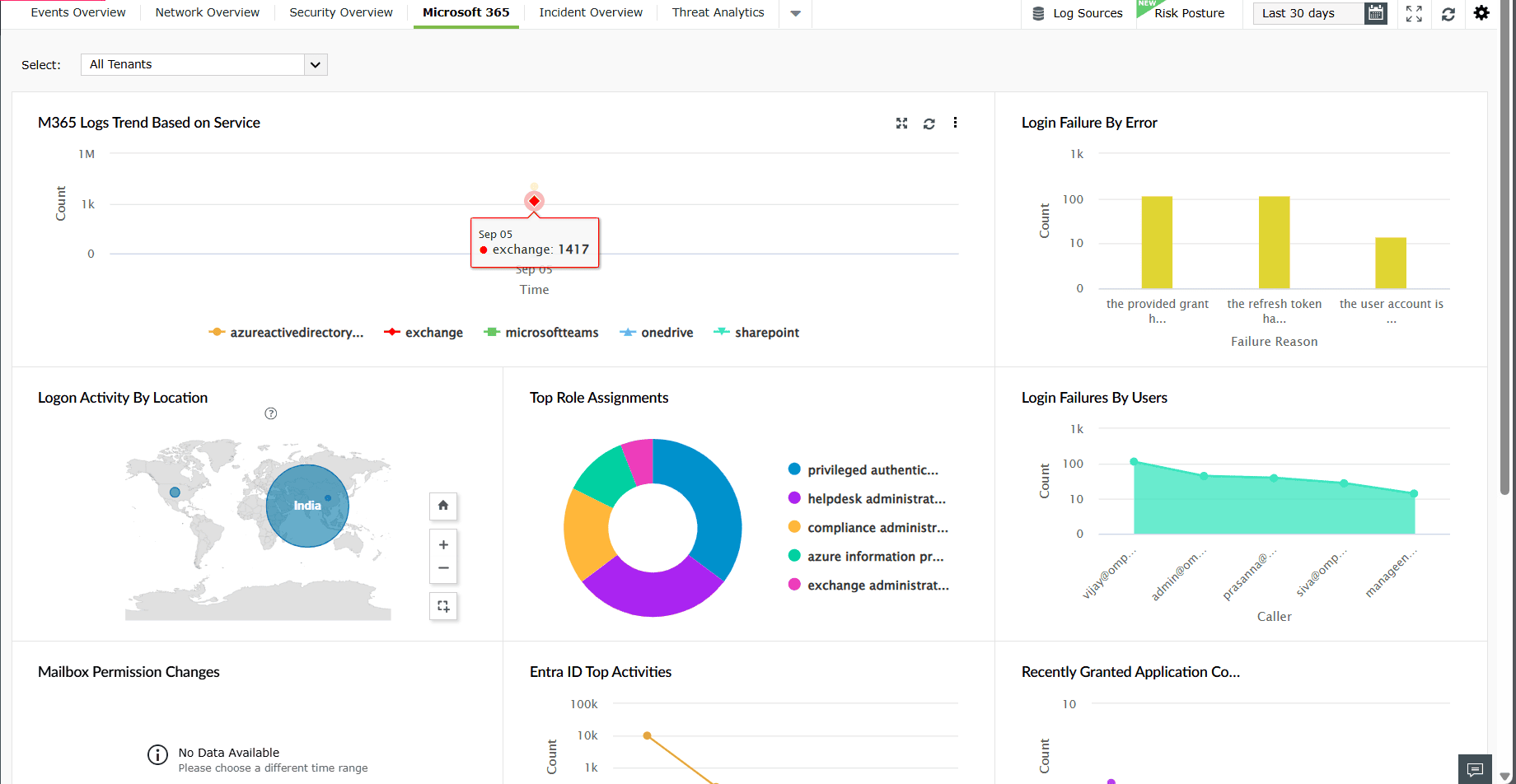
Microsoft 365
This tab provides an overview of activities and security events from various Microsoft 365 services. The widgets in this dashboard help you monitor login activity, role assignments, service usage, and activity trends across Exchange Online, SharePoint, Teams, OneDrive, and Entra ID.
The M365 Overview tab has the following widgets:
| Widget Name | Function | Widget image |
|---|---|---|
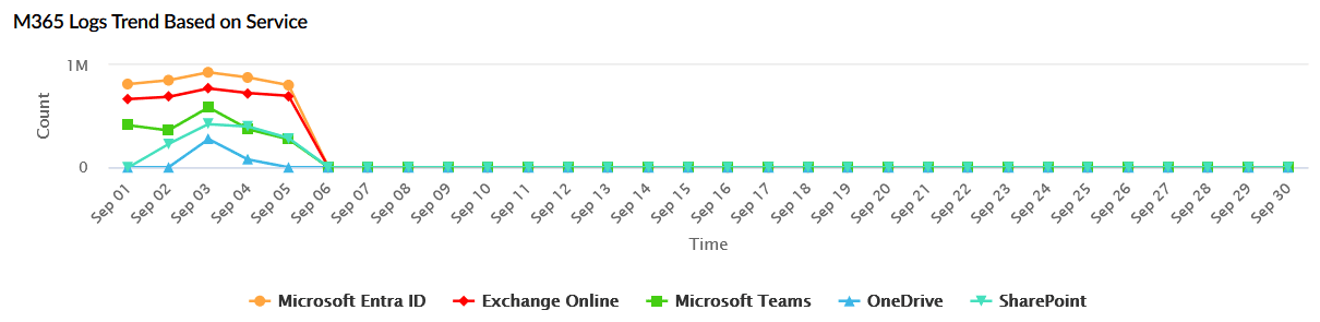
| M365 Logs Trend Based on Service | Displays the total number of logs received from M365 services (Microsoft Entra ID, Exchange Online, Teams, OneDrive, and SharePoint) over the selected time period. The X-axis represents the time range, and the Y-axis represents the log count. |
|
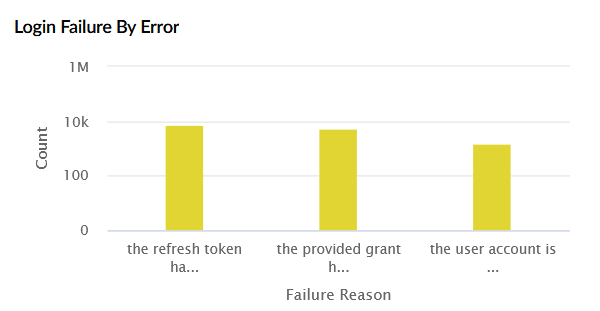
| Login Failure by Error | Shows failed login attempts categorized by error type, along with their count. The X-axis represents the failure reason, and the Y-axis represents the count. |
|
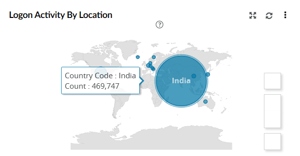
| Logon Activity by Location | Displays a world map of user login activity by country, highlighting the geographic distribution of sign-ins. Each circle corresponds to the logon count. |
|
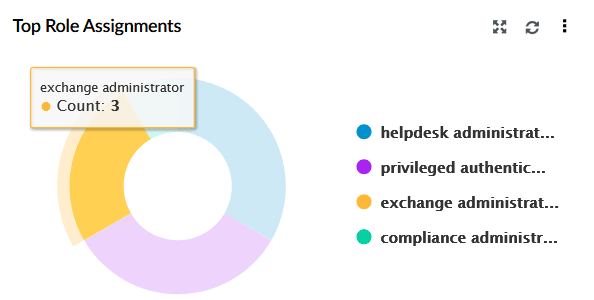
| Top Role Assignments | Lists the most assigned roles in the organization, such as global administrator. |
|
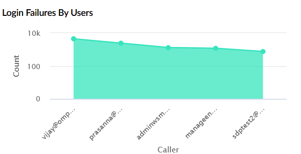
| Login Failures by Users | Shows the number of login failures per user within the chosen time range. The X-axis represents users, and the Y-axis represents the failure count. |
|
| Mailbox Permission Changes | Displays mailbox permission modifications performed by users specifically add and remove operations. The X-axis represents the type of operation, and the Y-axis represents the count. |

|
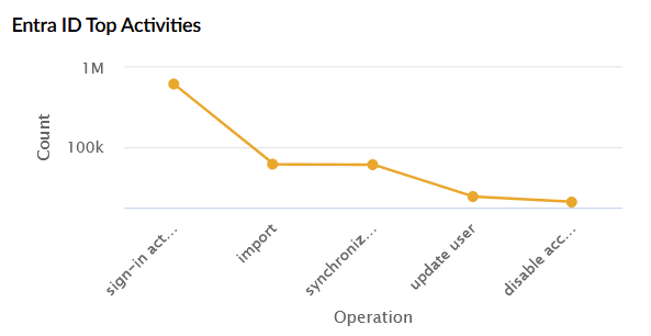
| Entra ID Top Activities | Shows the most common operations performed in Entra ID such as sign-in activity, import, synchronize, update user, and disable account. The X-axis represents the operation type, and the Y-axis represents the count. |
|
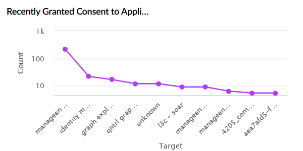
| Recently Granted Consent Applications | Displays applications to which users or admins recently granted consent. The X-axis represents the application name, and the Y-axis represents the permission grant count. |
|
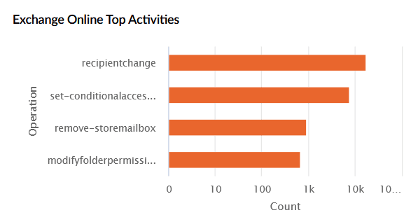
| Exchange Online Top Activities | Lists the top Exchange Online operations performed. The X-axis represents the operation, and the Y-axis represents the count. |
|
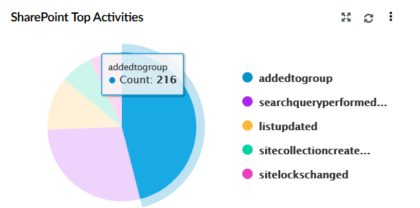
| SharePoint Top Activities | Displays a pie chart of the top SharePoint activities such as group additions, search queries, list updates, and site creation. |
|
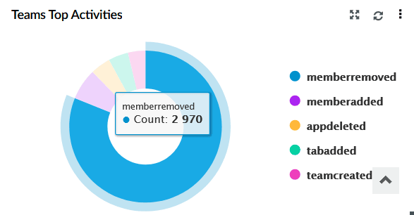
| Teams Top Activities | Displays a pie chart of the top Teams operations such as member added/removed, team creation, app added, and tab added. |
|
Incident Overview
This tab presents an overview of various security incidents. The widgets in this dashboard provide insights on the various critical incidents detected in the network within the specified time frame.
The Incident Overview tab has the following Widgets:
| Widget Name | Function | Widget image |
|---|---|---|
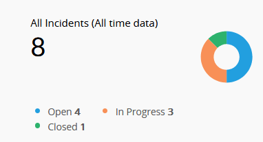
| All Incidents (All time data) | This widget displays the total number of incidents raised till date, categorized by status: Open (blue), In Progress (orange), and Closed (green). |
|
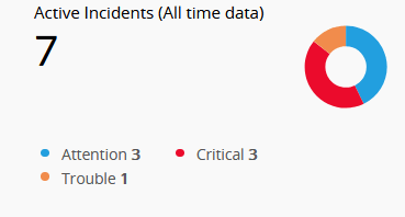
| Active Incidents (All time data) | This widget represents incidents that are currently Open or In Progress, categorized based on severity: Attention (blue), Trouble (orange), and Critical (red). |
|
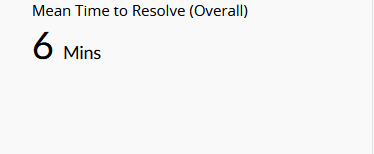
| Mean Time to Resolve (Overall) | This widget displays the average time taken to resolve incidents from the time they were created. |
|
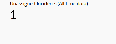
| Unassigned Incidents (All time data) | This widget indicates the number of incidents that have not yet been assigned to any user. |
|
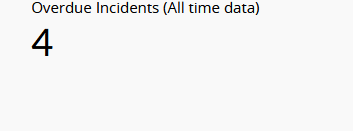
| Overdue Incidents (All time data) | This widget shows the count of incidents that have passed their expected resolution date. This helps track unresolved tasks beyond due dates. |
|
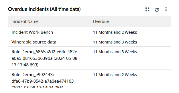
| Overdue Incidents (All time data) | This widget displays a table listing the names of overdue incidents along with their overdue duration. |
|
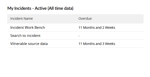
| My Incidents - Active (All time data) | This widget displays active incidents specifically assigned to the current user, along with overdue details. |
|
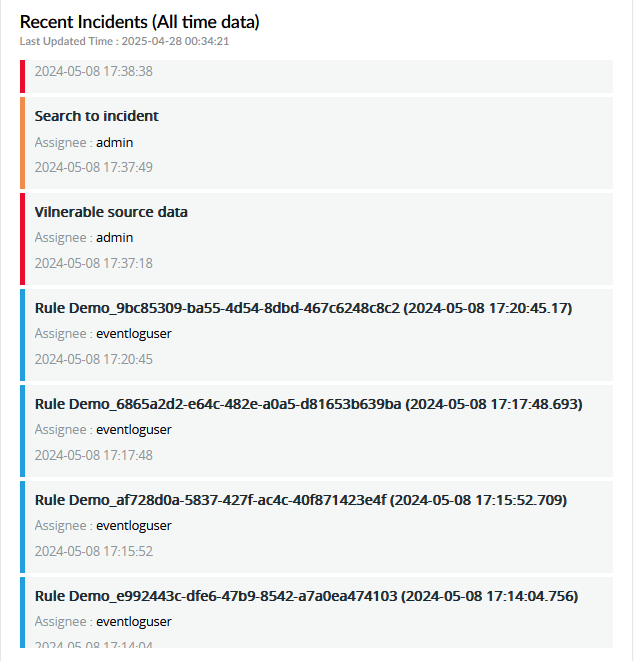
| Recent Incidents (All time data) | This widget lists the 50 most recent incidents created, including incident name, assignee, and timestamp. |
|
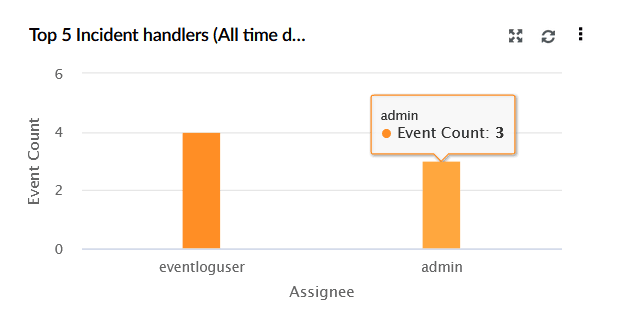
| Top 5 Incident Handlers (All time data) | This widget represents a bar chart that shows the top 5 users (assignees) based on the number of incidents they are handling. X-axis represents the Asignee, Y-axis shows Event Count. |
|
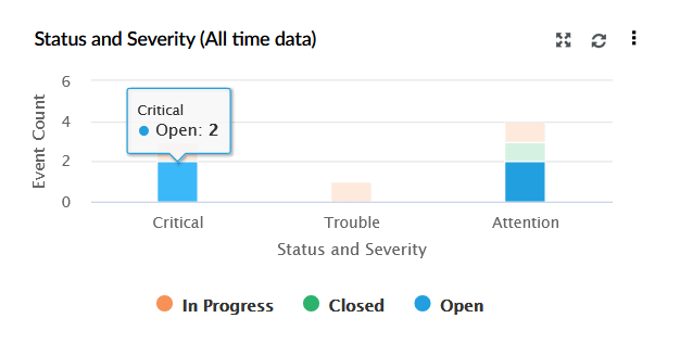
| Status and Severity (All time data) | This widget represents a bar chart displaying incidents based on both their status (Open, In Progress, Closed) and severity (Critical, Trouble, Attention). X-axis represents Status and Severity, and Y-axis represents Event Count. |
|
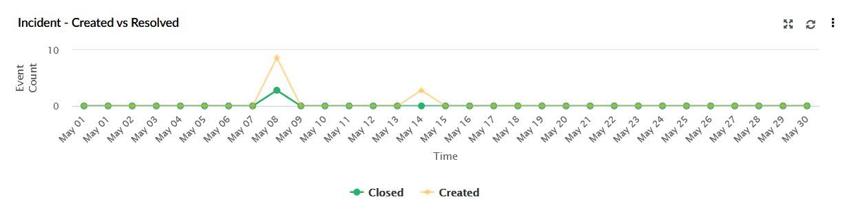
| Incident - Created vs Resolved | This widget represents a line graph comparing the number of incidents created (yellow) versus those closed (green) over time. X-axis represents Time, Y-axis representsCount. |
|
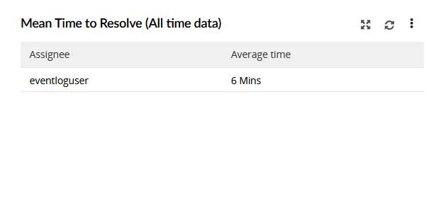
| Mean Time to Resolve (All time data) | This widget represents a table showing the average resolution time for each assignee. |
|
Threat Analytics
This tab presents an overview of various threat-related activities monitored. The widgets in this dashboard provide insights on the various critical threats identified in the network within the specified time frame.
The Threat Analytics tab has the following Widgets:
| Widget Name | Function | Widget image |
|---|---|---|
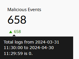
| Malicious Events | This widget displays the total number of events flagged as malicious based on the threat feeds from the configured threat sources like STIX/TAXII and ATA threat servers. |
|
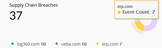
| Supply Chain Breaches | This widget displays the number of breaches attributed to third-party applications or vendors, helping assess external risk exposure through the supply chain. |
|
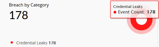
| Breach by Category | This widget categorizes breaches by the type of data exposed, such as Credential Leaks or Personal Info Leaks, giving insights into the nature of the stolen data. |
|
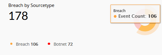
| Breach by Sourcetype | This widget presents breaches based on their origin, which can be either from Botnet or Breach. Botnet refers to breaches caused by malware infections, while Breach refers to data exposed on the dark web through unknown sources. |
|
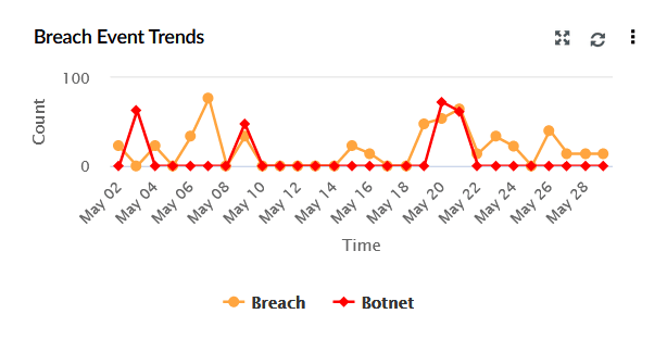
| Breach Event Trends | This widget represents a time-based graph showing the frequency of botnet and breach-related events over the selected date range. The X-axis represents the time range, which is based on the calendar range you choose. If you choose the time range as less than 24 hours, then the graph will present you with hourly log trend data. The Y-axis represents the Count. |
|
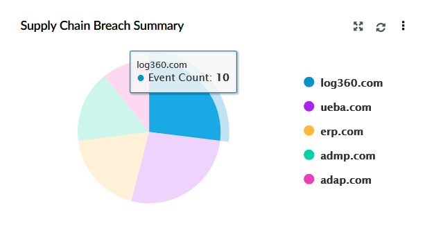
| Supply Chain Breach Summary | This widget represents a pie chart showing the distribution of breaches across affected third-party services or vendors, offering insight into which external platforms are most compromised. |
|
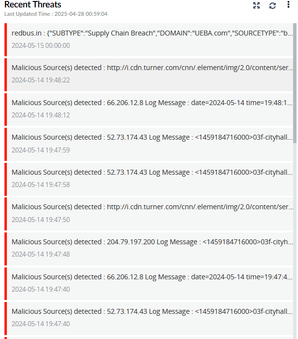
| Recent Threats | This widget is a real-time feed of the recent threat alerts, both from dark web sources and malicious event detections. |
|
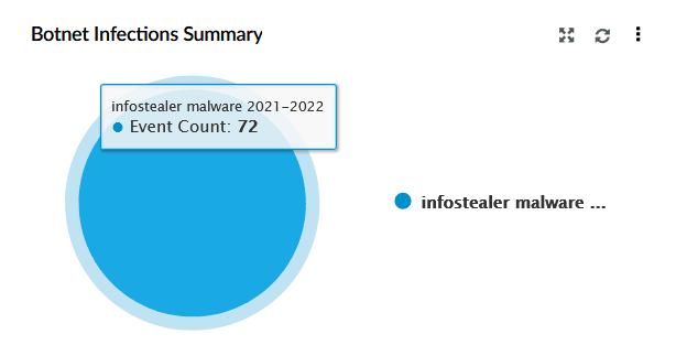
| Botnet Infections Summary | This widget represents a pie chart summarising botnet-related activity by malware type. |
|
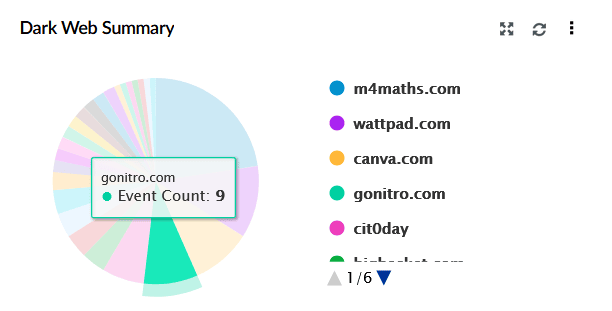
| Dark Web Summary | This widget represents a pie chart of leaked data detected across various dark web sources. |
|
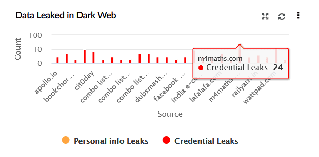
| Data Leaked in Dark Web | This widget represents a bar chart displaying the volume of leaked data found on the dark web. X-axis represents the breached source domains, and Y-axis indicates the count of leaked data instances. It distinguishes between Personal Info Leaks (orange) and Credential Leaks (red). |
|
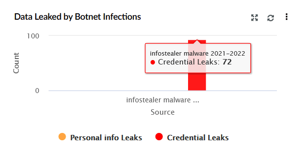
| Data Leaked by Botnet Infections | This widget represents a bar chart summarising data leaked specifically due to botnet malware. The X-axis shows the malware type, while the Y-axis represents the count of leaked credentials. |
|
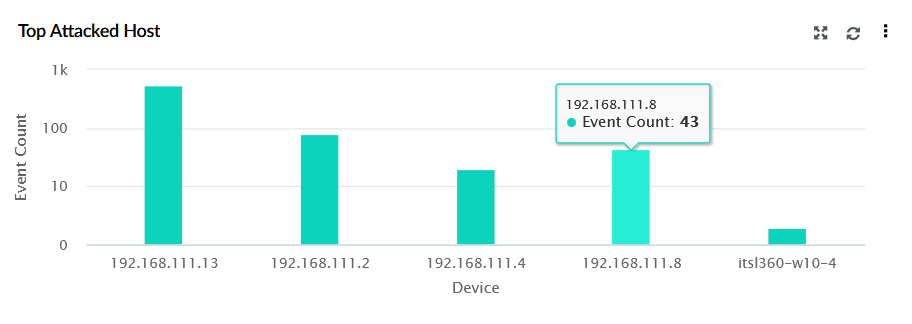
| Top Attacked Host | This widget displays a bar graph listing the most frequently targeted devices. X-axis represents the IP addresses or device names, and Y-axis shows the Event Count. |
|
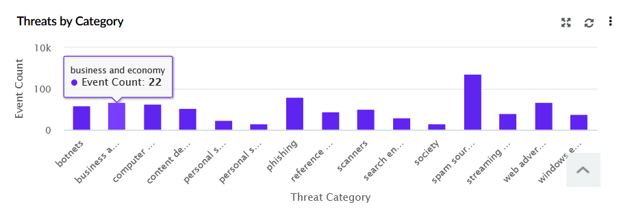
| Threats by Category | This widget displays a bar chart of malicious events, comparing them based on their threat category. The X-axis lists threat types (e.g., phishing, botnets), while the Y-axis represents the event count, providing insights into which threats have occurred most frequently. |
|
Detection Overview
The tab provides a centralized view of detections across your environment. It helps security teams monitor threats, analyze patterns, and prioritize incidents using real-time visuals and context-driven insights.
| Widget Name | Function | Widget image |
|---|---|---|
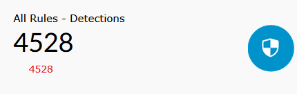
| All Rules - Detections | Displays the total number of detections triggered by all rules within the selected time frame. |
|
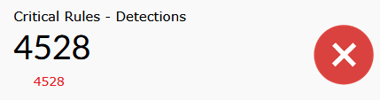
| Critical Rules - Detections | Shows the total number of detections triggered by rules categorized as Critical during the selected time frame. |
|
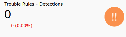
| Trouble Rules - Detections | Shows the total number of detections triggered by rules categorized as Trouble during the selected time frame. |
|
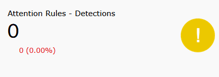
| Attention Rules - Detections | Shows the total number of detections triggered by rules categorized as Attention during the selected time frame. |
|
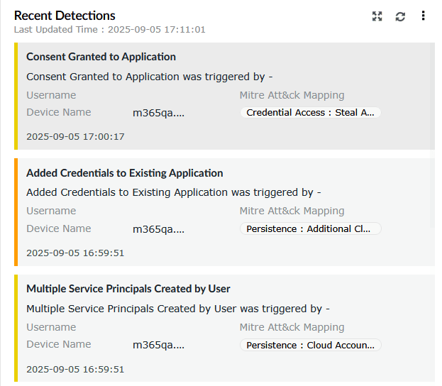
| Recent Detections | Lists the most recent detections triggered, along with details such as rule name, username, device name, and mapped MITRE ATT&CK tactic. |
|
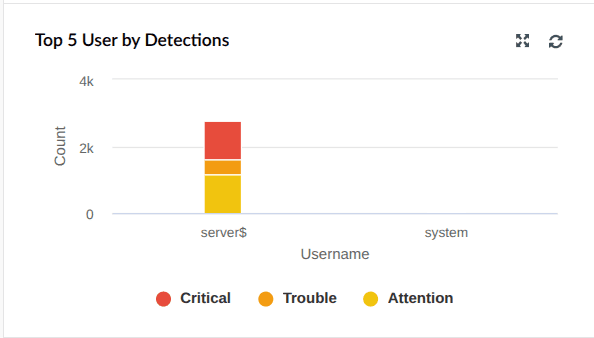
| Top 5 Users by Detections | Shows the top five users who have generated the highest number of detections, further categorized by severity. |
|
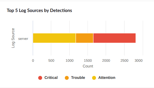
| Top 5 Log Sources by Detections | Displays the top five log sources based on detection count, categorized by severity. |
|
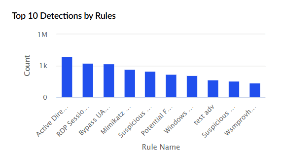
| Top 10 Detections by Rules | Highlights the ten rules that triggered most frequently within the selected time range. The X-axis represents rule identifiers, and the Y-axis shows the detection count. |
|
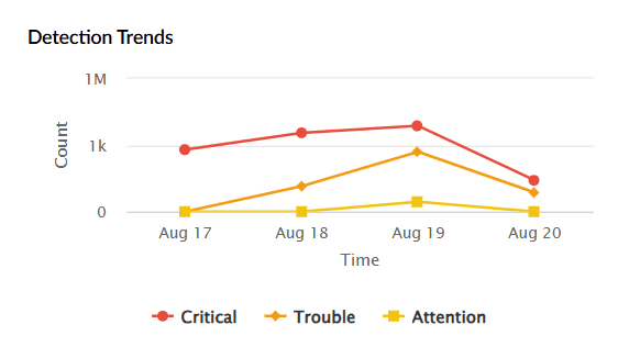
| Detection Trends | Provides a time-based view of detections. The X-axis represents the time period selected, while the Y-axis shows the count of detections categorized by severity. |
|
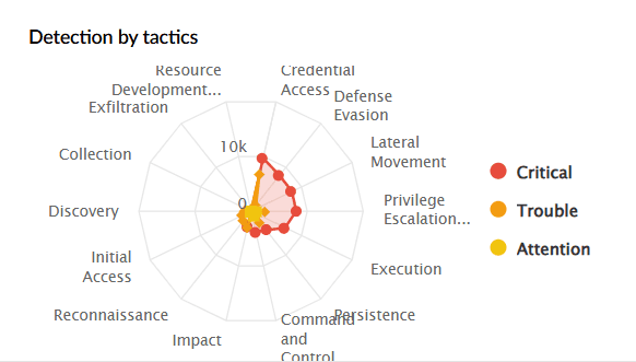
| Detection by Tactics | Displays a radar chart of detections mapped to MITRE ATT&CK tactics such as Credential Access, Persistence, Defense Evasion, etc. You can filter by severity. |
|
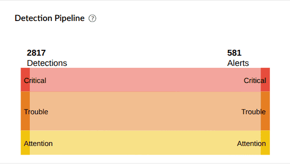
| Detection Pipeline | Summarizes detections based on severity and shows how many alerts were triggered for each severity type. |
|
AD Audit
This tab provides an overview of Active Directory logon activities, account changes, GPO modifications, and password resets. The widgets in this dashboard help administrators detect logon anomalies, track object modifications, and monitor account lockouts within the AD environment.
The AD Audit tab has the following widgets:
| Widget Name | Function | Widget image |
|---|---|---|
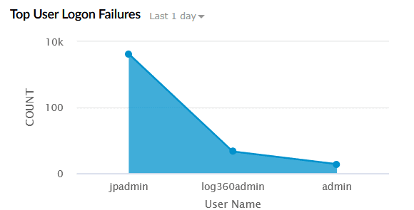
| Top User Logon Failures | Displays the users with the most failed logon attempts within the selected time range. The X-axis represents the User Name, and the Y-axis represents the Count of failed logons. |
|
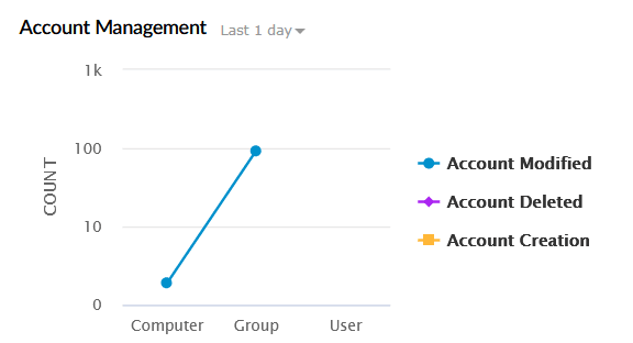
| Account Management | Tracks account-related operations across users, groups, and computers. This includes account creation, deletion, and modification. The X-axis represents the Object Type (User, Group, Computer), and the Y-axis represents the Event Count. |
|
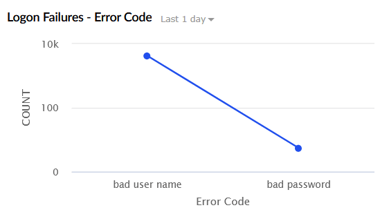
| Logon Failures - Error Code | Categorizes logon failures by error type such as invalid username and invalid password. The X-axis represents the Error Code, and the Y-axis represents the Count. |
|
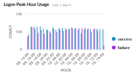
| Logon Peak Hour Usage | Shows logon activity trends by time of day. The X-axis represents the Hour of the Day, and the Y-axis represents the Logon Count. |
|
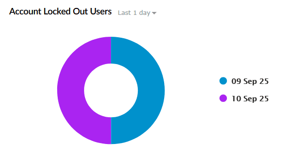
| Account Locked Out Users | Displays users whose accounts were locked due to repeated failed login attempts during the selected time period. |
|
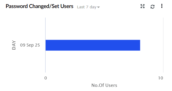
| Password Changed/Set Users | Tracks user password resets and change attempts. The X-axis represents the Type of Operation (Password Set, Password Change Attempt), and the Y-axis represents the Number of Users. |
|
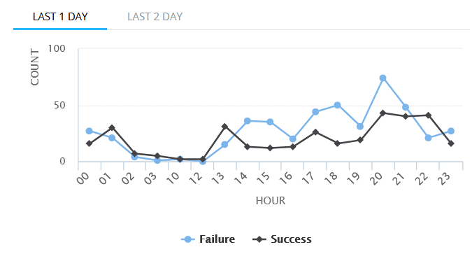
| ADFS Logon History | Displays logon activity for Active Directory Federation Services. The X-axis represents the Hour of the Day, and the Y-axis represents the Logon Count, categorized into successful and failed attempts. |
|
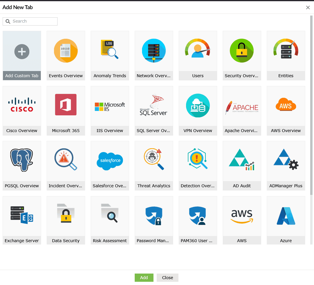
In addition to the above, there are multiple predefined templates available for dedicated monitoring. Select the ![]() icon and click Add tab to view the list of tabs available.
icon and click Add tab to view the list of tabs available.
Read also
This page explained about the predefined dashboard tabs and widgets in Log360. To learn how to customize dashboards and manage widgets, refer to the following documents: