Creating Custom Reports
What are custom reports?
Custom Reports let you build tailored, on-demand reports from the endpoint data collected by Endpoint Central. You can choose specific data columns, apply filter conditions, group data logically, preview results in real time, and export finished reports as PDF, CSV, or XLS files.
Custom Reports support three data sub-modules — Computer, Hardware, and Software — and two visualization types — Table and Chart.
How to create a Table Report?
Table reports display data in a structured, row-based layout. They are ideal for counting, grouping, or summarising records. Results can be exported as PDF, XLSX, or CSV.
- Navigate to the Reports tab and select Custom Reports.
- Click New Custom Report.
- Provide an appropriate Report Title.
- Select the Sub-Module: Computer, Hardware, or Software.
- Choose the report type as Table.
- Click + Add Column and select the fields to be displayed.
- Use Group By to logically group data. When using Group By, every non-grouped column must have an aggregation set: Count, String, Sum, or Average.
- Navigate to the Filter tab and apply conditions.
- Optionally, click Add Formula Column.
- Click Preview Table.
- Click Save.
Example: Table Report
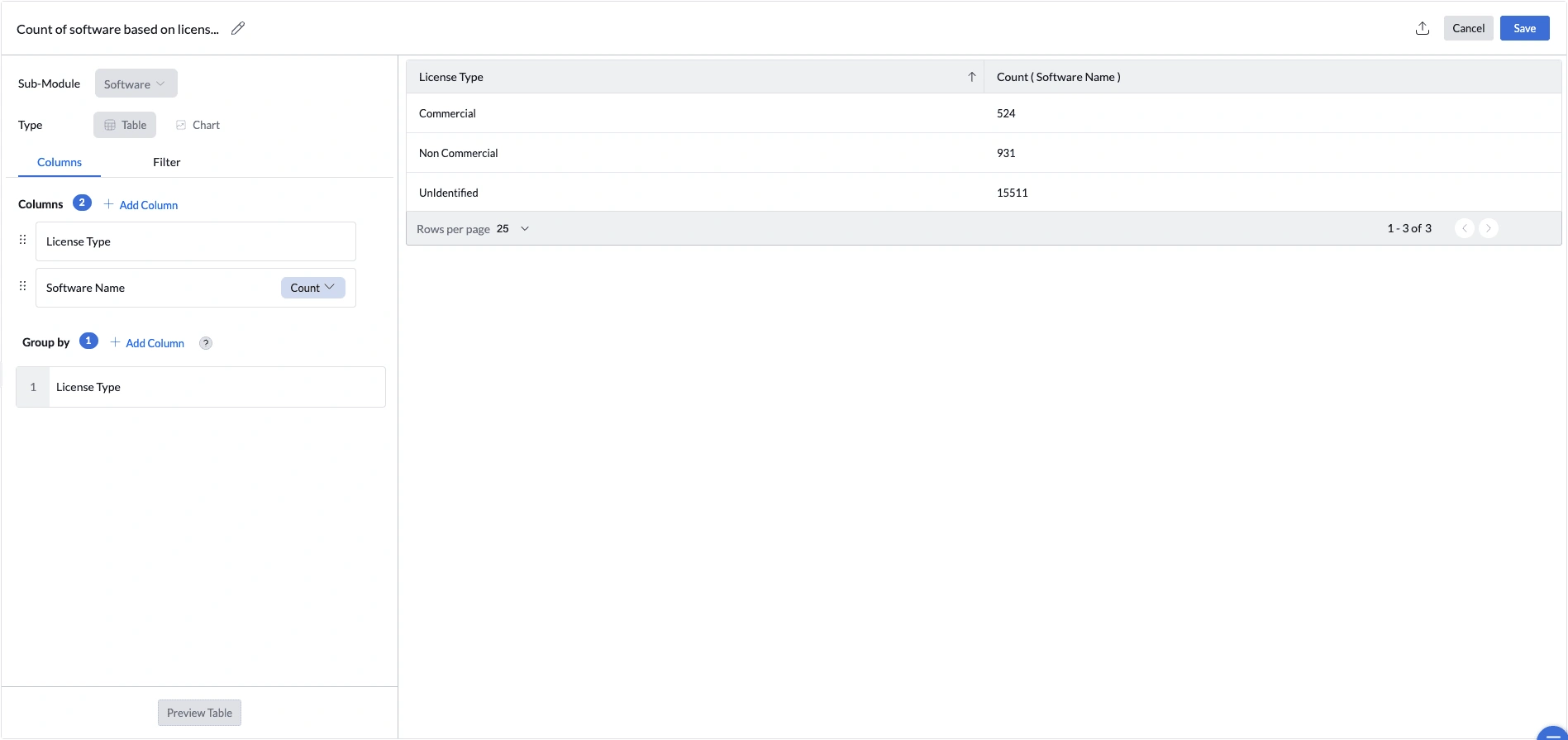
Use Case: Count software titles by licence type to understand the licence composition of your software estate.
- Report title: Count of Software Based on License Type.
- Sub-Module: Software.
- Report type: Table.
- Add columns: License Type and Software Name (Count).
- Group by License Type.
- Click Preview Table, then Save.
The report produces summary rows such as Commercial, Non Commercial, and Unidentified.
How to create a Chart Report?
Chart reports provide a visual summary of your data. Supported chart types are Bar, Line, Area, Pie, Dial, Pyramid, and Funnel.
- Navigate to the Reports tab and select Custom Reports.
- Click New Custom Report.
- Provide an appropriate Report Title.
- Select the required Sub-Module.
- Select the chart type.
- Select the column for the X-axis.
- Select the column for the Y-axis. Chart reports require aggregation: Count, Sum, or Average.
- Optionally, apply filters.
- Optionally, add a formula column.
- Click Preview Chart.
- Click Save.
Example: Chart Report
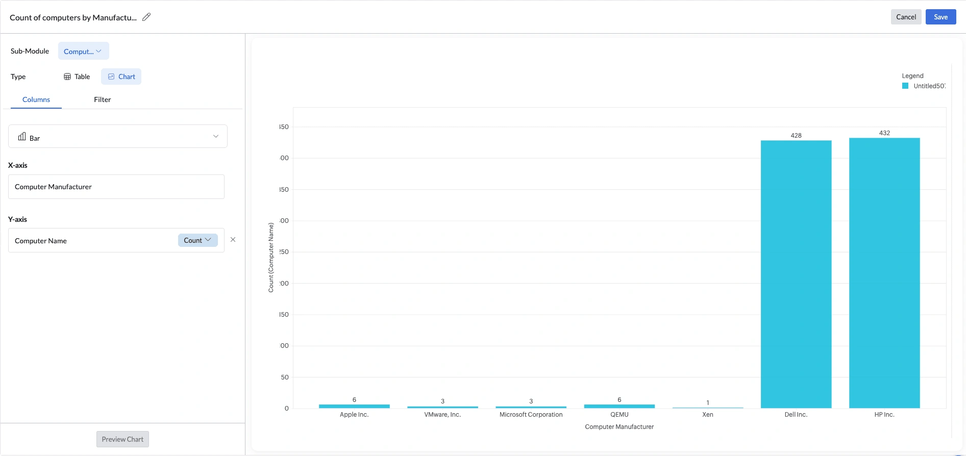
Use Case: Count computers per hardware manufacturer to understand vendor distribution.
- Report title: Count of Computers by Manufacturer.
- Sub-Module: Computer.
- Chart type: Bar.
- X-axis: Computer Manufacturer.
- Y-axis: Computer Name with aggregation Count.
- Click Preview Chart, then Save.
The chart displays one bar per manufacturer. Dell Inc. and HP Inc. typically dominate, giving the procurement team an immediate view of vendor distribution.
How to create a KPI Report?
KPI reports display a single, at-a-glance metric card — ideal for surfacing key numbers like total device count, average OS distribution, or hardware composition directly on a dashboard. Each KPI card shows a Primary Value (the main metric), an optional Secondary Value (a comparison metric), and a title.
KPI cards are built from templates. Currently, there are four templates available. Follow the steps below to create the KPI:
- Navigate to the Reports tab and select Custom Reports.
- Click New Custom Report.
- Provide an appropriate Report Title.
- Select the required Sub-Module.
- Choose the report type as KPI.
- Under the Columns tab, select a Template for the card layout.
- Enter a KPI Title. Optionally, click Add Description to include a supporting note.
- Under Select Column, choose the data field to measure and set its aggregation.
- Under Select Group By, choose the field to group the data by.
- Set the Primary Value — the main metric displayed prominently on the card. Options include Min, Max, Avg, Sum, or Count of the grouped results.
- Set the Secondary Value — the comparison metric shown below the primary value. Options include Min, Max, Avg, Sum, or Count.
- Optionally, apply filters to refine which records are included in the metric.
- Optionally, navigate to the Settings tab to configure the comparison indicator and number formatting:
- Comparison Icon — toggles the trend arrow on the card on or off.
- Value >= 0 icon — the icon shown when the value is zero or positive. Choose from Arrow Up (Green), Arrow Up (Red), Trending Up (Green), Trending Up (Red), Plus (Green), or Plus (Red).
- Value < 0 icon — the icon shown when the value is negative. Choose from Arrow Down (Red), Trending Down (Red), or Minus (Red).
- Show % of Difference — displays the percentage change between the current value and the comparison baseline alongside the trend icon.
- Units — sets the unit label appended to the displayed value. Grouped as General, Disk Size, Currency, Time, Power, etc.
- Click Preview Chart.
- Click Save.
Example: KPI Report
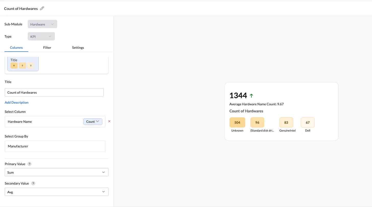
Use Case: Get a quick count of all hardware components across the environment, broken down by manufacturer, so the IT and procurement team can see at a glance which vendors make up the bulk of the hardware estate.
- Report title: Count of Hardwares.
- Sub-Module: Hardware.
- Report type: KPI.
- Template: Value + Trend + Secondary Label + Title with breakdown chips.
- Select Column: Hardware Name with aggregation Count.
- Select Group By: Manufacturer.
- Primary Value: Sum — totals the hardware count across all manufacturer groups.
- Secondary Value: Avg — average hardware count per manufacturer.
- Settings: enable Comparison Icon, set Value >= 0 to Arrow Up (Green) and Value < 0 to Arrow Down (Red); leave Units as None.
- Click Preview Chart, then Save.
The KPI card displays 1344 ↑ as the headline number, with Average Hardware Name Count: 9.67 shown as the secondary reference. Breakdown chips show the split by manufacturer — Unknown — 504, (Standard disk drives) — 96, GenuineIntel — 83, and Dell — 67 — letting the team see at a glance where the bulk of the hardware inventory comes from.
What are Formula Columns?
Formula columns let you create a new field whose value is determined by conditions you define. Instead of showing a raw number, the column shows a meaningful label such as Critical, Warning, or Healthy.
Formula columns use top-down evaluation. Conditions are checked in the order defined, and the first matching condition is applied. If no condition matches, the unmatched value is assigned.
Note: A formula column is visible only to the technician who created it. Formula columns are also scoped to the sub-module in which they were created.
How to define a Formula Column?
- While selecting columns in a custom report, click Add Formula Column.
- Provide a Formula Column Name.
- Provide a Derived Value Name and define the matching condition. You can add up to 5 derived values, with a maximum of 30 criteria across all values.
- Provide a label in the Name for Unmatched Value field.
- Click Save & Select.
Example: Disk Health Classification
Use Case: Classify computers based on available disk space.
- Formula Column Name: Disk Health Status
- Derived Value 1: Critical — Free Space less than 10 GB
- Derived Value 2: Warning — Free Space less than 20 GB
- Unmatched Value: Healthy
A device with 5 GB free is labelled Critical; 15 GB free is labelled Warning; 60 GB free is labelled Healthy.
Notes and Limitations
General
- Reports can be edited at any time using the Edit option.
- Table reports can be exported as PDF, XLSX, or CSV.
- Chart reports cannot be exported or scheduled.
Formula Columns
- Formula columns are technician-specific and not shared with other technicians.
- Formula columns are scoped to the sub-module in which they were created.
- Conditions are evaluated top-to-bottom; the first match wins.
Create AI-powered Custom Reports with Zia
Zia Reports is an AI-powered report generation assistant integrated into the Custom Reports module of Endpoint Central, designed to simplify report creation by allowing users to describe their reporting requirements in natural language. Instead of manually configuring report types, selecting modules, choosing columns, defining filters, and organizing visualizations, Zia automatically generates a report configuration based on the input — which can then be previewed, edited, and saved.
To create AI-powered custom reports using Zia, follow the steps below:
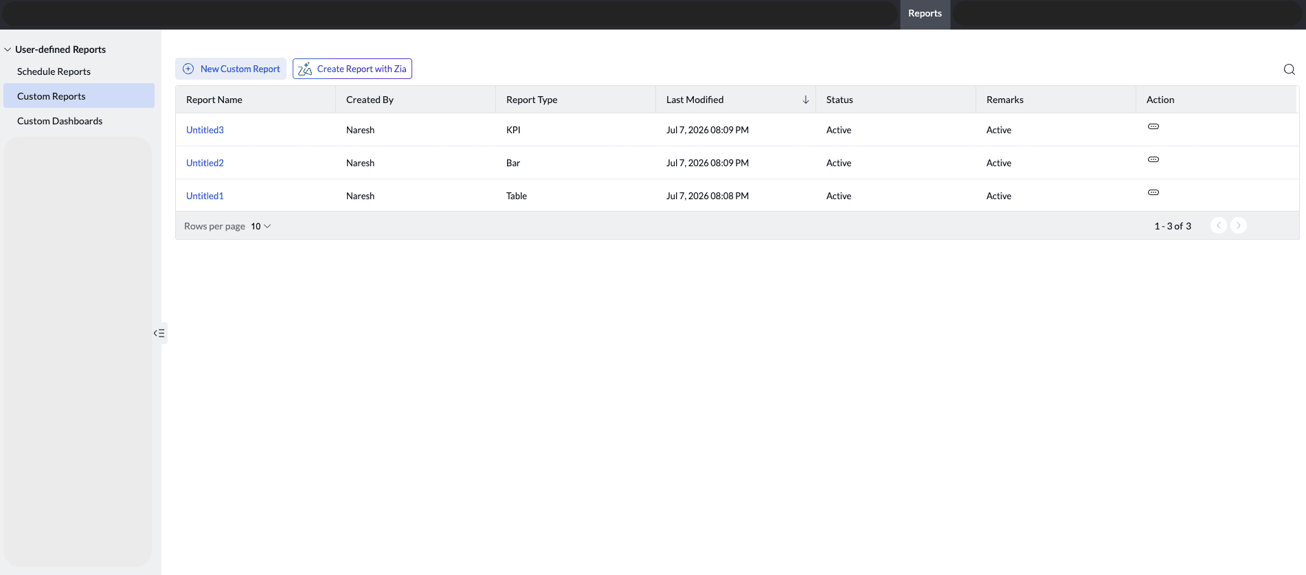
- Navigate to Reports → Custom Reports on the Endpoint Central console.
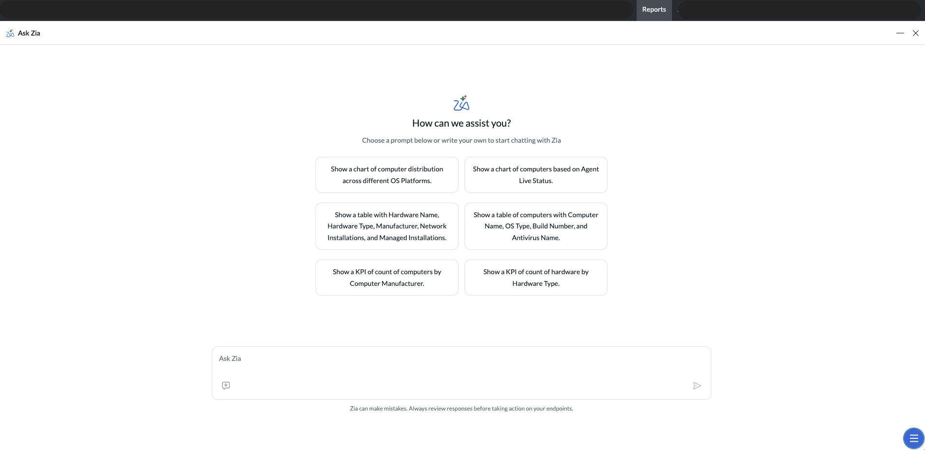
- Click Create Reports with Zia. The Zia assistant panel opens with a chat input field and a set of predefined starter prompts to help you get started quickly.
- Select a starter prompt that matches your requirement, or enter your own report request in natural language as per your business needs. For example, you can type a request such as "Show me all computers that have not been patched in the last 30 days" or "List users with failed login attempts this week."
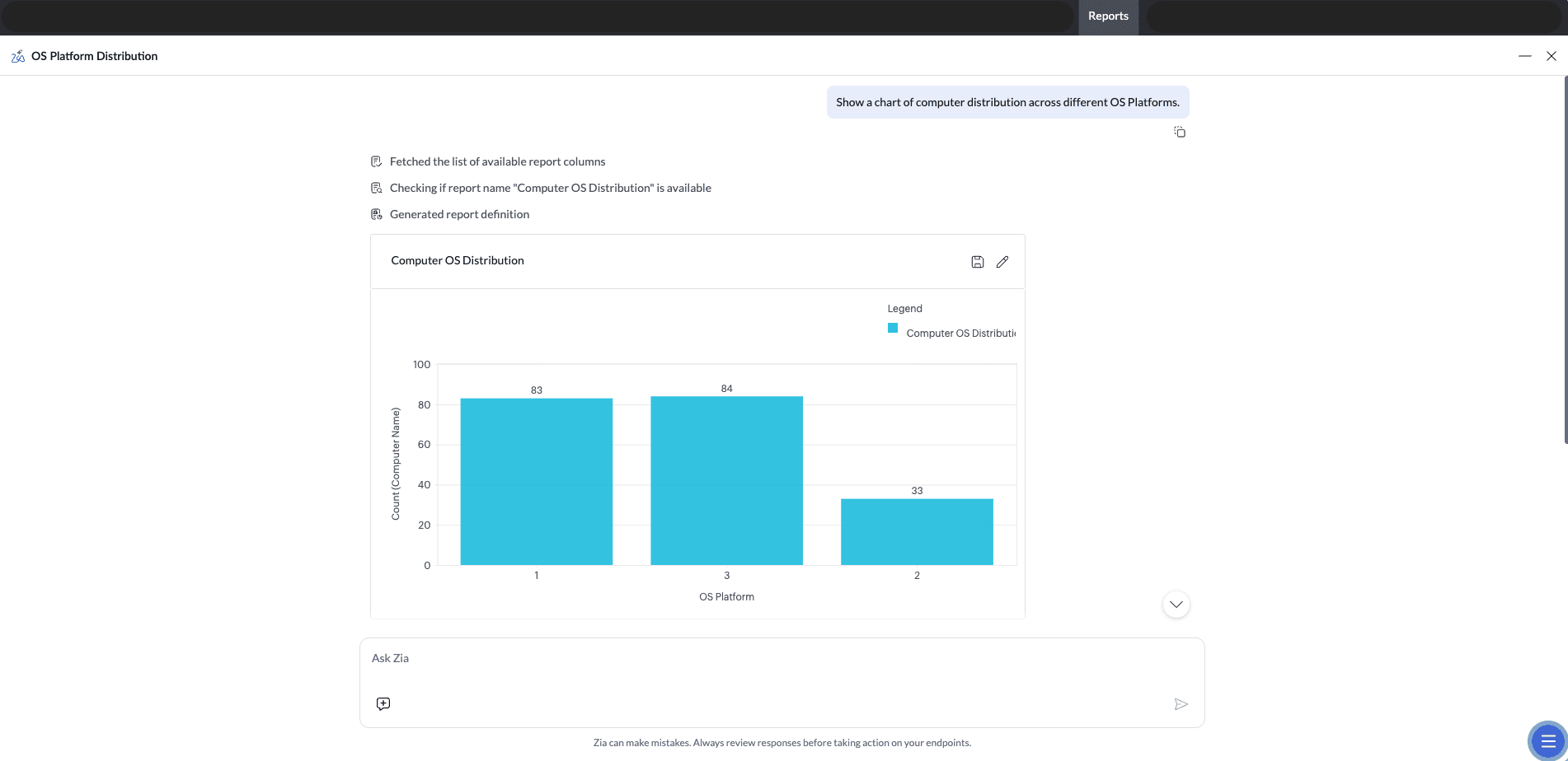
- Zia interprets the natural language input and maps it to the appropriate report configuration. If the request requires additional details or contains ambiguous information, Zia will ask clarifying questions before proceeding.
- Once Zia has sufficient information, it generates the report in one of the following formats — Table, Chart, or KPI — based on the nature of the request.
- A report preview is displayed. Review the generated report to verify that the configuration, columns, filters, and visualizations accurately reflect your intended requirements.
- Once satisfied with the report, click Save to store the custom report for future access and use.
- Only one report can be generated per request.
- Reports must be saved before closing the Zia chat panel. If a report is not saved, both the report configuration and the chat history will be lost, as the session is refreshed upon closing. Unsaved reports cannot be retrieved.
- AI-generated reports should be carefully reviewed for accuracy before being used for operational decisions, IT audits, or business reporting. While Zia is designed to interpret requests accurately, validating the output ensures that the data presented aligns with your intended criteria.
Click here to watch the video: