Basic Concepts of Analytics Plus
ManageEngine Analytics Plus is a self-service business intelligence and analytics software that helps you to transform complex IT data into actionable insights for informed decision-making.
This guide gives an introduction to some of the common terms specific to Analytics Plus.
The below image captures the way different entities are organized in Analytics Plus and explains the connection between them.
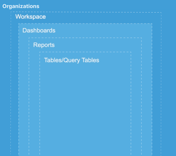
Organization
Organization refers to an Analytics Plus account subscribed to a paid plan, where users can , create reports and dashboards, collaborate with other users, and much more. An organization can have multiple workspaces and users associated with it. The Account Administrator of the organization is allowed to control the permissions, add/delete the users, and manage the subscription of the organization account.
To learn more about organizations, refer to managing organizations' documentation.
Workspaces
Information in Analytics Plus is organized into logical entities called workspaces. A workspace is a logical grouping of data sets, that are stored in tables, and every report and dashboard created over these data sets. It also offers various ways to create metrics on the data for further analysis. You can have several workspaces in your Analytics Plus setup, which can either be owned by you, or shared to you by other users.
To learn more about workspaces, refer the Workspaces documentation.
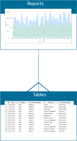
Tables
Tables contain the data that needs to be analyzed. A workspace contains a collection of tables, with logically related data. A table is similar to a spreadsheet and consists of columns and actual data rows. Each column has a name and a type (data type) associated with it. For example, a Sales workspace might contain the Products, Sales, and Purchases tables.
If you wish to define a logical relationship between data stored in two different tables, you can easily do so by creating a lookup (Click here to learn more). Once this is done you can create any type of report, using the columns from both tables.
To learn more about tables, refer the Working with Tables documentation.
Query Tables
Query table is a feature that enables you to create specific data views for easy reporting and analysis. You can create query tables for use cases like batching data together (union), transforming data, applying SQL query functions etc. You can create query tables using the standard SQL queries, written in Oracle, SQL Server, IBM DB2, MySQL, Sybase, Informix, PostgreSQL, and ANSI SQL dialects.
To learn more about query tables, refer the Query tables documentation.
Formulas
Formulas are calculations that help you derive key business metrics, which can be used in reporting and analysis. Analytics Plus provides a powerful formula engine to create any type of calculations that are required while creating reports.
Analytics Plus supports different types of formulas:
Custom Formulas: These are formula types that will help you add a new column to your data table. The values are derived based on the calculation/formula defined. The output of these formulas will be added as a new column in the table.
Aggregate Formulas: These formula types use aggregate functions (SUM, AVG.. etc.) in the calculation, and are generally used to derive business metrics. The result of Aggregate Formulas will not be added as another column in the base table, but they can be used while creating reports.
To learn more about formulas, refer the Adding Formulas documentation.
Reports
Analytics Plus offers a wide variety of reporting options such as Charts, Pivot Tables, Summary Views, and Tabular Views. This enables you to analyze your data easily, and derive great insights. Creating reports is made easy using the intuitive drag and drop interface of Analytics Plus.
A report can be created by joining one or more tables.
The following types of reports are supported in Analytics Plus:
Charts are a visual representation of data that allows you to analyze and interpret data effectively. You can create more than 25 different types of charts, such as Pie charts, Bar charts, Map charts, etc.
Pivot Tables (also known as Matrix Views) allow you to rearrange groups dynamically, and summarize data for easy analysis of large sets of data. You can filter, sort and customize the appearance and content of your Pivot Table easily.
Tabular Views help you display raw data in a simple tabular format. Using this view, you can create a spreadsheet-like report that contains all your data, with summaries and grouping.
Summary Views enables you to view your summarized data in tabular formats. This report is useful when you wish to analyze large amounts of data, with logical grouping and appropriate summarizations in a visually intuitive manner.
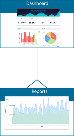
Dashboards
A Dashboard is an effective way of organizing reports into a single page, for quick insight into the key metrics. Analytics Plus provides a simple and intuitive drag and drop interface for creating dashboards within minutes. You can easily create a visually rich and interactive dashboard by adding reports, widgets, user filters, and rich-formatted text in a single or double column layout.
A dashboard can be created by adding any number of reports.
Analytics Plus also offers a widget-based model for creating single number chart within dashboards, called KPI Widgets. This highlights any key metric in a dashboard for easy comprehension. These key metrics can also be accompanied with associated comparison indicators to highlight trends.
To learn more about dashboards, refer the Working with Dashboards documentation.
To learn more about KPI widgets, refer the KPI Widgets documentation.