Customizing a Chart
Analytics Plus provides a wide range of customization options, allowing you to personalize the chart's appearance, which is visually appealing and informative. You can adjust colors, fonts, and layouts to match your branding or preferences.
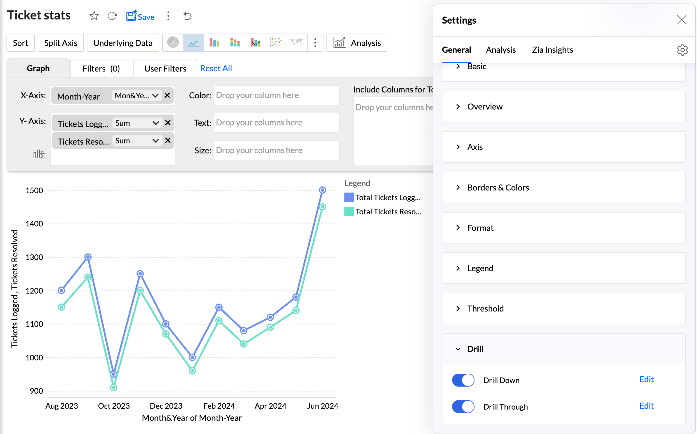
Analytics Plus' Settings pane comprises the following three tabs:
- General: From this tab, you can perform the following customizations:
- General Settings
- Overview
- Axis Settings
- Borders and Colors
- Format
- Legend Settings
- Adding Threshold
- Drill Capability
- Note: These options differ depending on the chart type.
- Analysis: This tab lets you customize the settings for advanced analytical features such as Forecasting, Trend Line, Cluster Analysis, Anomaly / Outlier, What-if Analysis, and Data Alerts. Please note these options will appear here once you enable them in the charts.
- Zia Insights: From this tab, you can customize and control the factors used to generate Zia insights. Click here to learn more.
General
This tab displays all the general chart settings, along with the settings specific to the selected chart type.
Basic
This section allows you to customize the elementary details about the report, such as the Title, Description, how to represent the Missing values in the report, and other chart specific options.
Specify what data should be displayed for null or empty values in the Display Unknown Value.
Select the checkbox Show missing values to plot the chart including the data points (dates/categories) that do not have any corresponding value in the underlying data. Deselecting this will skip these points in the axis.
Choose the chart effect to be applied.
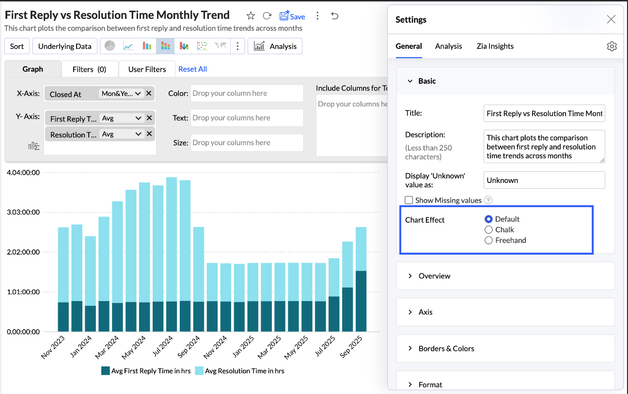
Overview
The Overview effect are beneficial for charts that have many data points. It helps to select a specific section of the chart to understand the leaps and bounds clearly.
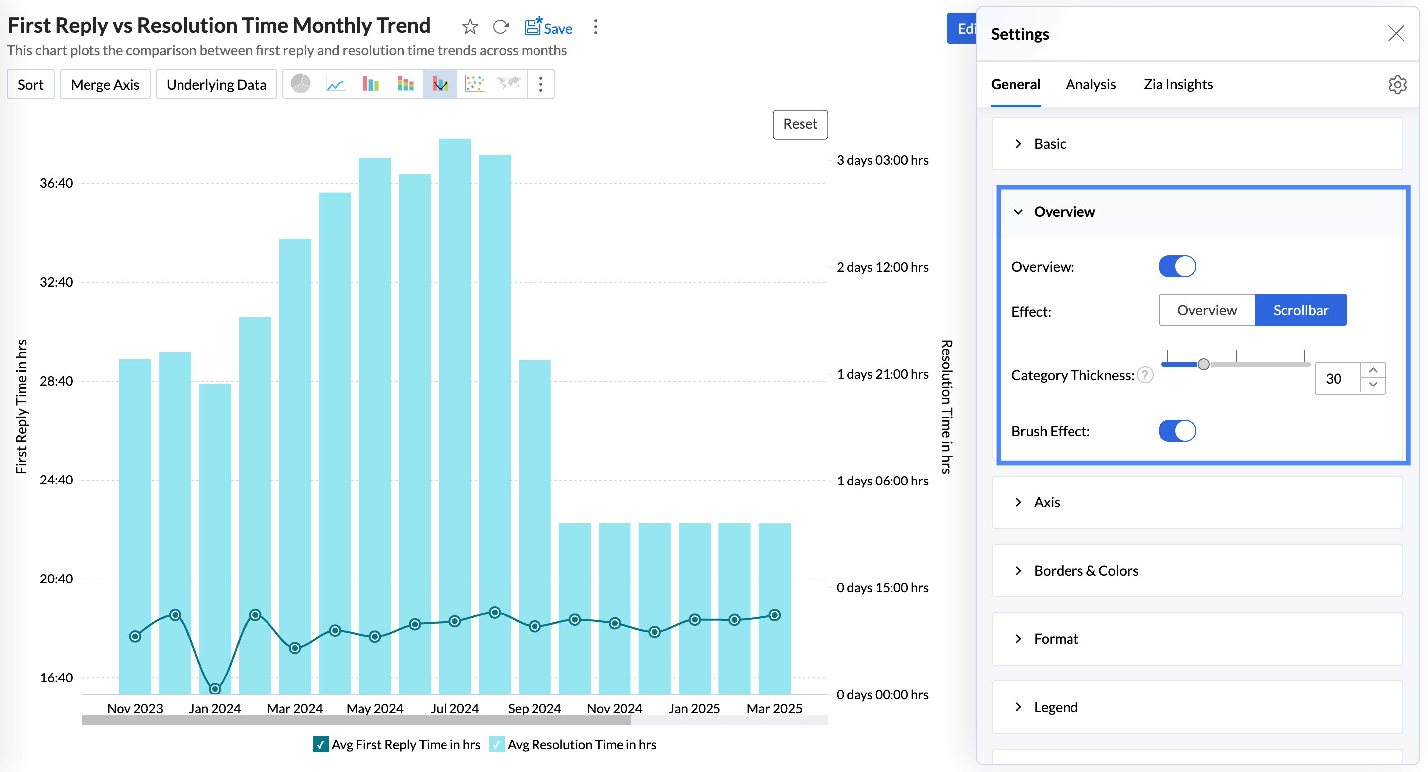
The Brush effect allows users to select, highlight, and explore specific portions of a chart by brushing over the data. This effect enhances data exploration and visualisation by enabling dynamic filtering or zooming into selected areas.
Overview Effect
The Overview Effect adds a preview to the bottom of the chart. You can adjust the slider in the overview chart to focus on a particular region of the chart for in-depth analysis.
Enable the Overview toggle button and choose the chart effect to be applied.
Enabling the Auto Hide Overview option hides the overview panel and displays it only on hover.
The Show Latest N data points displays only the specified number of data points while applying the overview effect. This option is available only when a date dimension is used in the report (x-axis).
Scroll Bar Effect
The scroll bar offers smooth horizontal movement through the data, helping users focus on different sections without needing to compress the entire dataset into one view.
Adjust the slider to choose the Category Thickness or specify a value.
Enable the Brush Effect to select, highlight, and explore specific data points or ranges within the chart.
Timeframe Filter
The Timeframe Filter lets you choose the time period for data visualization, helping you analyze trends across specific durations.
Auto: Selects an appropriate timeframe automatically based on the available data in the chart.
Custom: Allows you to define a specific date range manually, including both past and future periods.
Axis settings
Analytics Plus automatically sets values for chart axes (X-axis and Y-axis) such as labels, axis range, interval between labels, etc. You can also customize these properties as required.
Accessing the Axis settings
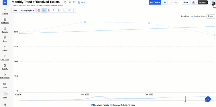
- Open the desired chart, and click the Settings icon.
- In the dialog that appears, expand the Axis tab.
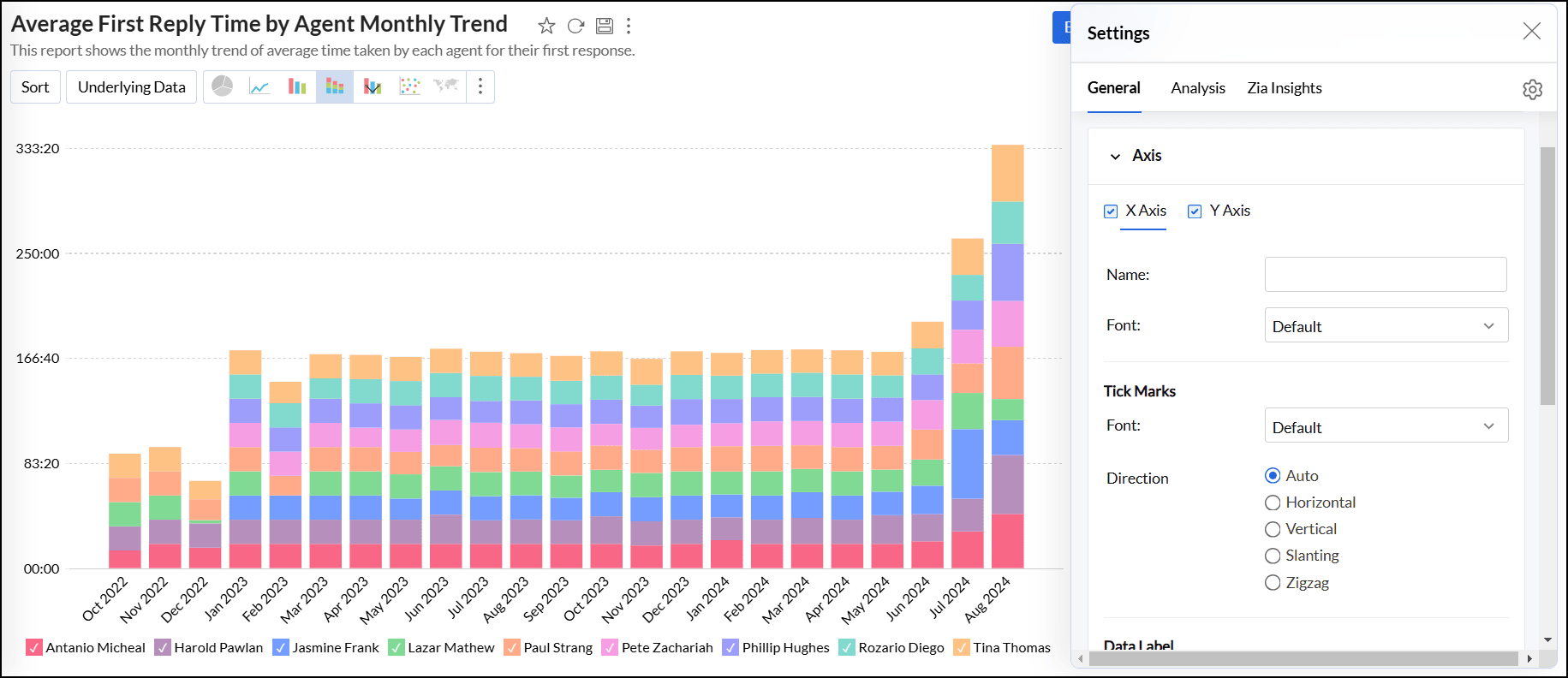
Working with Axis settings
The following options are available for customizing X-axis and Y-axis. To adjust the settings, navigate to the appropriate axis tab.
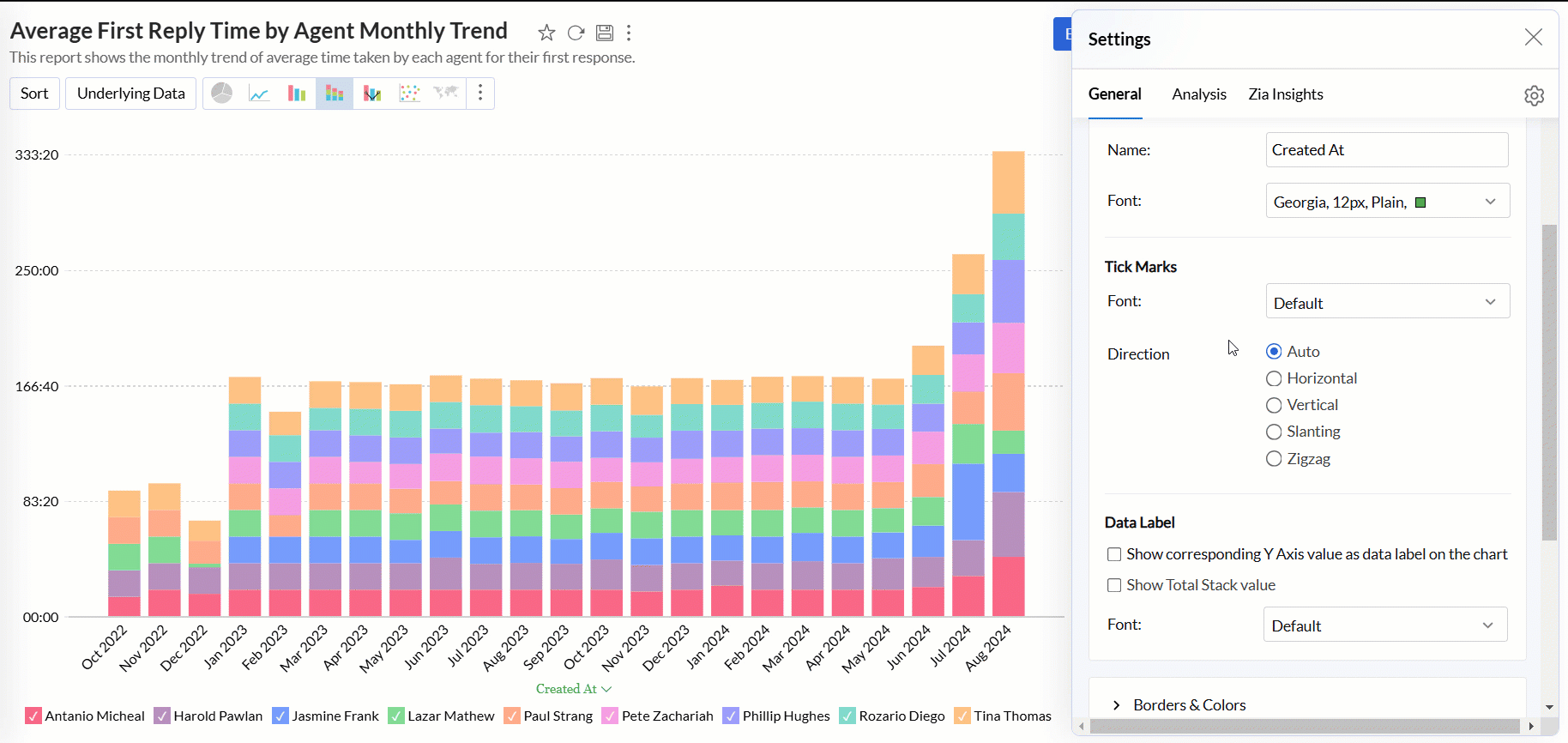
- Name: Specify a name for the axis. By default, the corresponding column name is set as the axis label. For numeric data types, you can also format the column values by clicking the Format link next to the axis label name.
Font: This option lets you choose the desired font style, size, and color for the axis label.
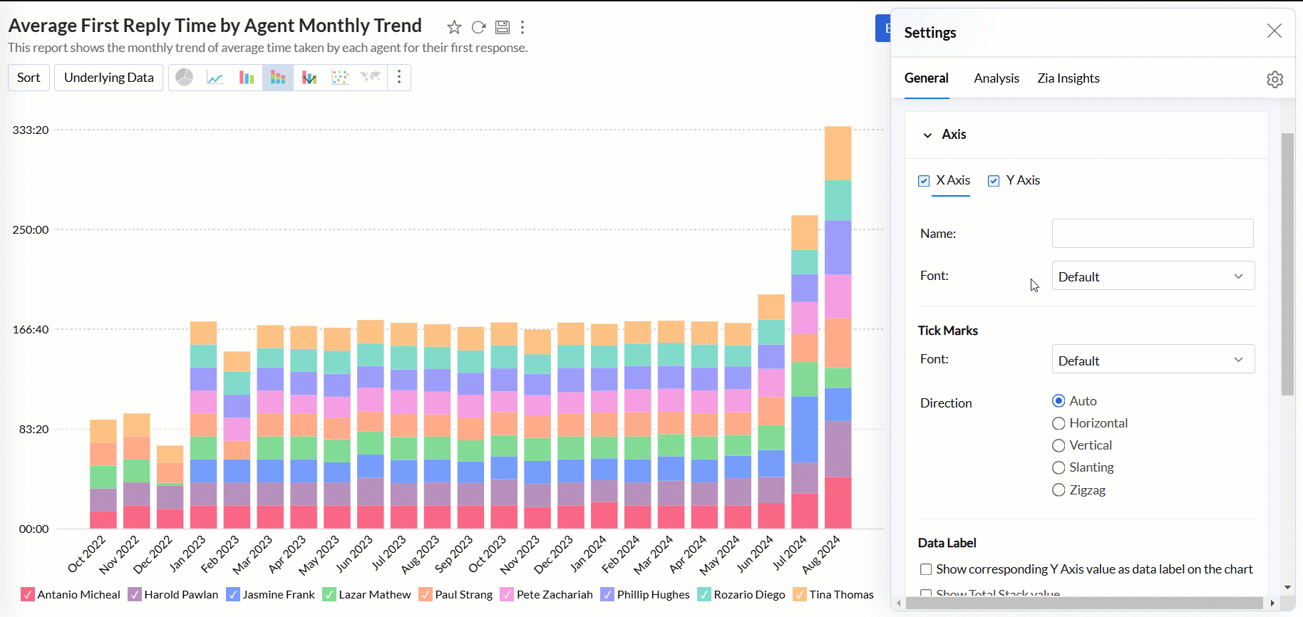
Tick Marks
- Font: This option allows you to set the font style, size, and color of the tick marks in the axis.
- Direction: This option sets the orientation of tick labels.
- Auto: Align the tick labels in the most appropriate direction based on the number of characters in the tick label.
- Horizontal: Align the tick labels in a horizontal direction.
- Vertical: Align the tick labels in the vertical direction (90-degree angle to the axis).
- Slanting: Align the tick labels in the slanting direction (45-degree angle to the axis).
- Zigzag: Aligns tick labels in a zigzag pattern.
Scale: This option lets you specify how to scale the tick labels. Available options are:
- Linear: Adds tick in linear number sequences as 100, 200, and 300 with equally spaced grid lines.
- Log: Adds ticks in log number sequences as 10, 100, and 1000 with equally spaced grid lines.
- SquareRoot: Adds tick in the square root sequence as 5, 25, 625 with unequally spaced grid lines. Spacing between the grid lines decreases as value increases.
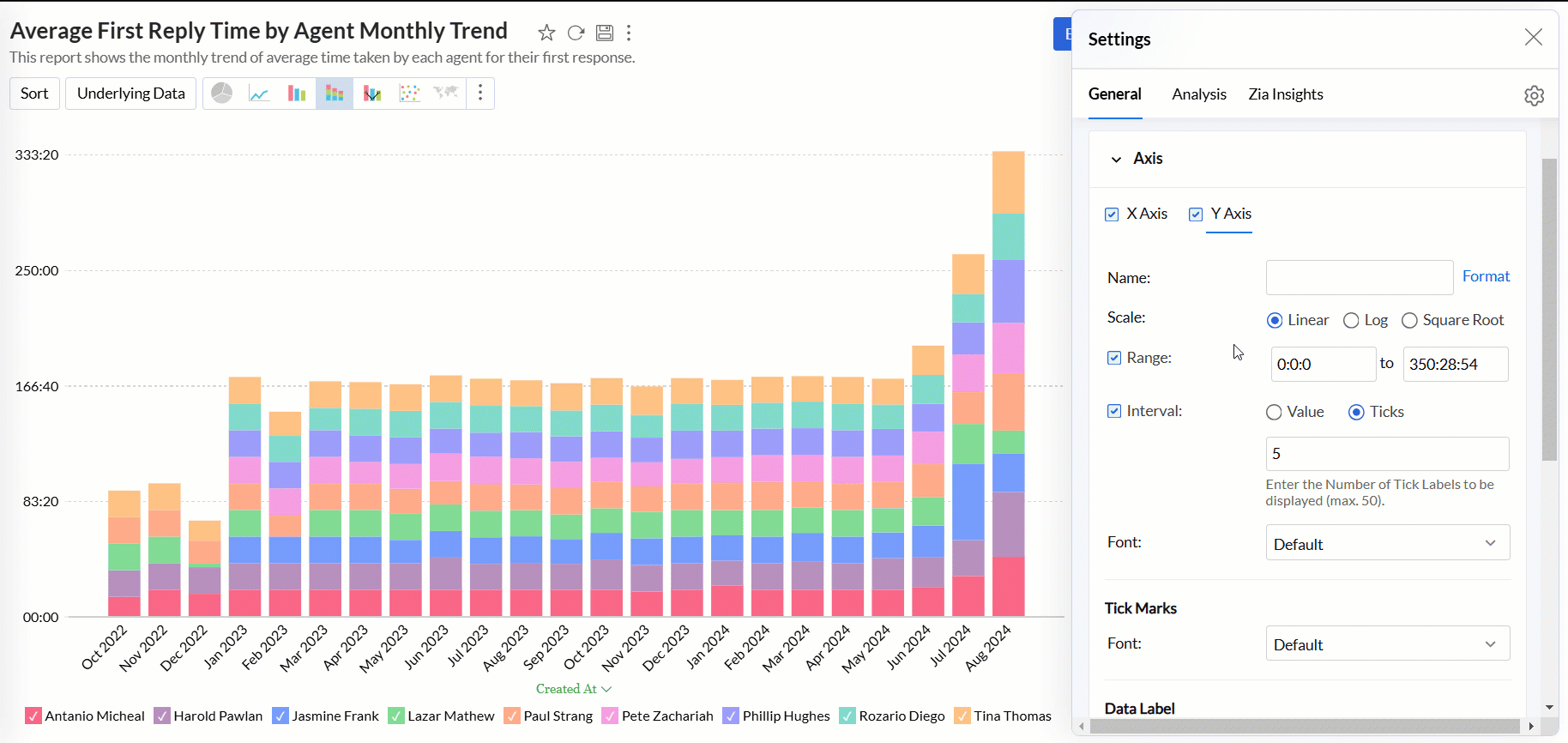
Range: Refers to the minimum and maximum values displayed on the axis. Analytics Plus automatically calculates the range based on the maximum and minimum values in the data series. However, you can also set a custom range by selecting the Range check box and adding the corresponding values.
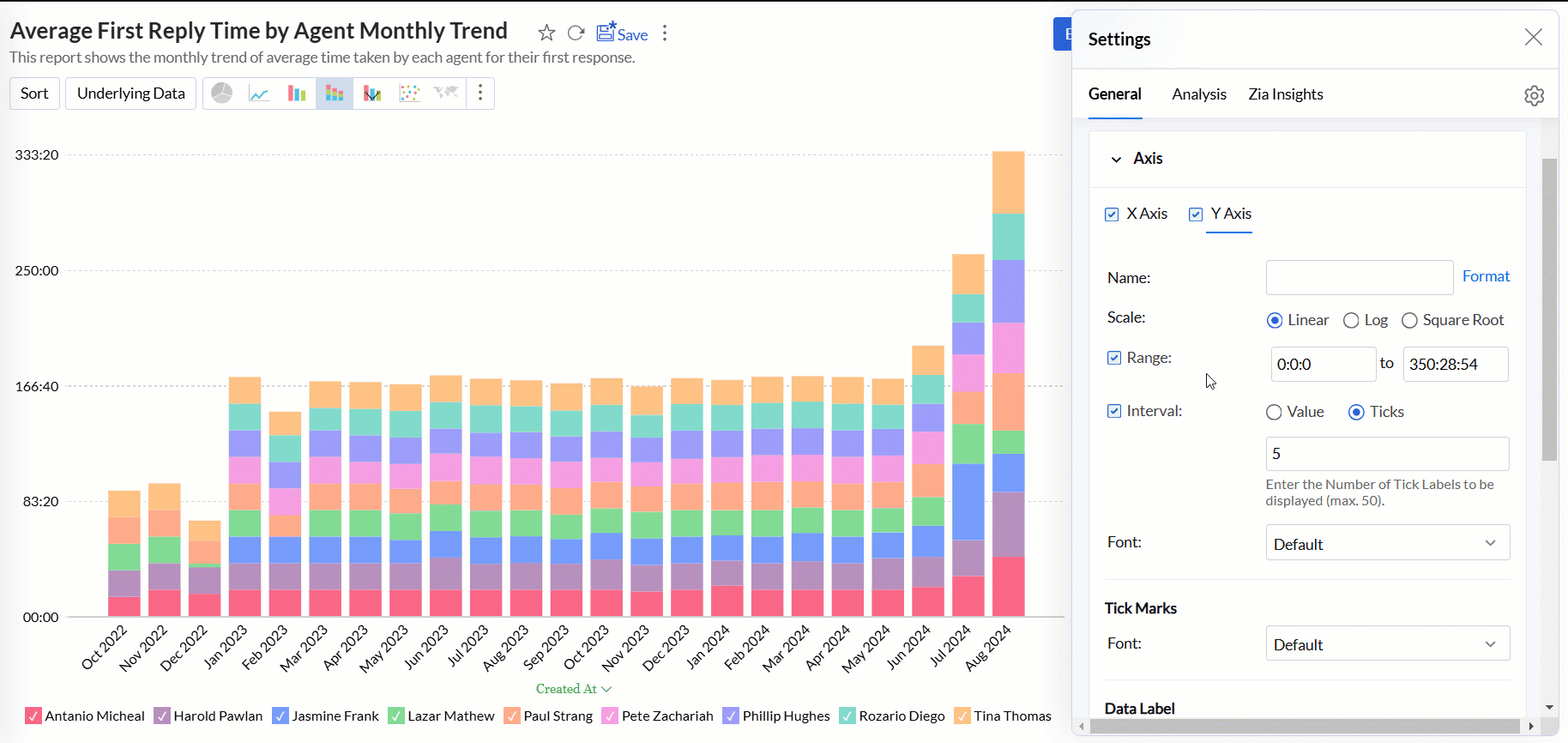
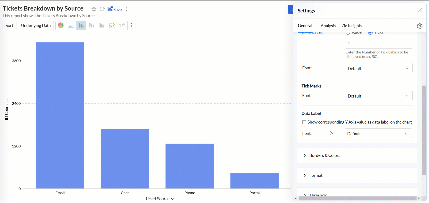
Interval: Refers to the spacing or distance between the tick marks or labels along the axis. Analytics Plus automatically determines this based on axis label length and chart size. You can also set a custom interval by selecting the Interval check box and choosing one of the following options:
- Value: It determines how much the axis value increments between each label. For example, if you set the value to 10 on a numeric axis, the tick labels will appear at 0, 10, 20, 30, etc.
- Ticks: Refers to the number of tick labels you want to display along the axis, regardless of the interval between them.
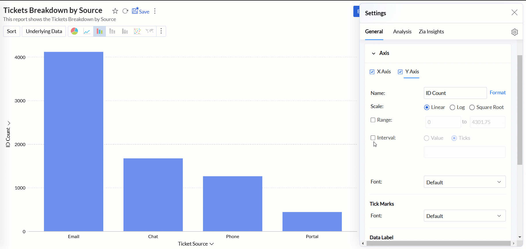
Data Label: This option displays the axis values as data labels on the chart.
- Font: This option allows you to set the font style, size, and color of the data label in the axis.
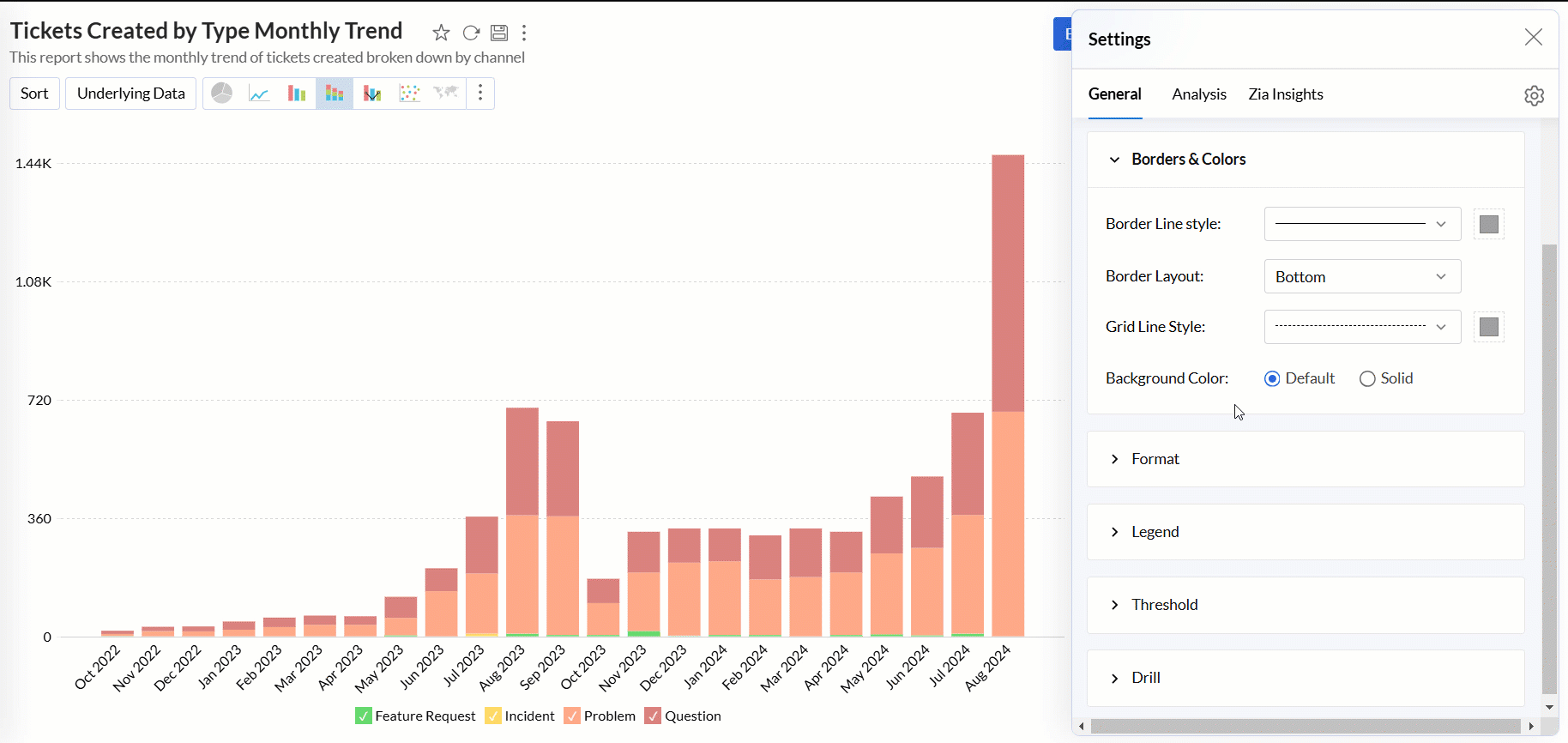
Borders & Colors settings
Analytics Plus enables you to customize the default background and border colors applied to the charts.
Accessing the Borders & Colors settings
- Open the desired chart, and click the Settings icon.
- In the dialog that appears, expand the Borders & Colors tab.
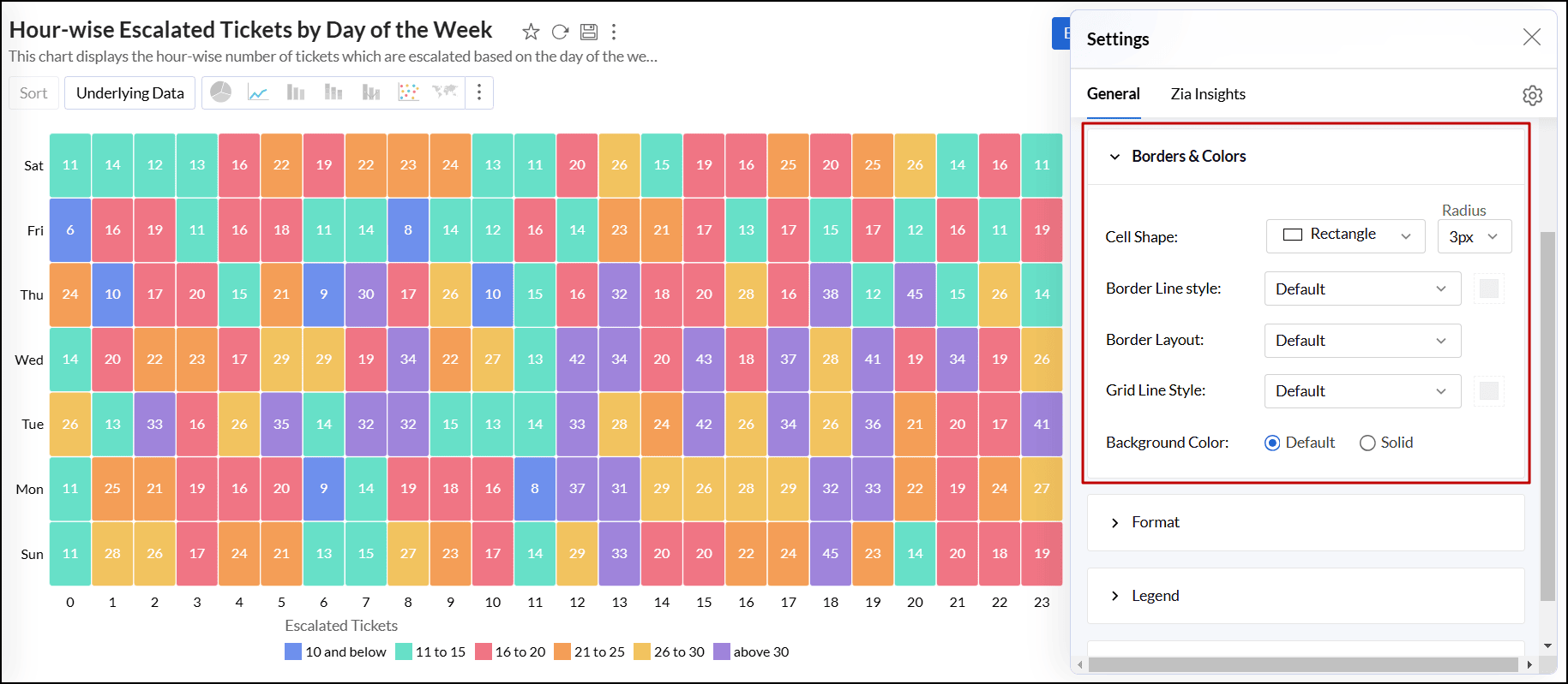
Working with Borders & Colors settings
- Border Line Style: Select the style and color for the borderline from the drop-down menu.
- Border Layout: Choose the layout of the border. The default option applies a thin gray border at the bottom of the chart.
- Grid Line Style: Select the style and color for the grid lines from the drop-down menu.
- Marker Fill Color: Select the fill color and style for the markers in the chart.
- Background Color: Apply a background color to the chart. By default, no background color is applied. Select the Solid option to choose a color if needed.
- Cell Shape: For TreeMap charts, choose the shape and size of the cells to customize the display.
Format
Using the right format is imperative for both analysis and interpretation of the data. Analytics Plus provides many options to format a column based on the data type. This helps ensure all the data points in the column have the same consistent format.
Access the Format tab to customize the following settings,
The columns in the X-axis and Y-axis of the report will be listed, along with the Format option on the right.
Click Format. The options listed are specific to the data type of the column.
Specify the preferred format.
The format can also be applied from the report editor.
Click the Settings icon that appears on hover and choose Format from the drop menu.
Make the required modifications and click Ok.
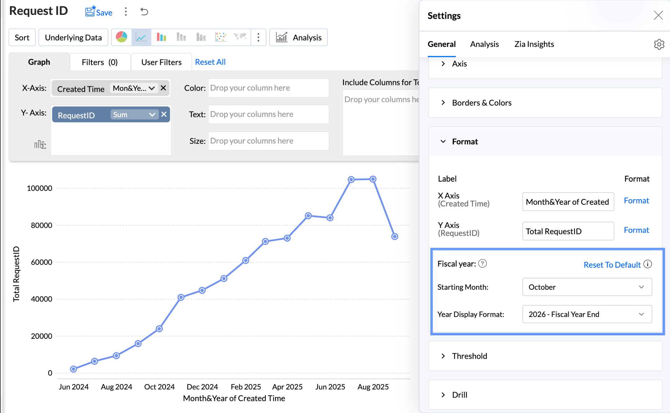
Report Level Fiscal Year Settings
The Fiscal Year setting in the chart options allows you to define the starting month for the fiscal year. This customization applies solely to the current report. This option is shown when a date column is used in the report.
To customize the report level fiscal year settings,
- Click Format.
Legend settings
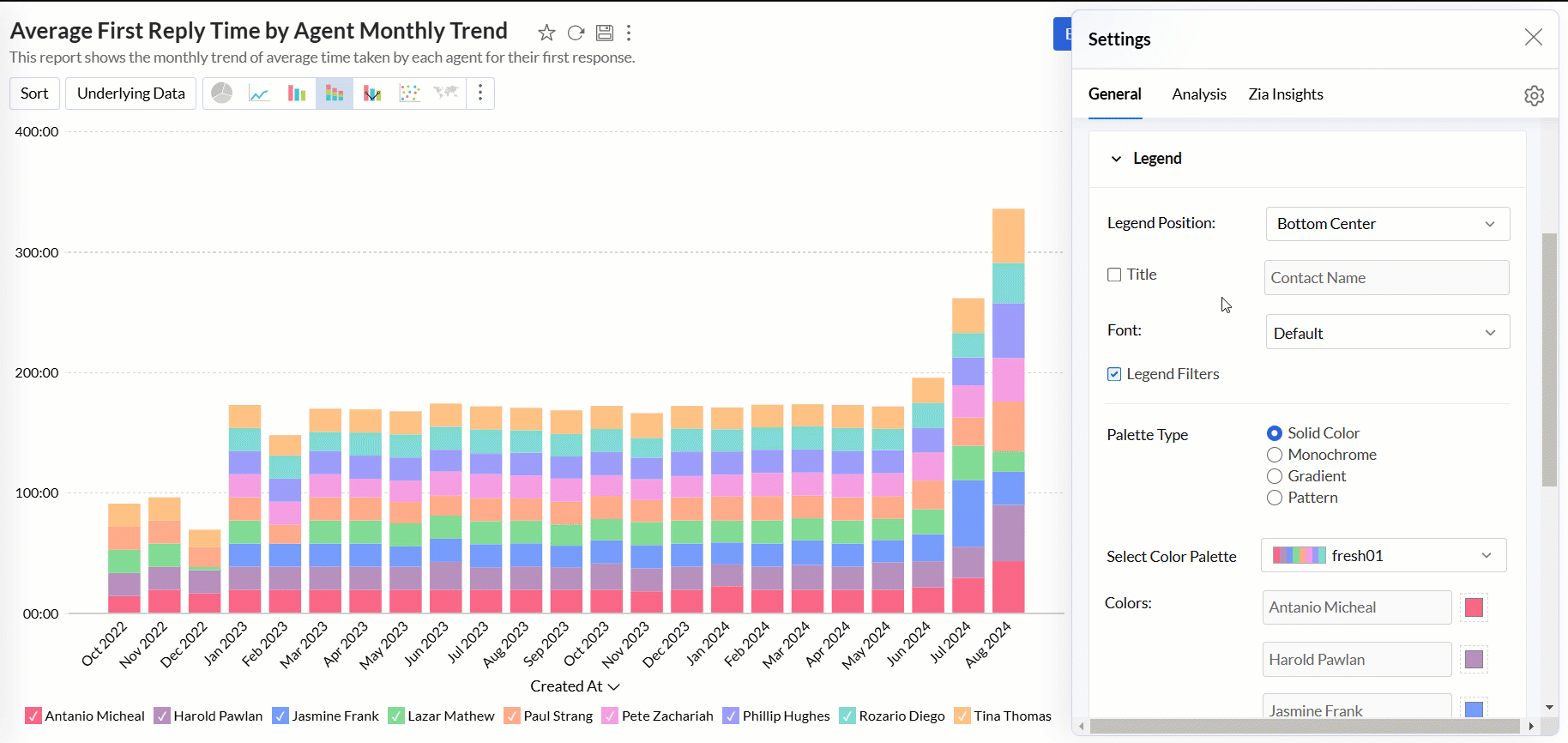
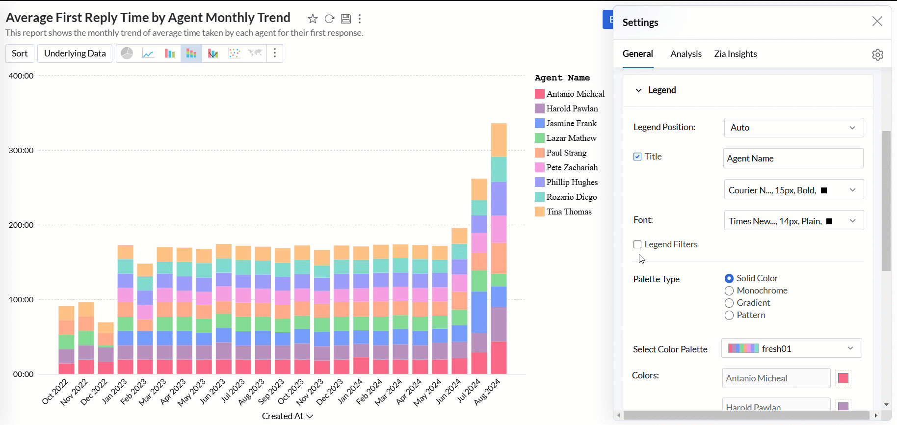
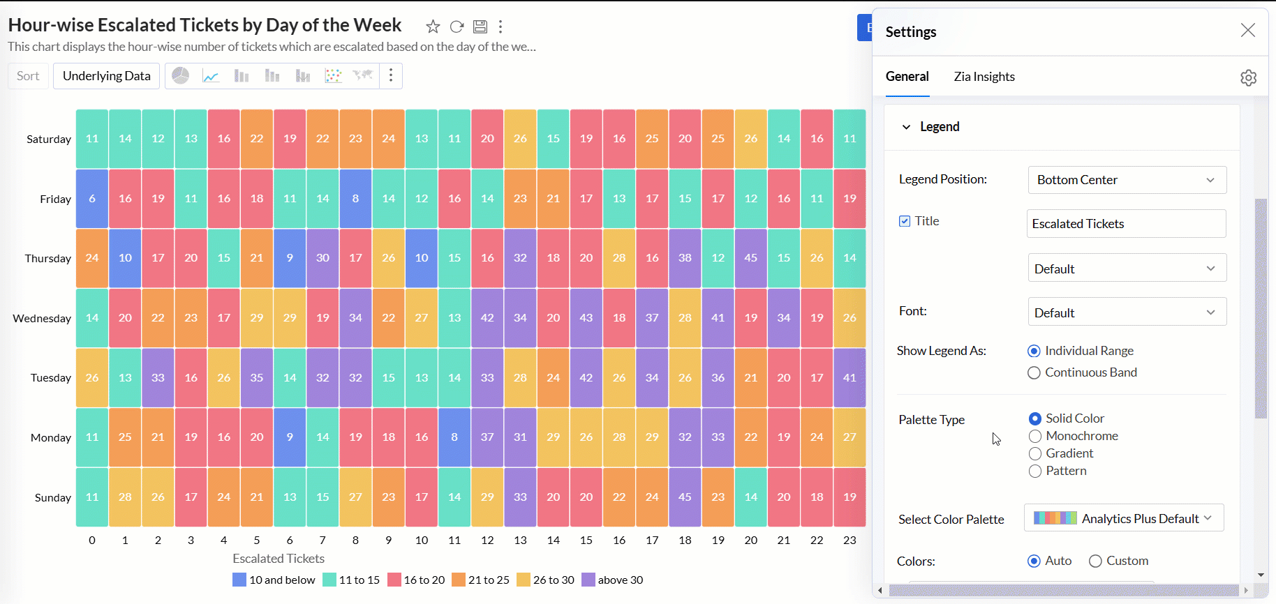
The legend in a chart provides a quick overview of the data series, with each series represented by a color-coded box and its corresponding name. It includes a Legend Title and Legend Items, where each item corresponds to a specific data series.
By default, the legend is positioned on the right side of the chart, and legend items are automatically added based on the data series in the chart. You can customize the legend’s position, title, filters, and the colors of each data series to suit your preferences.
Accessing the Legend settings
- Open the desired chart, and click the Settings icon.
- In the dialog that appears, expand the Legend tab.
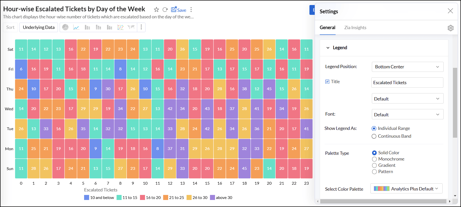
Working with Legend settings
- Legend Position: This option lets you choose the position of the legend within the chart. The available positions are Hide, Auto, Right, Left, Top Left, Top Center, Top Right, Bottom Left, Bottom Center, and Bottom Right.
- Title: This option allows you to specify a title for the legend. You can also customize the font style, size, and color of the legend title.
Font: This option enables you to customize the font style, size, and color of the legend items.
- Legend Style: Specify whether to display the legend items with or without the corresponding values. You can also customize the format to display data using the Format link.
Legend Filters: This option enables legend items to function as filters in the chart's View mode. It allows users to filter data series using legend items dynamically. Click here to learn more about using legend filters to filter a data series.
Show Legend As: This option allows you to determine the display style of the legend in relation to the data series in the chart. The available options are:
- Individual Range: The legend displays each data series as a separate entry with its color and label.
- Continuous Band: The legend represents data using a continuous color gradient or band.
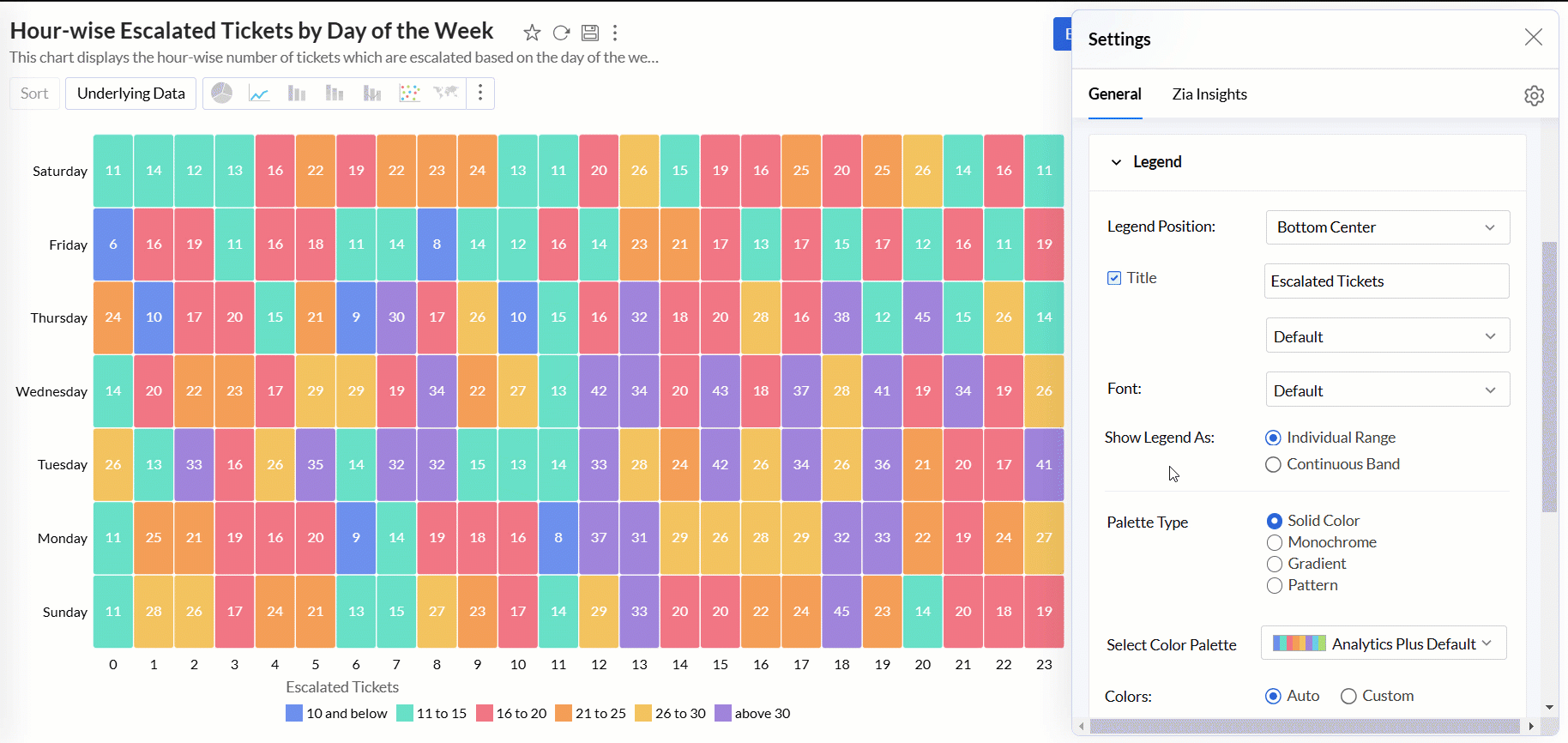
Palette Type: Analytics Plus provides three palette types for customizing the legend colors.
- Solid Color: Each data series in the legend is represented by a single, solid color.
- Monochrome: All data series are displayed in shades of a single color, varying in lightness or darkness.
- Gradient: The option uses a smooth gradient of colors to represent the data series, typically based on a range of values.
- Pattern: This option uses different patterns to differentiate data series.
Color Palette: This option enables you to choose the color palette you wish to apply to your data series. You can select a palette based on the selected Palette Type (Solid Color, Monochrome, or Gradient). Analytics Plus provides a predefined set of color palettes, and you also have the option to create and add custom palettes to fit your needs.
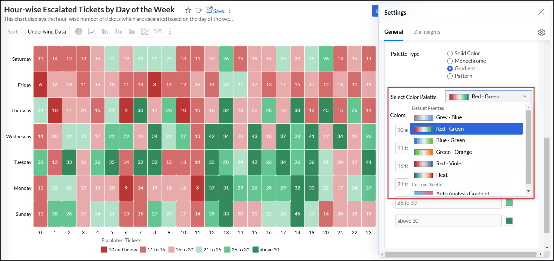
Colors: This option allows you to override the colors of the individual data series of the chart. Once you override the palette, you will find the following options.
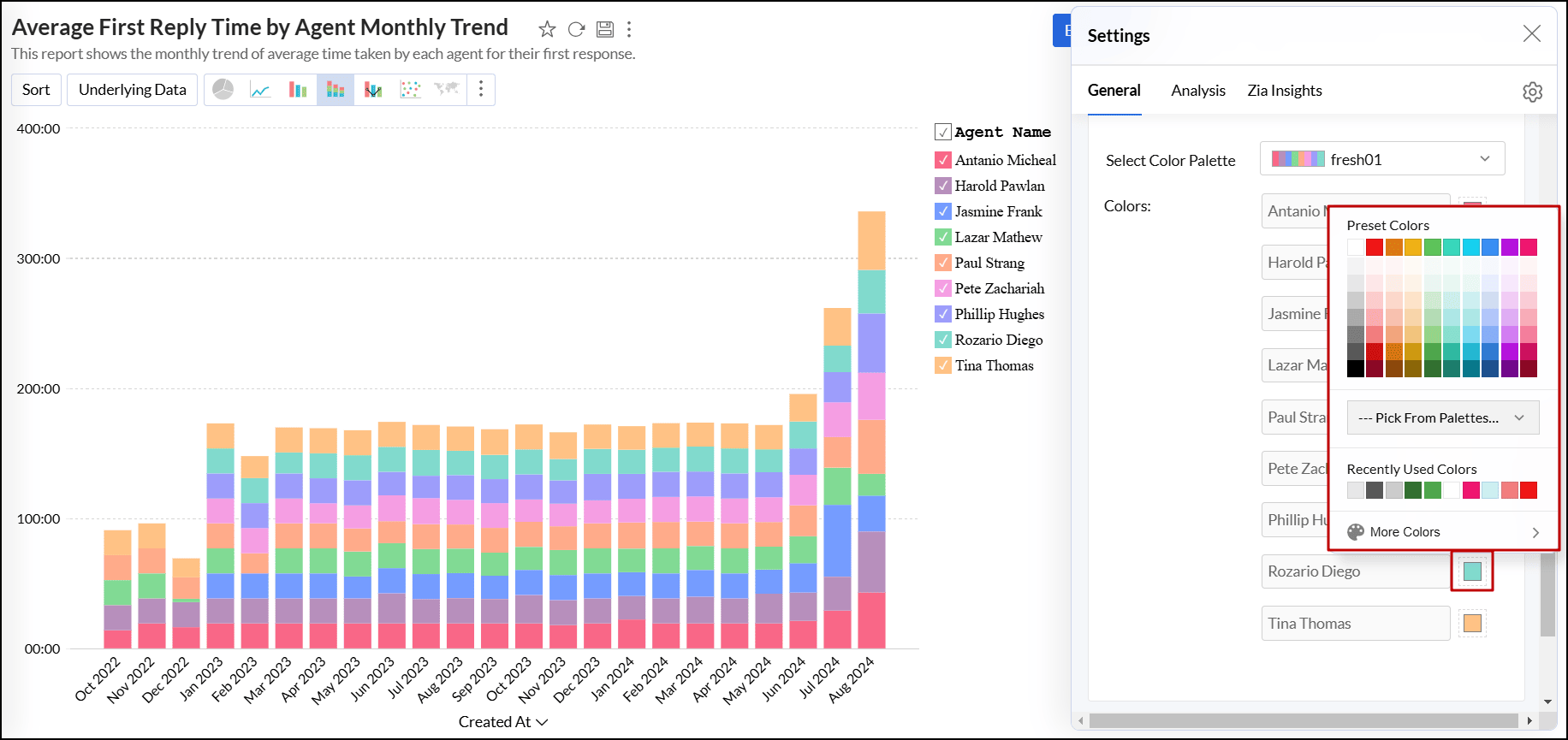
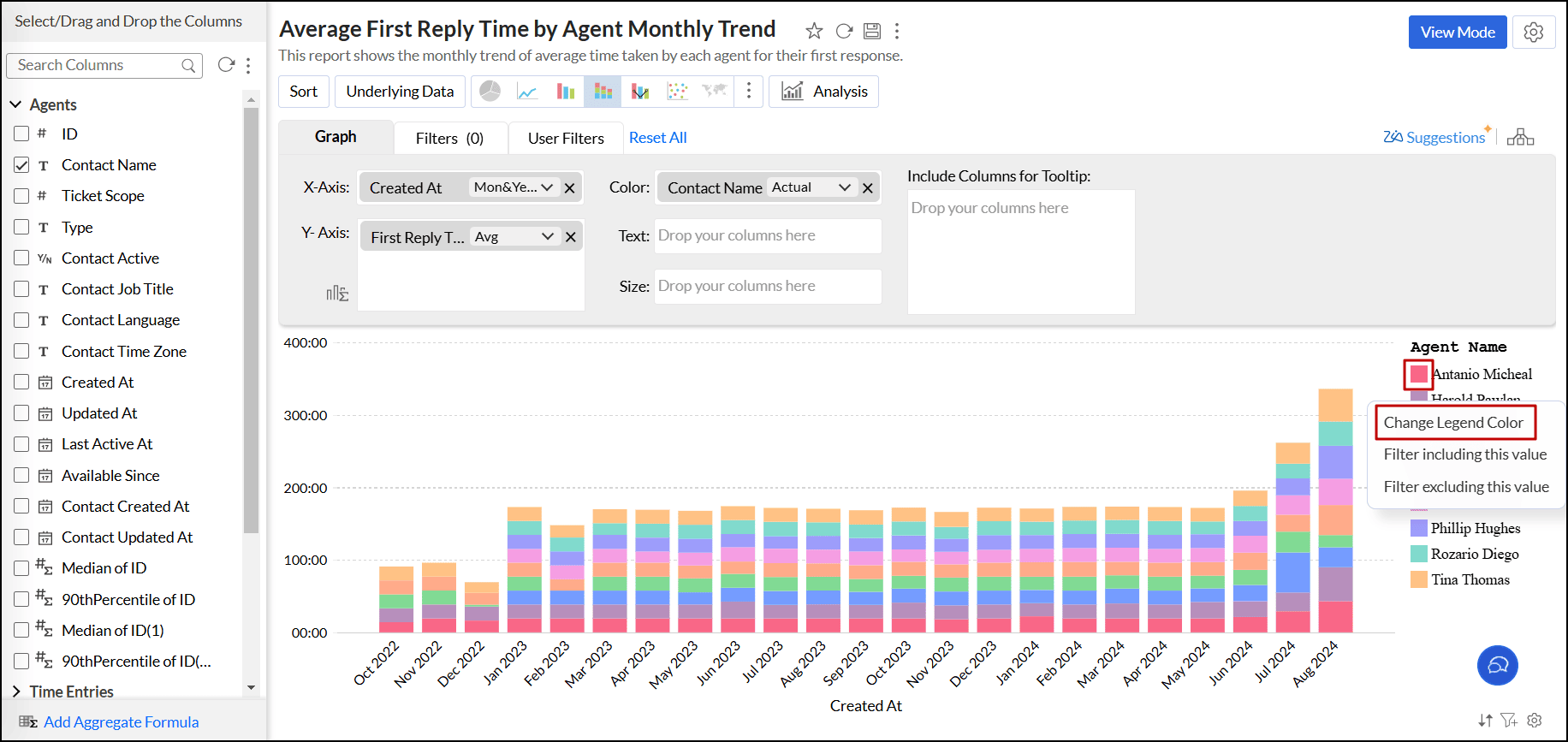
You can also change the color of each data series using the corresponding legend item in Edit Design mode. Click the desired legend item, and select the Change Legend Color option to change the color.
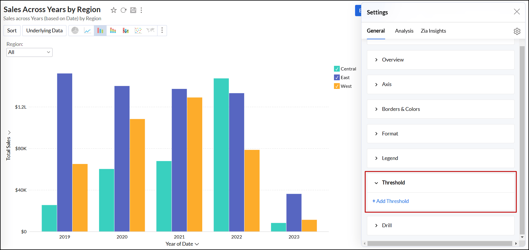
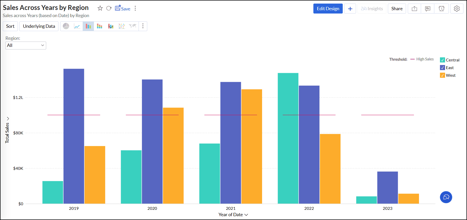
Threshold settings
A threshold is a predefined value or limit that is used to highlight specific data points or regions within the chart. It helps visually distinguish values that meet or exceed a certain threshold. Threshold lines can be added horizontally or vertically at a fixed value on the X or Y-axis of a chart. Analytics Plus enables you to set two types of thresholds.
Follow the steps below to add threshold,
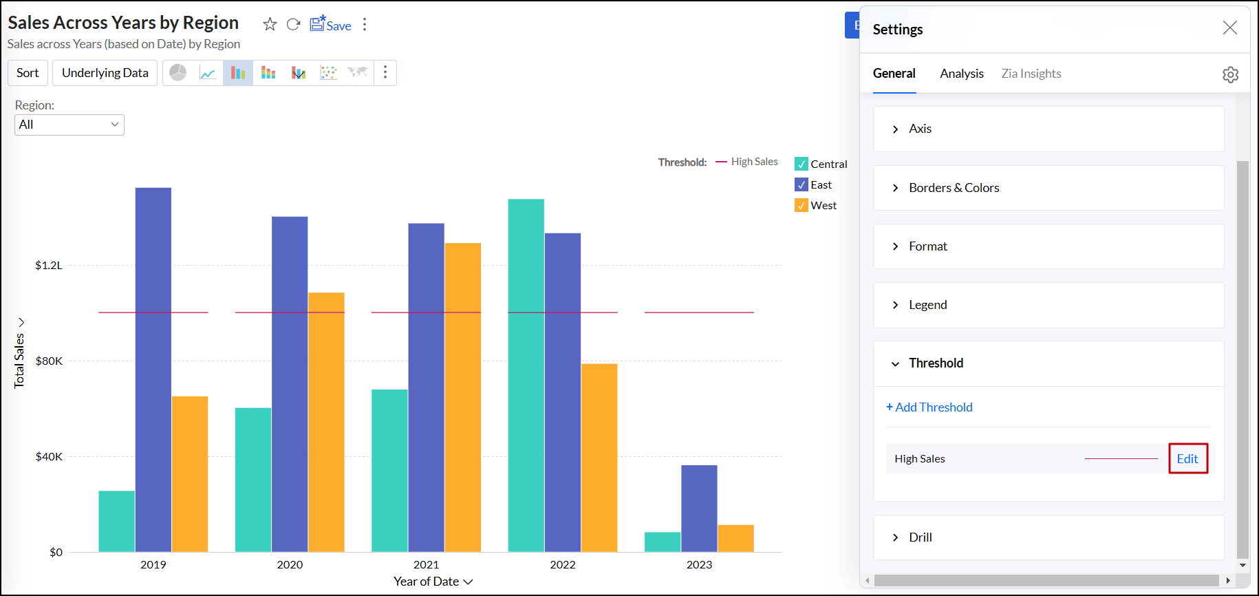
- Open the desired chart and click the Settings icon.
- In the dialog that appears, expand the Threshold tab.
Click the + Add Threshold link.
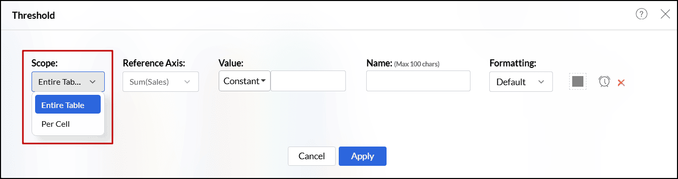
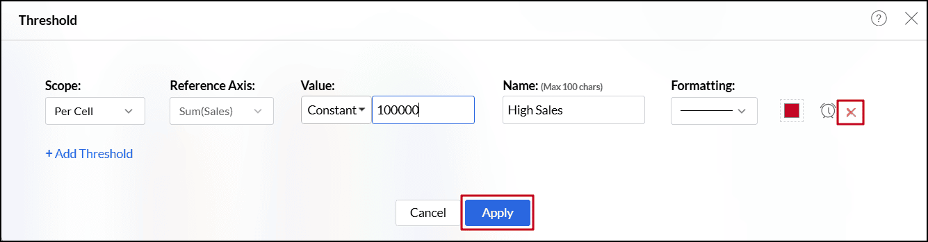
In the dialog that appears, select one of the following scopes.
- Entire Table: Applies the same threshold for the entire table.
- Per Cell: Applies different threshold lines for each data point represented in the report.
- For charts with multiple y-axes, select the axes you wish to use as reference from the Reference Axis drop-down.
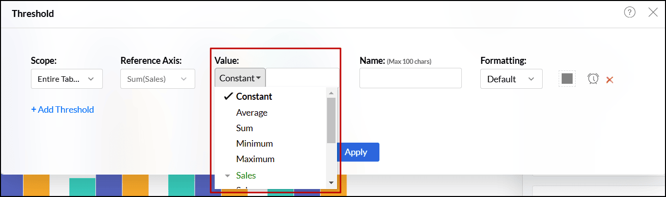
Choose one of the following options from the Value drop-down.
- A static threshold is a reference line set at a constant value. It is added manually by selecting Constant from the Value drop-down.
- A dynamic threshold is a reference line drawn to represent computed values such as the minimum, maximum, average, or sum of columns in your reference axis. To add a dynamic threshold line, select a function from the Value drop-down.
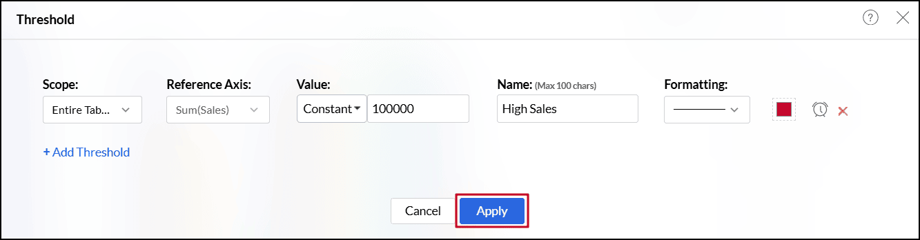
- Enter the desired label for the threshold line in the Name text box.
- Select the line type and color from the Formatting drop-down.
- You can also create an alert when the values meet or exceed a certain threshold by clicking the Create Alert icon. Click here to learn more about creating data alerts.
- Click the +Add Threshold link to add more thresholds.
Click Apply once you have added required threshold lines.
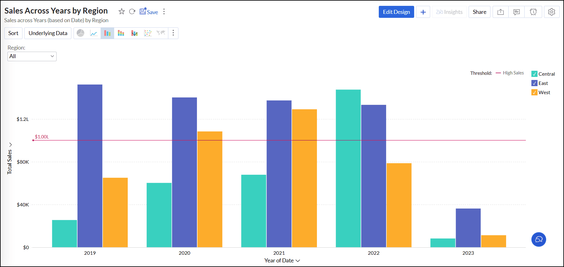
Threshold applied for the entire table:
Threshold applied for each data point:
To remove a threshold,
- Open the desired chart and click the Settings icon.
- In the dialog that appears, expand the Threshold tab.
Click the Edit link corresponding to the threshold name that needs to be deleted.
- In the dialog that appears, click the Delete icon.
Click Apply to save the changes.
Drill Capability
The drill capability allows you to view data at different levels of granularity. Facilitates comparison between different segments of the data.
Drill Down
The drill feature in Analytics Plus enables you to get the granular details in a report. It helps to get insights from the specific categories or sections of the data.
The following are the steps to define a drill path for a chart:
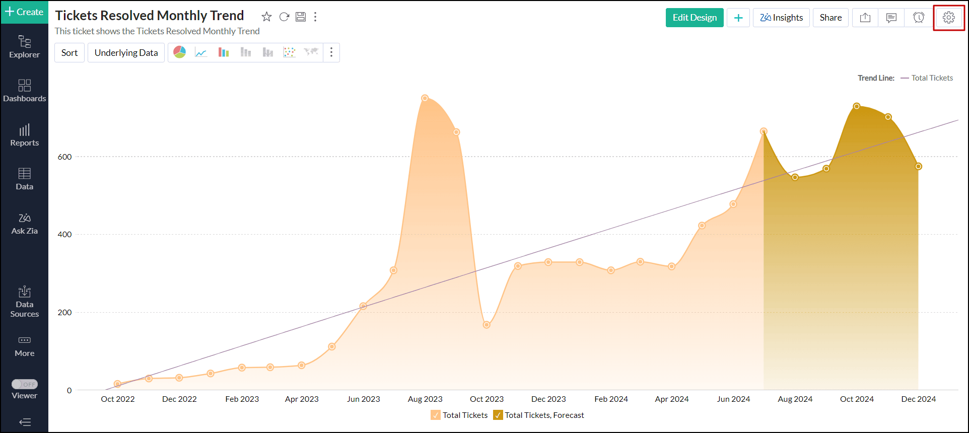
Click the Settings icon in the top right corner.
Enable the Drill Down toggle button.

Define the drill-down paths for the report.
The Allow Dynamic Drill Down option helps users who access the report drill down by choosing any column used in the chart.
Additionally, the drill function for the measure columns can also be customized as needed. Enabling the Show options to alter Scale type allows users who access the report to change the scale type (Linear, Log, and Square root) of the report.
Enabling the Show options to apply Window functions on the measure column allows users to change the advanced summary functions (Running Total, % of Total, Difference From, % of Difference From, % of Previous Value) used in the report.
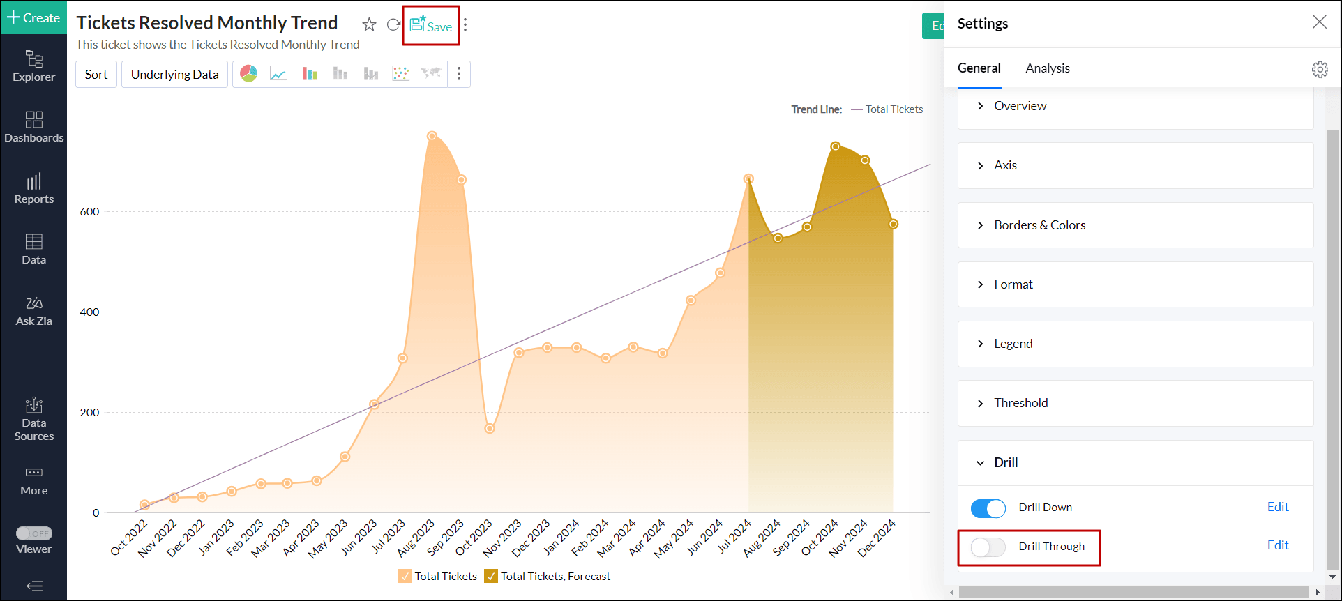
Drill Through
The Drill through action enables users to navigate and view the reports related to the current data point. This action helps link all the related reports specific to metric or dimension.
The drill through action can be configured for all the visualisations (Chart, Pivot view, Summary view, tabular view, and dashboards).
Configuring a Drill Through Action
Click the Settings icon in the top right corner.
Enable the Drill Through toggle button.
Select the views to drill through from the report. Drill through lets you open another view from this chart, passing the selected data point(s) as filter. All the views created over the chosen table and its related views are listed for selection. Only the views created over the same chosen table and the related tables are listed.
Click Apply.
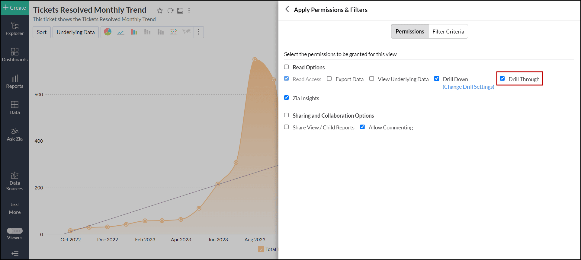
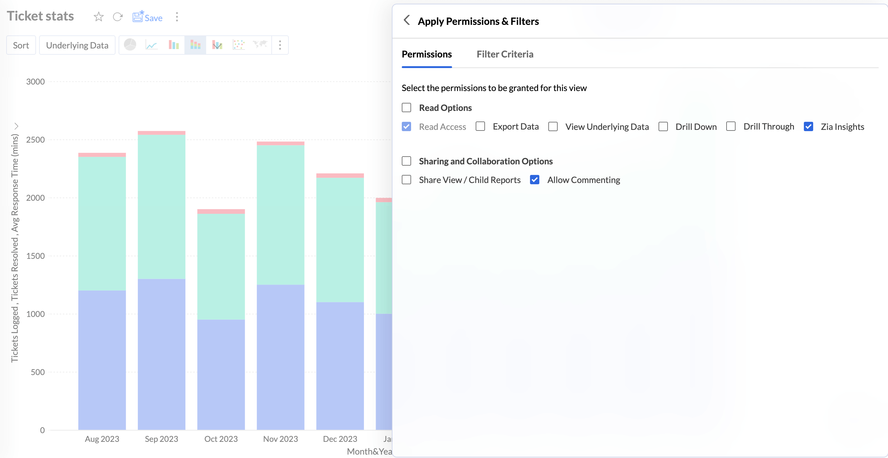
Drill Through Action Permission
Drill-through options are available in a report based on the user’s access permissions. Administrators have this capability by default. For other non-administrative roles, such as Users or Custom Roles, the Drill Down and Drill Through interaction permissions can be enabled while sharing the views.
This ensures that only authorized users can access the related reports opened through drill actions.
Drill-through actions are also supported for public views and embedded views. As with shared views, you must enable the required interaction permissions (drill through) when making a view public to allow users to perform drill actions.
When a user performs a drill-through action, the related reports open in a child or secondary window, allowing them to explore the underlying data without leaving the main view.
Working with drill through
Click any data point in the report and choose Drill Through.
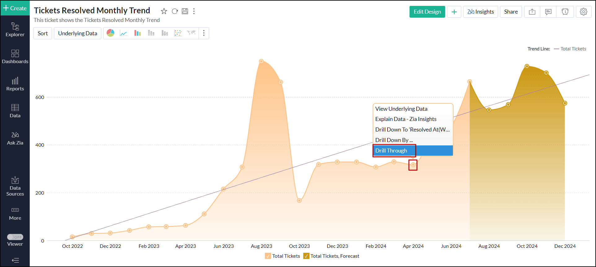
Select the desired report you wish to jump.
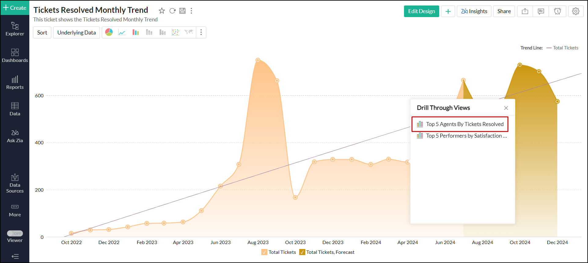
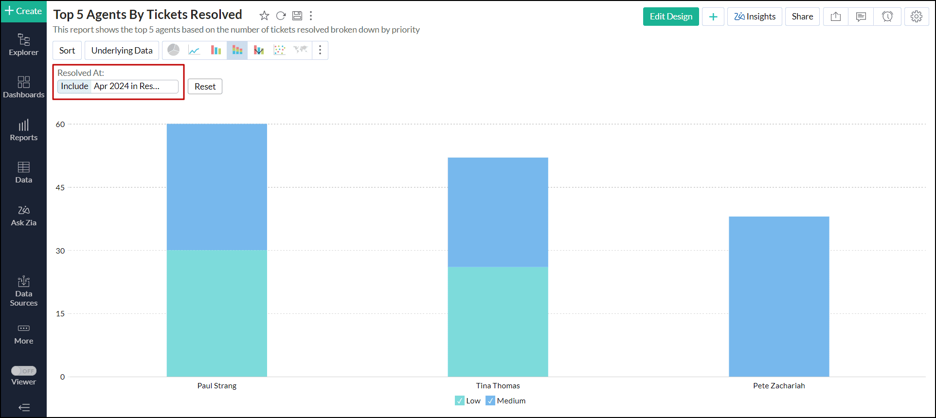
The selected report will open in a new tab with filters applied according to the chosen data point.
Disable drill through
Open the desired chart, and click the Settings icon at the top right corner.
- In the right pane that pops up, scroll down and expand the Drill option.
Disable the Drill Through toggle button, and click Save.
Sharing and collaboration
While sharing views, Analytics Plus allows report owners to enable the Drill Through option, granting other users the ability to drill through the related views.