Understand chart element in a page
A chart is a graphical representation of data, in which the data is represented by symbols, such as rectangular bars in a bar chart, lines in a line chart, or slices in a pie chart. Charts make it easy to understand patterns and relationships and also identify trends in large quantities of data.
You can add a chart to your page and configure it as per your requirements. Also, you can choose a theme, apply background color, and set legend positioning. Learn how
Examples
- Pie charts can be used to display data that presents percentages in different groups such as excellent, good, average and dissatisfied.
- Line charts can be used to display data that represents numbers that change over a period of time such as "annual revenue from 2000 to 2005".
Major elements of a chart
The major elements of a chart include:
| Element | Description |
| X-axis | Defines the horizontal axis of the chart |
| Y-axis | Defines the vertical axis of the chart |
| Legends | Displays a list of the values appearing in the chart and an example of their appearance. This information allows the data from each value to be identified in the chart. AppCreator allows you to choose the position of the legend in your chart. |
Different types of gauges available in ManageEngine AppCreator are:
| Chart Type | Chart Type Variation | Description | Appearance |
| Column chart | Displays data along X-axis (horizontal) and Y-axis (vertical) as rectangular bars. These charts are helpful in finding trends over time periods by using different colors. | 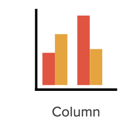 | |
| Stacked Column Chart | Displays data as vertical bars, stacked one on top of the other in vertical columns and allow part-to-whole comparisons across categories. | 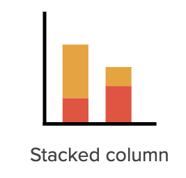 | |
| Stacked Percentage Column Chart | A variation of the stacked column chart, this chart enables you to check a specific percentage of the overall data quickly. | 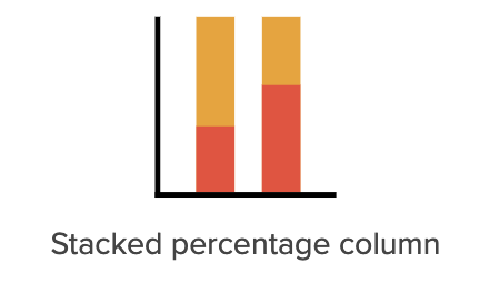 | |
| Bar chart (horizontal) | Displays your categorical data in rectangular bars with lengths proportional to the values they represent. They are similar to column charts and are preferred when dealing with larger data. | 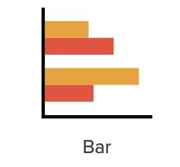 | |
| | Stacked bar chart | Displays data as horizontal bars, with each bar divided into a number of sub-bars stacked from end to end and corresponding to the field values it is stacked by. This chart enables part-to-whole comparisons over time or across categories. | 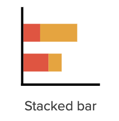 |
| | Stacked percentage bar chart | A variation of the stacked bar chart, this chart enables you to check a specific percentage of the overall data quickly. | 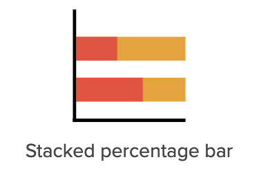 |
| Line chart | Displays data as a series of data points called markers, that are connected by lines. They are used to depict trends over time periods such as analyzing long-term trends in sales, financial data, or marketing statistics. | 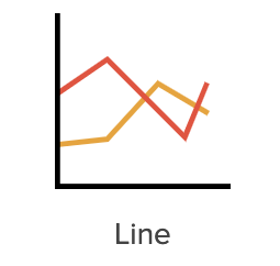 | |
| Scatter chart | Displays the relationship between two or more field values using marked, distinct points that appear scattered in the chart. It provides you with the degree of difference between those values, which is known as correlation, such as comparing the sales of ice-cream at different temperatures of the day. | 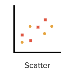 | |
| Area chart | These are similar to line charts, as they display data that are plotted using lines but with a filled area below. They offer a simple presentation that is easy to interpret at a glance. | 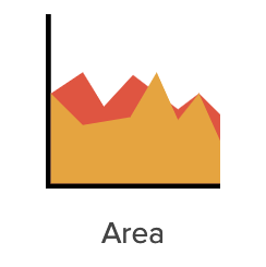 | |
| Stacked area chart | Displays your data plotted with filled areas stacked, one on top of the other. These charts depict how part to whole relationships change over time. | 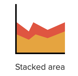 | |
| Web chart | Resemble a spider web, where its axes radiate out from the center and data points are plotted on each axis using a common scale. These charts are preferred for large set of different data groups For example, the HR department can use web charts to check the skill pattern of different employees and analyze their performance. |  | |
| Pie chart | Uses pie slices to display the relative size of data. Useful for small categorized groups of data. For example, survey questions in yes/no format, data split by gender, etc. | 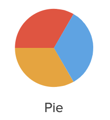 | |
| Donut chart | Essentially a pie chart with an area of the center cut out. Displays proportions of categorical data, with the size of each piece representing the proportion of each category. For example, comparing the total value of policies in each policy class of an insurance company. | 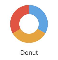 | |
| Semi donut chart | Simply a donut chart cut in half. The main advantage is that it takes two times less space than the regular pie or donut chart for the same amount of data displayed. Also, they provide compact visualization, often used in dashboards. | 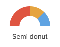 | |
| Funnel chart | Displays the progressive reduction of data in stages, where each stage represents a part of the total. For example, these charts can depict the potential leads funnel that allows executives to see how effective the sales team is in turning a sales lead into a closed deal. |  |