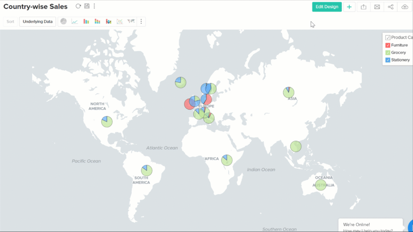
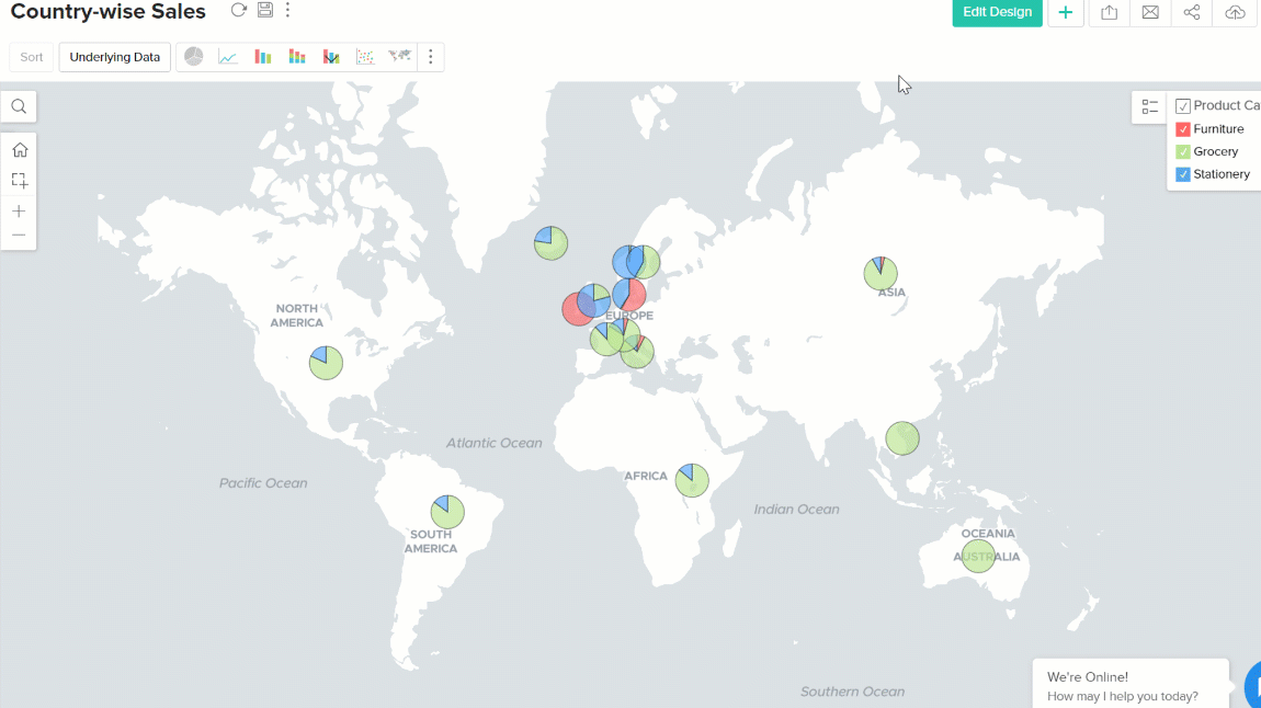
Map chart
A map chart can be used to tag metrics against geographical locations on a map view. You can create map charts using location specific columns in your data. This location information can be continent, country, county, state/province, city, zip code, latitude and longitude, or even IATA airport codes, which are used to identify airports and metropolitan areas around the world.
Creating a map chart
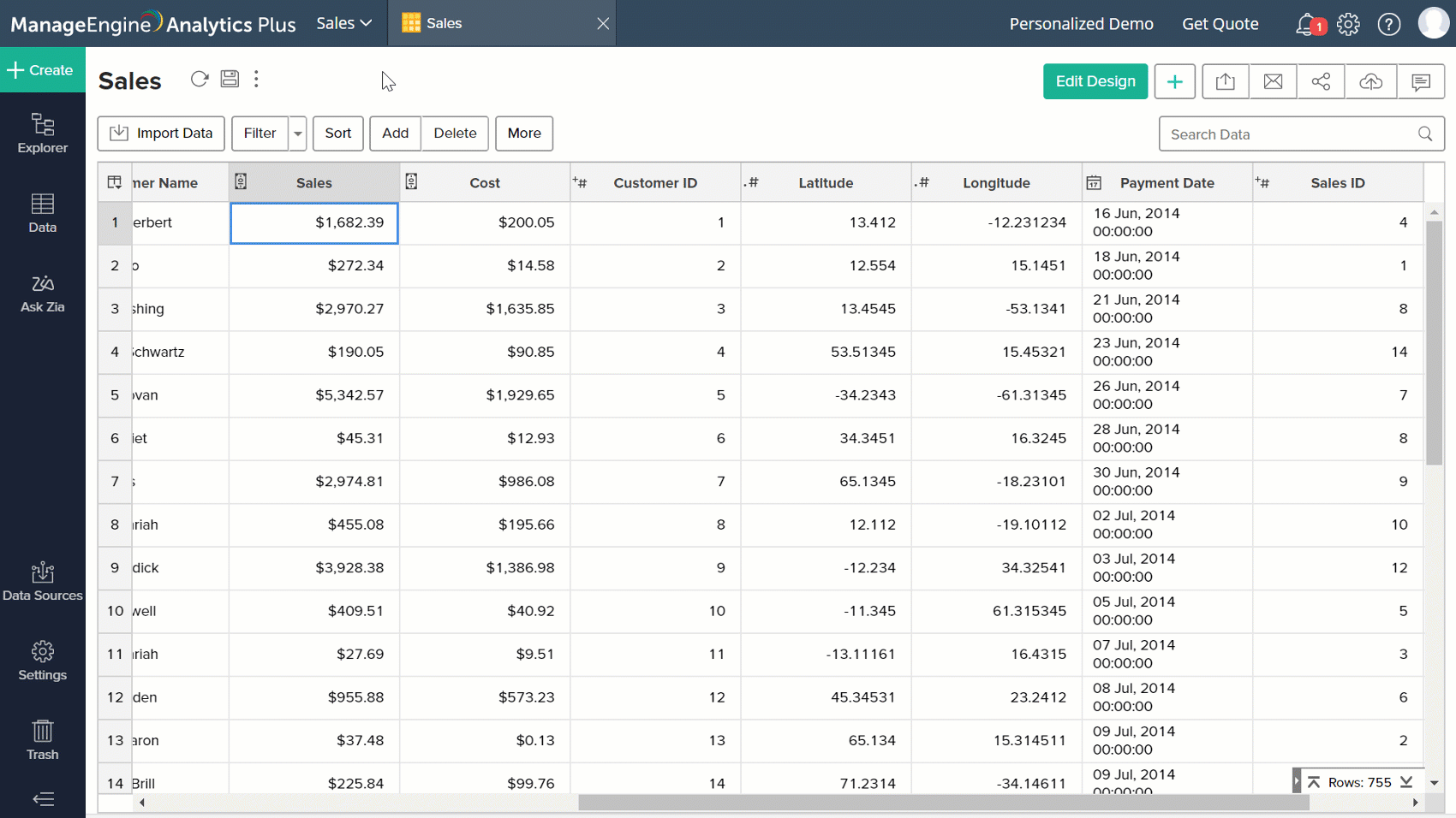
Analytics Plus allows you to visualize geographical data using map charts. To create a map chart, your data set should contain location-specific columns. During data import, Analytics Plus auto-identifies the columns that contain geographical data in your data set.
- Continent - If your column contains the names of the continents or their codes.
- Country - If your column contains the names of countries or their codes (alpha 2-code, alpha 3-code).
- County - If your column contains the names of counties.
- State/Province - If your column contains the names of states/provinces.
- City - If your column contains the names of cities.
- Zip Code - If your column contains the postal code of locations.
- Latitude and Longitude - If your column contains the latitude and longitude of locations. Click here to know about the supported DMS formats.
Creating a map chart using Latitude and longitude-specific information in the dataset
To create a map chart using latitude and longitudes, you need both latitude and longitude data as different columns in your dataset and set the data type of the columns to Latitude/Longitude.
Follow the below steps to change the data type of your column.
- Right-click the column name and select Change Data Type.
- Select the Latitude/Longitude from the drop-down.
- Click OK.
- You can choose the format for the latitude and longitude columns using the Format Column option.
Note: Make sure that the data type is changed to Latitude or Longitude to use the format specific to the latitude and longitude columns.
- Right-click the column name and select Format Column from the drop-down.
- In the Format Column dialog that opens, Specify the Alignment.
- Choose the preferred format from the Display Format drop-down. Supported formats are,
- Decimal
- (+/-) 12.3456789
- Degrees Minutes Seconds (DMS)
- (+/-) 12° 34' 56"
- 12° 34' 56" (N|S|E|W)
- (+/-) 12d 34m 56s
- 12d 34m 56s (N|S|E|W)
- (+/-) 12.3456°
- 12.3456° (N|S|E|W)
- Decimal
- Click OK.
Once you have set the data type as latitude and longitude. You can create reports using this.
Changing the data type
Analytics Plus will auto-identify geographical columns i.e. columns that contain information about continents, countries, counties, states/provinces and cities. However, to create map charts using columns containing zip code, or latitude and longitude, the data type of the column needs to be changed manually. To do this,
- Right-click on the specific column header, and select the Change Data Type option.
- Select the appropriate Geolocation data type from the drop-down, and click OK.
Note: You can also create a map chart without changing the data type of your column, using the Treat as Geo option in the chart designer. When you use this option, the data type of the column will be considered as Geo Data within the scope of that specific report.
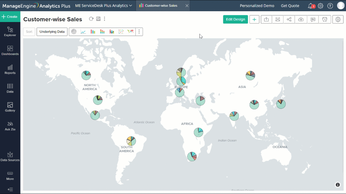
Types of map charts
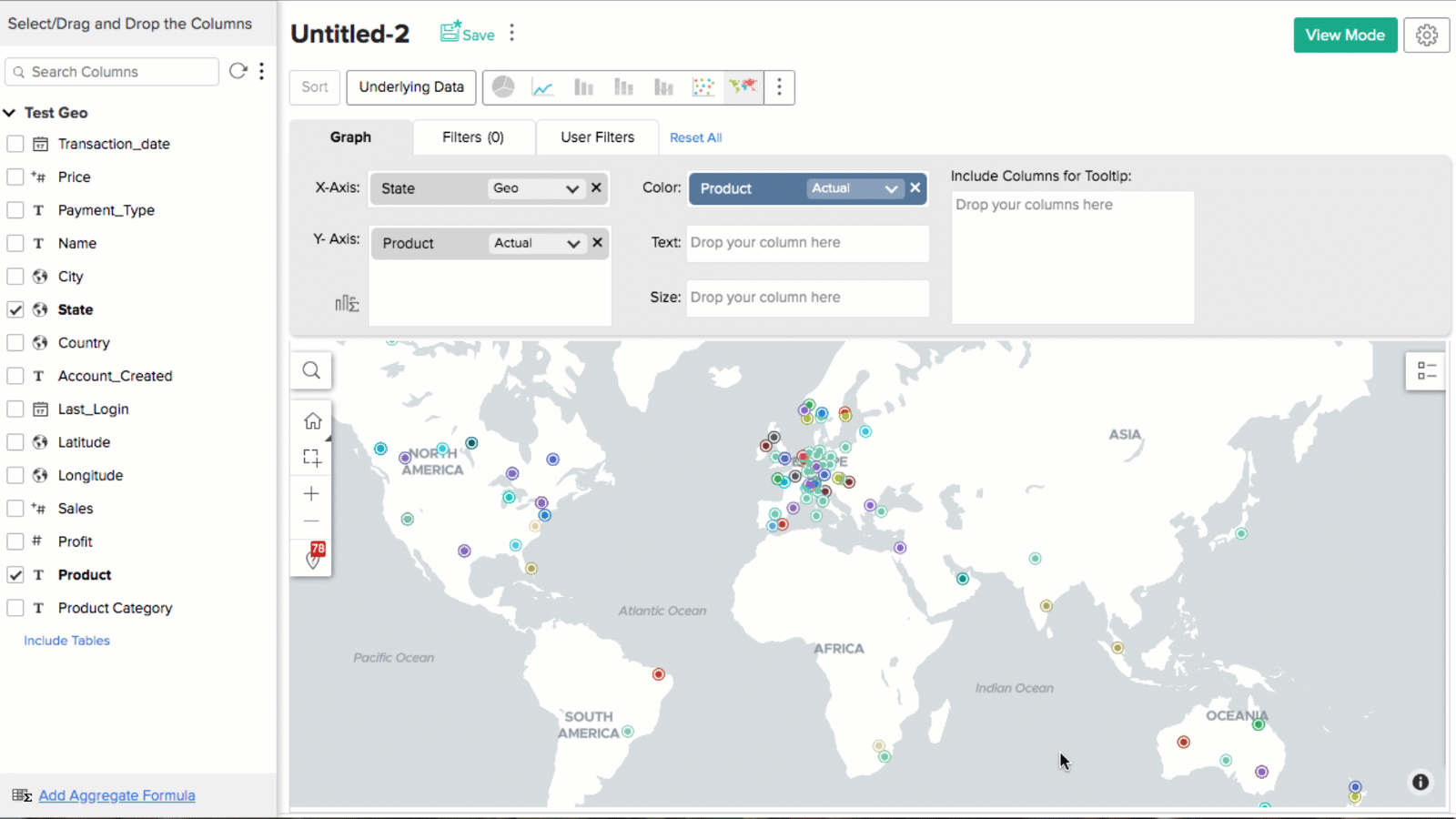
Map - Scatter: Data points are represented as scatter plots on a map view.
Map - Bubble: This chart is a variation of the Map - Scatter chart in which data points are replaced with bubbles.
Map - Pie: This chart is a variation of the Map - Scatter chart, with the data points represented as pie charts.
Map - Bubble Pie: This chart is a variation of the Map - Pie chart, with the data points represented as Bubble Pies. The size of the pie chart is determined by the column dropped in the Size field.
Map - Filled: Fills the region of the location dropped in the X-axis. Countries, cities, and other locations are color-coded on the map based on the column in the Color field.
Geo Heat Map: Data points are displayed on a map, color coded based on the density of data points.
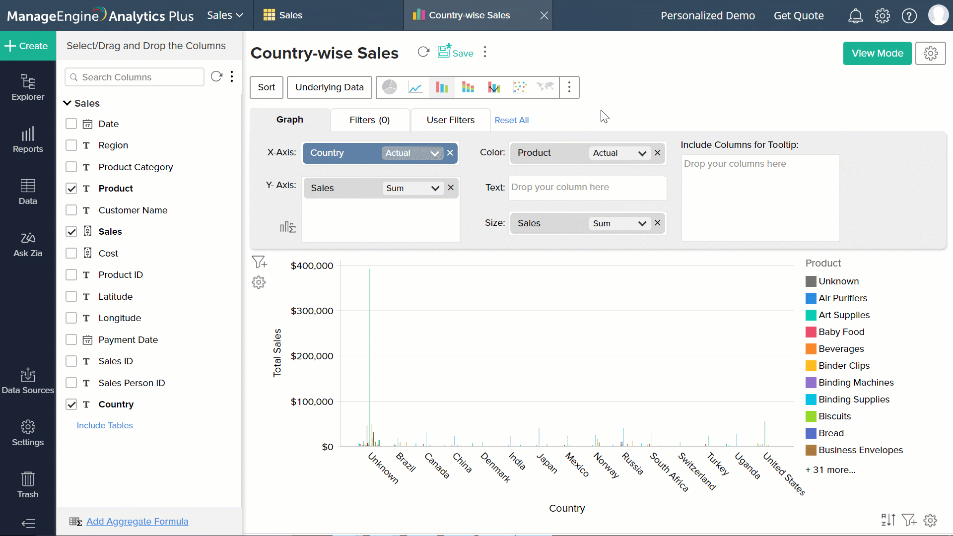
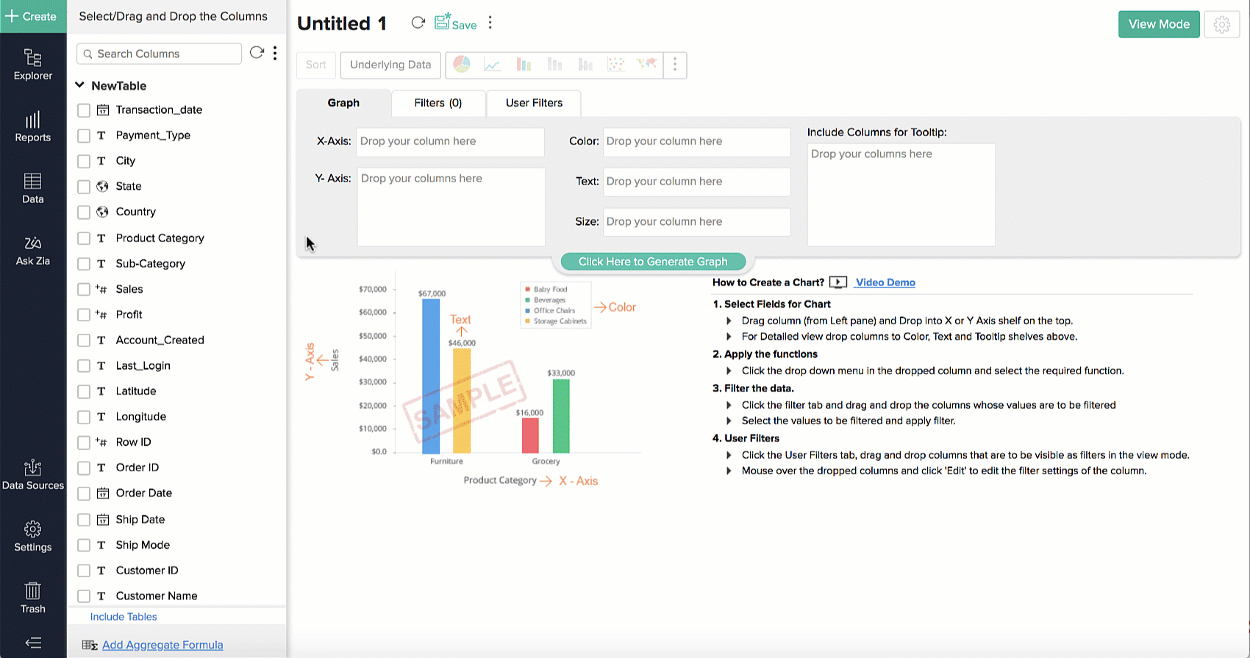
Creating map charts
Follow the steps below to create a map chart in Analytics Plus:
- Step 1: Click the +Create button from the side panel, and select the Chart View option.
- Step 2: Drag and drop the Geo location columns in required fields, and click the Click here to Generate Graph button. You can change the chart type with the More Charts option.
Map interactions
You could interact with the map chart using the following options available in the panel.
- Search - This option allows you to search for any location on the map.
- Home - This option returns the map chart to its original dimensions. You can also customize the map chart's default home screen.
- Grab Area - You can use this option to select a required area on the map, and zoom in.
- Zoom in
- Zoom out
In addition to these map chart interactions, options such as drill down, view underlying data, and legend filter will also be applicable.
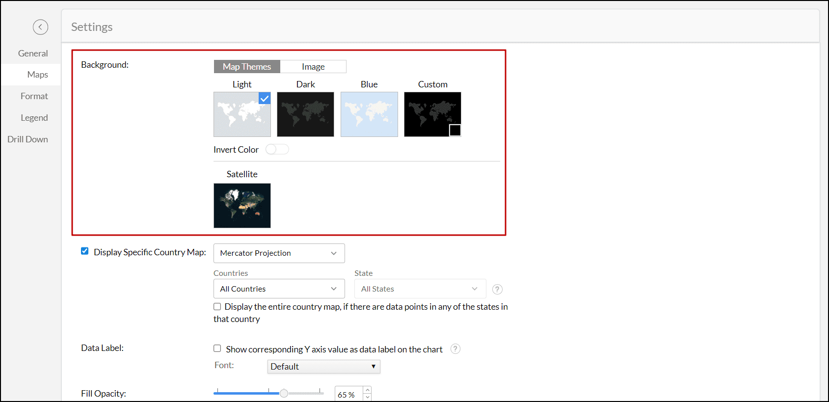
Customizing map chart
Analytics Plus lets you customize the map chart using the various options in the Settings page. To do this, open the required Map chart and click the Settings icon in the toolbar. In the page that appears, navigate to the Maps tab. The following are the customization options available for map charts.
Background
This option allows you to change the background of the map chart. The following are the options available to customize the background.
- Map Themes: Choose one of the following options.
Enable the Invert Color toggle button to switch the water area color with the land area color and vice versa.
- Light: This option applies a light grey color to the water areas and a white color to the land areas.
- Dark: This option applies a dark grey color to water and a white color to land.
- Blue: Choose this option to apply a light blue color to water and a white color to land.
- Custom: This option lets you choose your own choice of color. Analytics Plus applies a darker shade of the selected color to water and a lighter shade to land.
- Satellite: This option applies a satellite map.
- Image: This option allows you to upload a custom image for the chart's background and edit its positioning.
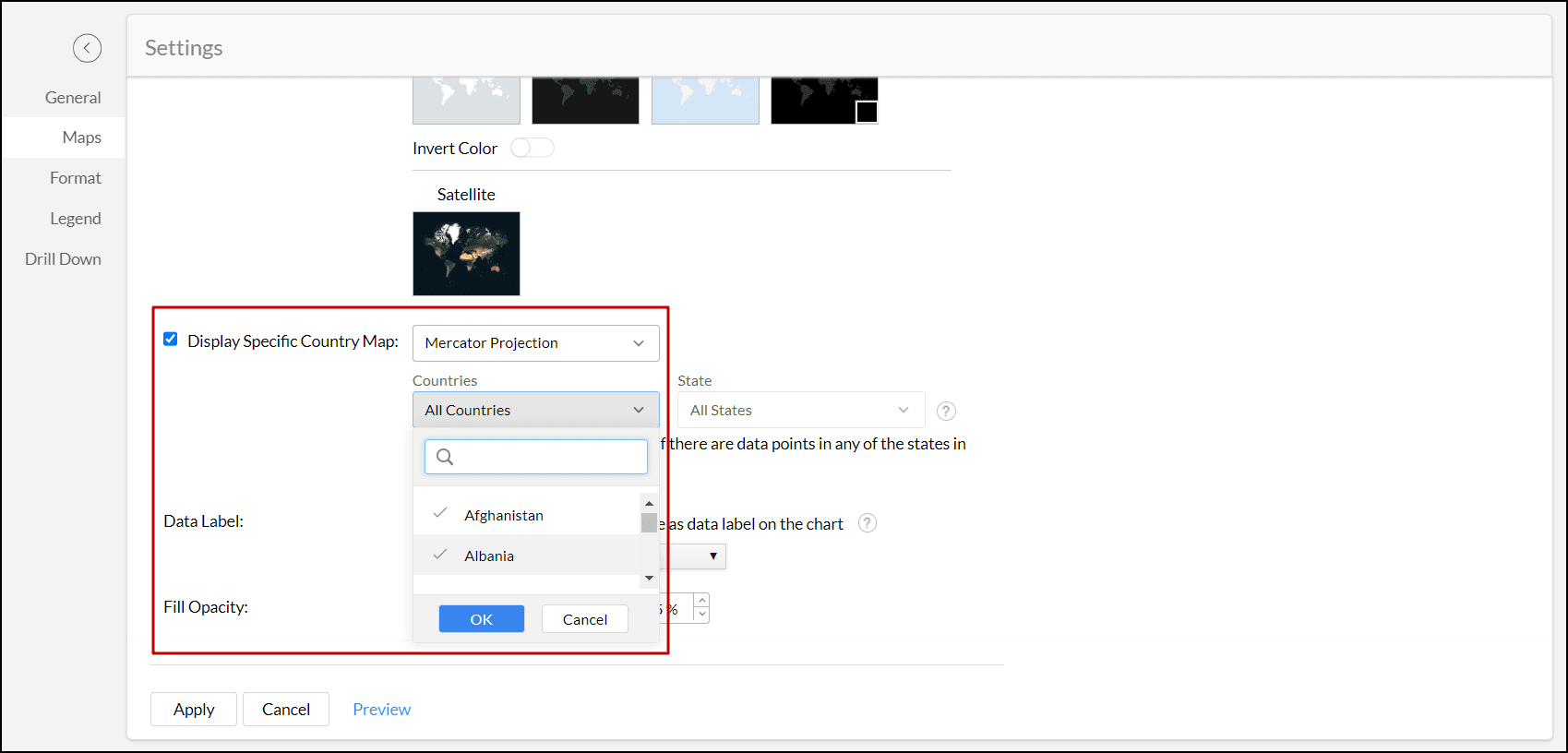
Display specific country map
Analytics Plus offers the following two map projections to plot data on a map view. You can choose the projection based on your needs.
Mercator Projection
This is a conformal cylindrical projection that is widely used and is the default projection used while creating a map view in Analytics Plus. By default, the world (all the countries) map will be displayed. You can choose a specific country map to be on display. To display a specific country map,
- Select the Display Specific Country Map checkbox.
- Click the All Countries drop-down menu.
- Select the countries for which the map should be displayed.
Albers USA Projection
This could be the ideal choice for visualizing US-centric data, as it shows Alaska and Hawaii in close proximity to the other states. Follow the below steps to apply Albers USA projection,
- Select the Display Specific Country Map checkbox.
- Select Albers USA Projection from the projections drop-down.
- Click Apply.
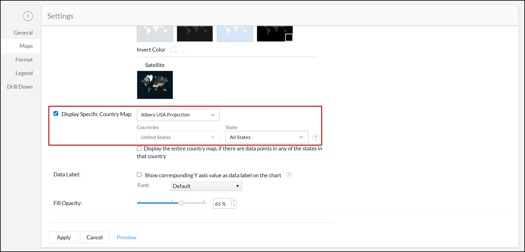
Note: If the data has values of other countries, Analytics Plus will display only the US data and ignore the other countries' data.
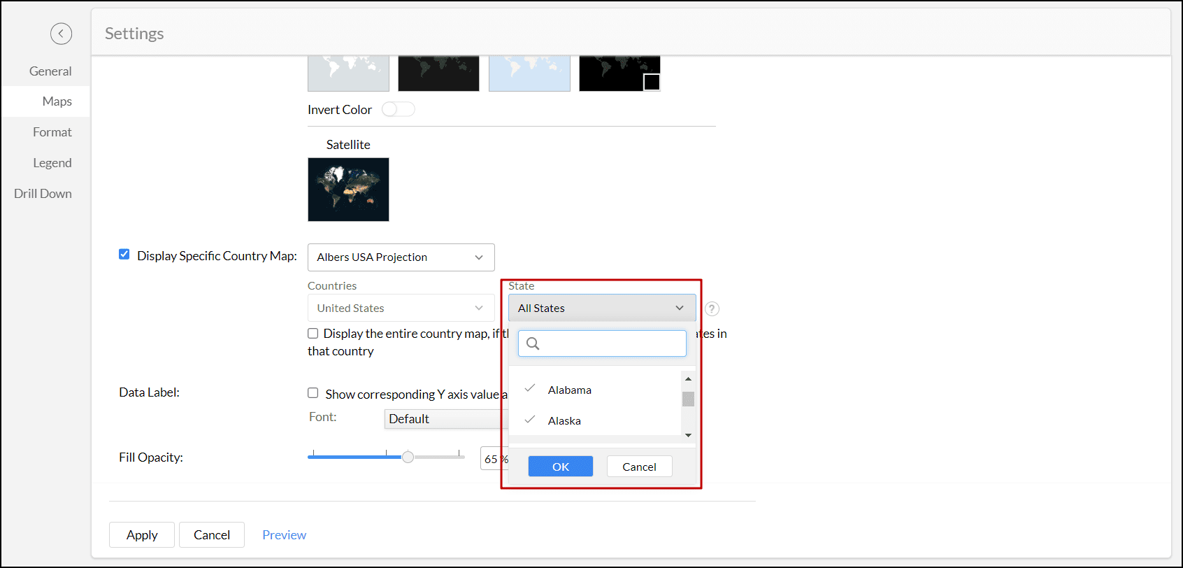
Display specific state map
Analytics Plus allows you to choose specific state maps within the selected country. By visualizing geographical data on these state maps, you can get a more impactful analysis of specific regions. Follow the below steps to display the state map.
- Select the Display Specific Country Map checkbox.
- Select the type of Projection from the projections drop-down.
- From the Countries drop-down, select the required country.
- Choose the required states from the State drop-down.
- Enable the Display the entire country map checkbox to showcase the political representation of the state map within the encompassing country map.
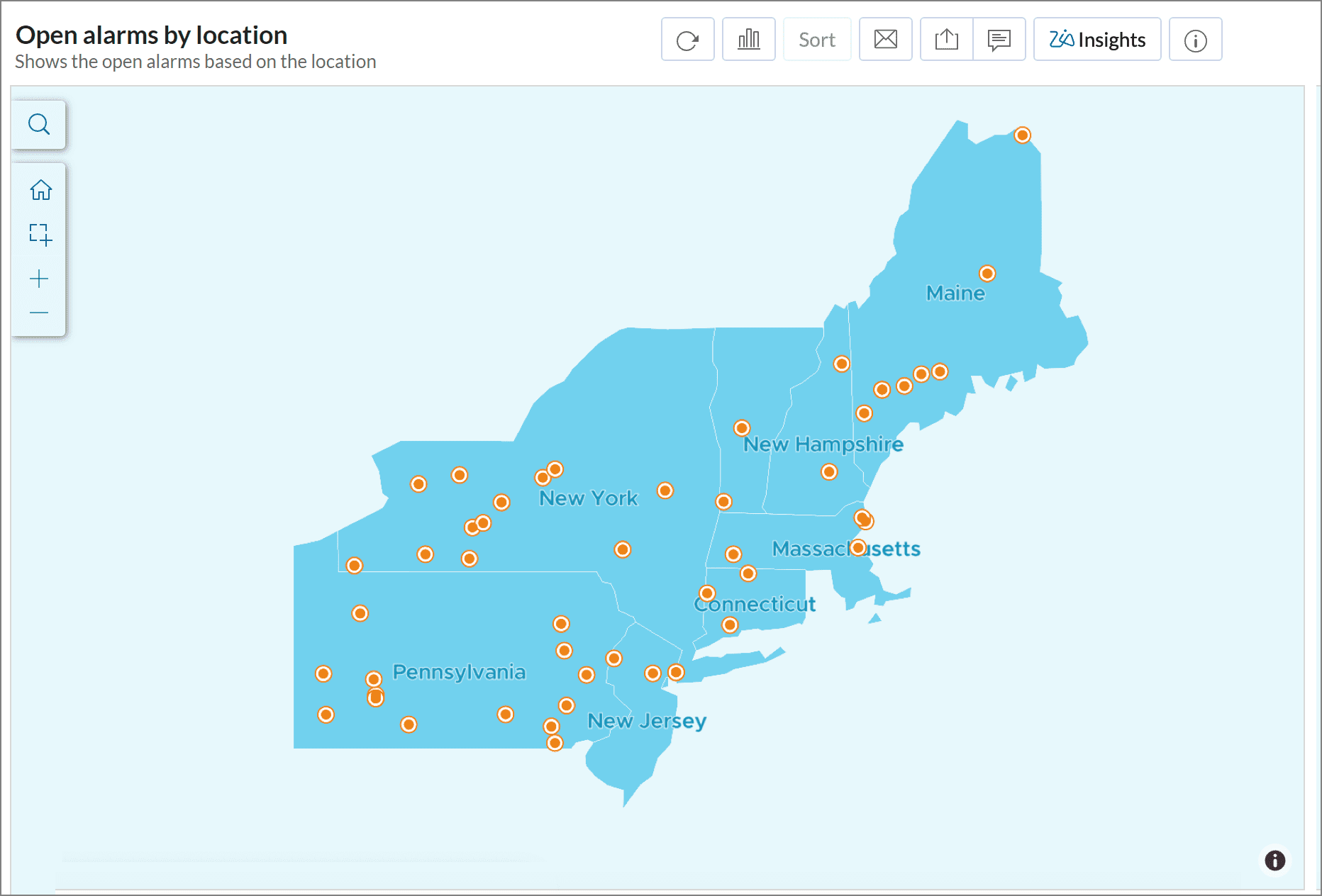
The following is an example map for analyzing the Open alarms based on Location in the north eastern parts of the United States of America.
Other available options
- Data Label: This option allows you to add the Y-axis value as a data label on the map chart. You can also customize the font of the data label.
- Fill Opacity: You can specify the opacity of the chart series color. This option does not apply to Map-Scatter charts.
- Markers Type: You can select the type of marker that is used to denote locations. This option does not apply to Map-Scatter charts.
- Heat Radius: You can specify the boundary to combine the data points for heat calculation. This option is applicable only for Geo Heat map charts.
- Heat Intensity: This option allows you to customize the intensity of heat and is applicable only for Geo Heat map charts.
- Heat opacity: You can customize the opacity of the heat map. This is applicable only for Geo Heat map charts.
Setting a continuous color range legend
You can also customize your map chart to differentiate data based on the volume of occurrence by setting a continuous color range legend. To do this,
- Click the Settings icon in the top right corner of your map chart, and navigate to the Legend tab.
- Select the Continuous Band radio button, make changes to the palette and color if needed, and click Apply.
Unresolved locations
There may be cases where some locations are not categorized, due to issues in resolving geographical data such as ambiguous location names, misspelled locations, their colloquial name, etc. Such locations are listed as Unresolved locations in the panel. This option is visible in the Edit mode.
Resolving unresolved locations
You can resolve the unresolved locations in your map chart by providing additional information in one of the following ways.
Resolving through Geo column mapping
Mapping it to a country column: This allows Analytics Plus to identify the country in which the unresolved location is located and correct it automatically. Open the map chart in the Edit mode, and click the Unresolved locations icon. In the Edit Unresolved Locations screen that appears, navigate to the Geo Role in Column Mapping section. If you have a country column in your data set, select the Country option from the Country drop down to map the unresolved locations.
If there are no country columns present, but the states or cities all belong to a single country, use the Provide the Location option to enter the name of that country.
Mapping it to a state column: This allows Analytics Plus to identify the state in which the unresolved location is present, and resolve it automatically. If your data set contains a state column in addition to a country column, you can further map the unresolved locations to the corresponding state column as well. If there are no state columns, but the cities all belong to a single state, use the Provide the Location option to enter the name of that state.
Note:
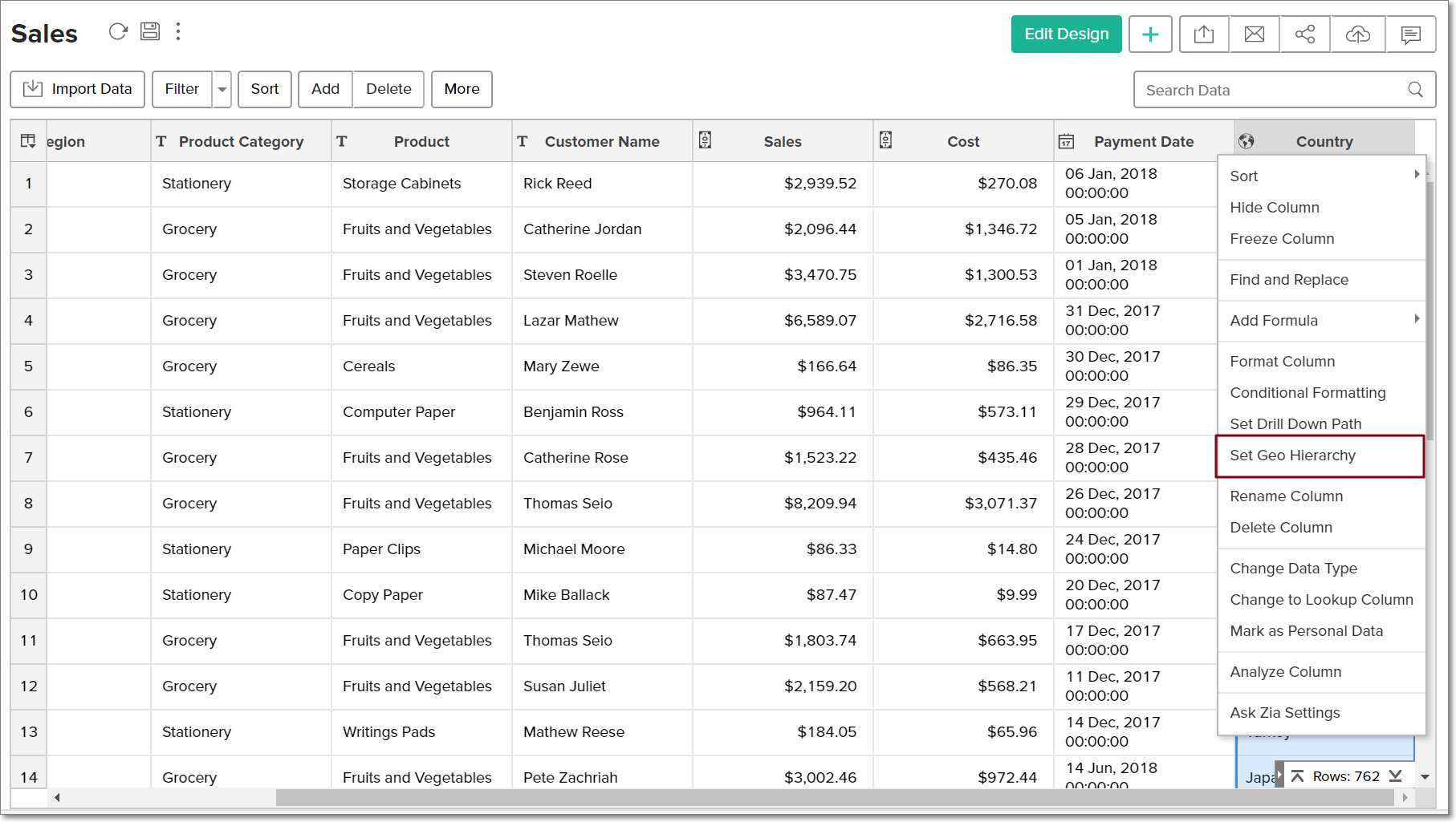
You can also resolve these issues from your data table. Right-click the required column, and select the Set Geo Hierarchy option. This opens the Edit Unresolved Locations page and you can follow the steps mentioned above to resolve the locations.
Plot latitude and longitude
You can also resolve these location issues by specifying the latitude and longitude values in the Edit Unresolved Locations page.
Correct misspelled locations
Spelling errors in locations names can also result in unresolved locations. For example, "Hong Kong" could be misspelled as "Hongkong", or "Brooklyn" as "Broklyn". You can always correct spelling errors in the imported table, or change them in the original data before import.
Pick location for Geo data
You can also use the Geo location picker to resolve unidentified locations on map charts. Click the Pick Location link, search for the location in the map using the given search field, and click Apply. The latitude and the longitude values for the selected location will be auto-filled in the respective fields. Click Save to reflect the changes.