Definition: Network mapping and network visualization
Network mapping is the process of discovering, documenting, and maintaining an up-to-date model of a network's devices, interfaces, IP addresses, and their relationships. Network visualization builds on that model to present network information through topology maps, dashboards, performance graphs, heat maps, and other visual formats that support monitoring, troubleshooting, planning, and analysis.
Mapping creates the structural context that describes how a network is built. Whereas, visualization presents that context and, where appropriate, combines it with monitoring data to help admins interpret the state of the network and make informed decisions.
In this article, we'll explain how network mapping and network visualization differ, why they depend on one another, where each fits into day-to-day network operations, and what to look for in a platform that brings both together.
Why network visualization depends on network mapping
Networks are distributed and layered by nature, spread across sites, where devices are added, replaced, relocated, and reconfigured often, with physical (cabling and hardware links) and logical connections (VLANs, routing paths, and other software-defined relationships) continually changing alongside them. In environments like these, manually maintained network diagrams become outdated quickly, making them an unreliable foundation. So reliable visualization calls for an accurate, up-to-date understanding of that underlying structure.
This is where network mapping provides the foundation. Through automated discovery (through protocols such as SNMP, LLDP, CDP, and ARP table queries), it identifies devices, interfaces, IP addresses, and their relationships, maintaining a current model of the network.
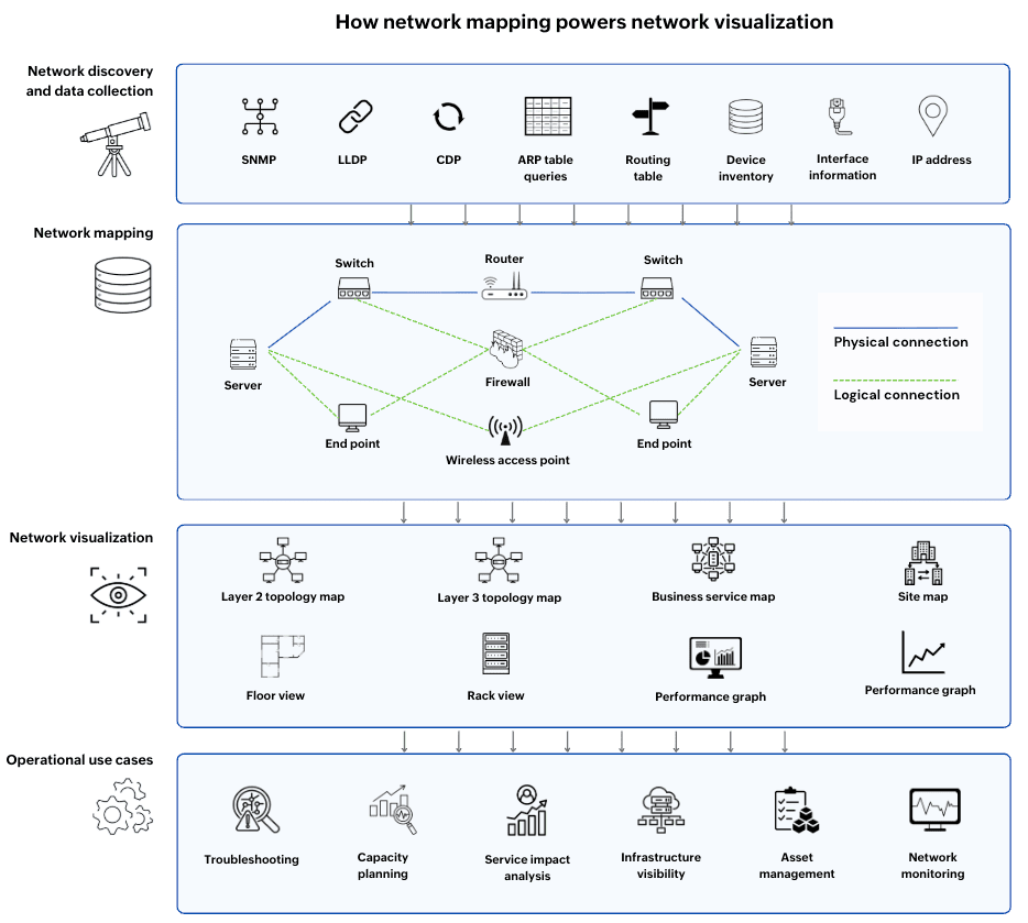
Network visualization builds on this foundation.
- A layer 2/layer 3 topology map visualizes discovered device relationships.
- A business service map organizes those relationships around applications and services.
- Dashboards and performance graphs combine the mapped network structure with monitoring data
- Heat maps present utilization patterns across devices or locations.
Network mapping vs. network visualization: Key differences
| Aspect | Network mapping | Network visualization |
|---|---|---|
| Primary purpose | Discover and document network structure | Present network information visually |
| Focus | Devices, interfaces, IP addresses, and relationships | Understanding, monitoring, troubleshooting, planning, and analysis |
| Primary output | A continuously maintained network model and network maps | Topology maps, dashboards, performance graphs, heat maps, and other visual views |
| Data source | Discovery protocols and network inventory | Network mapping data, monitoring metrics, and operational telemetry |
| Best suited for | Establishing an accurate representation of the network | Choosing the most effective way to interpret network information |
How network mapping and visualization support real-world network operations
In day-to-day network management, admins rely on various visualizations, each answering a specific operational question: where an issue started, how capacity is being used, which services are affected, or how infrastructure is distributed. In each case, network mapping provides the structural context that makes those answers possible.
Troubleshooting network issues
During a network issue, an admin's quick need is to determine where the fault originated and which downstream devices or services are likely to be affected. A topology map shows the device relationships established through network mapping, while performance graphs and fault alerts provide real-time operational context. Together, they help isolate the source of the problem and understand its downstream impact.
For example, if a core switch goes offline, the topology map immediately shows which access switches and business services sit downstream, allowing admins to assess the scope of the outage before troubleshooting the underlying fault.
Capacity planning
As networks grow, admins need to see how much capacity is being used and where that usage is concentrated. Heat maps highlight utilization patterns across devices, links, or locations, while rack views or floor maps show where infrastructure is physically deployed. Network mapping data powers these visualizations to identify capacity constraints and planning expansions.
Assessing business service impact
During an incident, admins need to know which devices are affected and which business services depend on them. Business service maps organize infrastructure around applications and services, using the relationships established through network mapping. This allows teams to assess the operational impact of an issue quickly and prioritize restoration efforts.
Understanding distributed infrastructure
In environments spanning multiple sites or data centers, admins need a clear view of how infrastructure is distributed. Site maps and department-level maps provide this perspective, showing where devices are located and how they are connected across locations. Because these views are based on continuously updated network mapping data, they remain accurate as the network evolves, reducing reliance on static documentation.
What makes an effective network mapping and visualization platform
The value of network mapping and visualization depends on how closely the two are integrated. Mapping should continuously maintain an accurate network model through automated discovery, while every visualization should draw from that same model so it reflects the current state of the network.
An effective platform keeps all visualizations synchronized with the underlying network information. As devices are discovered, moved, reconfigured, or removed, topology maps, business service maps, rack and floor views, and other visualizations should update accordingly without requiring manual edits. Monitoring dashboards and performance graphs should also share this common network context, allowing admins to move between understanding how the network is built and how it is performing without switching between disconnected views.
ManageEngine OpManager: The network monitoring tool with network mapping and visualization
ManageEngine OpManager is a comprehensive network monitoring solution that combines automated network discovery, mapping, performance monitoring, fault management, and network visualization in a single platform.
It automatically discovers network devices and maintains an up-to-date network model, which powers topology maps, business views, rack and floor views, and site maps. Complementing these are dashboards and performance graphs that combine monitoring data with network context, helping administrators monitor network health, understand infrastructure relationships, assess service impact, and troubleshoot issues from a unified interface.
FAQ
Which network visualization pairings work best for real-time troubleshooting?
For live incident response, a topology map paired with performance graphs is the most effective combination. The topology map shows where the issue sits in the network, while the graphs reveal when performance began degrading and which metrics changed. Together, they provide both structural context and operational insights.
Can a network visualization exist without network mapping?
What's the difference between a network map and a topology map?
Transform network maps into actionable operational views
ManageEngine OpManager for enterprise network monitoring
Download nowBy Javith Razvi,
Solutions Marketer, ManageEngine FSO