Self Service Portal Customization
The Self-Service Portal can be designed and customized by the administrator to display it in a way that he/she requires the users to view it. This customization option allows the administrator to re-arrange, restore, add, delete, hide and re-size the widgets. The widgets can be positioned anywhere in the screen and can re-sized through easy drag and extend/compress. This option can be accessed by clicking on Admin>>Self-Service Portal Settings >>Customize Self-Service Portal.
-
Self-service Portal Customization (Advanced) - For build 14000 or later
- Self-service Portal Customization (Basic)
Self-service Portal Customization (Advanced) - For build 14000 or later
From version 14000 onwards, ServiceDesk Plus MSP extensively offers options to customize the requester homepage of the self-service portal according to your business needs. Customization of the requester home page includes advanced options such as panels, buttons, snippets, widgets with pre-defined or custom templates. SDAdmins can create and save multiple customized pages using advanced customizations, however, only one of the pages can be published.
Notes:
-
This is an instance-specific configuration.
-
For new installations with build 14000 or newer, the advanced customization replaces the basic customization.
-
For installations migrated to 14000, the existing basic customization will be accessible only if a customized home page is already configured. However, if a new page is created using advanced customization options, the existing basic customizations will be removed.
Create or Edit Pages
- To customize the requester portal with advanced options,
- Go to Admin > General Settings > Advanced Portal Settings > Customization.
- Click Customize Self-Service Portal.
- Open the page editor using any of the below options:
- New page with pre-configured template: Under the All Pages tab, choose the page of your choice and click Edit on the card.
- New page without pre-configured template: Click Create New card to open the editor, create your own page from the scratch using various customization options.
- Previously saved page: Go to My Pages and choose the page of your choice and click Edit on the card.
- Adding a Template: Click Select Templates and select the preferred template from the list of available templates.
- Adding background color: Click Page Properties and choose between pre-selected colors or click
to choose any color of your choice from the color gamut.
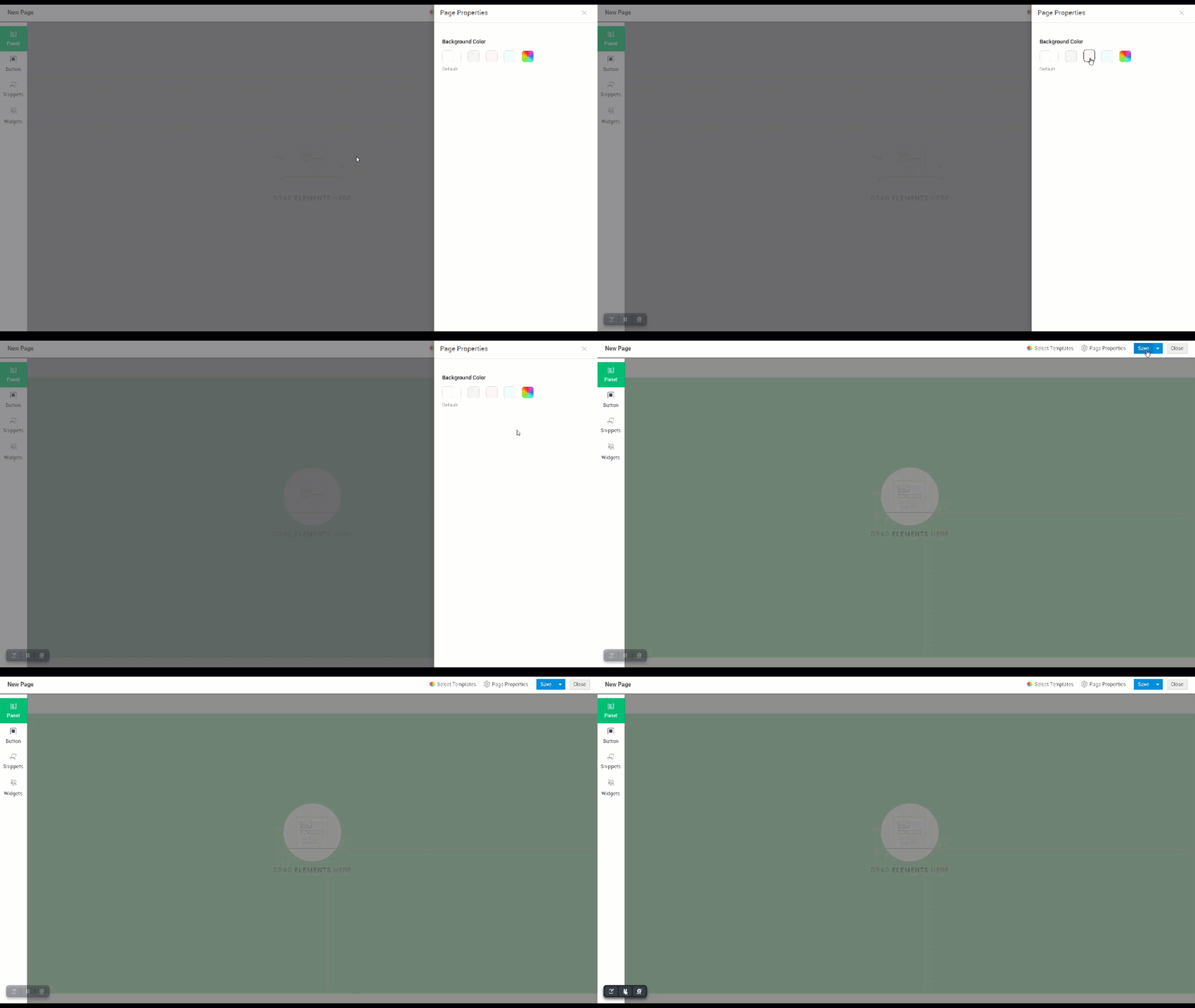
- Add and configure panels, buttons, lists, or snippets to the pages as needed. To learn more about the functionalities and configuration of these elements, click here.
- Click Save.
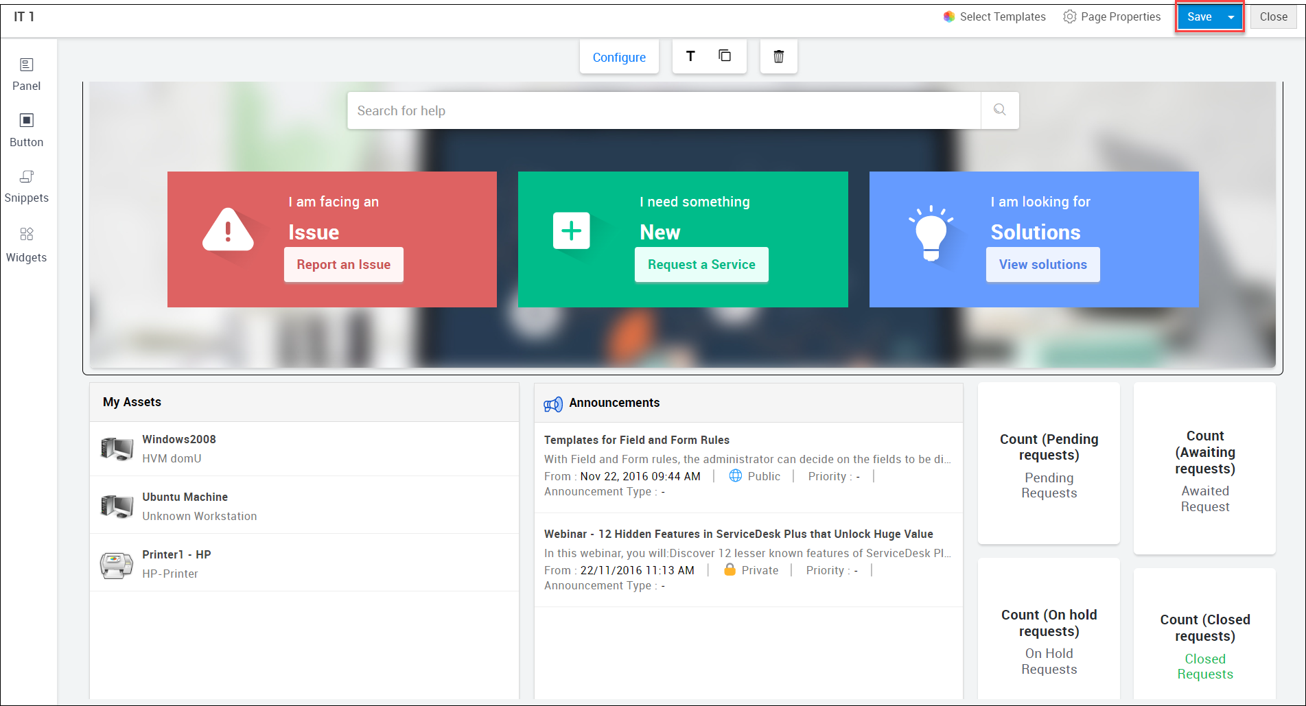
Note
-
To save the self-service portal home page as a separate new page, go to Save and select Save as from the drop-down menu, provide a name, and click Save.
-
To apply customizations to requester home page, go to Save and select the action Save & Set as Requester Home Page from the drop-down menu.
Configuring Customizable Elements
The page editor includes various customizable elements that add different functionalities and configurations to the requester home page as described below.
Panels
Panels help you add elements such as textboxes, functions, buttons, etc to the self-service portal home page. By default, the panel option enables pre-defined functions that display information such as the number of tasks, requests, status, etc. You can further customize the panel by adding the required elements to it.
Adding a panel:
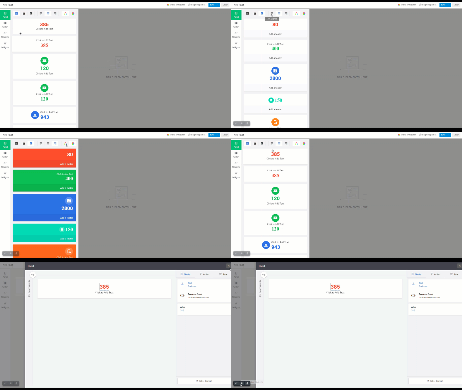
- Click Panel on the left-side pane of the editor.
- Customize the alignment and color as required.
- Choose a panel type: No header or footer, Include header, and Include footer.
- Drag and drop your preferred panel to the page editor.
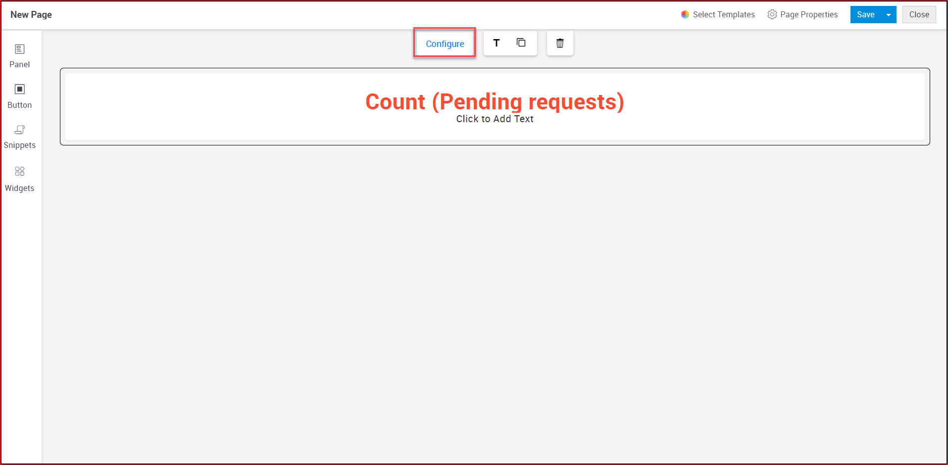
- Click Configure and customize the selected panel as described below:
To customize the displayed information, go to Display, and select the required value displayed in the tab. The values shown in the Display tab will be contextual as discussed below. For functions such as task count or request count, a non-editable field is displayed whose value is fetched based on task or request status. For search box and text box, a placeholder will be displayed.
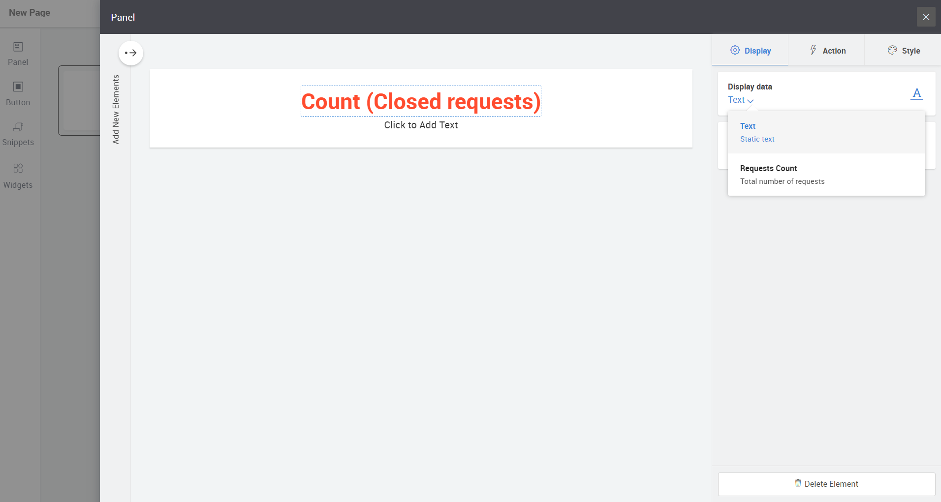
To configure an action, go to Action, and select the action type from the drop-down. The values shown in the Action tab will be contextual depending on the element selected such as Open URL, Report an Issue, etc.

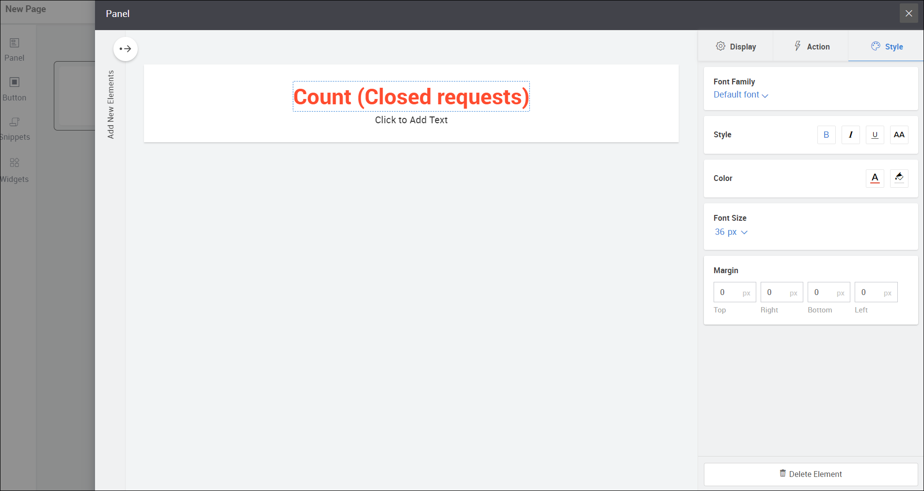
To configure the styling of the element, go to Style and choose your preferred font, color, shape, size, margin etc, depending on the element.
Note
-
To add a title to the panel, click
and provide a title and click Done.
-
To copy a panel, select the panel and click
.
-
To delete a panel, select the panel and click
.
Buttons
Buttons perform configured actions when clicked. You can add buttons to an existing panel or add default buttons to a new panel and customize the panel as required.
Adding a button:
To add a button within an existing panel:
Select the panel, click Configure.
Click the icon and drag the required button to the panel.
To add a new button in a new panel:
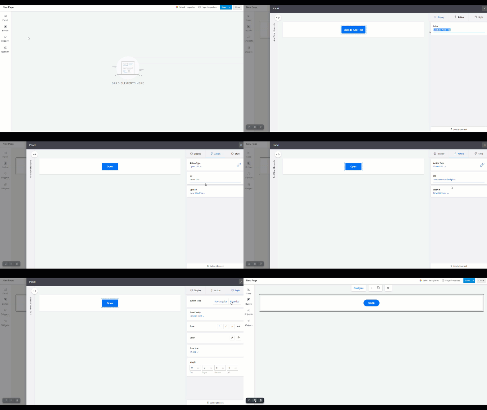
- Click button on the left-side pane of the editor.
- Drag your preferred button to the page editor.
- Click Configure by selecting the required button and customize it as described below:
- To customize the displayed information, go to Display, and select the required value.
- To configure an action, go to Action, and select the action type from the drop-down. The values shown in the Action tab will be contextual depending on the element selected such as Open URL, Report an Issue etc.
- To configure the styling of an element, go to Style and choose your preferred button type, font, color, shape, size, margin, etc.
- To add more elements to the panel, click the arrow and select a preferred element amongst text, image, button, or search box and drag it to a preferred location.
- To resize the panel or the elements within the panel, click the edge of the panel / element and drag it to the preferred location.
- To arrange elements within the panel, drag the elements to the preferred location within the panel.
Notes
-
To add a title to the panel, click
and provide a title and click Done.
-
To copy a panel, select the panel and click.
-
To delete a panel, select the panel and click
.
Widgets
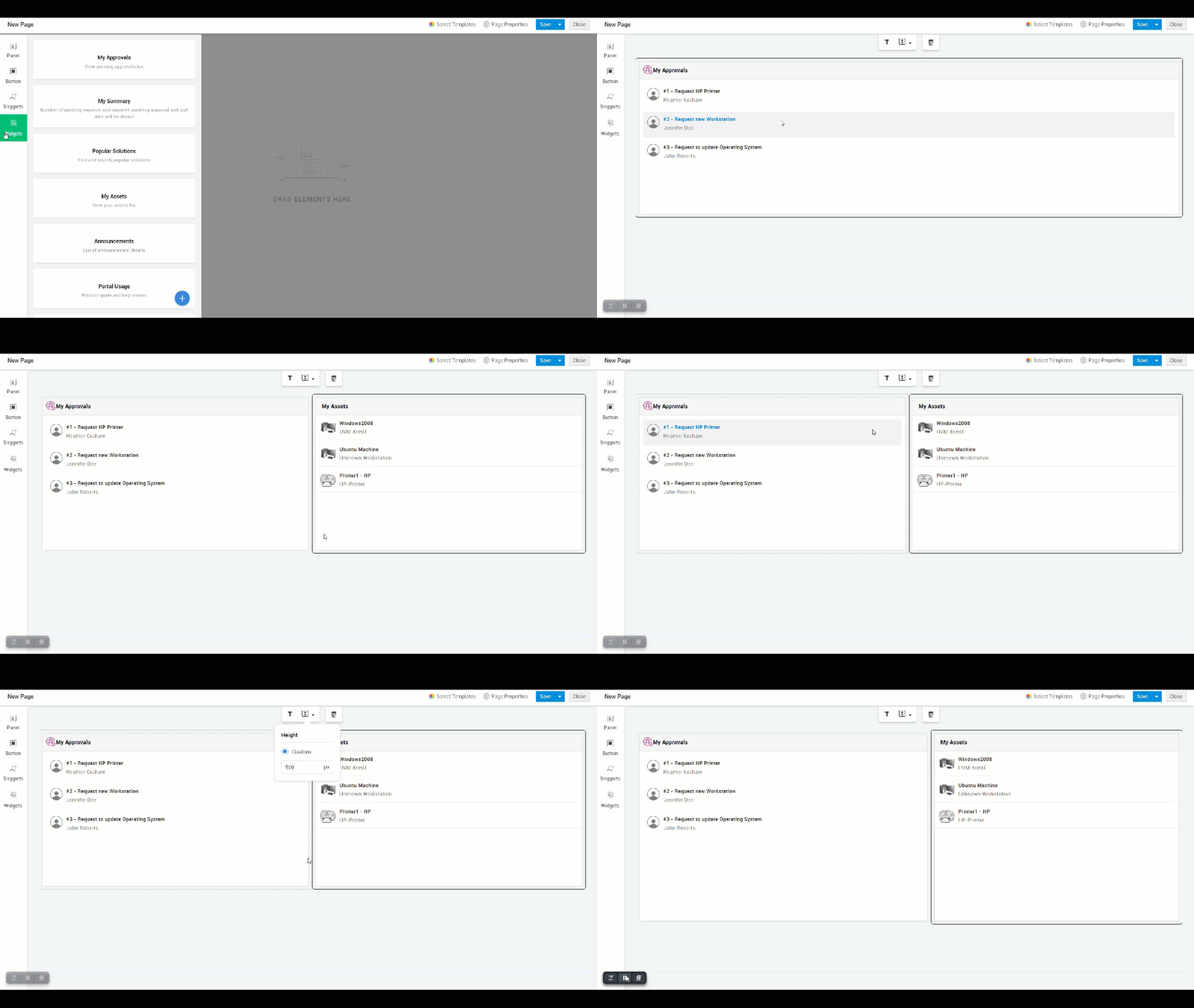
- Add default widgets such as My Summary, Announcements, My Assets, etc to the self-service portal using Widgets. Although these widgets are non-customizable, you can add a title and adjust its dimensions as required. To add a widget, click
and drag a widget to the preferred position on the page.
Notes
-
To add a title to the widget, click
and provide the title and click Done.
-
To delete a widget, select the panel and click
.
Snippets
Snippets are containers used to render external links or add HTML/Deluge scripts to create custom views.
To add a snippet,
- Click
and drag a snippet type container to the preferred location on the page.
- For HTML Snippet Container: Add your code to the HTML editor and click Save.
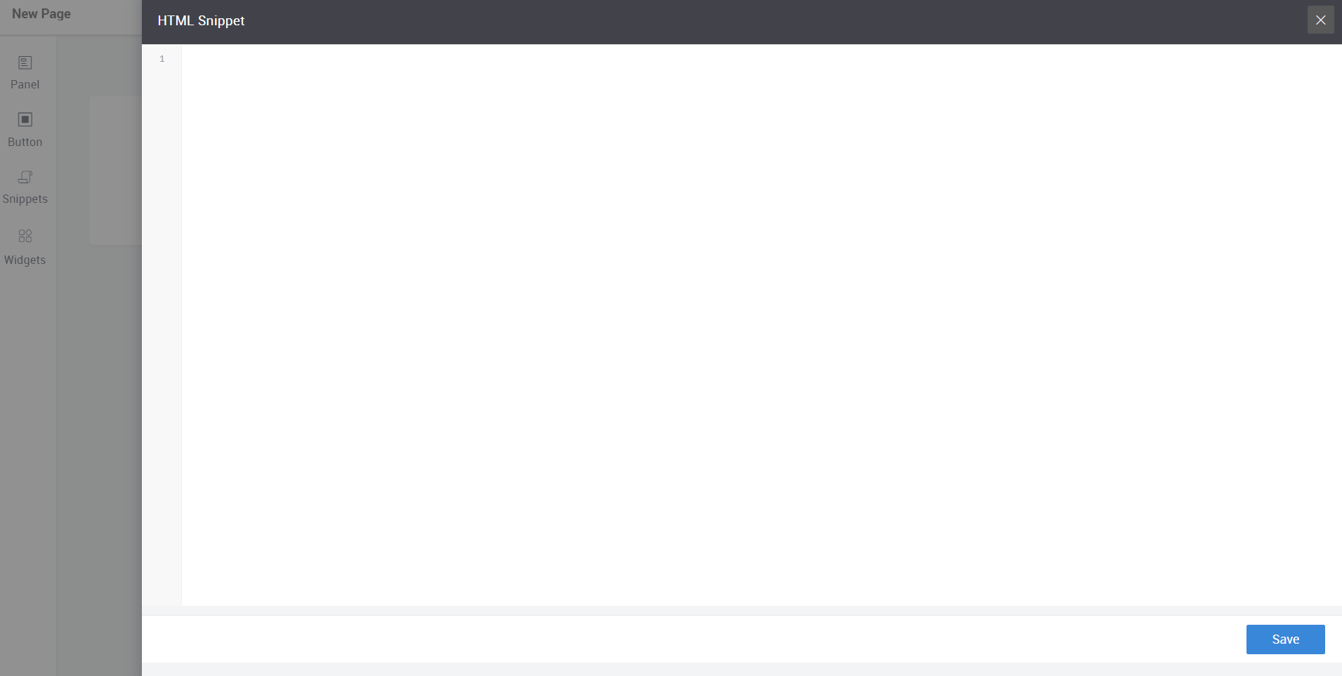
- For Embed container: Add a URL using iFrame tag and configure the dimensions using Height and Width attributes.
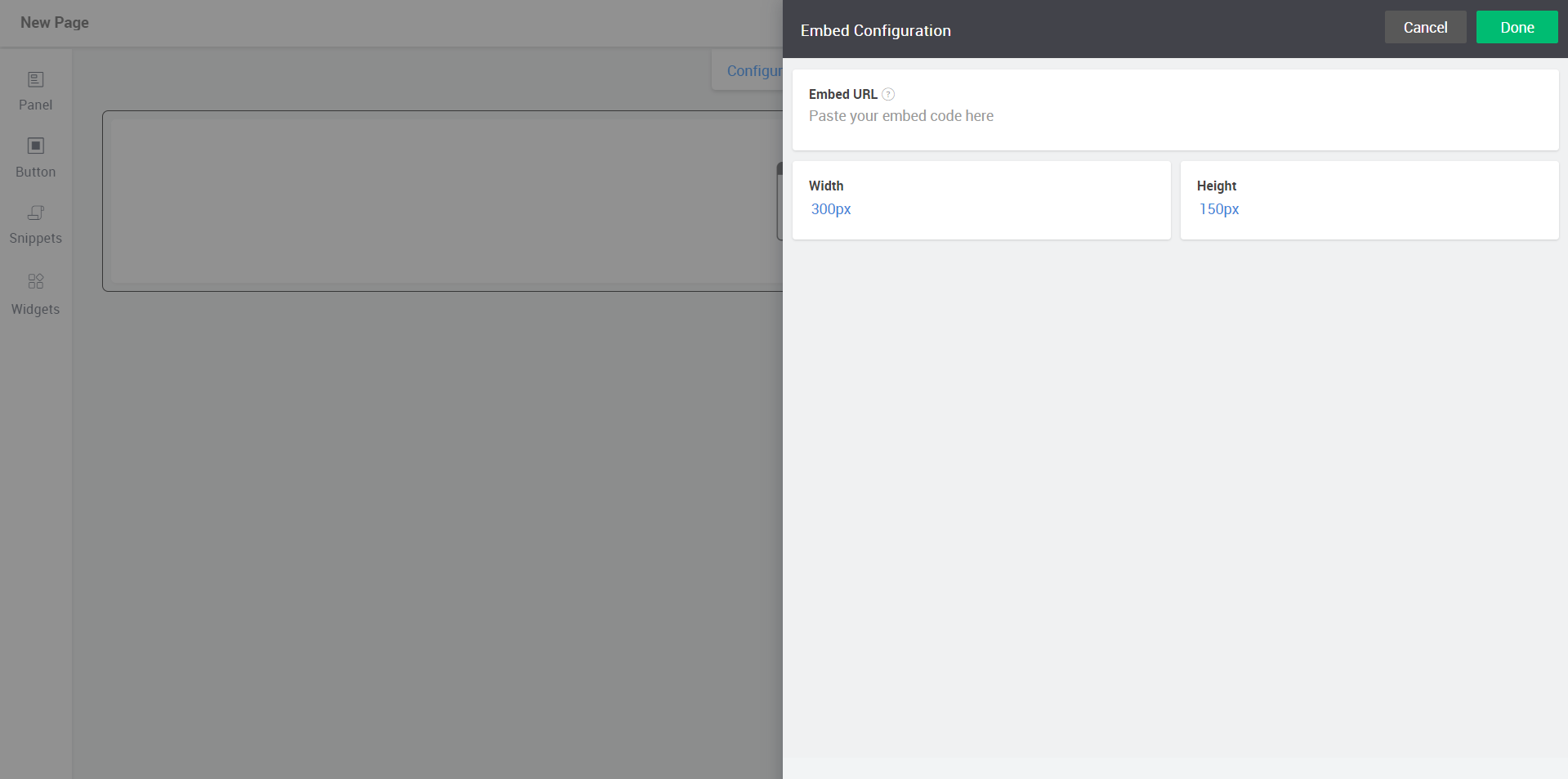
- Click Done.
Notes
-
To change the URL, select the snippet, click Configure, and click Change.
-
To modify dimensions, select the snippet, click Configure, and change Width and Height.
-
To change the alignment, select the snippet, choose your preferred option from the alignment icon.
-
To add a title to the snippet, click
and provide a title and click Done.
-
To delete a snippet, select the panel and click
.
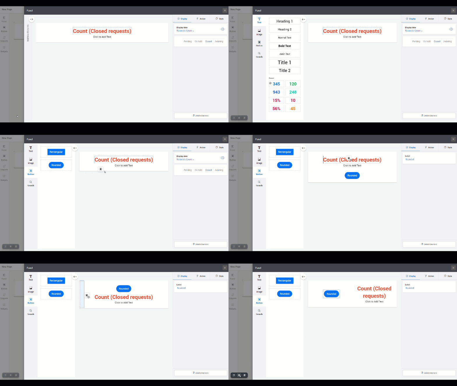
Add multiple elements to a panel
- To add more elements to the panel, click
and select an element type (text, image, button, or search box) and drag your preferred element to the panel.
- To resize the panel or the elements within the panel, click the edge of the panel/element and drag it to the required size.
- To arrange elements within the panel, drag the elements to the preferred location within the panel.
Manage Pages
Manage your pages from the Advanced Customization page. To access it, go to Admin > General Settings > Advanced Portal Settings > Customize Self-Service Portal and click Customize Self-Service Portal.
➤ To find a page, use the relevant keywords in the search box at the top-right.
➤ To preview a page, hover over the page and click .
Note: You can customize the preview using the toggle Show header and navigation menu.
- To duplicate a page, hover over the page, click
and select Duplicate.
- To rename a page, hover over the page, click
, click Rename, provide the name, and click Save.
- To delete a page, hover over the preferred page, click
, click Delete and confirm the action.
- To preview a page, hover over the page and click
.
Self-service Portal Customization (Basic)
- Steps to customize Self-Service Portal
- Adding Widgets
- Setting Properties
- Actions on Drafts
- Preview the Portal
- Publish the customized settings

Steps to customize Self-Service Portal:
Click 'Customize Self-Service Portal'. The Self Service Portal Customization window will be displayed with five options:
- Widget: My Request Summary, Announcements, Popular Solutions, Submit Your Request, My Approvals, Portal Usage Video & Help document are the default widgets.
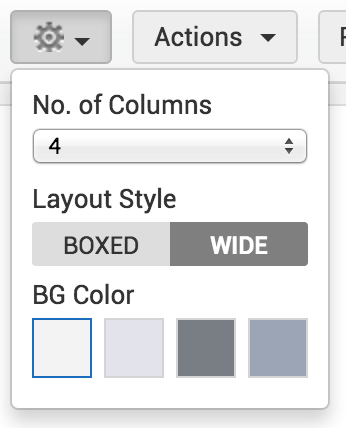
- Properties: Upto four columns can be displayed with desired layout and background color.
- Actions: Drafts pertaining to design can be cleared/saved and changes can be discarded.
- Preview: Preview displays a wholesome view of the page before saving the desired settings.
- Publish: The customization done will be saved and applied and will be visible to all users.

- Click 'Widget'.
- Enter the widget name and its corresponding web address in the space provided and click 'Add'.
- The newly added widget(s) will be displayed in the portal and can be re-sized and positioned accordingly.
- If any default/external widget is removed, it will be displayed under removed default/external widgets. All removed default widgets and the last three removed external widgets will be listed. The removed widgets can be added back by just clicking on the widget from the removed widgets list.
Note:
An alert message 'Not yet published' will be displayed until the design is published.
If 'Do you wish to hide solutions tab from Requester?' is set to 'Yes', ‘Popular Solutions’ widget will not be available in self-service portal customization page. If 'Do you wish to hide solutions tab from Requester?' is set to ‘No’ and if the portal is already published or saved without the ‘Popular Solutions’ widget, then the ‘Popular Solutions’ will be available under the removed default widgets list.

- Click 'Properties'. Choose the required number of columns and the layout style.
- The layout of the Self-Service Portal can be either "boxed" or "wide". Wide layout occupies the whole screen width while the boxed layout will make the Self-Service Portal 1328 pixels wide.
- Choose the background color for the Self-Service Portal. On clicking each color, a preview along with the selected color will be displayed.
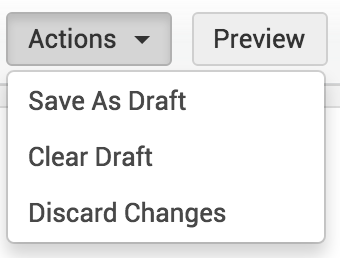
After setting the properties, Click on 'Actions' drop-down.
- Save As Draft: The customized design will be saved as draft but will not applied until 'Publish' is chosen.
- Clear Draft: The previously saved draft will be deleted and the newly published version of the Self-Service Portal will be displayed.
- Discard Changes: The changes applied so far will be deleted and the Self-Service Portal will be restored to its already existing state.
Note:
Administrator can save only a single draft. After publishing the draft, the saved draft will get removed from the 'Drafts'.
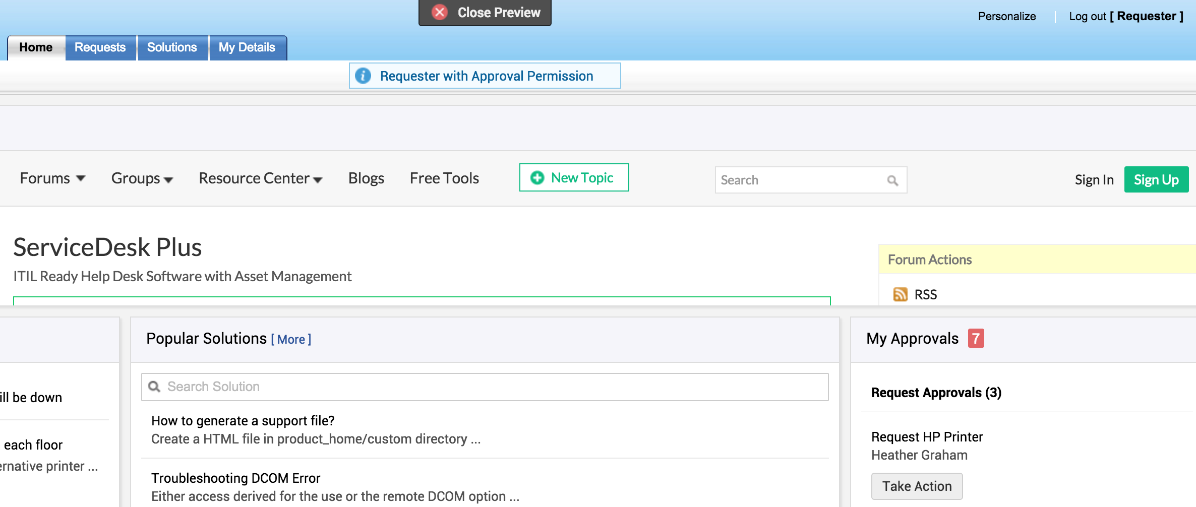
- Click 'Preview' to examine the customized Self-Service Portal. The preview of the Portal will be displayed.
- If 'My Approvals' widget is selected, then a version with 'Requester with Approval Permission' and a version without 'My Approvals' will be displayed alternately.
- To stop viewing the preview, click 'Close Preview'.
Publish the customized settings
Click 'Publish' to save the customized changes and display the customized portal to all the users.


