Trend line
Trend lines can be employed to identify past and future data trends in a time or number series in Analytics Plus.
- What are Trend Lines and how are they derived?
- What are the various models available for plotting trend lines in Analytics Plus?
- What are the various prerequisites for plotting trend lines in a chart?
- How do I add a Trend Line to the chart?
- What are the various chart types that support trend lines?
- How do I access details of the mathematical model used to plot the trend line?
- Is it possible to plot trend lines for forecasted data?
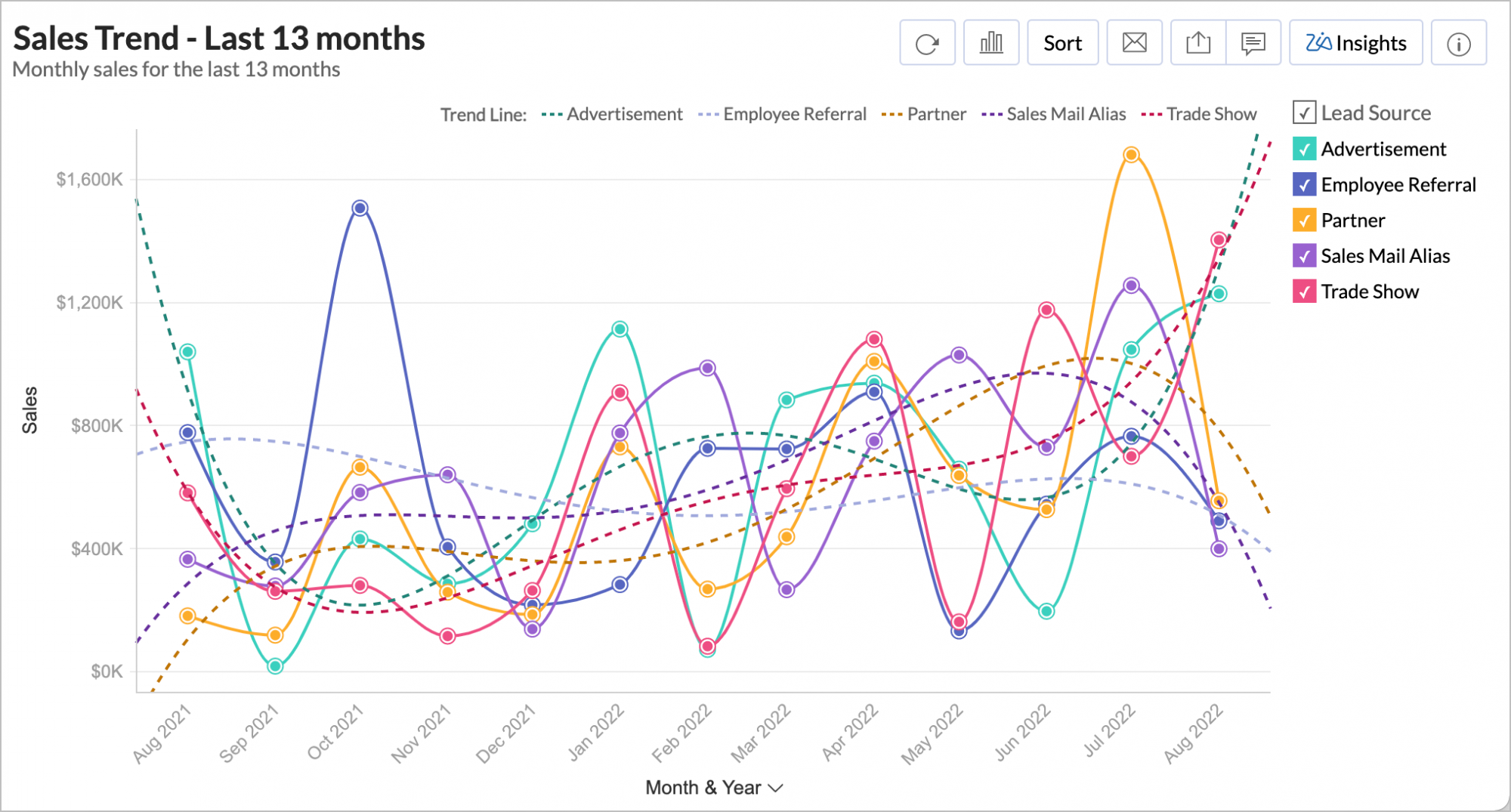
- Is it possible to plot trend lines over multiple Y-axes?
- Can shared users access trend line details?
- Is it possible to export the trend line's data?
- Can I set up a Trend Line over a chart with legend?
1. What are Trend lines and how are they plotted?
Trend Line are used to identify data trends in a time or number series. They are derived based on one of five mathematical models - Linear, Logarithmic, Exponential, Power, and Polynomial. To learn more about the supported models, click here.
The following points detail how trend lines are plotted in Analytics Plus:
Based on the selected mathematical model, and the chart's underlying data, Analytics Plus predicts the various possible trend values.
The error square value will be identified by calculating the square of the difference between the actual Y and predicted trend Y values. This process will be repeated by changing the parameters to check for any reductions in the error square value.
The trend line will then be plotted using the actual Y and predicted trend Y values that result in the least error possible.
2. What are the mathematical models available for plotting trend lines in Analytics Plus?
Analytics Plus supports the following mathematical models for predicting data trends.
Linear: This option allows you to employ a Linear model to derive trend lines.
Logarithmic: Select this option to use a Logarithmic model to plot data trends. This model is not recommended for data points that have negative values.
Exponential: This option allows you to employ an Exponential model to predict data trends.
Power: The Power factor model is another form of the Exponential model, where a natural log is applied on the factors before calculating their exponential values.
Polynomial: This option allows you to plot data trends based on a Polynomial model. You can specify the degree to which the polynomial series is to be derived.
Auto: This option allows Analytics Plus to automatically select the mathematical model that is best suited for the data present in the chart.
3. What are the various prerequisites for plotting trend lines in a chart?
Trend lines can only be plotted on charts that meet the following prerequisites:
The X-axis value must be a single dimensional time, date or number series.
The Y-Axis should have one or more aggregate columns, or a single Measure column.
There should not be value in the Color field i.e. the chart should not be categorized based on colors.
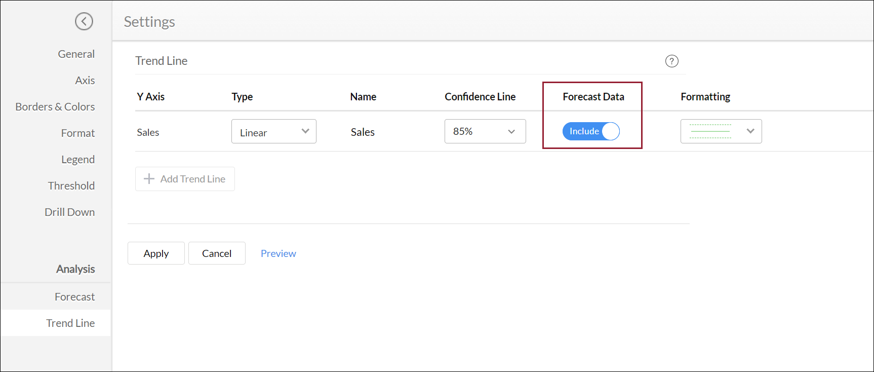
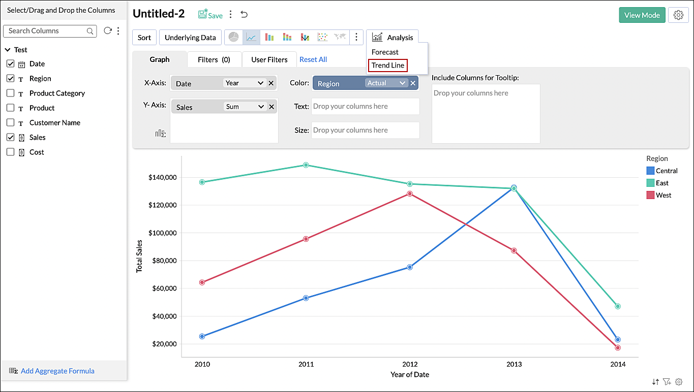
4. How do I add a Trend Line to the chart?
Follow the steps below to plot trend lines in Analytics Plus:
Navigate to the required chart and click the Edit Design button to open the chart in edit mode.
Click the Analysis button and select the Trend Line option.
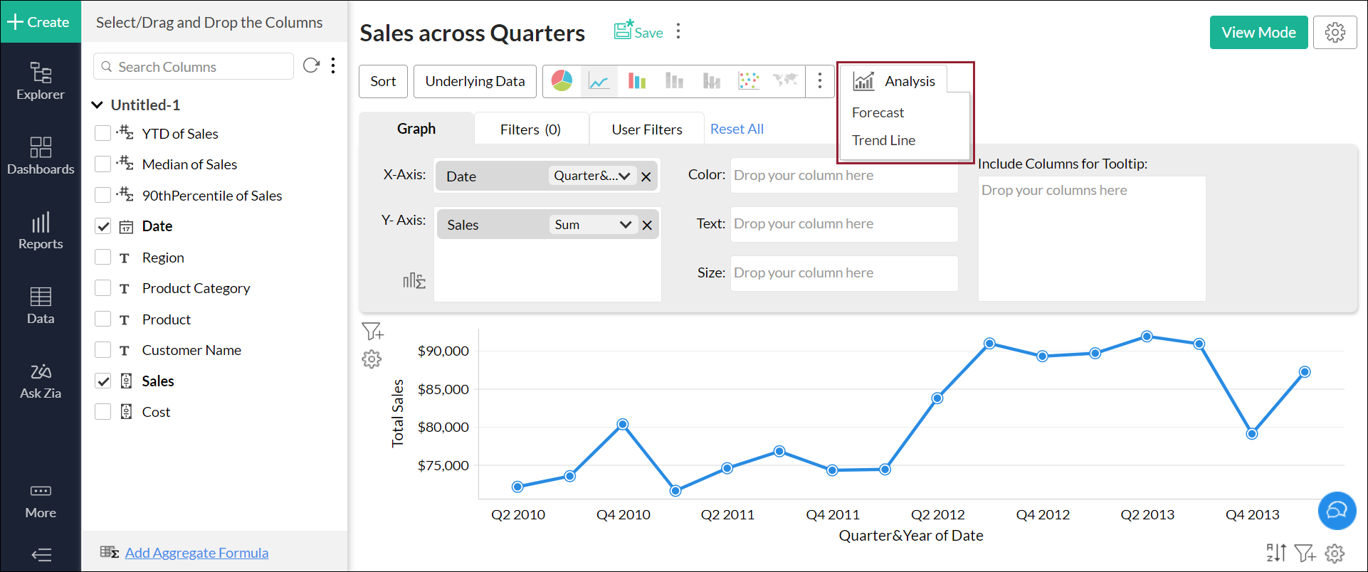
In the popup that appears, click the Add Trend Line button and select the required value.
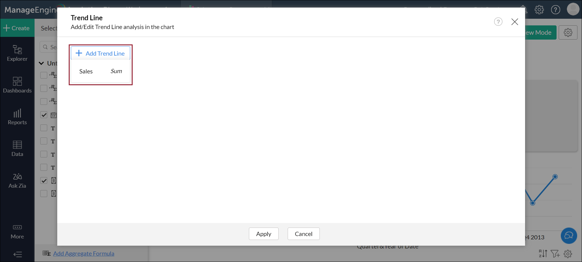
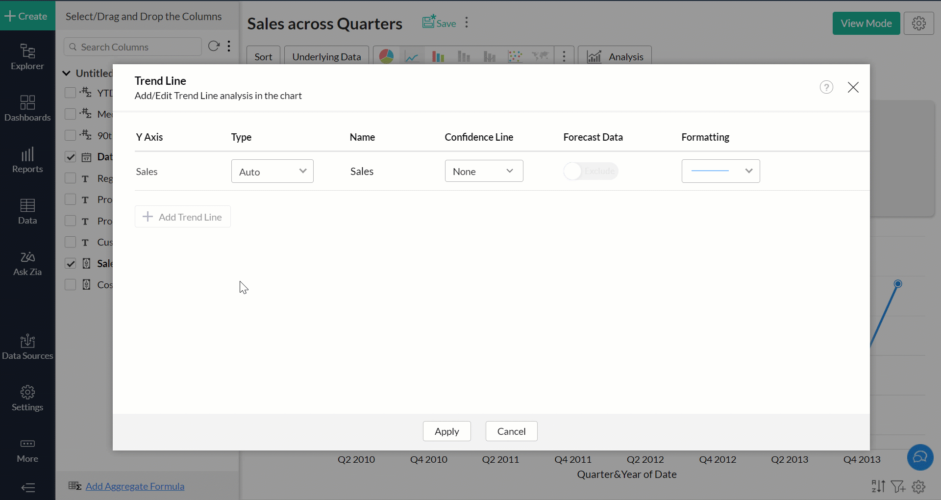
Customize the trend line using the following options:
Type: This drop down allows you to choose the required mathematical model for plotting the trend line.
Confidence Line: This allows you to predict the data trends according to the selected probability percentage. For example, if you select a 90% confidence range, in the event that the underlying data is modified (in keeping with the various prerequisites), the updated Trend line will have a 90% chance of being within the plotted Confidence lines.
Forecast Data: Use this option to include or exclude forecasted values from the trend line calculation.
Formatting: This drop down allows you to customize your trend and confidence lines as required.
Click Apply.
The required trend line will be plotted over the chart successfully.
5. What are the various chart types that support trend lines?
You can plot trend lines in Analytics Plus over the following types of charts:
- Line chart
- Bar chart
- Stacked Bar chart
- Scatter chart
- Area chart
- Stacked Area chart
- Bubble Chart (not Bubble Pie or Packed Bubble chart)
- Combination charts
6. Can I access details of the mathematical model used to plot the trend line?
You can access this information in two ways:
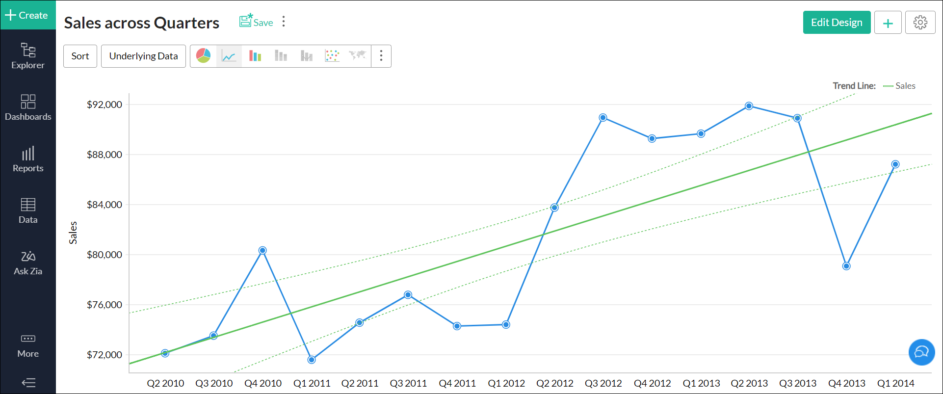
Open the chart that has a trend line plotted over it. Navigate to the legend on the left and click the info icon that appears on mouse over.
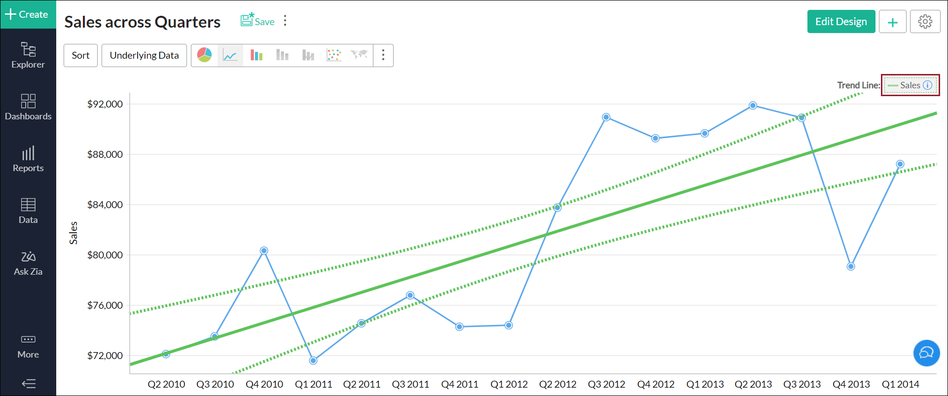
You can also view the details from the chart's Settings page. Navigate to the Trend Line tab and click the Trend Line Info icon that appears on mouse over the listed trend line.
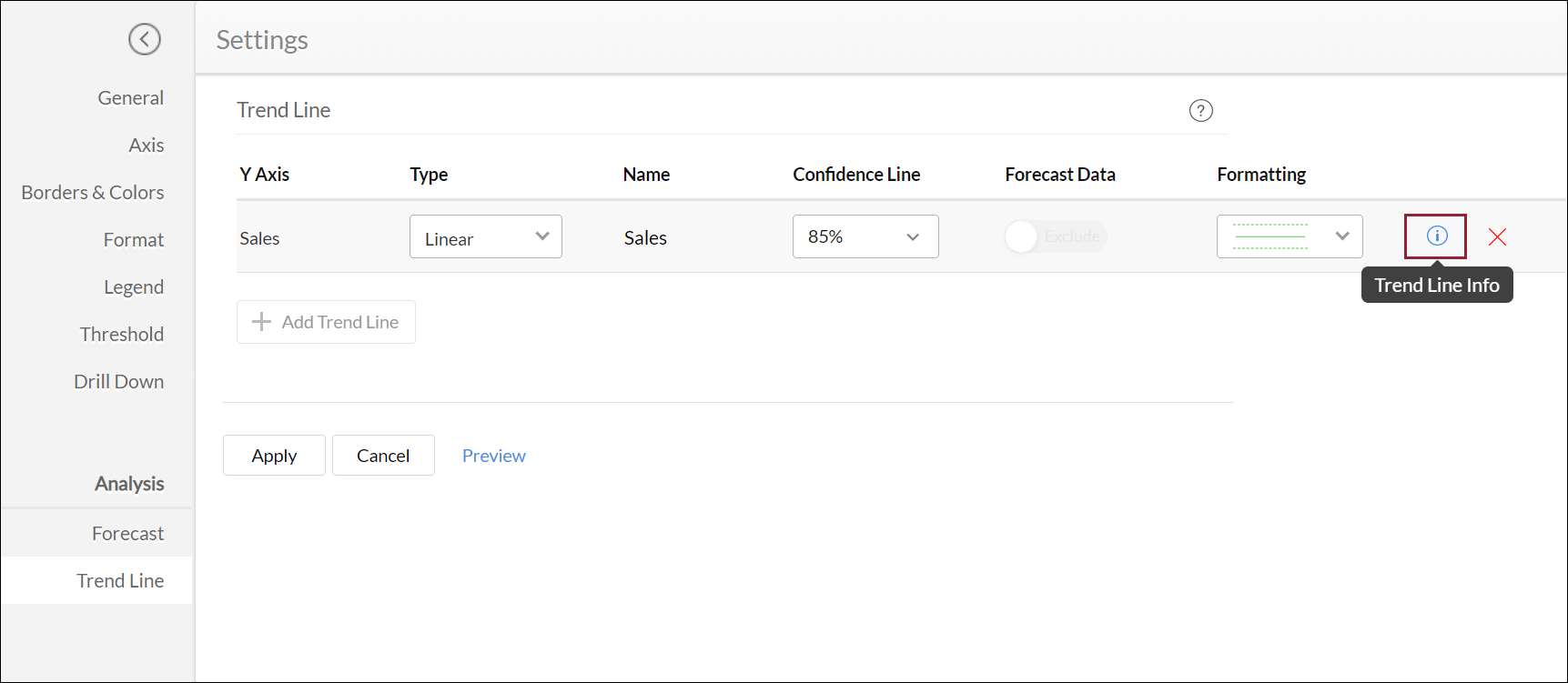
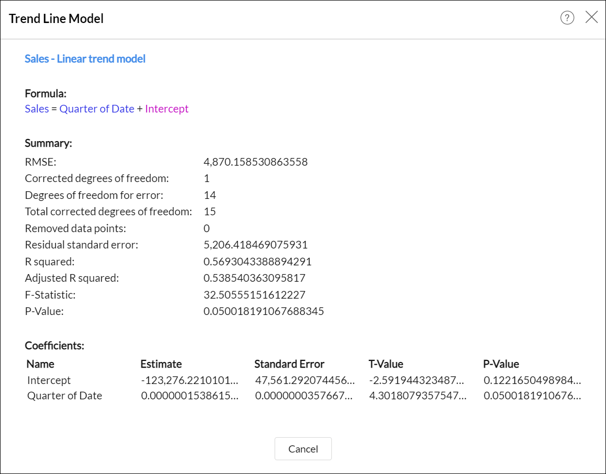
The trend line model summary is displayed with the following information.
Formula: This section displays the formula that is applied over the underlying data in the chart to drive the trend line.
Summary: This section displays detailed information about the selected mathematical model:
RMSE: The Root Mean Square Error (RMSE) value depicts how concentrated the data is around the trend line. The RMSE value is calculated by dividing the square of the error by the mean, and deriving the square root of that value.
Corrected degrees of freedom: This value is calculated by reducing the number of coefficients by 1. The corrected degrees of freedom will be 1 for every mathematical model except Polynomial.
Degrees of freedom for error: This value is calculated by subtracting the number of coefficients from the total number of data points involved in deriving the trend line.
Total corrected degrees of freedom: This value is calculated by reducing the total number of data points involved in deriving the trend line by 1.
Removed data points: This displays the number of data points that were discarded while calculating the trend line. Please ensure you select a mathematical model that discards the least number of data points.
Residual standard error: This value is calculated by dividing the square of the error by the corrected degrees of freedom.
R squared: R squared (or the coefficient of determination) can be used to determine if the selected mathematical model is best suited for the provided data set. This value is calculated by plotting a line for the average of the data, and dividing that by the square of the error value. If this result is approximately equal to 1, the selected mathematical model is a right fit for the underlying data in the chart.
Adjusted R squared: In cases where multiple input variables are present, this metric can be used to determine if the selected mathematical model is best suited for the provided data. Similar to the R squared metric, if the Adjusted R squared value is approximately equal to 1, the selected mathematical model is a right fit for the underlying data in the chart.
F-Statistic: This metrics depicts the extent to which the X-axis values influence the trend line. The higher the metric, the greater is the contribution of the X-axis values towards the data trend.
P-Value: This value indicates the significance of the coefficients involved in plotting the trend line. The lower the metric, the greater is the significance of the model and the coefficients.
Coefficients: This section displays detailed information about the coefficients involved in deriving the trend line:
Name: This lists the names of the parameters involved in plotting the trend line.
Estimate: This is the estimated value of the coefficient for each corresponding parameter.
Standard Error: This metric denotes the coefficient's possibility of error.
T-Value: This metric allows you to determine if the model is best suited for the given data set. The T-value is calculated by dividing the Estimate value by the Standard error value. A higher result indicates that the selected mathematical model is a right fit for the underlying data in the chart.
P-Value: This value indicates the significance of the corresponding coefficient in plotting the trend line. The lower the metric, the greater is the significance of the coefficient.
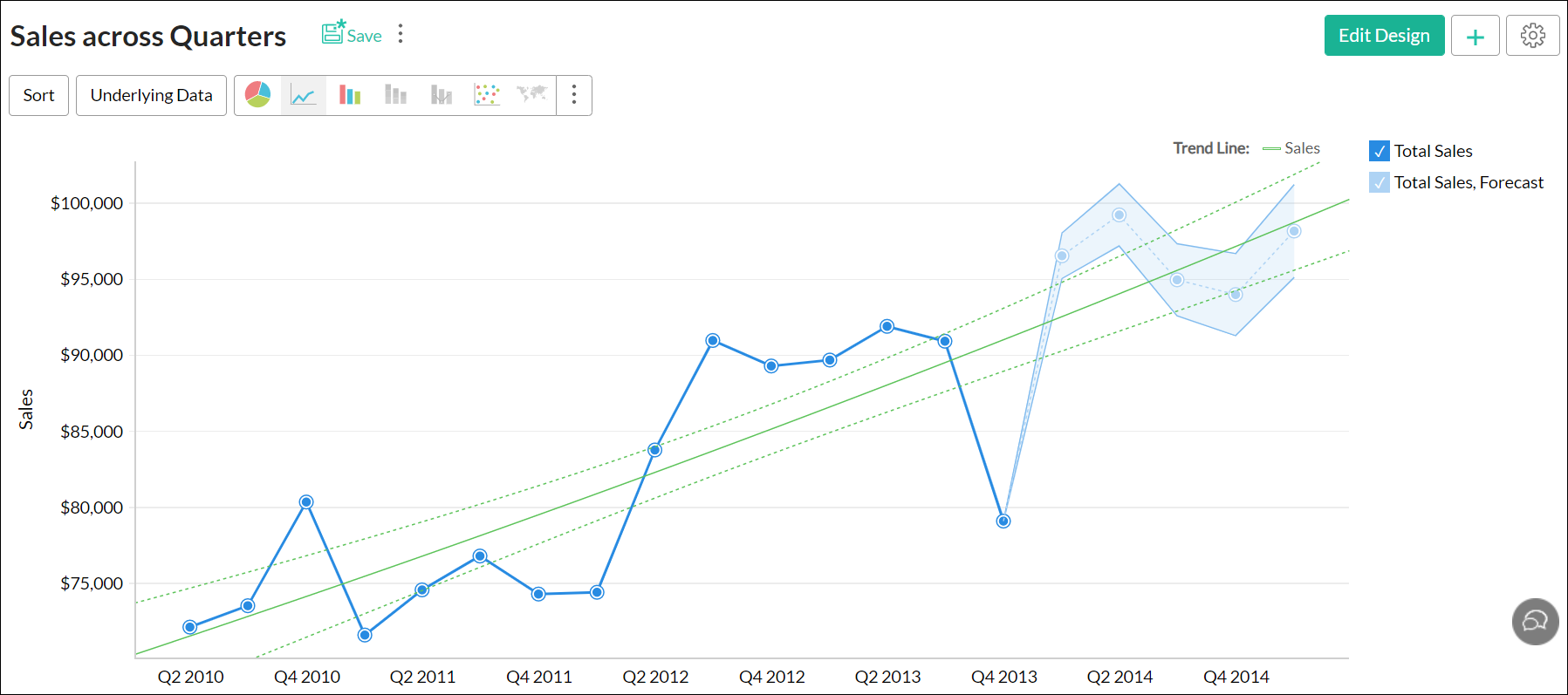
7. Is it possible to plot trend lines for forecasted data?
Yes. You can plot trend lines for forecasted data using the Forecast Data toggle button. This option can be accessed from the Trend Line tab in the chart's Settings page.
You can also choose to include forecasted data while creating a trend line. To learn more about creating trend lines, click here.
The following is the Sales across Quarters report with a trend line plotted over forecasted data.
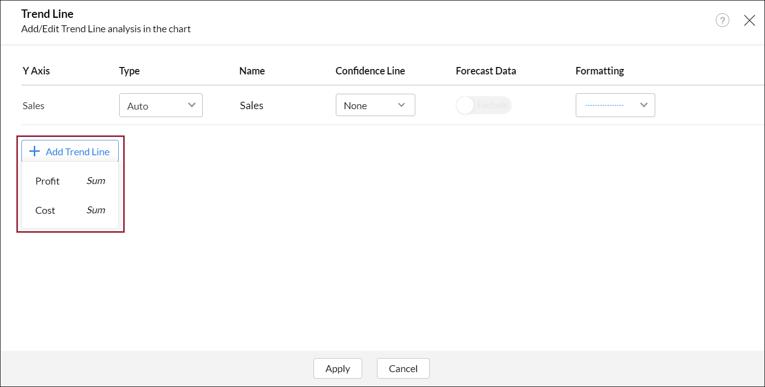
8. Is it possible to plot trend lines over multiple Y-axes?
Analytics Plus allows you to plot trend lines for a maximum of five aggregate columns in the Y-axis. To do this, click the Add Trend Line button in the trend line dialog, and select the required Y-axis value.
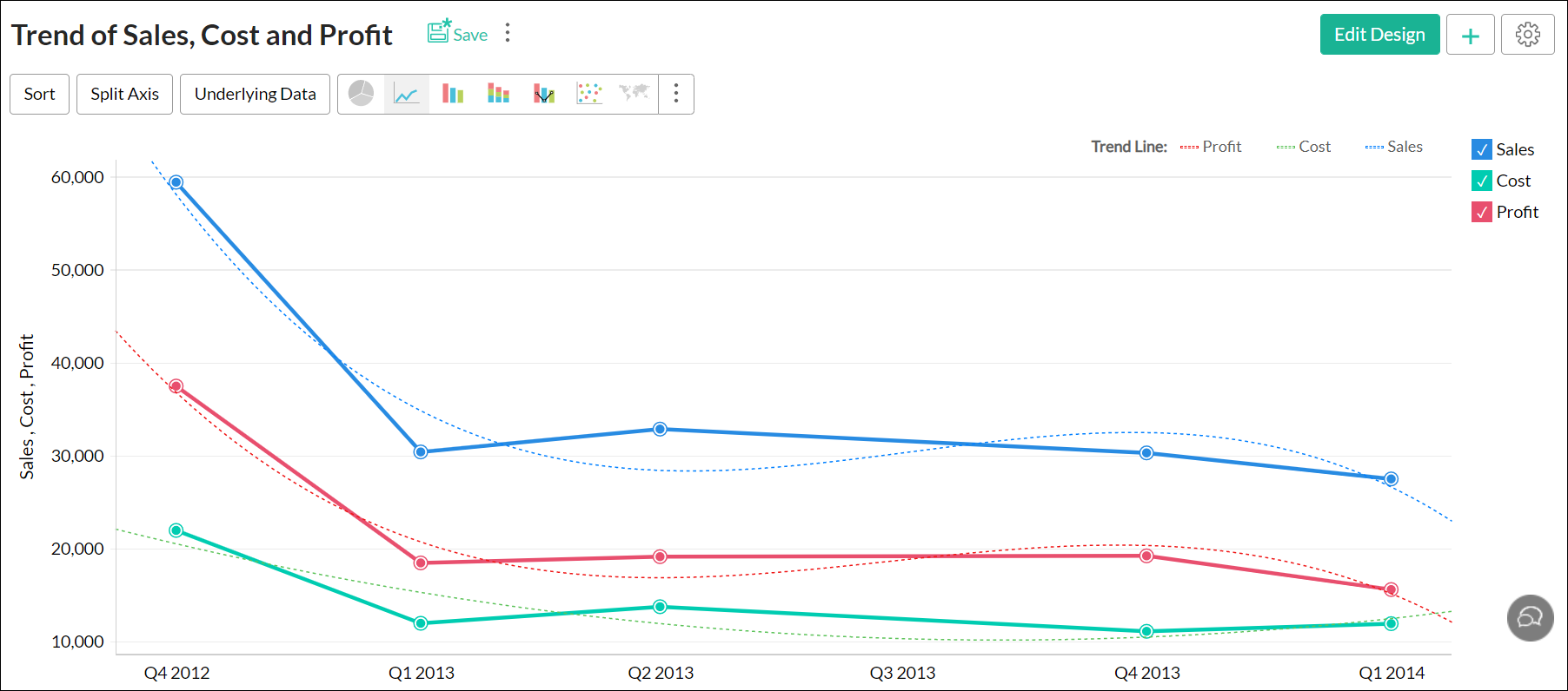
The following is a report with a trend line plotted over multiple aggregate columns.
9. Can shared users access trend line details?
Shared users can view the plotted trend line, and access details of the trend line model from the Settings page. (To learn more about the trend line model details, click here.) However, shared users will not be able to edit the plotted trend line.
10. Is it possible to export the trend line's data?
Analytics Plus allows you to export the trend line's data along with the data in the chart. If the chart is exported into a tabular format (CSV, Excel), the data from your trend lines will be exported as separate columns.
11. Can I set up a Trend Line over a chart with legend?
Yes, you can plot the trend for a chart with legend.
- Navigate to the required chart and click the Edit Design button to open the chart in edit mode.
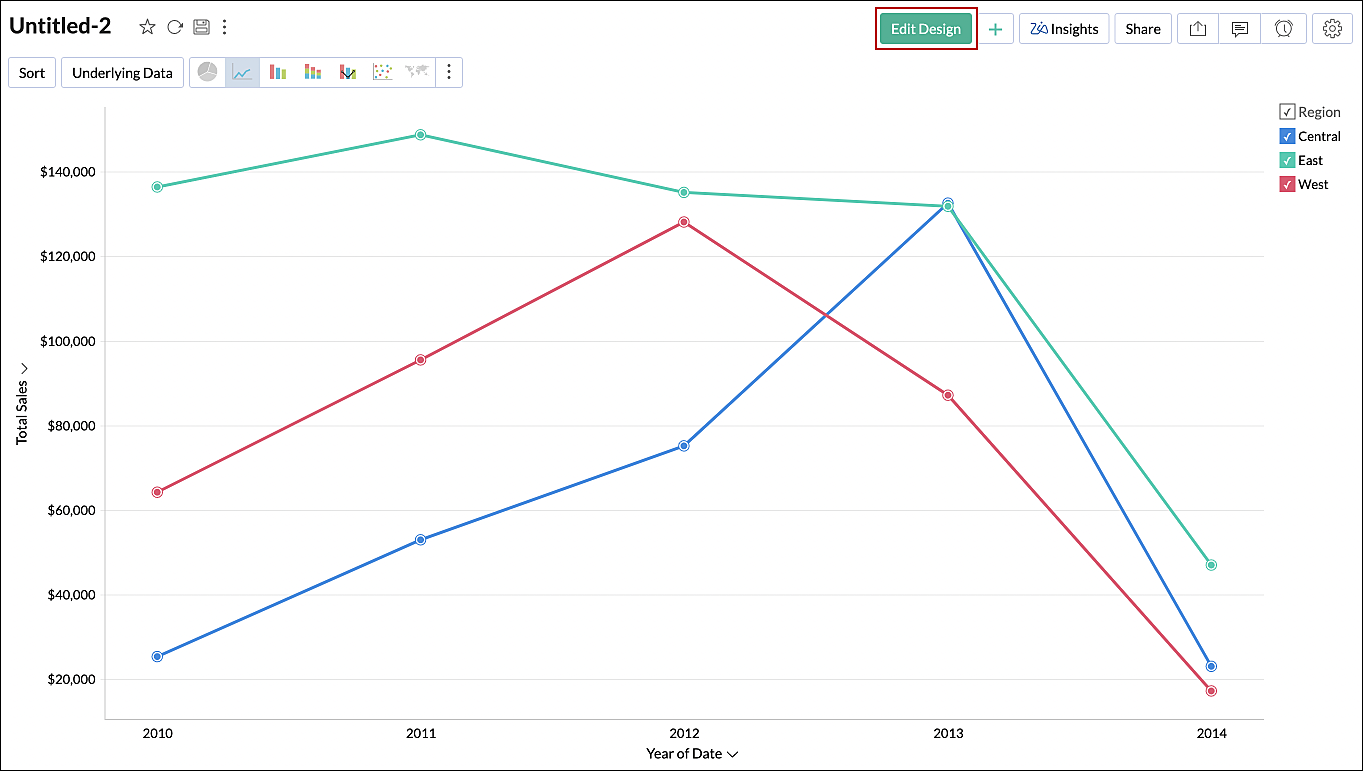
- Click the Analysis button and select the Trend Line option. Click here to know more.
- The required trend line will be plotted over the chart with the legend successfully.