Gantt Charts
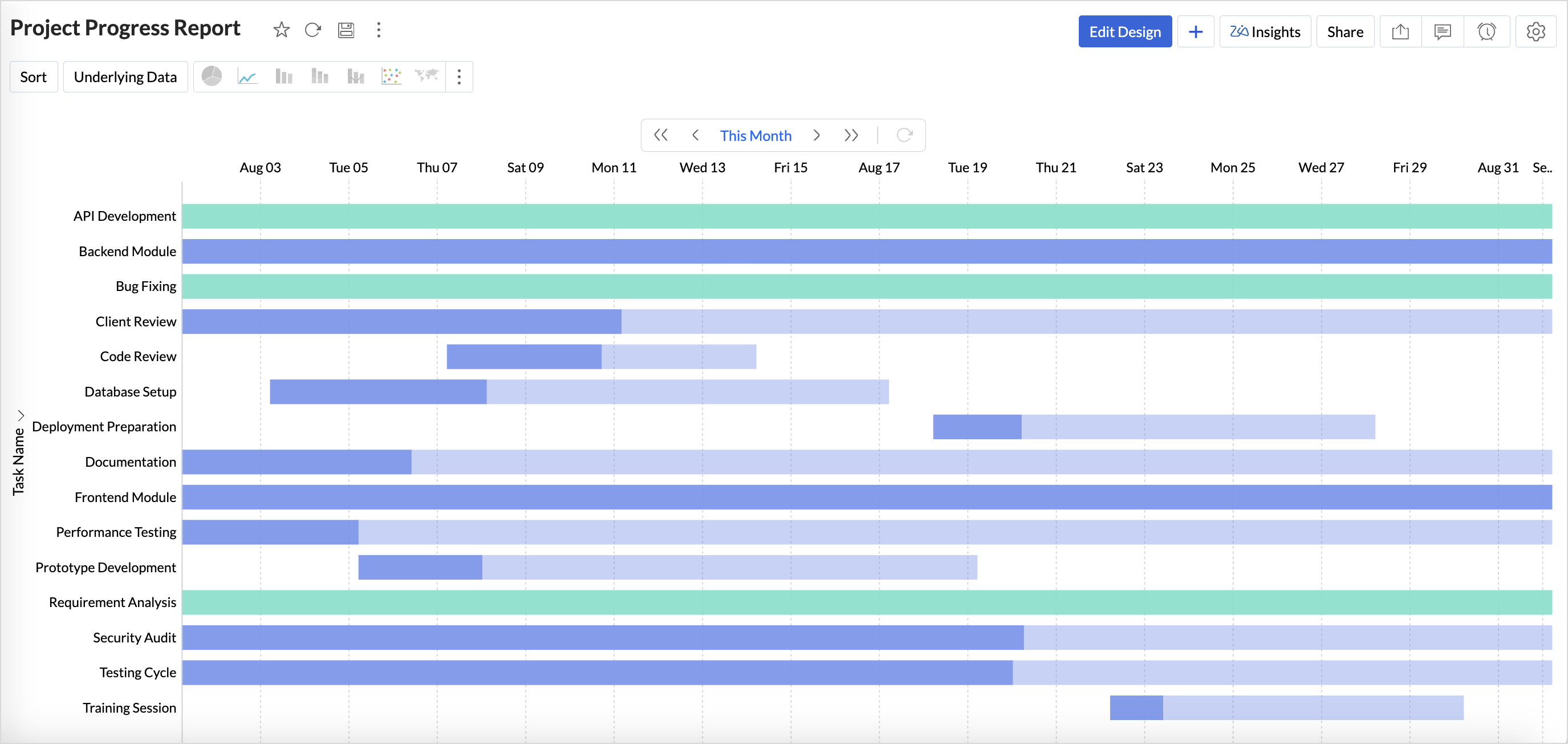
Gantt charts in Analytics Plus help visualize the progress of projects over time, enabling teams to analyze project timelines and performance. In a Gantt chart, each task is displayed as a horizontal bar, where the length represents the task duration and the position indicates the start and end dates.
Connect your project management data with Analytics Plus and track your project progress in real time using Gantt charts. Analytics Plus provides extensive customization options to tailor the chart according to your project requirements.
Gantt charts help in various aspects throughout the lifecycle of a project.
- Project Planning: Break projects into manageable tasks and map them clearly on a timeline. This helps teams track tasks that are in progress, delayed, scheduled, or completed, ensuring deadlines are met.
- Performance Analysis: Compare planned timelines with actual progress to identify bottlenecks, delays, or overlapping tasks that may affect overall project execution.
- Smarter Resource Allocation: Gain visibility into how resources are distributed across tasks to ensure efficient resource utilization.
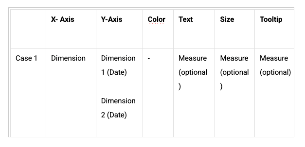
Data Requirements
A minimum of three columns is required:
- A dimension column containing task details
- A start date column
- An end date column
Creating a Gantt Chart
- Access the project data for which you want to create a Gantt chart.
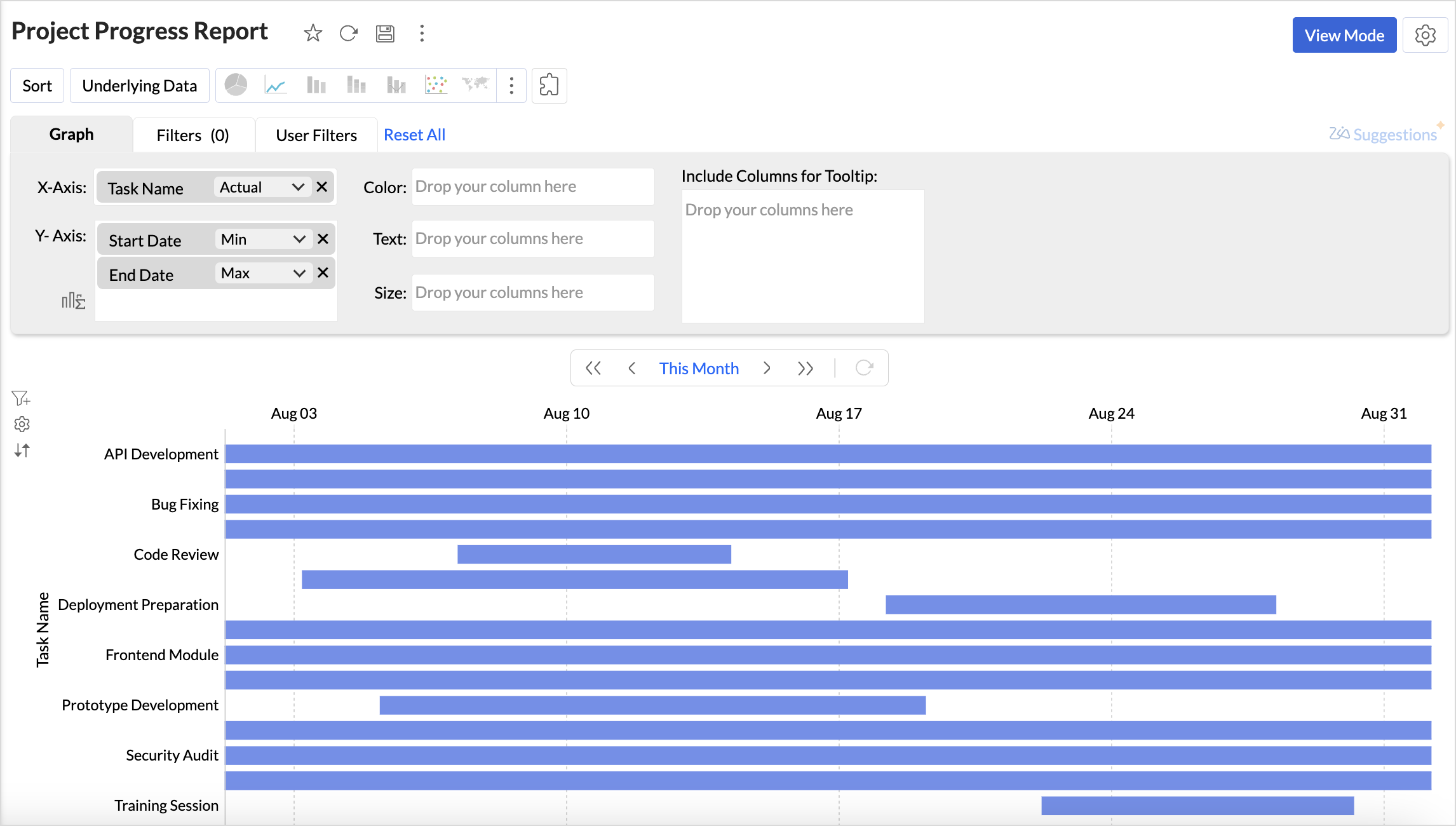
- Click the Create icon in the side navigation panel and choose New Chart View.
- Drag and drop the columns into the chart designer area as follows:
- X-axis: A dimension column such as the task name to track project progress.
- Y-axis: Add the Project Start Date column with the Minimum Date function and the Project End Date column with the Maximum Date function. This generates a basic Gantt chart.
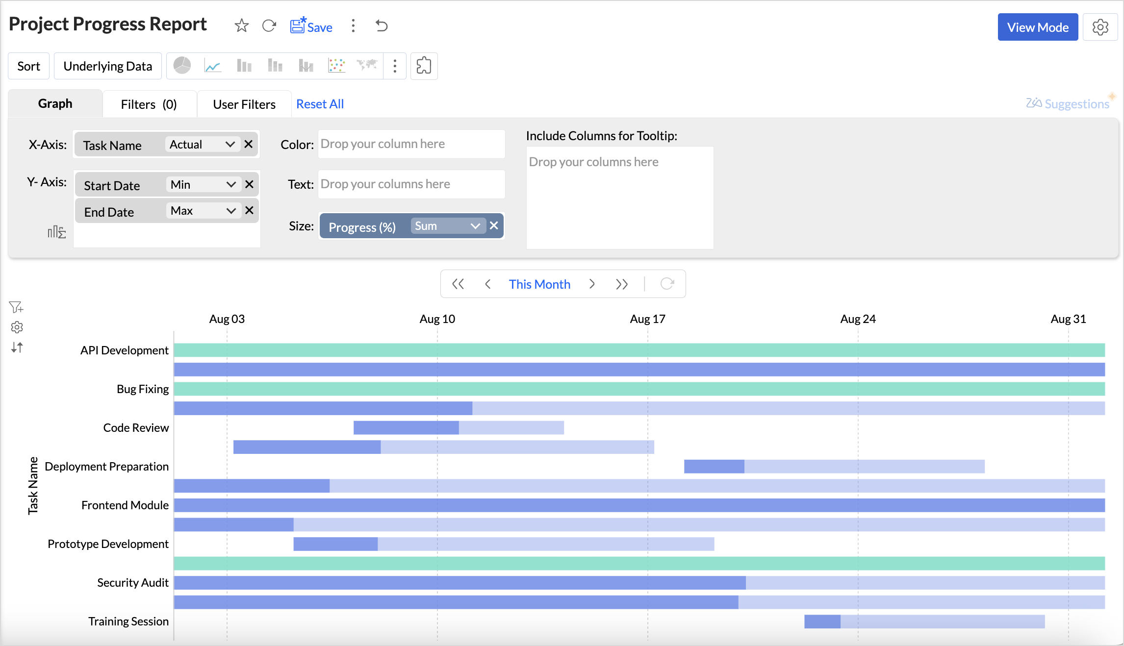
- Text/Size/Tooltip: Add a measure column such as Progress (%) to the Text, Size, or Tooltip shelf to visually distinguish tasks that are In Progress from those that are Completed. When added to the Text shelf, the completion percentage appears at the end of the task bar.
- Click Generate Graph. A scatter plot chart will be generated.
- Choose Gantt Chart from the visualization types.
- Customize the Default Date Value to define the initial timeline view.
Customizing a Gantt Chart
Analytics Plus offers extensive options to customize charts. This section explains the customization options specific to Gantt charts. Refer to the Customizing Charts article to learn more.
Click the Settings icon in the top-right corner of the chart designer and choose Gantt to customize the chart settings.
Select Gantt Style
- Bar: Displays tasks as horizontal bars along a timeline, making it ideal for detailed project planning with task durations, dependencies, and overlaps.
- Bullet: Represents tasks or milestones as bullet markers on the timeline, best suited for high-level tracking of key checkpoints and important dates.
Bar Color
Customize task colors to visually distinguish tasks based on their status. This makes it easier to track overall project progress. You can apply this customization by adding a measure column to the Text, Size, or Tooltip shelf.
Default Date Value
Set the initial timeline displayed when the Gantt chart opens. You can choose to view tasks for the current week, month, quarter, or year, or define custom date ranges aligned with your project timelines.
Possible Combinations