7/30 Reports
The 7/30 Reports is available for various attributes/resource of a particular monitor. The 7/30 reports, apart from displaying availability for the past 7 days or 30 days, they also display the following reports for each attribute/resource. These reports can be exported into PDF formats.
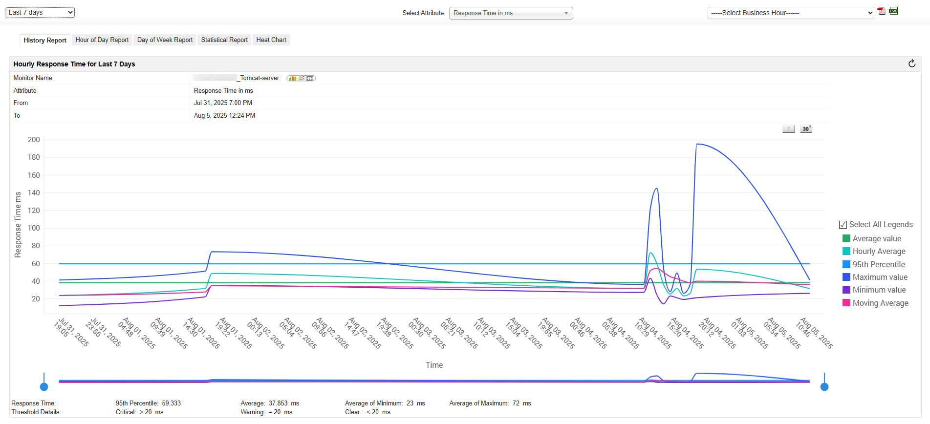
History Report
History Report in Applications Manager provides detailed history of the particular attribute of a monitor. You can also generate history trend across business hours for a particular attribute. This provides you with an understanding to the amount of resources that has been utilized by the particular attribute over a period of time (week/month/year).
Archiving: All the data are archived and stored every one hour. Eg. Data from 10 AM to 11 AM are archived and marked as 11 AM when stored. If the monitor instance is completely down during the archiving interval of one hour, archiving will not take place for that hour.
Average of Minimum: It represents the lowest value from the collected values in an hour. Eg: 6 on Sep 01, 2008 - 14:00 hours represents the lowest value '6' collected on Sep 01, 2008 between 13:00 and 14:00 hours.
Average of Maximum: It represents the highest value from the collected values in an hour. Eg: 12 on Sep 01, 2008 - 14:00 hours represents the highest value '12' collected on Sep 01, 2008 between 13:00 and 14:00 hours.
Hourly Average: It represents the average value from the collected values in an hour. Eg: 9 on Sep 01, 2008 - 14:00 hours represents the average value '9' collected on Sep 01, 2008 between 13:00 and 14:00 hours.
Total value: It represents the sum of the values from the collected values in an hour. Eg: 20 on Sep 01, 2008 - 14:00 hours represents the total value '20' collected on Sep 01, 2008 between 13:00 and 14:00 hours.
- Moving Average: A simple moving average is the unweighted mean of the previous n data points. For example, a 10-day simple moving average of attribute value like CPU utilization is the mean of the previous 10 days' CPU Utilization value. By selecting this option, you can add moving average graph in the 7, 30 graphs of the various monitors. Learn more
- 95th Percentile: It represents a number that is greater than 95% of the numbers in a given set. This statistic is so useful in measuring data throughput is that it gives a very accurate picture of the maximum response generated on a resource. Learn how 95th percentile is calculated
Note: Applications Manager does not support Report enabling option for string attributes. Consequently, only polled data report can be generated for these attributes.
Hour of Day Report
A sample Hour of Day Report is shown below. This report generates hour's average for a particular time period (week/month/year) for the particular attribute. For example, if you have selected last 7 days data, the report generates hour's minimum, maximum and hourly average. This report helps you visualize the various bottlenecks that appear for this attribute / resource during a particular time period. This allows you to plan future impact of bottleneck on this attribute / resource.

Minimum value: It represents the lowest value among the collected values in a particular hour of the day over a period of time. Eg: The lowest value '41' represents the data collected between 13:00 - 14:00 hours from Dec 4, 2008 3:55 PM to Dec 11, 2008 3:55 PM.
Maximum value: It represents the highest value among the collected values in a particular hour of the day over a period of time. Eg: The highest value '81' represents the data collected between 13:00 - 14:00 hours from Dec 4, 2008 3:55 PM to Dec 11, 2008 3:55 PM.
Hourly Average: It represents the average value of the collected values in a particular hour of the day over a period of time. Eg: The average value '62' represents the data collected between 13:00 - 14:00 hours from Dec 4, 2008 3:55 PM to Dec 11, 2008 3:55 PM.
Total value: It represents the total value of the collected values in a particular hour of the day over a period of time. Eg: The total value '102' represents the data collected between 13:00 - 14:00 hours from Dec 4, 2008 3:55 PM to Dec 11, 2008 3:55 PM.
Day of Week Report
A sample of Day of Week Report is shown below. This report generates average of a day for a particular time period (week/month/year) for the particular attribute. For example, if you have selected last 7 days data, the report generates everyday's minimum, maximum and hourly average and is shown below in this report. As shown in the graph below, the connection time for Oracle DB server has been highest for Wednesday and lowest for Monday. This implies that the traffic on Wednesday has been high when compared to rest of the days during the week. This would allow you to ensure that the connection time of Oracle DB server remains low for that particular day and help you troubleshoot performance issue quickly.

Minimum value: It represents the lowest value among the collected values in a particular day of the week over a period of time. Eg: The lowest value '41' represents the data collected on Wednesdays from Nov 11, 2008 3:55 PM to Dec 11, 2008 3:55 PM.
Maximum value: It represents the highest value among the collected values in a particular day of the week over a period of time. Eg: The highest value '81' represents the data collected on Wednesdays from Nov 11, 2008 3:55 PM to Dec 11, 2008 3:55 PM.
Hourly Average: It represents the average value of the collected values in a particular day of the week over a period of time. Eg: The average value '62' represents the data collected on Wednesdays from Nov 11, 2008 3:55 PM to Dec 11, 2008 3:55 PM.
Total value: It represents the total value of the collected values in a particular day of the week over a period of time. Eg: The total value '102' represents the data collected on Wednesdays from Nov 11, 2008 3:55 PM to Dec 11, 2008 3:55 PM.
Note: The total value will be only displayed for the Counter attributes (Eg: Page views) of the Real User monitor. In the case of the other attributes, the total value will not be displayed.
Statistical Report
A sample Statistical Report is displayed below. This report represents the standard deviation of this attribute over a period of time. For example, let us analyze the CPU utilization attribute over a period of time. X-axis represents the CPU Utilization range in percentage and Y-axis represents Count in percentage. Let us consider the peak value of the Count percentage to be 55% and is within the range of 70% - 80%. This means that 55% of the polled value is within the range of 70% and 80%. This data can be used to reallocate or organize resources for the server accordingly.

Heat Chart report
A sample Heat Chart report is shown below. This report is helpful to compare similar types of monitors and to compare the performance of each monitor with other monitors. These heat charts are plotted based on how the attribute of the particular monitor type performs according to the threshold configured for that particular monitor. If a threshold is configured for the attribute of a particular monitor, then the heat chart is plotted based on its performance.
There are three colors by which the heat chart is plotted. Red indicates a critical breach in the threshold, Orange indicates a warning, and Green is clear.
If the threshold is breached, then the color of the heat chart changes accordingly. This implies a drop in performance, thus providing a clear understanding of various monitors' performance. If the threshold value for each attribute for that particular monitor is not set, then the common threshold value is automatically assumed.
The Edit option provided in this chart will facilitate the user to view the heat chart in any other threshold definition on the fly. Please note that by editing the threshold the view won't affect the original threshold configured for the attribute.

Note: In the heat chart report, the performance of non-counter attributes will be calculated based on the Average value. However, in the case of Counter attributes of the Real User Monitor, attribute performance will be calculated based on the Total value.