Summary
When a network issue sets off a wall of alerts, OpManager Nexus's causal AI groups them into one Problem and points to the probable root cause, so you start at the source instead of the loudest alert. In this example, 17 alerts across the office network traced back to a single HTTPS traffic surge slowing the switches. You skip the log diving and cross-team triage and go straight to the fix.
Every network engineer has the same instinct when alerts start firing: go to the loudest one first. It feels logical. The device screaming the most must be the device that broke, but most of the time it isn't.
So you're left with a pile of alerts and no idea where to start. You know something's broken. You just don't know what caused it. That's the gap causal AI in OpManager Nexus closes: it connects the traffic surge to the slow switches automatically, so you skip the log hunting and cross-team triage and start at the cause.
If causal AI is new to you, here's the short version. Traditional correlation software notices when two things move together, like traffic and response time climbing at the same moment. Causal AI goes one step further and works out which one caused the other, so you get the source instead of a list of coincidences.
Previously in this series:
- How causal AI can resolve application latency caused by database bottlenecks
- How causal AI traces a Kubernetes pod crash back to a YAML misconfiguration
Now let's see how it works in network monitoring, and how much manual digging it can save you.
The real problem: 17 symptoms, one cause, no map between them
Take a real example. A response time alert fires on Access Switch 1, then the core switch. A traffic threshold breaches on one VLAN (virtual local area network), then another, then an interface. Within minutes you have 17 open alerts across one network group, all red. So you do the obvious thing. You open the slowest switch and start digging.
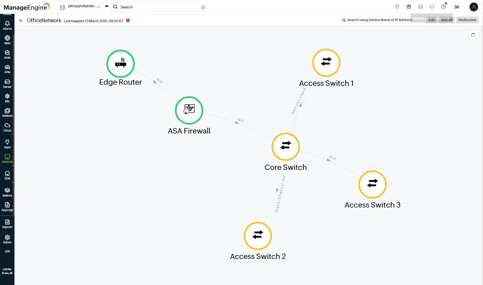
Here's the catch: the switches aren't the source. Pull up the topology and the core switch and all three access switches show yellow, flagged for trouble because their response times crossed the threshold. That's the symptom you came to investigate. Look one layer up, though, and the edge router and the ASA firewall sit green and healthy. The slow response times are real, but what caused them is sitting one layer away, and it isn't a network device at all.
That's the problem with raw alerts. They tell you what hurts, not why. It's like a power outage: three rooms go dark, and you don't fix it by replacing three bulbs. You find the one breaker that tripped. One underlying issue sets off an alert on every monitor it touches, and triaging that wall by hand is slow. You can spend 20 minutes tuning a switch that was never the issue while the real cause remains unresolved. And the loudest alert is rarely the root one. The quiet traffic surge behind a response time spike barely registers.
What you want isn't more alerts. It's the one sentence that explains all of them.
What causal AI does with the wall of red
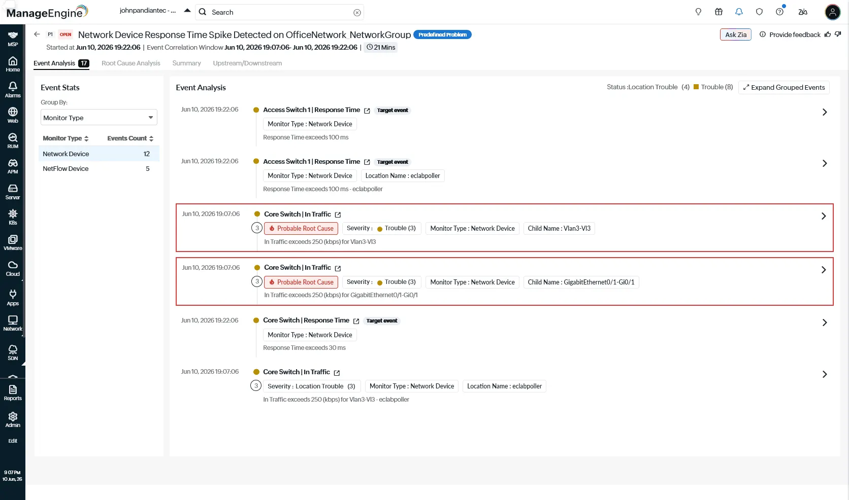
OpManager Nexus's AIOps engine does two things to the wall of red. First, it correlates. Related events get grouped by timing, dependency, and relevance into one problem instead of 17 separate alarms. Here, all 17 collapsed into one record: a network device response time spike on the office network group, with a 10-minute correlation window.
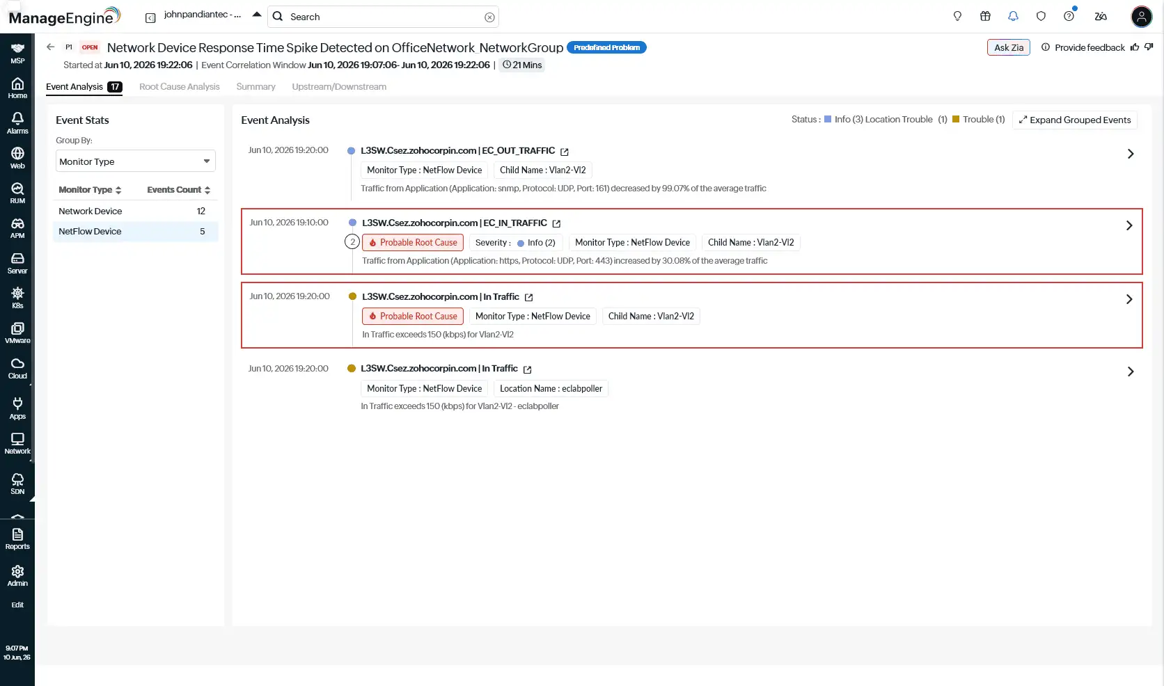
Second, it separates symptom from cause. The response time breaches on the switches are tagged as target events. A smaller set gets flagged as the probable root cause. Here's what it found, end to end.
| Layer | What the alert said | What it actually was |
|---|---|---|
| Application | https traffic up 30.08% over its average | The probable root cause |
| Network traffic | In Traffic past 250Kbps on core switch VLANs and a gigabit interface, 150 kbps on a Layer 3 switch VLAN | The pressure |
| Network device | Response time on the core and access switches climbing toward 300ms | The symptom you saw first |
How OpManager Nexus cracks the case using causal AI
So how does it trace that chain? Not by guessing. It reads the network data you're already collecting, one layer at a time—the way a good engineer would, only faster.
It starts with the map you built during setup. That Layer 2 map is the first thing the correlation engine checks, because it shows how every device connects: the edge router feeds the ASA firewall, the firewall feeds the core switch, and the core switch feeds Access Switches 1, 2, and 3. So when response times spike on both Access Switch 1 and the core switch, the engine already knows they sit on the same path. Not three separate problems. One path under stress.
From there it walks down through the data you already have:
- Network performance monitoring: This reads the device metrics such as CPU, memory, and the In Traffic and response time breaches that tripped the alerts.
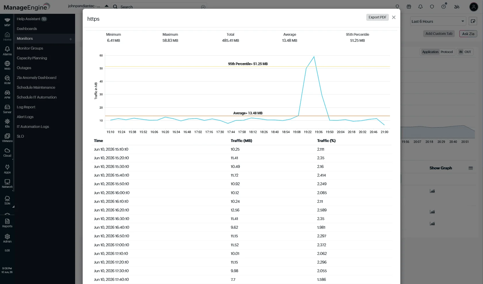
- NetFlow Analyzer: This reads the actual traffic—comparing it against historical patterns—to find the source: an https application surge on port 443, with the source and destination IP addresses behind it.
- Network Configuration Manager (NCM) gets checked for recent config changes. None lined up with the timeline here, so it's ruled out.
Weighed together, one event stands out, flagged Domain Aware on the Root Cause Analysis tab: the https traffic surge. The switch response times were the symptom. The surge was the source. You see that the moment you open the problem—no log diving required.
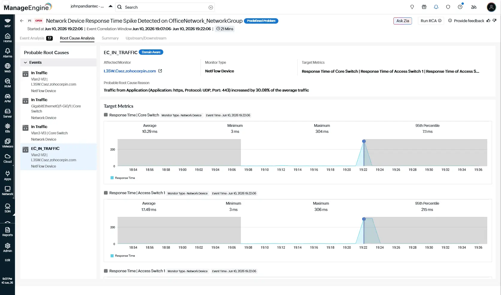
Instead of debugging three healthy switches for an hour, your team starts at the cause. It's a probable cause, not a sworn verdict, so you have to confirm before you act. And you act on the surge, not the switches. NetFlow already gave you the source and destination IPs behind that port 443 traffic, so you go straight to the application driving it: plan for it if the spike is legitimate, or fix it at the source if it isn't. Either way, the switches were never the problem; the traffic was. And makling that determiniation is how you cut mean time to resolution (MTTR) from hours to minutes.
Getting started
If you're not monitoring your network in OpManager Nexus yet, start at the foundation and build up:
- Install the On-Premise Poller on a Windows or Linux machine inside your network, with the Network module enabled. It polls your devices over the Simple Network Management Protocol (SNMP) from behind your firewall (no agent goes on the devices themselves).
- Add your network devices and build the Layer 2 map. Go to Admin > Inventory > Add Monitor, choose the network monitor, add your SNMP credentials, and run discovery. Then create the Layer 2 map so OpManager Nexus knows how your devices connect. That map is the foundation correlation reads first when a problem hits.
- Turn on the other data layers. Enable NetFlow Analyzer for traffic and Network Configuration Manager for config tracking in your network settings. These are what correlation reads to find the source.
- Let Smart Groups form. Related monitors are grouped automatically by dependency, and that's what event correlation runs on.
After that, the day-to-day work is short. When a problem hits, go to Alarms, switch to Problems, and open it. The Event Analysis tab shows the grouped events and probable root causes. The Root Cause Analysis tab gives you the causal reasoning and the metric charts that prove the timeline, or click Run RCA on demand.
Start there the next time a wall of red shows up. Read the one sentence before you debug the seventeen.
FAQ
1. What data does OpManager Nexus use to find the root cause?
It reads the network data you already collect: the Layer 2 map for how devices connect, performance metrics like CPU and traffic, NetFlow Analyzer for the source of that traffic, and Network Configuration Manager (NCM) for recent config changes. It weighs all four together to trace the chain. The result is one probable root cause, not a pile of clues.
2. How does this reduce MTTR?
Mean time to repair (MTTR) covers detecting an issue, diagnosing it, and fixing it. The fix takes as long as it takes. What causal AI shortens is the diagnosis (which is usually the biggest chunk) by handing you the probable root cause the moment you open the Problem. So your team spends its time on the fix instead of on finding what to fix.
3. What does "Domain Aware" mean in event correlation?
Domain-aware correlation uses context about a specific area, like application or network behavior, instead of treating every event as a generic alert. That's how in the example provided above OpManager Nexus tied the https surge to the slow switches rather than just noting they happened together. The Domain Aware tag on the Root Cause Analysis tab means that deeper context was used to find the cause.
4. How do I find the root cause of slow switch response times?
Open the Problem in OpManager Nexus and check the Root Cause Analysis tab. It correlates the response time breaches with the data underneath them, then flags the most likely trigger (often a traffic surge rather than the switch itself). You start at the probable cause instead of debugging each switch by hand.
5. Why are all my switches and VLANs alerting at once?
Because they share a path. One issue upstream, like a traffic surge, raises response times on every device downstream of it. OpManager Nexus reads your Layer 2 map, sees those devices sit on the same path, and groups the alerts into one Problem instead of leaving you 17 separate alarms.
6. What is NetFlow Analyzer, and how does it help find the root cause?
ManageEngine NetFlow Analyzer reads your actual traffic and compares it against historical patterns, so it can name the source of a surge down to the application, port, and the source and destination IP addresses. That's what lets OpManager Nexus' correlation engine tie a switch slowdown back to an https traffic spike rather than just noting both happened.
7. Can causal AI tell when the traffic, not the switch, is the problem?
Yes, that's the point of it. The switch response time breaches get tagged as symptoms (target events), while the traffic surge that drove them gets flagged as the probable root cause. So you can see the switch is reacting, not failing, before you touch it.