Real Time Traffic Details in NetFlow Analyzer
NetFlow Analyzer generates traffic graphs as soon as Netflow data is received. The Traffic tab shows real-time traffic graphs for incoming and outgoing traffic. Depending on which link was clicked, you can see traffic graphs for an interface.
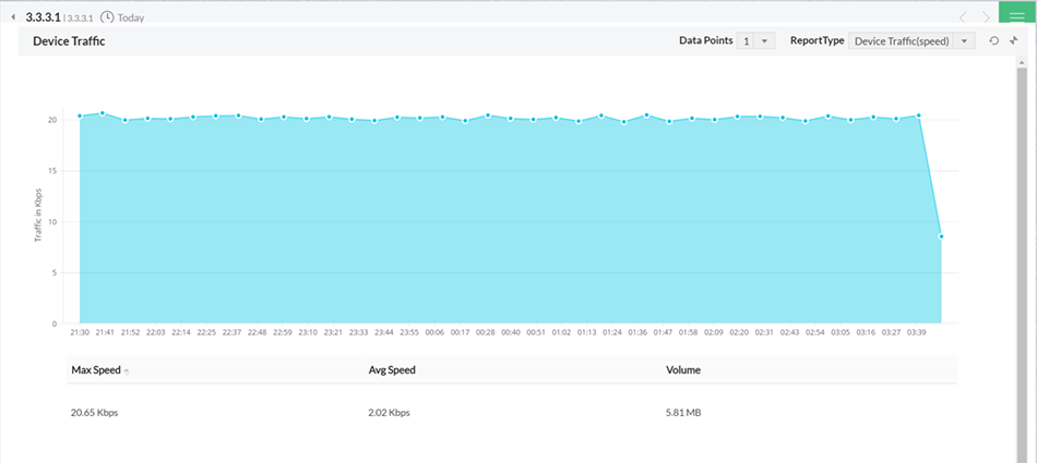
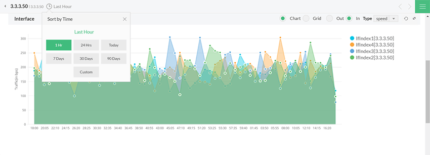
The Traffic reports are displayed based on Volume of traffic, Speed, Bandwidth utilization, and number of packets received/sent by a specific resource. The graph and the data points can be viewed as Today, last 15 mins, last month or other by selecting from the top left.
 | The Packets tab shows the number of actual packets of traffic data received. This information is included in exported Netflow data. |
The Traffic IN Details and the Traffic OUT Details show sampled values of traffic generated over the selected time period.The Packets tab shows the number of actual packets of traffic data received. This information is included in exported Netflow data.
Time Filters
The default graph is for the "Last Day". You can choose to see hour-based data in the traffic graphs for daily and weekly reports. To do this, first select the Last Day Report or Last Week Report option in the top time selection bar. When the respective traffic graph is displayed, the table below the graph includes manual selectable area to view details in depth.
95-th Percentile
The 95th percentile is the number that is greater than 95% of the numbers in a given set. The reason this statistic is so useful in measuring data throughput is that it gives a very accurate picture of the maximum traffic generated on an interface. This is a standard measure that is used for interpreting the performance data.
The 95th Percentile is the highest value left when the top 5% of a numerically sorted set of collected data is discarded. It is used as a measure of the peak value used when one discounts a fair amount for transitory spikes. This makes it markedly different from the average. The following example would help you understand it better.
Consider if the data collected for CPU Utilization is 60,45,43,21,56,89,76,32,22,10,12,14,23,35,45,43,23,23,43,23 (20 points). This list is sorted in descending order and a single top value, 89, is discarded. Since 1 consitutes 5% of 20, we discarded 1 value in this case. The highest value in the remaining list, 76, is the 95th percentile.
Selectable Graph
NetFlow Analyzer brings you the added advantage of drill-down to the traffic graphs presented. As you hover the mouse over the plot-area you can see a "+ " - cross-hair icon. Click on an area of the graph and holding the mouse down, drag it to the point(time period), you wish to further drill down to. For example : Having chosen a Last week report you could choose to study two specific days by selecting them. You could further drill down on until the time period you have chosen is more than 1 minute. Click on "reset graph" link to take you to a time period depending on the time difference between the From time and the system time.
Illustration
If you choose Last Hour Report at 18:15 hours, then a graph with a plot of data from 17:15 to 18:15 is shown. If you choose the time period 17: 25 to 17:50 then a corresponding graph with 1 Minute Average is shown. When you click on the "reset graph" link the screen changes to the Last Hour report. ( as the time difference between the From Time 17:25 and system time 18:20 is less than 1 hour)
Thus depending on the time difference you are either taken to the Last Hour or Last Day or Last Week or Last Month or Last Quarter graph.
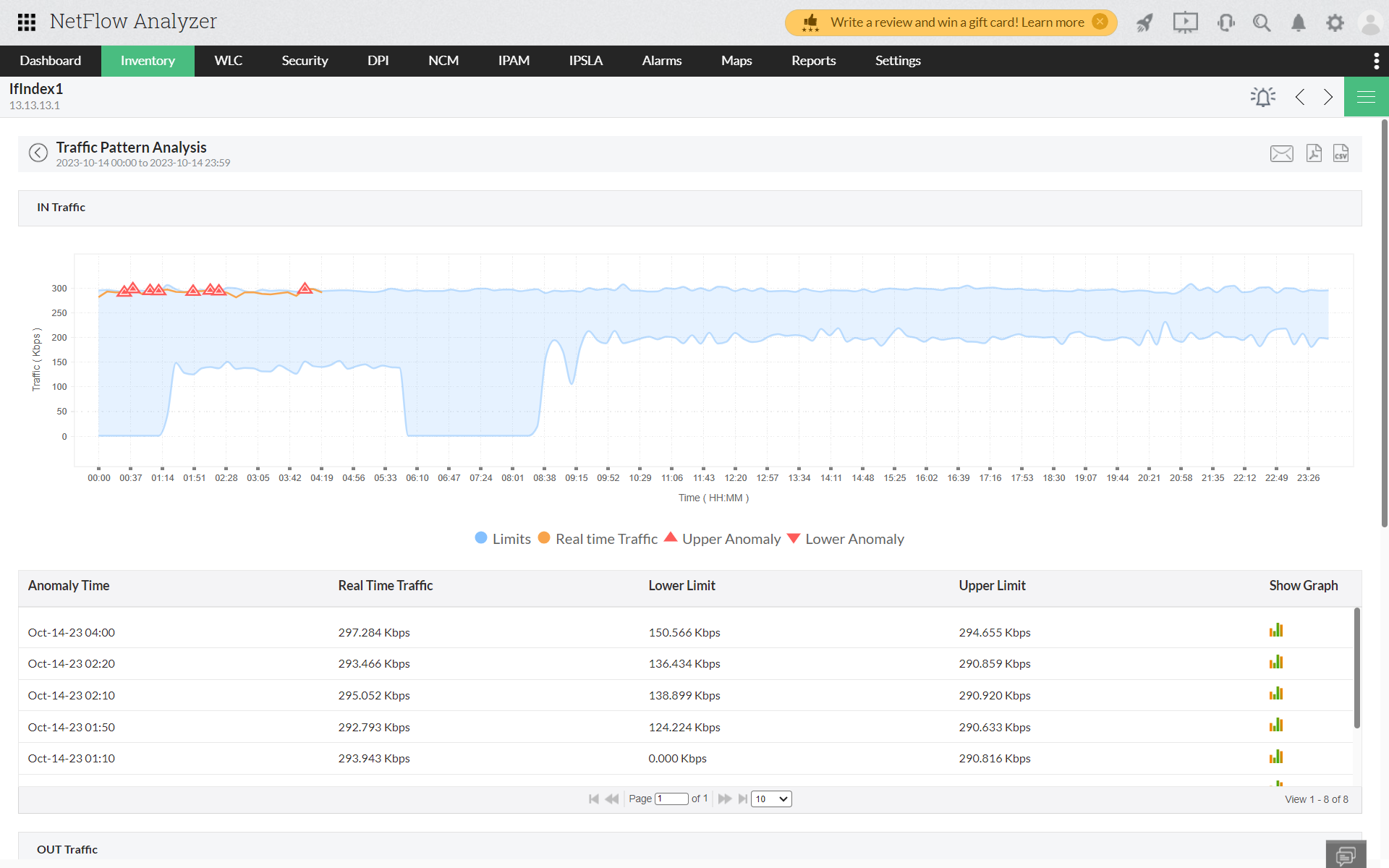
Traffic Pattern Analysis
NetFlow Analyzer's Traffic Pattern Analysis empowers you to scrutinize shifts in network interface behavior, identifying any unusual traffic patterns as anomalies. This analysis delves into both incoming (IN) and outgoing (OUT) traffic for a specific interface within a designated time frame, typically set at intervals of 10 minutes. Data is segregated for each 10-minute window over the current day and traffic patterns are analysed. Data is flown in real-time basis, creating a network pattern analysing for future predictions and anomalies. An unexpected surge in traffic beyond the upper limit of the buffer time results in anomaly detection. Similarly, if there is a drop in network traffic beyond the lower limit of the buffer due to events like ISP issues or critical interface failures, it is also flagged as an anomaly. Traffic pattern alerts are promptly generated in real-time for anomalies that deviate from the expected pattern. These flagged anomalies, and their associated traffic contribution can be explored by clicking on the anomaly and Show Graph button.