
Dashboard
The Dashboard is a visual display of real-time information, consolidated and arranged in a single view so that it can be easily monitored. The Dashboard displays various statistical data related to number of requests, changes, problems, assets, software, POs and contracts based on various criteria.
|
|
Note: Information displayed on the Dashboard largely depends on the site and roles associated to the technician. |
Data shown in the Dashboard is restricted to the site the technician is associated to. When a technician is associated to multiple sites, then a drop down option with sites he is associated to appear. By choosing the site, information and data associated with that site are displayed to the technician.
Similarly, data displayed on the dashboard is also restricted based on the roles associated to the technician.
Dashboards contain the following sub tabs :
Under the Helpdesk tab, 8 small widgets are available to provide request based information at one glance.
-
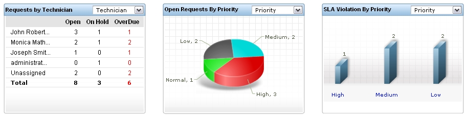
The first widget displays a matrix chart. It shows the total number of requests in Open, On Hold and OverDue statuses. This information can be viewed based on the criteria provided in the drop down box. Number of requests can be viewed based on Technician, Category, Level, Priority and Mode. Clicking on the numbers in the chart opens the corresponding list of requests.
-
The second widget displays a pie chart. It shows the number of open requests that can be viewed based on Level, Mode, Priority and Category. By clicking on the graph, you can view the requests corresponding to each shaded criteria.
-
The third widget displays a bar graph. It shows the number of SLA violated requests. A drop down box provided allows you to view the number of SLA violated requests based on Priority, Group, Level, Technician and Category. By clicking on each bar, you can view the SLA violated requests corresponding to the selected criteria.
-
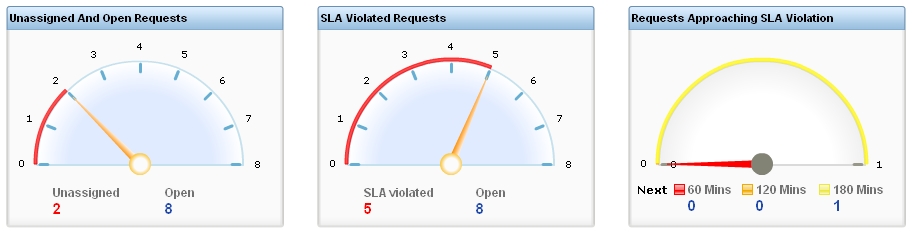
The next 3 are angular charts that show the number of unassigned and open requests, number of SLA violated open requests, and number of requests nearing SLA violation in the next 60, 120 and 180 minutes. Clicking on the number of requests present in the bottom of the widget opens the corresponding list of requests for viewing.
-
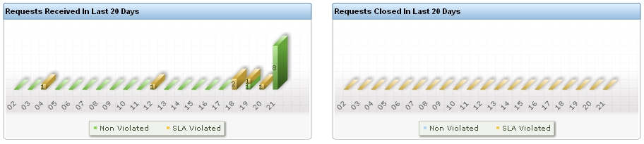
The last 2 bar graphs show the number of requests that were created and closed in the last 20 days. Clicking on the bars on the graph opens the corresponding requests for view.
Technicians who have permission to view the Problem and Change module can also view the Problem & Change widgets in the Dashboard.
-
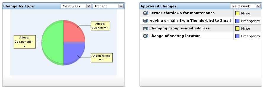
The first widget in the dashboard is a pie chart that shows all the scheduled upcoming changes that are to be rolled out. The changes that are scheduled to be rolled out in the following time period (This week, Next week, This month and so on) by selecting the time period from the first drop down box. The changes can also be viewed based on criteria such as Change Type, Priority, Urgency and Impact.
-
The second widget shows a list of Approved changes that are scheduled to be rolled out. The list can be viewed based on the time period during which the changes are scheduled to be rolled out (This week, Next week, This month and so on). The list indicates the Title of the change along with the Change Type. Clicking on the title of the change opens a pop-up with the change details. By clicking on the title of the change in the pop-up, the complete change details page can be viewed.
-
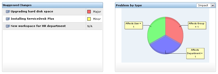
The third widget shows a list of unapproved changes along with the change type. Clicking on the title of the change opens a pop-up with the change details. By clicking on the title of the change in the pop-up, the complete change details page can be viewed.
-
The last widget is a pie chart displaying the problems. The chart can be customized to be displayed based on Priority, Urgency and Impact.
Technicians who have permission to view Asset module can also view the Asset Dashboard and monitor the statistical data displayed on it. The widgets in the Asset Dashboard give complete summary of all physical assets (IT and non-IT), software assets, workstations and POs & contracts.
-
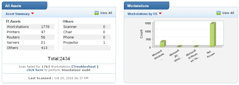
The first widget shows a summary of all physical assets in the organization including IT and non-IT assets. By default only number of Workstations, Printers, Routers, Servers and Others are displayed. By clicking on "View All", the Others category is expanded and other IT and non-IT assets such as Access points, Switches are displayed. The number of workstations failed to be scanned is also indicated in this widget along with the option to Troubleshoot the failure operation. By clicking on the number displayed next to the assets, one can view the list of those assets under the Asset module.
-
The second widget displays a bar graph indicating the number of workstations depending on various criteria. These criteria can be selected by clicking on the red drop down arrow at the top of the widget. By clicking on "View All", a pop-up showing the extended graph is displayed. Set of graph that is not included in the original widget is displayed in this pop-up. Mouse hovering over each bar displays the number of workstations corresponding to the selected criteria. By clicking on the bar, the list of workstations is displayed under the Asset module.
-
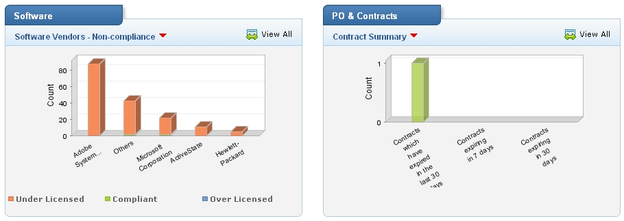
The third widget shows software related information in a combination of pie chats and bar graphs. By clicking on the red drop-down arrow below the widget title, one can select the criteria based on which the graph should be displayed. By clicking on "View All", a pop-up showing the extended graph is displayed. Set of graph that is not included in the original widget is displayed in this pop-up. Mouse hovering over each bar/pie region displays the number of software corresponding to the selected criteria. By clicking on the bar/pie region, the list of software is displayed under the Asset module.
-
The fourth widget shows a summary of Purchase Orders (POs) and Contracts. By selecting Purchase Order summary from the drop down, one can view the overdue POs, POs due in the next 7 days and the POs due in the next 30 days. By Selecting Contracts summary, one can view the contracts that have expired in the last 30 days, contracts expiring in the next 7 days and contracts expiring in the next 30 days.
Refresh dropdown
It is required to refresh the Dashboard periodically, so that the latest data is loaded into the Dashboard. But, it is painful to do it manually always. The Refresh dropdown automates this process and allows you to set the Refresh Frequency, say 5 Minutes, 10 Minutes, etc. Thus, the Dashboard can be efficiently used by Admins with large monitors or something similar.
