5 ITSM dashboards to empower CIOs to achieve data-driven success
07 mins read
A CIO dashboard is a visual representation of the key performance indicators (KPIs) necessary for the CIO to take informed decisions. It provides insights on the organization's IT infrastructure and operations, and projects the data in a structured manner. CIO dashboards can be utilized to track the efficiency of IT services, identify potential pitfalls, and make informed IT financial decisions to combat todays economical headwinds.
CIOs count on dashboards to see real-time insights, visualize data, make decisions, monitor performance, track goals, and manage risk. CIOs can effectively pilot their organizations' overall performance, improve operational efficiency, and facilitate stronger company growth by leveraging dashboards.
Here are five essential dashboards to consider for effective management of your IT operations:
1. IT financial dashboard
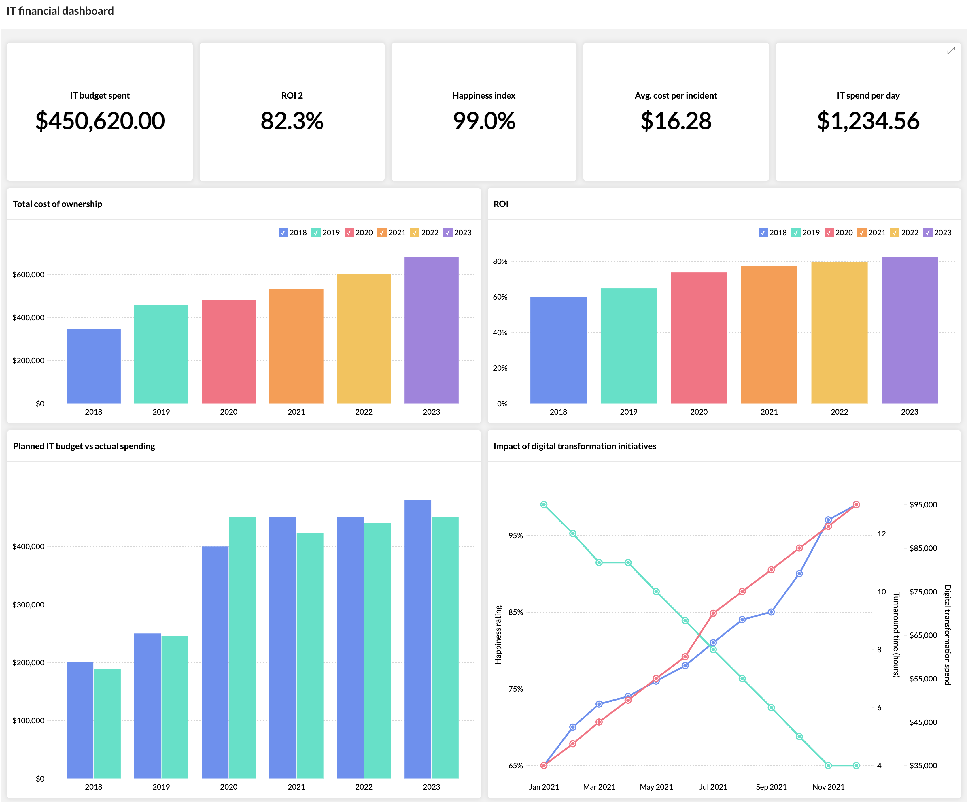
The IT financial dashboard contains a chart to monitor the utilization of the IT budget up to the present time. These metrics help with analyzing IT expenditure and devising improved plans that align with requirements. Alternatively, IT teams can establish a reserve budget to mitigate unexpected IT costs.
Some critical KPIs:
- Total cost of ownership (TCO): This metric measures the total cost of all aspects of IT, including hardware, software, maintenance, and support. The TCO helps highlight the grey areas in the structure of the budget and show areas where expenditure can be reduced. The TCO also helps forecast spending, aiding in preparing a tighter budget with an improved TCO.
- Return on investment (ROI): This metric measures the financial benefits of IT investments, such as increased productivity, improved customer service, and reduced costs. CIOs can use the ROI to track the effectiveness of their IT initiatives and make informed decisions about future investments.
- Budget adherence: This metric measures how closely IT spending aligns with the budget. With this metric, CIOs can track their spending and identify areas where costs may be out of control.
- Cost per incident: This metric measures the average cost of each IT incident, such as a service outage or a security breach. CIOs can use this metric to track the efficiency of their IT incident management process and identify areas where costs can be reduced.
- Spending on productivity and uptime: IT expenditures may directly affect staff productivity. For instance, spending money on new software that simplifies corporate procedures might provide staff more time to work on activities that are more strategically important. On the other hand, downtime can result in lost productivity, income, and customer satisfaction. As a result, it's crucial to spend money on IT infrastructure that is dependable and consistently available.
2. Cybersecurity dashboard
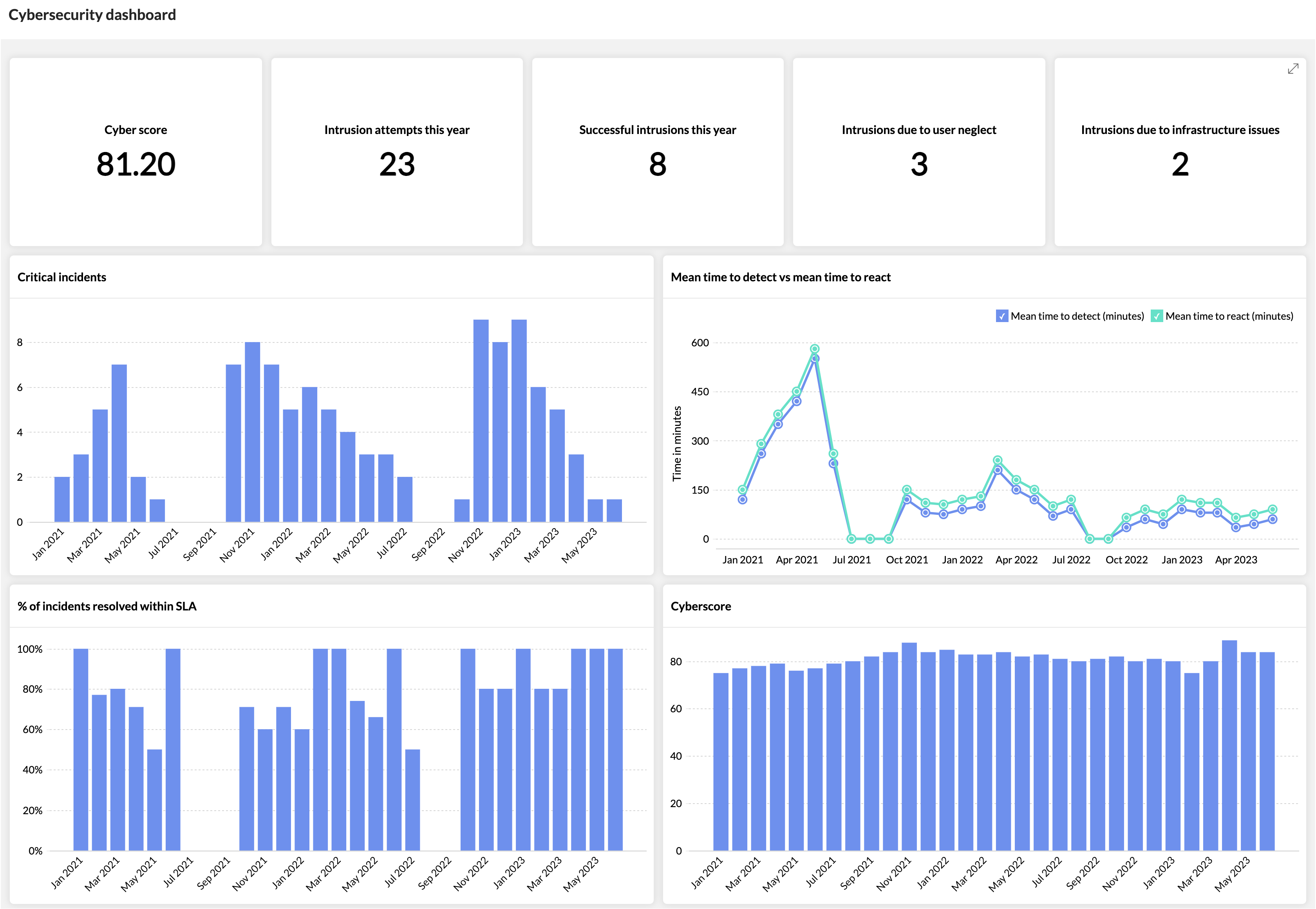
An organization's networks, applications, and systems are constantly exposed to cyberthreats. CIOs need to gain a thorough understanding of the organization's security posture to secure data better in the future. The cybersecurity dashboard combines data from SIEM, endpoint management, password management, and other security solutions to provide a complete overview of the state of data security.
Some critical KPIs:
- Number of security incidents: The number of security incidents that are reported to the service desk is tracked by this measure. It may be used to assess the efficiency of the security policies and practises followed by the service desk.
- Mean time to detect (MTTD): This statistic measures how long a security event typically
takes to be discovered. A low MTTD shows that the service desk can identify and address security risks promptly. - Mean time to react (MTTR): This statistic measures the typical duration of a security issue response. A low MTTR suggests that security incidents can be resolved swiftly by the
service desk. - Percentage of security incidents meeting service level agreements (SLAs): This statistic measures the percentage of security incidents that are resolved in line with the established SLA.
- Cyber score: A cyber score is a rating based on the overall security performance calculated, similar to a credit score, which is based on user behavior, security diligence, security breaches, and compromised systems.
3. Technician performance dashboard
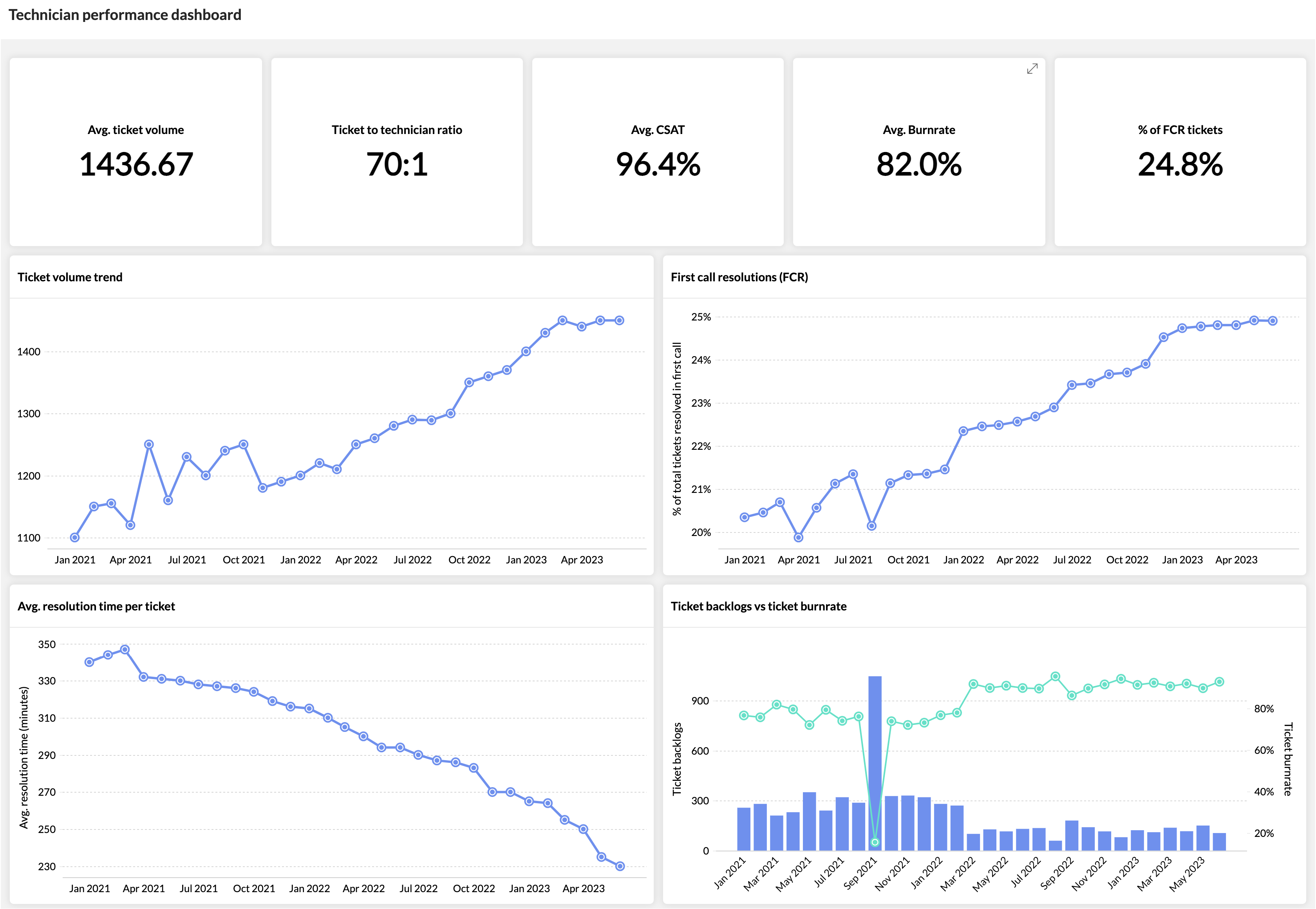
The technician performance dashboard is a valuable tool for any company that relies on technicians to provide services to customers. It can help you track the performance of your technicians, identify areas where they may need improvement, and make changes to your processes to improve overall efficiency. A technician performance dashboard helps measure success, improve areas of failure, identify pain points for technicians, and make processes and systems easier to use, reducing the strain on technicians.
This dashboard can provide you with a real-time view of how your technicians are performing, including their call volume, average handle time, and first-call resolution rate. By tracking technician performance over time, you can identify areas where your team is excelling and areas where they could use improvement and make changes to your processes to improve efficiency and reduce costs.
Some critical KPIs:
- First call resolution (FCR) rate: This measure identifies the percentage of tickets that are resolved during the initial call. With a high FCR, professionals are better equipped to repair problems swiftly and inexpensively, increasing customer satisfaction.
- Average resolution time: This is the typical time required to resolve a ticket. With a short average resolution time, personnel are more likely to be able to address problems promptly, which can increase customer satisfaction and lower expenses.
- Customer satisfaction: This represents how happy consumers are with the support that they receive from technicians. A high customer satisfaction rating reveals that technicians are offering top-notch service, which encourages repeat business and good word of mouth.
- Ticket volume: This represents the total number of tickets generated each month. If there are issues with the goods or services the service desk supports, a high ticket volume could be a major indication.
- Burn rate: This measures the rate at which technicians are completing work. It is calculated by dividing the number of tickets closed by the number of hours worked. This KPI can help identify areas where technicians are spending too much time, which can be used to improve efficiency and productivity.
4. CSAT dashboard
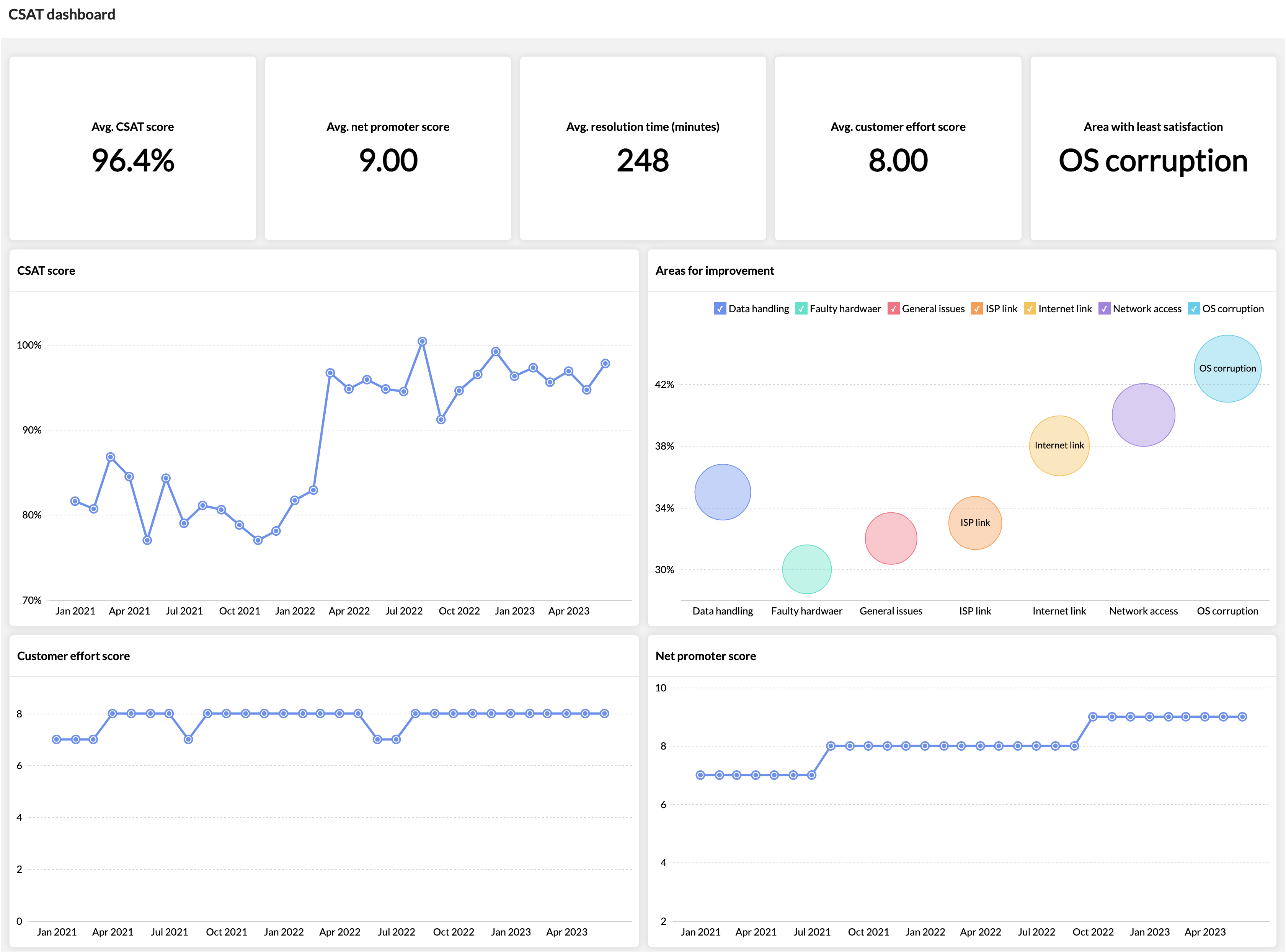
This dashboard provides a central location for CIOs to view customer satisfaction (CSAT) data from various sources, such as surveys, customer support tickets, and social media. This data can be used to identify areas where customers are unhappy and make changes to improve the customer experience. This dashboard helps identify trends in customer satisfaction. By tracking CSAT scores over time, CIOs can see if customer satisfaction is improving or declining.
A CSAT dashboard can help CIOs prioritize customer feedback. When there is a lot of customer feedback, it can be difficult to know where to start. A CSAT dashboard can help CIOs prioritize feedback by showing them which areas of the customer experience are most important to customers. This information can be used to focus resources on improving the customer experience in the areas that matter most to customers.
Some critical KPIs:
- CSAT score: The overall satisfaction rating for the service desk is obtained by calculating the average of all CSAT scores given for interactions.
- Customer effort score (CES): This metric determines how easy it is for customers to interact with the service desk. A low CES score implies that customers find the service desk user-friendly and easy to navigate.
- Net promoter score (NPS): This metric is used to measure the likelihood of customers recommending the service desk to others. A high NPS score suggests high customer satisfaction with the service desk.
- CSAT score based on geography: By tracking CSAT scores by geography, organizations can identify areas where customer satisfaction is low. Comparing CSAT scores to those of competitors in the region, organizations can get a sense of how they are performing relative to their peers. This information can be used to identify areas where they need to improve.
5. Unified IT dashboard
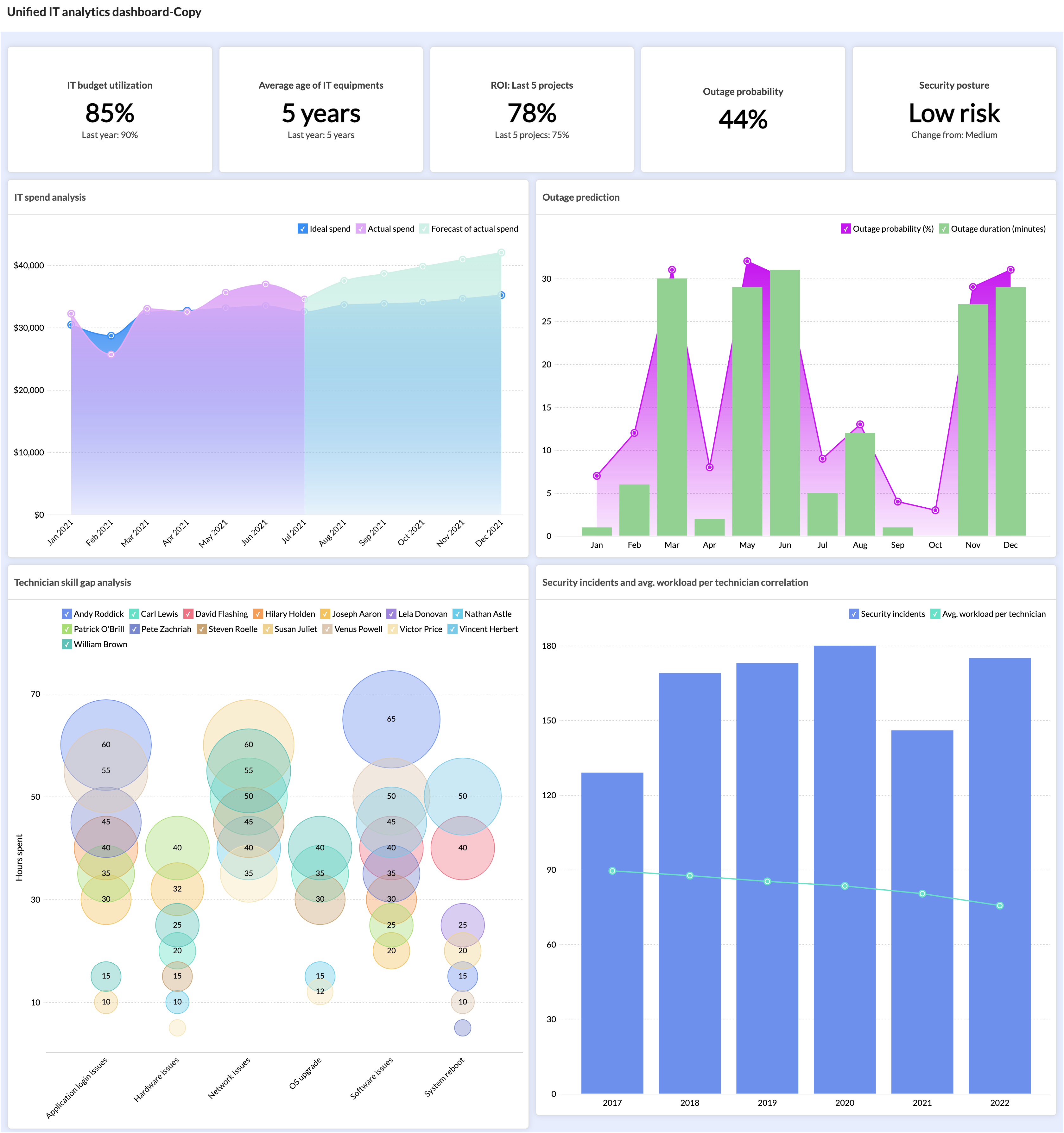
A unified IT dashboard is a comprehensive, centralized dashboard that provides key data about an organization's IT architecture, systems, and operations. In order to stay ahead, CIOs need 360-degree visibility and information of their IT landscape in a single view to take calculated decisions and stay on top of IT infrastructure operations. This is made possible by the unified IT dashboard.
This dashboard projects all the necessary information related to critical systems like network security, environmental impact, data center performance, cloud computing capacity, application monitoring, and much more.
Some critical KPIs:
- Network availability and uptime: This metric shows the percentage of time the network is operational and available without outage or disruptions.
- Security patching compliance: This is the percentage of assets that are patched and up to date.
- Technician performance: Assess the technicians' ability to provide adequate support to users. Analyze process bottlenecks and aid technicians by streamlining them.
- Security posture: Determine the vulnerability and resilience of your organization and its IT infrastructure to potential cyberattacks.
- Carbon footprint: This shows the impact caused on the environment by the consumption of energy, products, and services.
Similar to the unified IT dashboard, CIOs can unify different facets of data to create a personalized dashboard for their specific goals.
These are just some of the key aspects and metrics a CIO and IT leaders should be monitoring to enhance their ITSM operations without compromising on service delivery quality. ServiceDesk Plus, the ITSM platform from ManageEngine, with out-of-the-box analytics capabilities and a watertight integration with ManageEngine Analytics Plus, helps businesses establish a value oriented IT service delivery system.
