KPI Widgets
ManageEngine Analytics Plus offers a widget-based model for adding single numbered widgets and chart type widgets within dashboards. These are called KPI Widgets.
Analytics Plus offers 2 types of KPI widgets:
- Single number widgets
- Chart type widgets
- Adding images and icons to KPI widgets
- Adding Descriptive Tooltip
- Drill Through in Widgets
- KPI widget with images
- KPI widget with forecast
Single number widgets
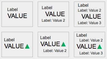
Single number widgets are used to display a single numeric value as formatted text. They are useful to highlight key metrics in a dashboard. The key metrics can also be accompanied by comparison indicators to highlight the trend. Analytics Plus currently offers six types of single number widgets with or without the comparison indicator.
Adding a single number widget
You can add a new KPI widget by clicking the Widget option from the dashboard's toolbar in the Edit Design mode. The KPI Widget Editor will appear.
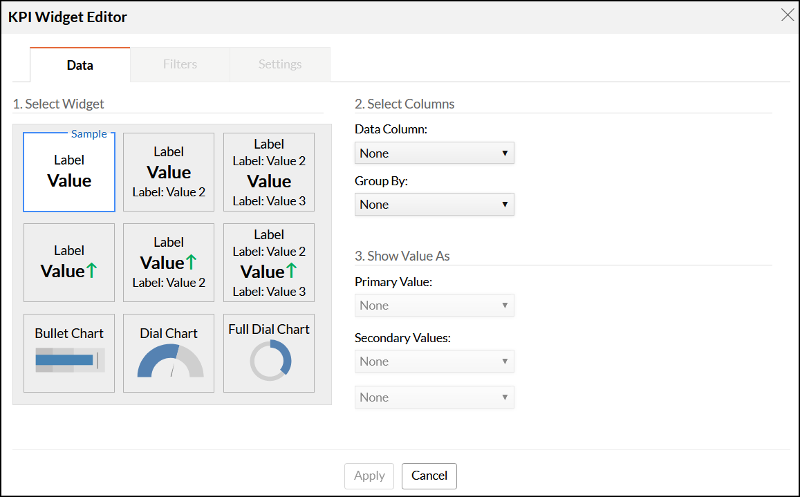
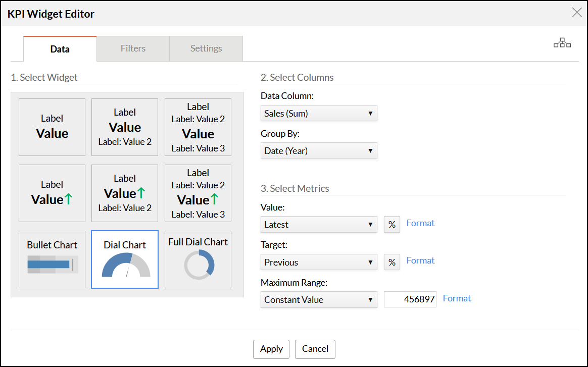
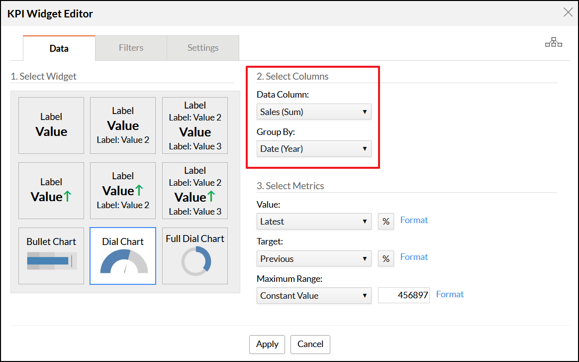
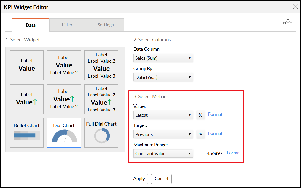
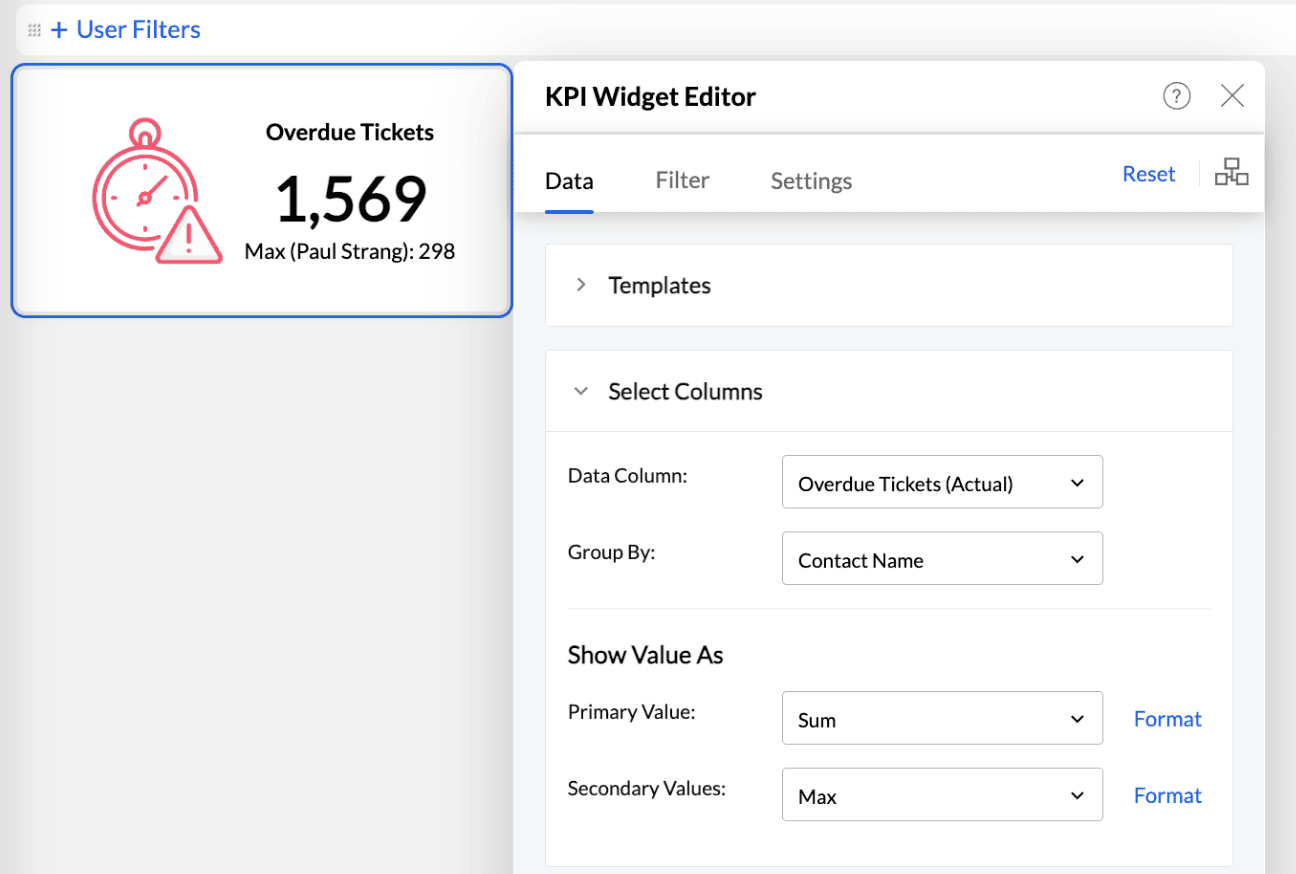
The Data tab
The Data tab provides options to add a primary key performance indicator and secondary values to support it. You can choose the type of widget and the required columns from this section.
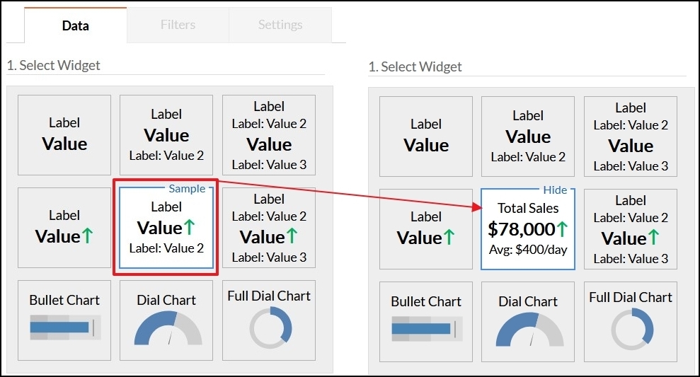
Select the required widget type from the Select Widget section. You can view each template with sample data by clicking the Sample link that appears on mouseover.
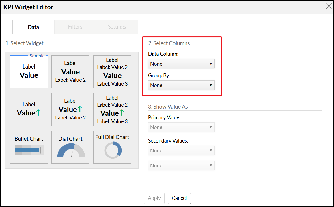
- Select the required columns from the Select Columns section. Analytics Plus will display a single value based on the columns and functions selected in this section.
- In the Data Column drop-down, select the data column that you want to display in the widget along with the required mathematical function.
In the Group By drop-down, select the column by which the previously selected data column value should be grouped.
Based on the selected widget layout, additional information may be required to create the KPI widget.
- The following options are available under the Show Value As section:
- The Primary Value drop-down allows you to apply a summary function over the data column. The computed value will be displayed as the main value (primary value) of the widget.
The Secondary Value section allows you to apply an additional function over the data column and display it along with the primary function.
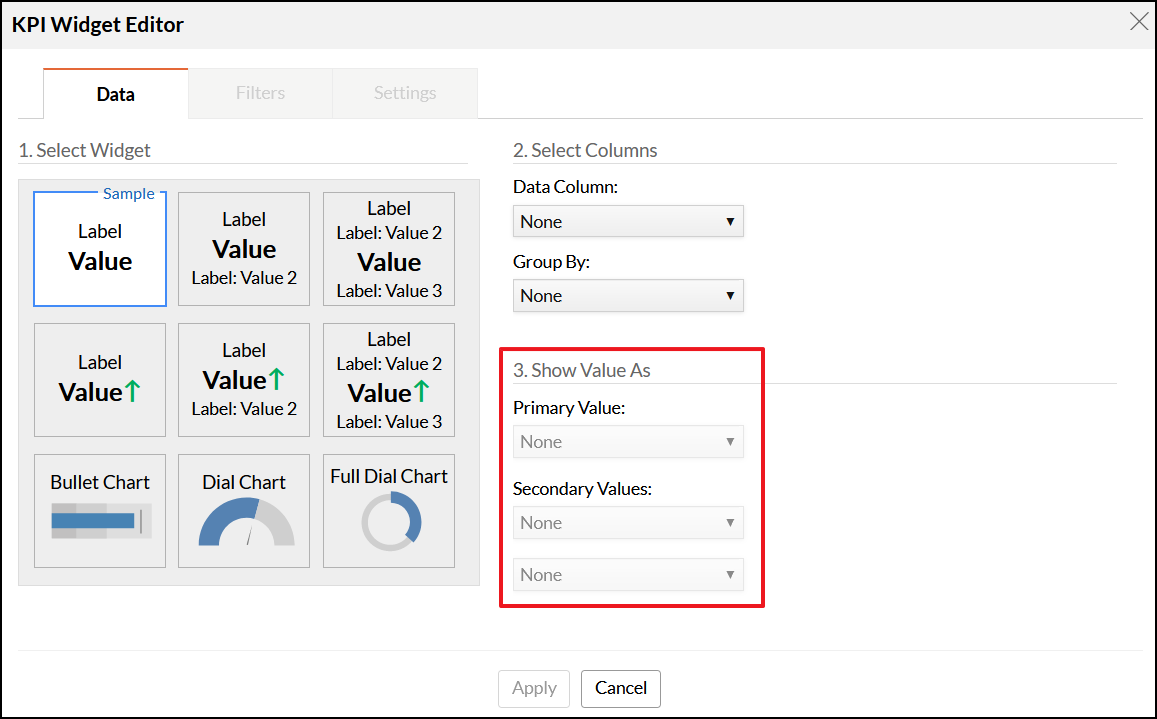
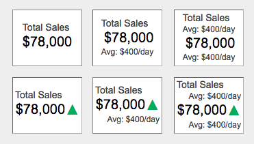
For instance, if your primary metric is total sales, you can also choose to display the maximum and minimum sales values along with the main value by selecting the appropriate template. A maximum of two secondary values can be displayed with the primary value, based on the selected widget template.
- The following options are available under the Comparison Indicator section:
Compare: This option allows you to specify the values for comparison. You can either select an aggregate of your data column or a constant value.
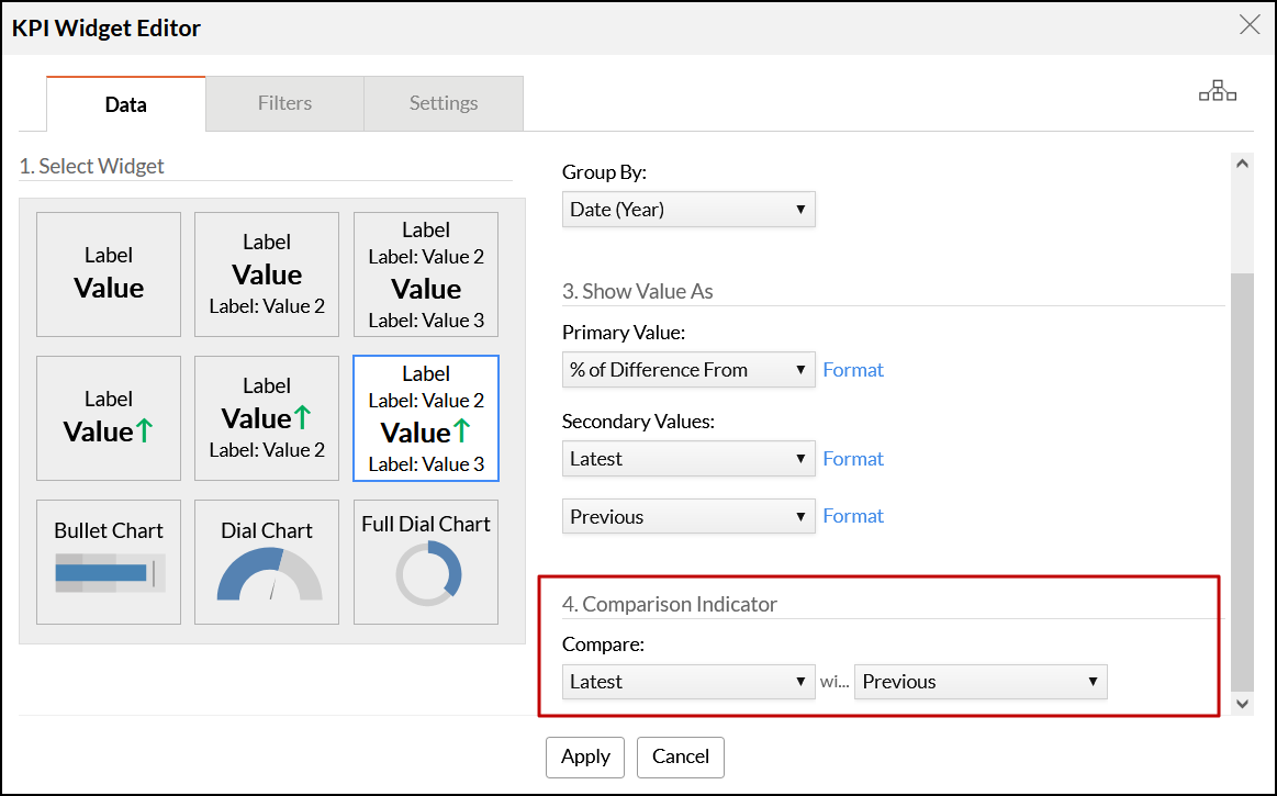
In the above example, we are comparing the Latest and Previous to compare the growth between the current and previous months.
Analytics Plus also allows you to format the value displayed using the Format link. To know how to format a column, refer here.
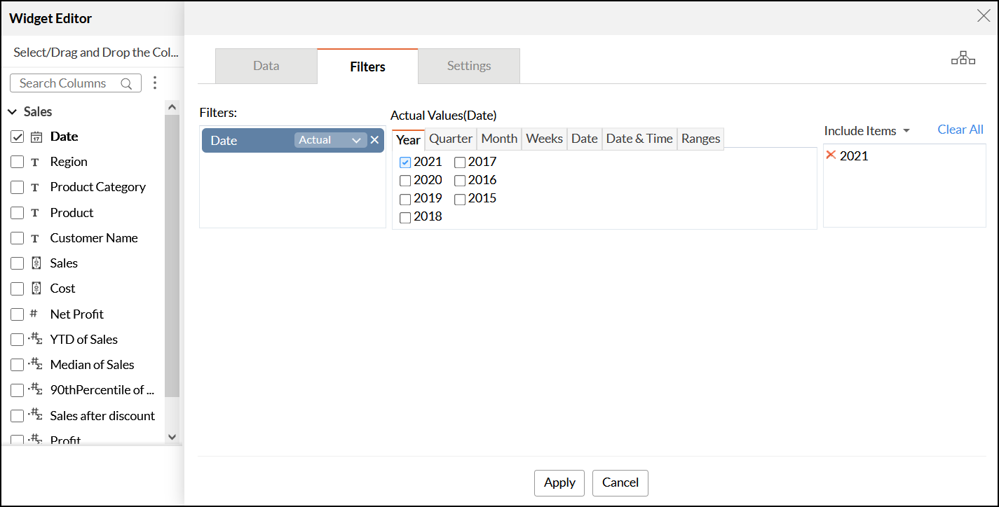
The Filters tab
The Filters tab allows you to filter the data as required by dropping the columns into the filters area and selecting the appropriate values. The filtering functionality in KPI widgets works in the same manner as it does in charts.
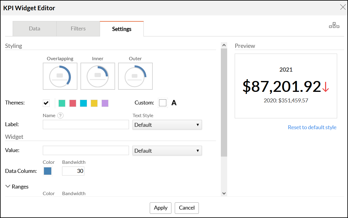
The Settings tab
The Settings tab provides several options to format the widget by customizing the label name, font, and comparison indicator.
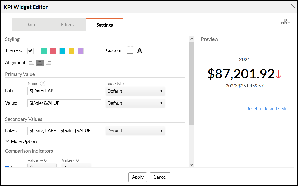
The following are the available options:
Styling
You can apply widget themes to customize the widget's background.
- Themes: Select the required theme for the widget's background from this section. There are five preset options available.
- Custom: This section allows you to customize the widget's theme and font color.
Primary Value
This section provides options to customize the displayed primary value. You can modify the primary value's label and the primary value being displayed, as well as the text style used for both.
Secondary Values
This section provides options to customize the secondary value. You can modify the secondary value's label and the secondary value being displayed, as well as the text style used for both.
Parametrized Format
You can also customize labels for primary and secondary values using a parameterized format, which allows you to display dynamic values in your KPI widget. The following are the supported formats for specifying a dynamic label:
- ${ColumnName}.LABEL: This is the default label generated based on the selected column and the corresponding operations applied over the column in the Data tab.
- ${ColumnName}.VALUE: This displays the corresponding value of the specified operations over the selected column.
- ${OPERATION}: This denotes the mathematical operation specified in the Show Value As section of the Data tab.
- ${PERCENTAGE}: This displays the value as a percentage, and is only applicable to full dial chart widgets.
Comparison Indicator
You can configure the indicator icons and the color of the displayed metric from this section. These indicators will be displayed beside the primary metric value. The following options are available:
- Icon: This section allows you to choose the type of icon used and its color.
- Value: This section allows you to customize the primary value's font color based on the indicator's value.
The following image shows a sample dashboard with KPI widgets:
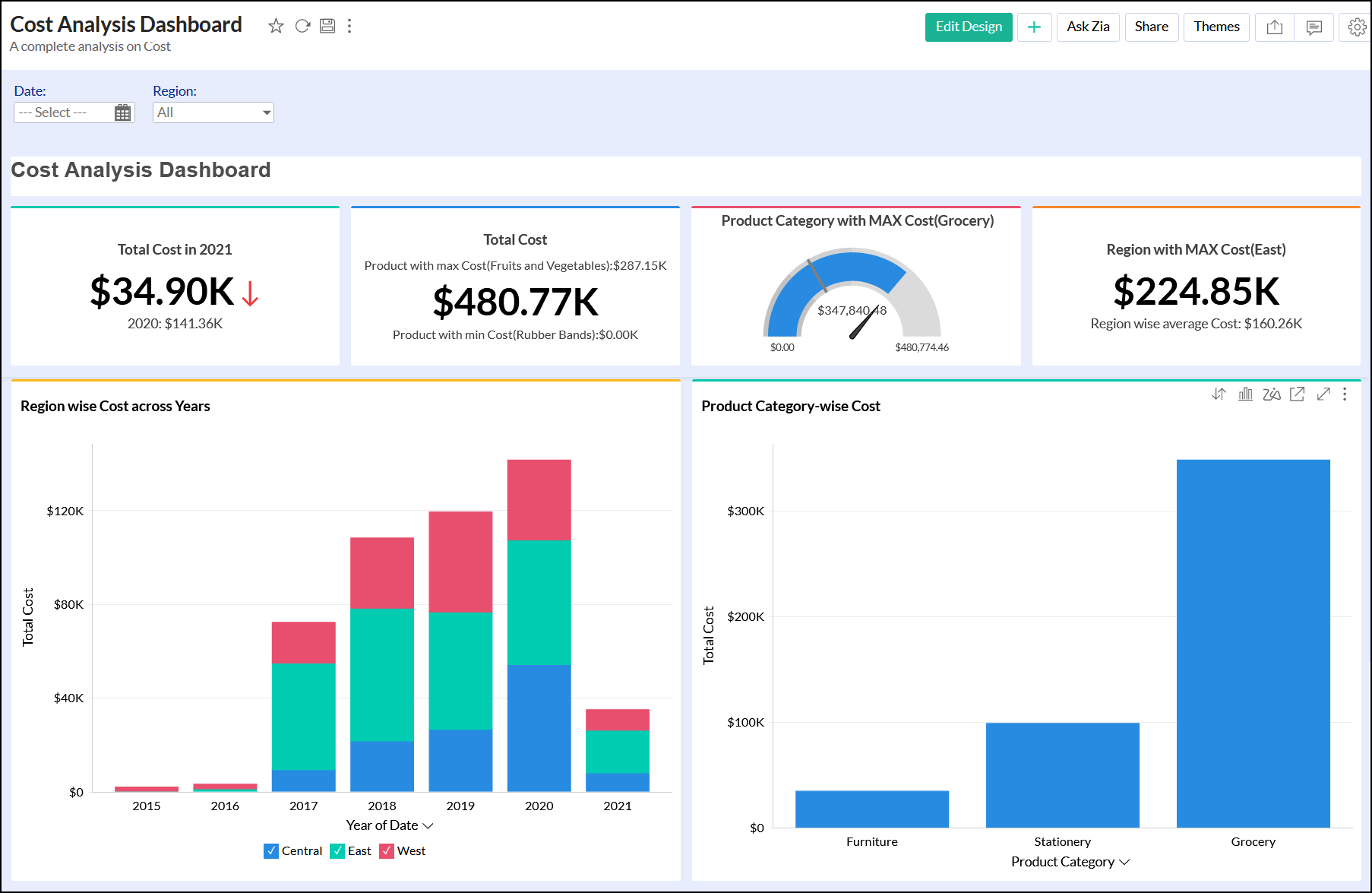
Chart type widgets
The chart type widgets in Analytics Plus enable you to highlight your data metric using chart visuals. These are different from actual charts and are focused on displaying a single value. Analytics Plus currently supports three types of chart widgets.
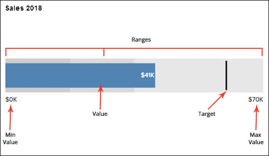
Bullet Chart
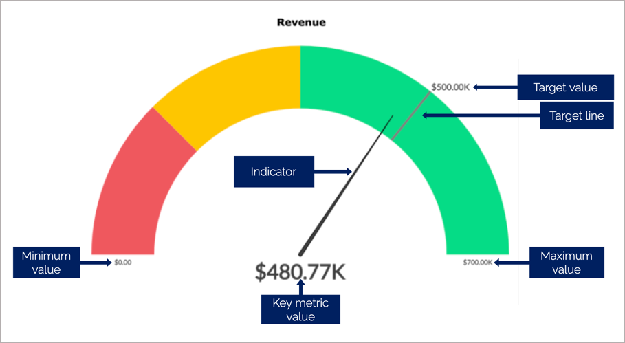
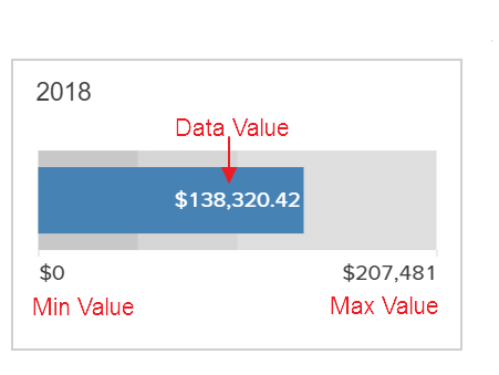
A Bullet Chart is best suited to highlight a metric and compare it with a target value. You can also specify qualitative ranges of performance, such as poor, satisfactory, and good. The qualitative ranges are displayed as varying intensities of a single hue.
The image below displays a bullet widget in Analytics Plus, with the various components of a bullet chart highlighted in red.
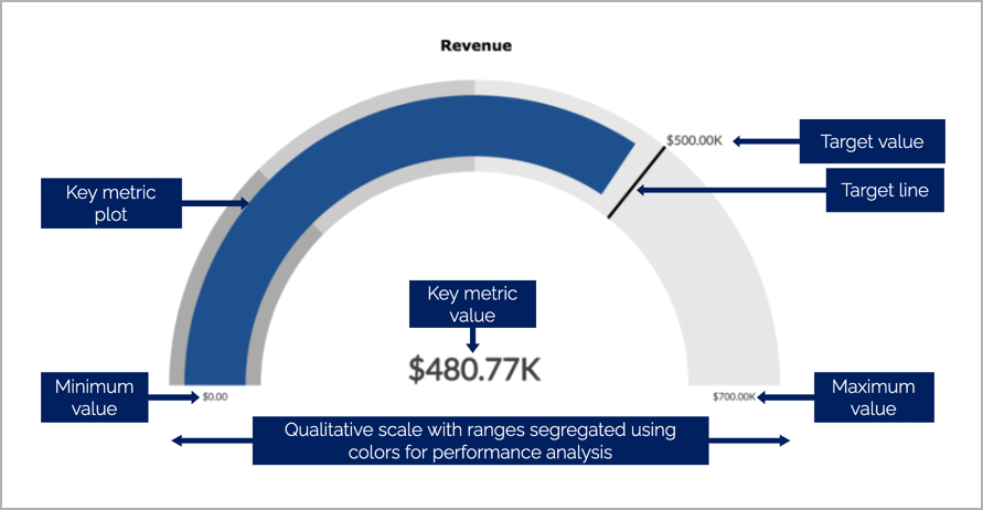
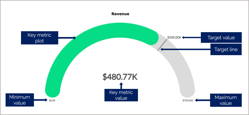
Dial Charts
A Dial chart is used to indicate the current value of a metric in a given range. Although similar to a bullet chart, it displays the values in the form of a semi-dial. You can also specify qualitative ranges of performance using dial charts.
The following types of dial charts are available in Analytics Plus:
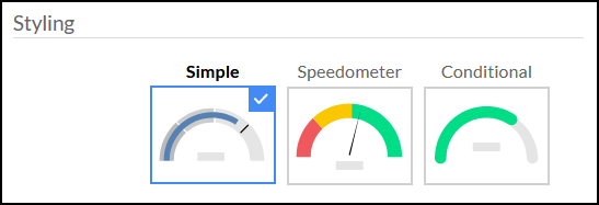
Simple: This is a basic dial chart which consists of chart range, target, key metric plot, and its value.
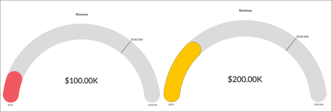
Speedometer: The speedometer is a dial chart with an indicator that marks the position of the key metric value in a given range. By default, the qualitative ranges in the speedometer don't follow the same hues. The red, yellow, and green colors prove beneficial in indicating your performance range.
Conditional: In conditional dial charts, the color of the key metric plot is based on the specified conditions. This helps in categorizing key metric values into different qualitative buckets.
Analytics Plus allows you to specify a default color for the key metric plot, and different colors when a condition is met. For instance, to measure the progress of sales over a month, you can assign various colors for instances when the sales reaches 25% and 50% of the overall sales. The default color will be applied when the sales value is above 50%.
You can choose the required dial chart from the Settings tab in the KPI editor. Click here to learn more.
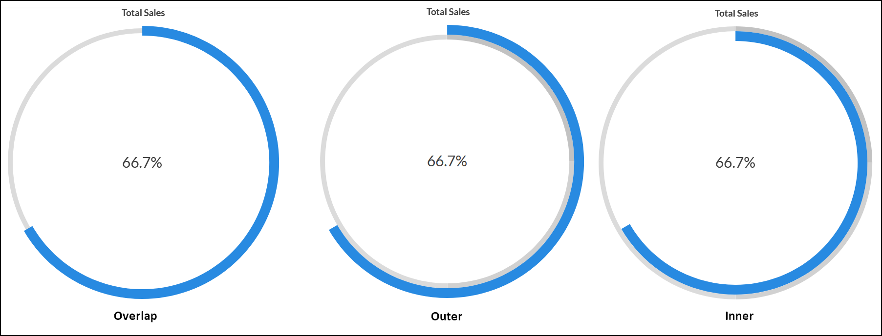
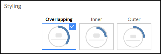
Full Dial Charts
A full Dial Chart is a gauge chart with a full ring. This is similar to a dial chart, however, the maximum range value will be configured as the value of the full ring.
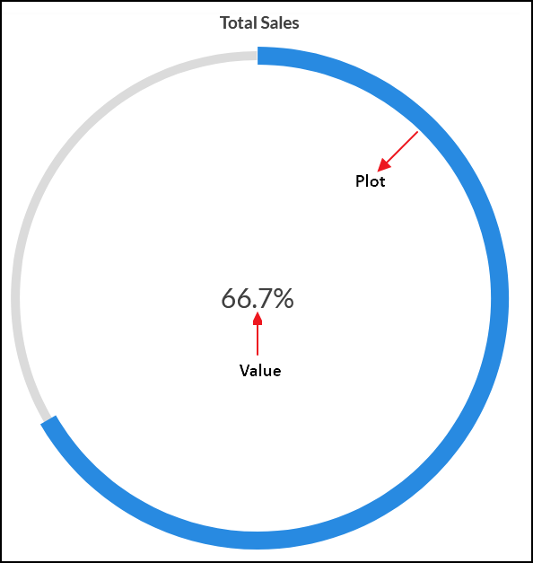
You can customize the full dial chart by plotting the key metrics to overlap the dial, outside the dial, or inside the dial.
You can choose the required full dial chart from the Settings tab in the KPI editor. Click here to learn more.
Adding Chart Type Widgets
To add a chart type KPI widget, open the required dashboard in the Edit Design mode, and click the Widget button from the toolbar. The KPI Widget Editor screen will appear.
Data tab
Select the required chart type widget from the Select Widget section of the Data tab.
Select the required columns from the Select Columns section.
- Data Column: Select the data column you wish to display in the widget along with the required mathematical function.
- Group By: Specify the column by which the previously selected data column value should be grouped.
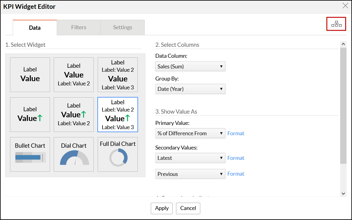
Note: In cases where the columns in the Data Column and the Group By fields are from different tables, you can view and modify the way the tables are joined by clicking the View paths used in the widget icon on the top right corner of the widget editor. You can modify the lookup columns and configure the lookup path used from the popup that appears. Click here to learn more.
The Metrics section provides the following options to customize your widget's data:
- Value: This drop-down allows you to apply an advanced summary function such as sum, average, etc., over the selected Data column.
- You can also specify the primary value as a percentage of the data column. Click on the % button to mention the percentage. This multiplies the value of the mentioned factor.
- Target: This section allows you to select a target. You can either apply summary functions or specify a constant value in this field.
- Maximum Range: You can specify a maximum range for the widget using this section. You can either choose to apply summary functions or specify a constant value in this field.
- Value: This drop-down allows you to apply an advanced summary function such as sum, average, etc., over the selected Data column.
Analytics Plus provides various formatting options for KPI Widgets. To customize your widget, click the Format link next to each component under the Select Metrics section, and a popup appears with several formatting options. These options are similar to the formatting options available in reports. Click here to know more about the formatting options.
Filters tab
The Filters tab allows you to filter the data as required by dropping the columns into the filters area and selecting the appropriate values. The filtering functionality in KPI widgets works in the same manner as it does in charts.
Settings tab
The Settings tab provides several options to format various aspects of the chart type widget.
Styling
- You can customize the dial chart and full dial chart's appearance using this section.
For dial charts, you can choose from a simple, speedometer or a conditional dial chart. Click here to learn more about these options.
For full dial charts, you can choose from overlapping, inner or an outer full dial chart.
- You can also apply widget themes to customize the background of the widget.
- Themes: Select the required theme for the widget's background from this section. There are five preset options available.
- Custom: This section allows you to customize the widget's theme and font color.
- Specify the name and font style of the label using the Name and Text Style fields.
Widget
The following options are available under the Widget section of the Settings tab:
- Value: This option allows you to modify the font style of the value being displayed.
- Data Column: You can change the color and bandwidth of the data displayed in the chart type widget from this section. A maximum bandwidth of 200px is allowed.
- Target Marker: This section allows you to customize the color, size, and type of target line used in the chart type widget.
- Needle: You can modify the type, size, and color of the needle used in dial chart widgets.
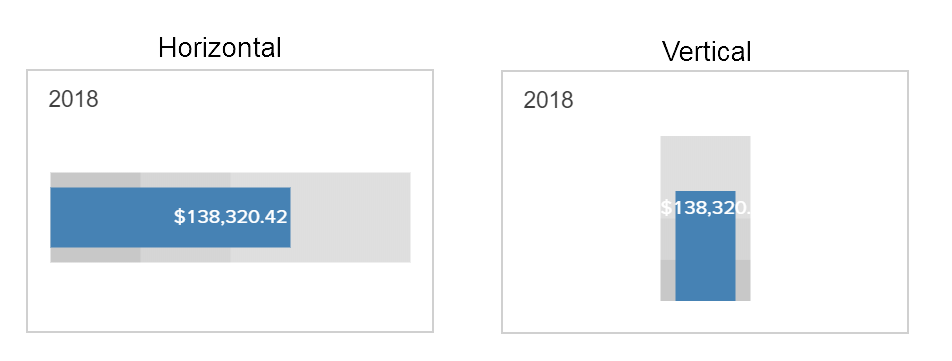
Orientation: Specify if the bullet chart widget will be horizontally or vertically oriented from this section.
- Show Min Max Label: Select this checkbox to display the minimum and maximum values.
- Show Data Label: Select this checkbox to display the data value within the chart type widget.
Show Target Label: Select this checkbox to display the target value beside the target line within the bullet and dial chart widgets.
Ranges are hues that are displayed in the background of a chart type widget to highlight the primary value. Analytics Plus allows you to specify different ranges to visually categorize primary values. For instance, you can use different hues to categorize performance as poor, satisfactory, and good. The color and bandwidth of these ranges can be customized from the Ranges section in the Settings tab
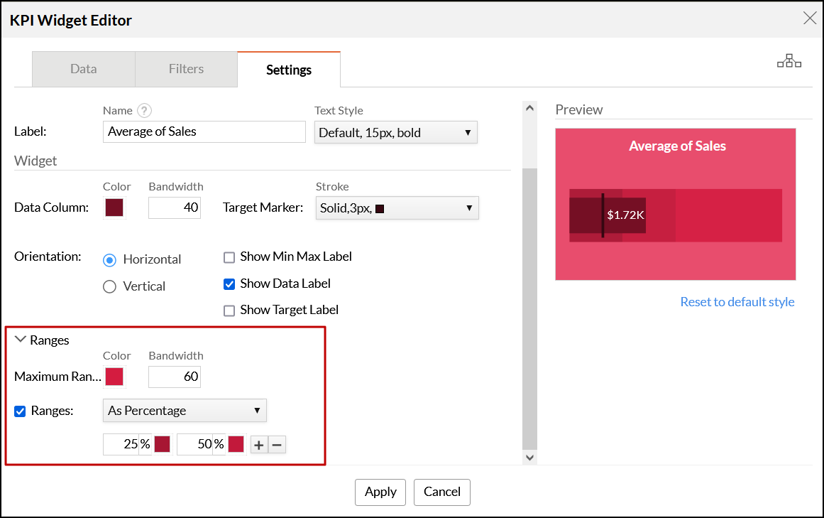
The following options are available under the Ranges section:
- Maximum Range: Use this section to specify color and bandwidth for the maximum range. A maximum bandwidth of 200px is allowed.
- Ranges: Ranges can be set as a percentage or as a value, by selecting the corresponding option from the drop-down in this section. A maximum of five ranges can be configured.
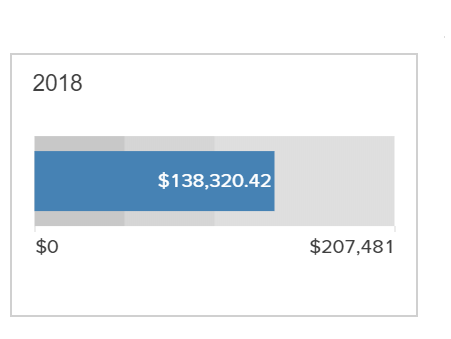
On specifying the required configurations, click Apply to create the chart type widget. The following is a sample widget that will be added to your dashboard.
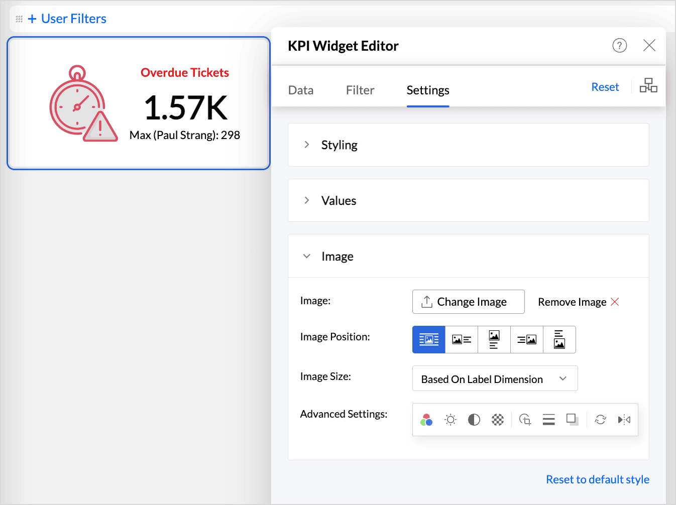
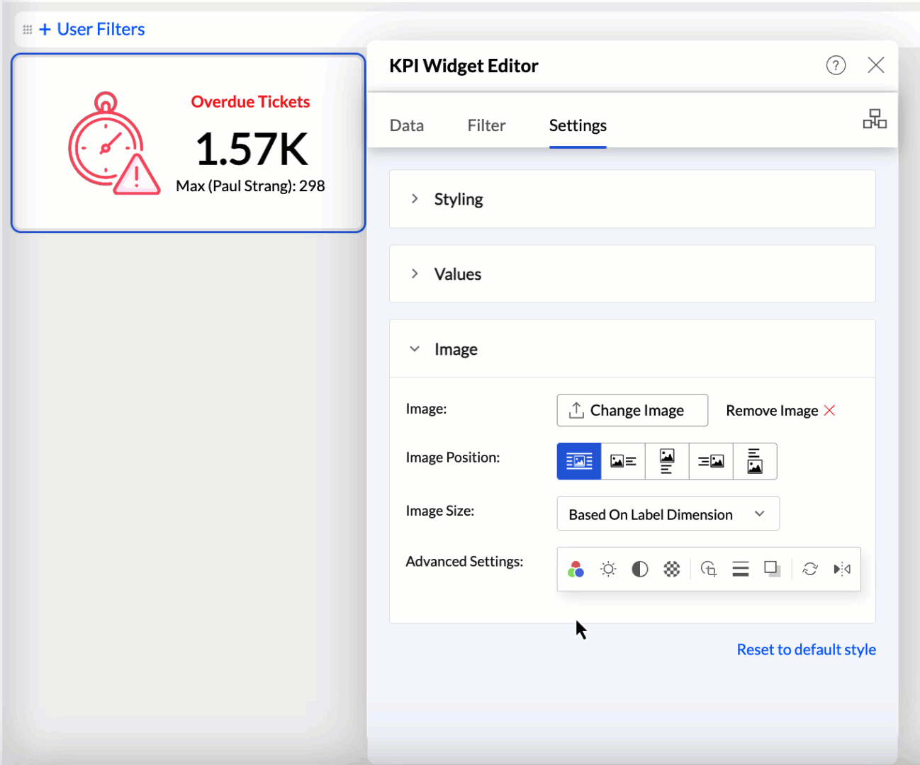
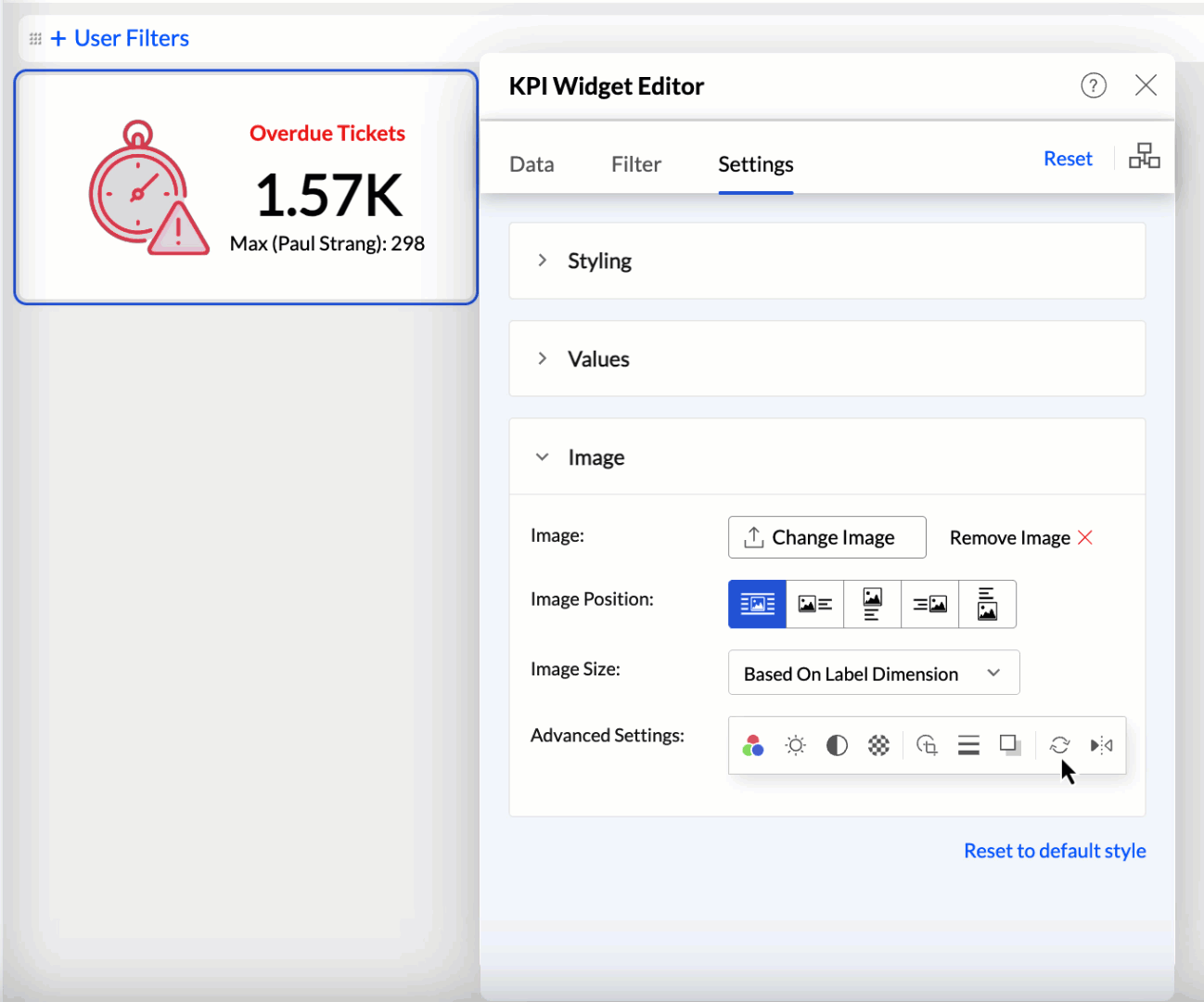
Adding images and icons to KPI widgets
Analytics Plus enables you to enhance your dashboard widgets by adding image and custom icons to provide visual cues about the type of information they display. This feature helps convey information more effectively without requiring lengthy descriptions. Follow these steps to add images and icons.
- Click the Choose Image button to browse and select the desired image or icon.
- Choose the desired position for the image, such as left, right, top, or bottom, to place it within the widget layout.
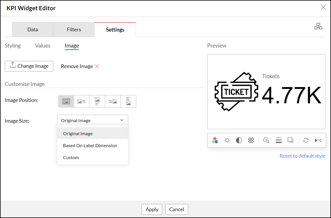
- Use the Image Size option to adjust the image or icon size. The following are the available options:
- Original Image: Displays the image or icon at its actual size.
- Based on label dimension: Resizes the image or icon to fit the dimensions of the associated label.
- Custom: Allows you to manually specify the desired dimensions for the image or icon.
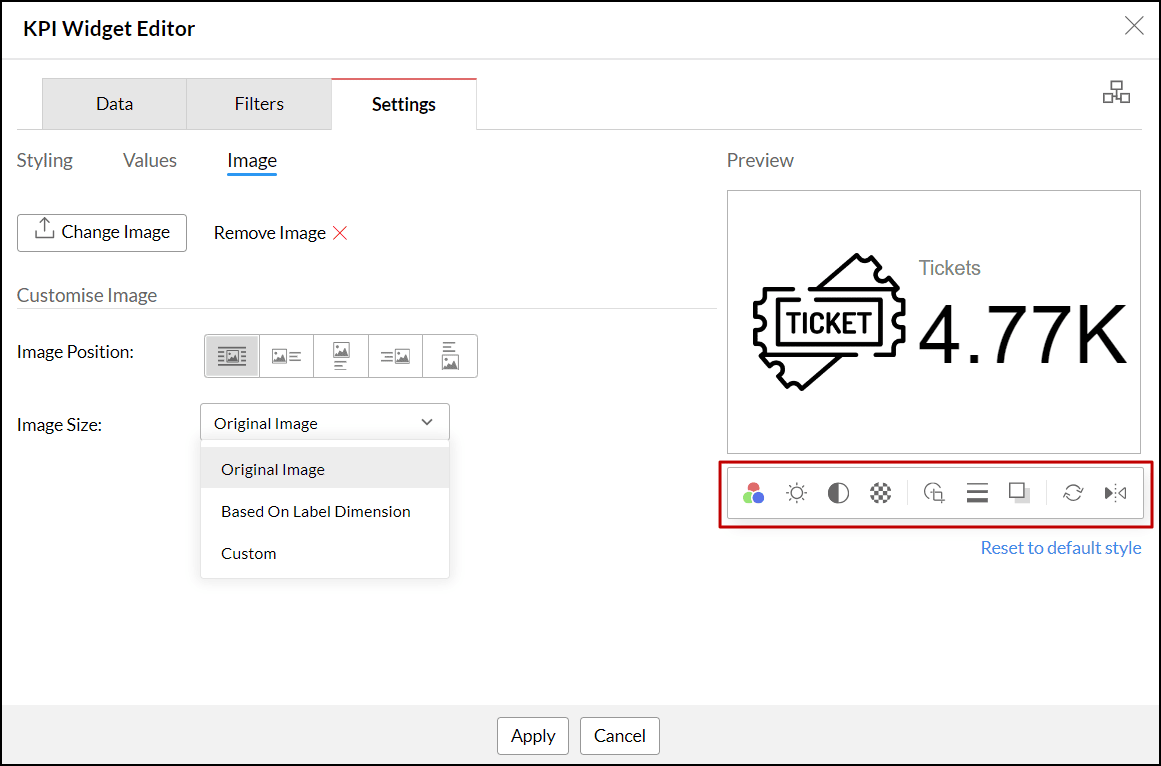
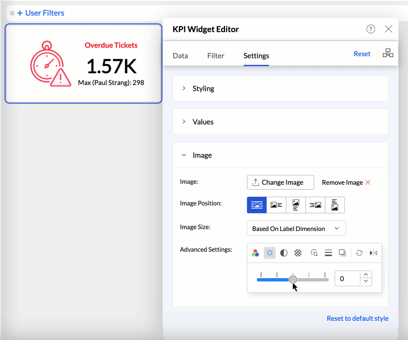
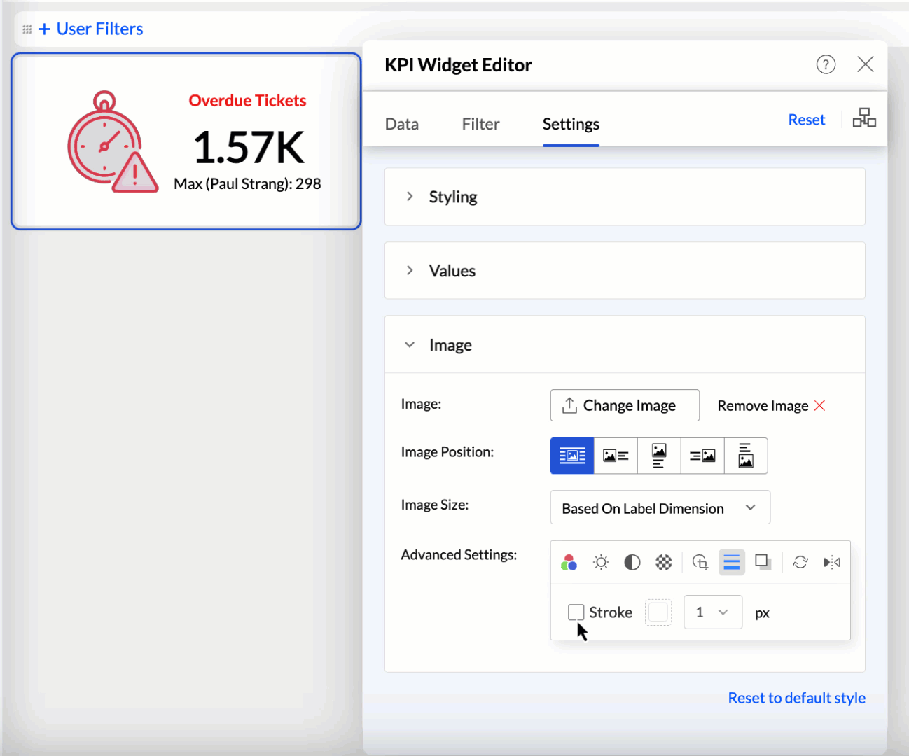
You can also customize or edit the image using the following options:
- Color: Set a different color to the icons.
- Brightness: Modify the brightness level to enhance visibility.
- Contrast: Change the contrast to make details more pronounced.
- Transparency: Set the image's transparency to blend seamlessly with other elements.
- Crop to Shape: Crop the image into predefined shapes to fit your design needs.
- Stroke: Add or adjust the border around the image.
- Drop Shadow: Apply a shadow effect to give the image a three-dimensional appearance.
- Rotate: Rotate the image to the desired angle.
- Flip: Flip the image horizontally or vertically for the desired orientation.
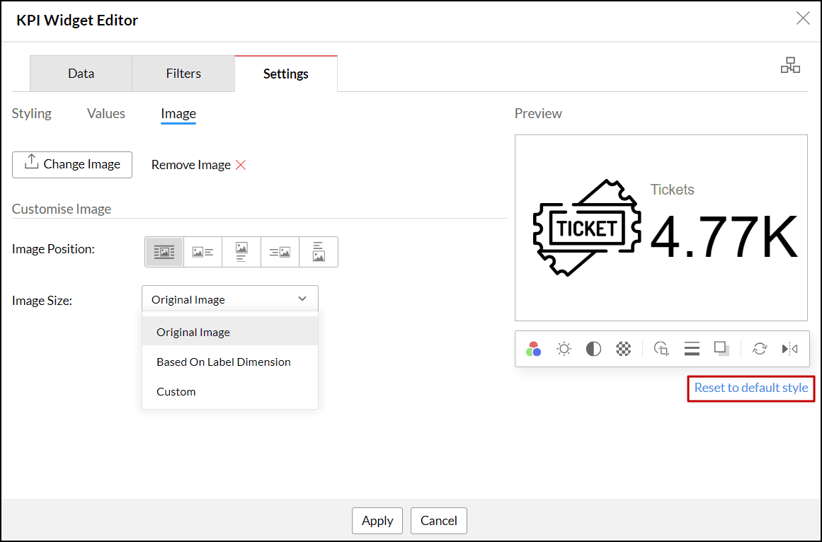
To revert any changes made to the image or icon, click the Reset to default style link at the bottom of the image editor.
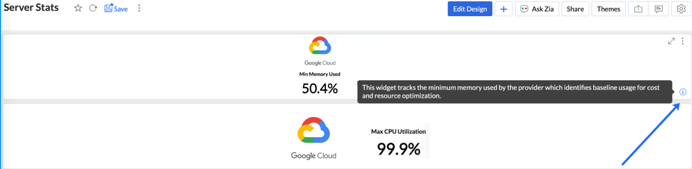
Adding Descriptive Tooltip
Analytics Plus allows you to equip widgets with an informational tooltip. This is achieved by enabling an information icon and providing a concise description.
To add informational tooltip to your widgets:
- Access the KPI Widget Editor.
- Navigate to the Settings tab and select the Values section.
- Enable the Widget Info checkbox. This activates the info icon to your widget.
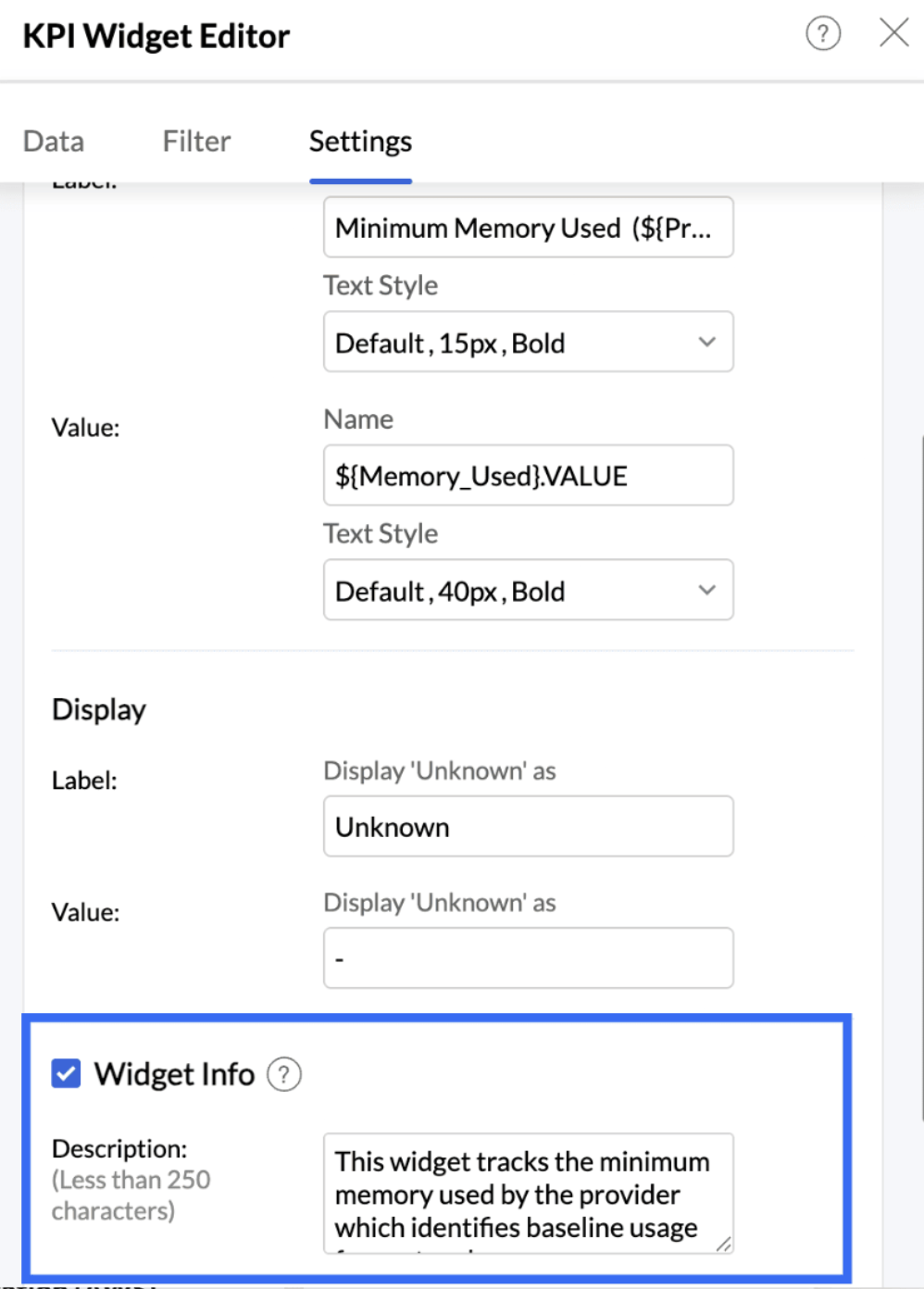
- In the Description box, enter a description for your widget (less than 250 characters).
- Once finalised close the widget editor. In View Mode, users can hover their cursor over the new info icon on the widget to read your description as a tooltip.
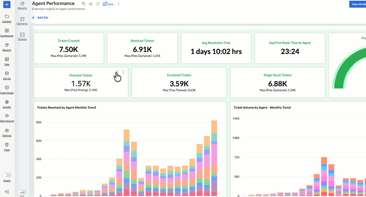
Drill Through in Widgets
Analytics Plus allows you to link widgets to related reports or dashboards, enabling users to drill through for deeper insights. This is achieved by enabling the Drill Through option and configuring the target reports or dashboards.
To add Drill Through to your widgets:
- Access the KPI Widget Editor.
- Navigate to the Settings tab and select the Drill section.
- Enable the Drill Through checkbox. This activates the drill through option for your widget.
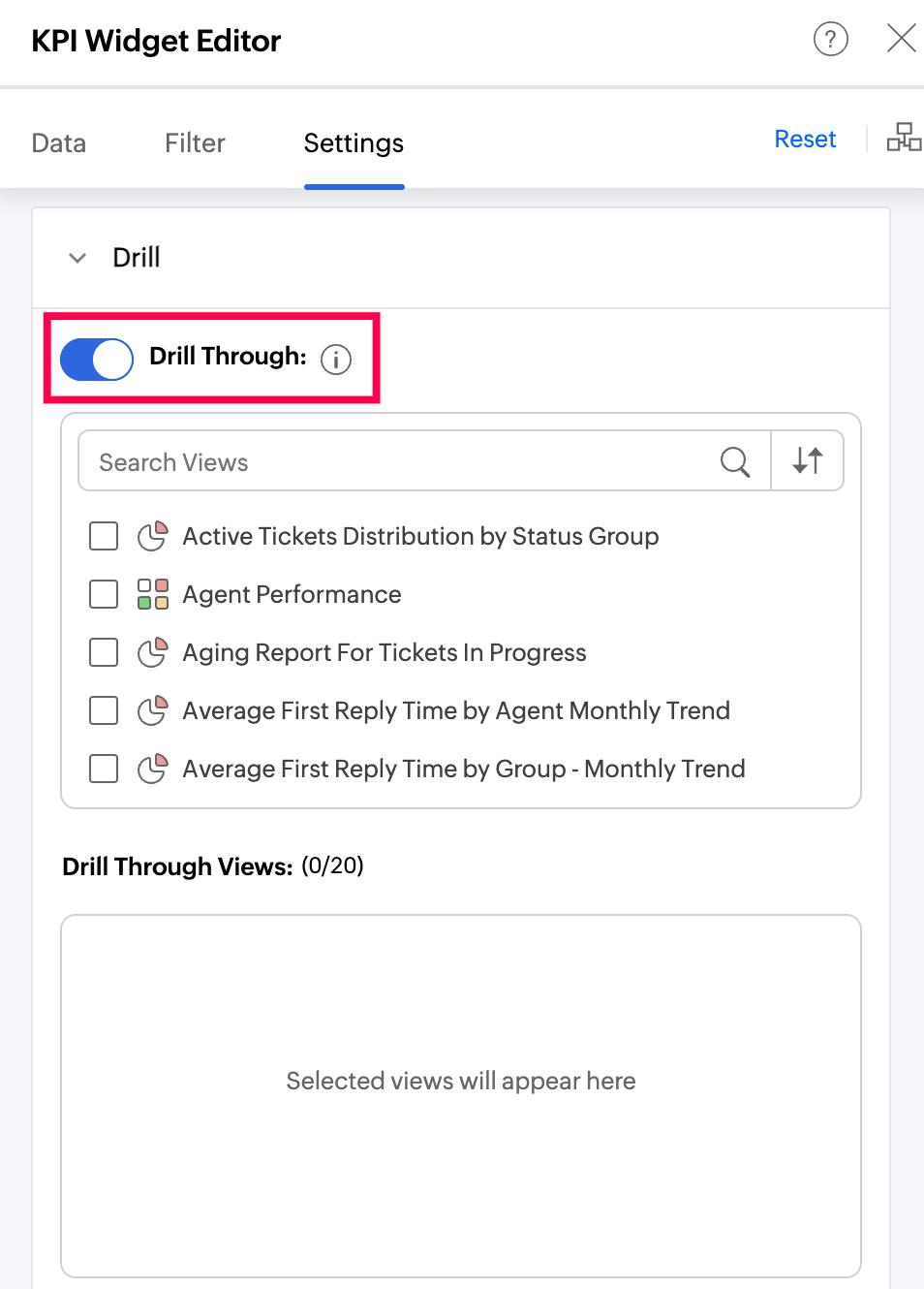
- In the report/dashboard selection panel, choose the target reports or dashboards you want to link to. All the dashboards and the reports relevant to the current widget will be listed, and you can link up to 20 per widget.
- Use the Remove All option to unlink all configured reports and dashboards from the widget at once.
- Once finalized, close the widget editor.
- In View Mode, users can click on the widget to view the list of linked reports and dashboards and navigate to them directly. If the widget has date columns or dimensional filters configured, they will automatically be passed as criteria when opening the target.
Note:
- If the widget has only a measure and no dimensions, the drill-through action will open the selected report/dashboard without any criteria.
- If a linked report or dashboard is deleted or access is revoked, it will be automatically removed from the drill through list.
- Resetting the widget will restore it to its previous state, including any drill through configuration.
KPI widgets with images
Images help process information far more efficiently than numbers and lengthy text descriptions. They also improve the visual appeal and aesthetics of the dashboard, and result in increased engagement and attention span from the users.
Analytics Plus allows you to incorporate images to the widgets in the dashboard. This can be done in two ways in Analytics Plus.
Static Images in Widgets: These images are used to indicate the type of data primarily, and the information contained in the widget. The images do not change based on data fluctuations.
Dynamic Images in Widgets: In this method, the data values are grouped by the Image column, resulting in images changing dynamically based on the groupings defined by the data in that column.
Creating Widgets with Static Images
Open the dashboard in Edit mode and click the Widget button.
Choose the suitable Widget Type.
Choose the Data Column for computing and the column to be used for Group By.
Access the Settings tab for widgets and click Image.
Click Choose Image. You can upload a locally stored image, gif or an image URL.
Customize the Image Position and Image Size. By default, the image is positioned at the center.
The Navigation bar below the Preview section provides the following customization options:
Easily change the color of the image to suit the dashboard color theme. You can also apply the Font color to the image.
Adjust the Contrast, Brightness, and Transparency to enhance visibility of the image.
Include Stroke and Shadow to make the images more prominent.
Use the Rotate and Flip options to change the orientation for better alignment and fitting within the dashboard layout.
Click Apply.
Creating Widgets with Dynamic Images
To create widgets with images,
You need a column that has the images (URLs of image addresses).
Each image's size should not exceed 200KB.
The Display as option under the Format Column menu must be set to Image. The below presentation shows how to create widgets with images.
KPI widgets with forecast
KPIs are beneficial to measure the progress towards your goals. By combining KPIs with forecasting, you can get a better understanding of how close you are to your goals, based on your current data trend.